
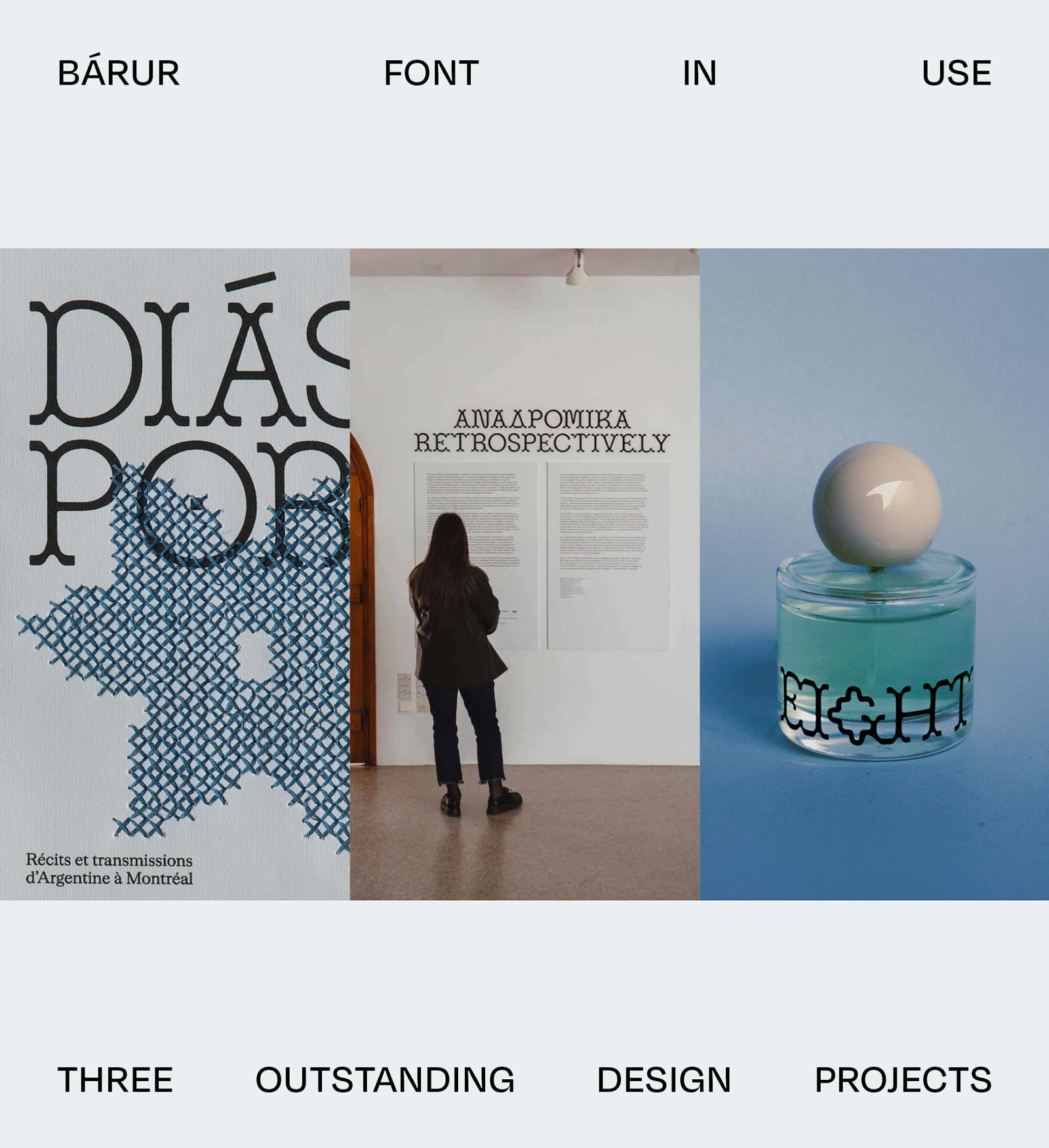
Bárur Font in Use: Three Outstanding Design Projects
→ Get Bárur here
There’s nothing quite like seeing a typeface leave the studio and find its place in the world. Here are three recent projects that showcase Bárur at its best.
Bárur has been out in the world for about six months now, and we’re slowly discovering the first branding, editorial, exhibition, spatial, and packaging projects created with our debut MNDT Type display typeface.
This growing collection of Bárur font in use examples reminds us why we designed the typeface in the first place: to give designers a distinctive display tool that feels both contemporary and timeless.
We’re incredibly grateful that designers, studios, and founders are embracing Bárur and would like to say thanks by showcasing them here on our blog.
The three Bárur font in use projects featured below demonstrate the typeface’s versatility across editorial, exhibition, and packaging design:
- Dyaspora Diáspora — editorial design project using Bárur Light
- ΑΝΑΔΡΟΜΙΚΑ or Retrospectively — exhibition design using Bárur Regular
- Eight — brand and packaging design using Bárur Regular
Let’s dive in!
1 Dyaspora Diáspora
© Darline Sophie
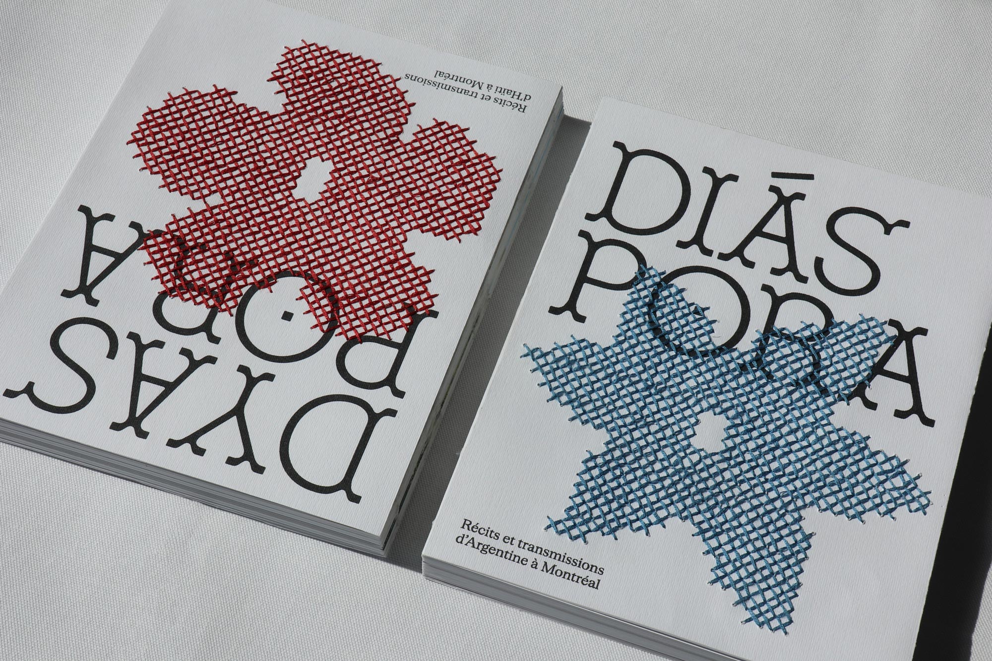
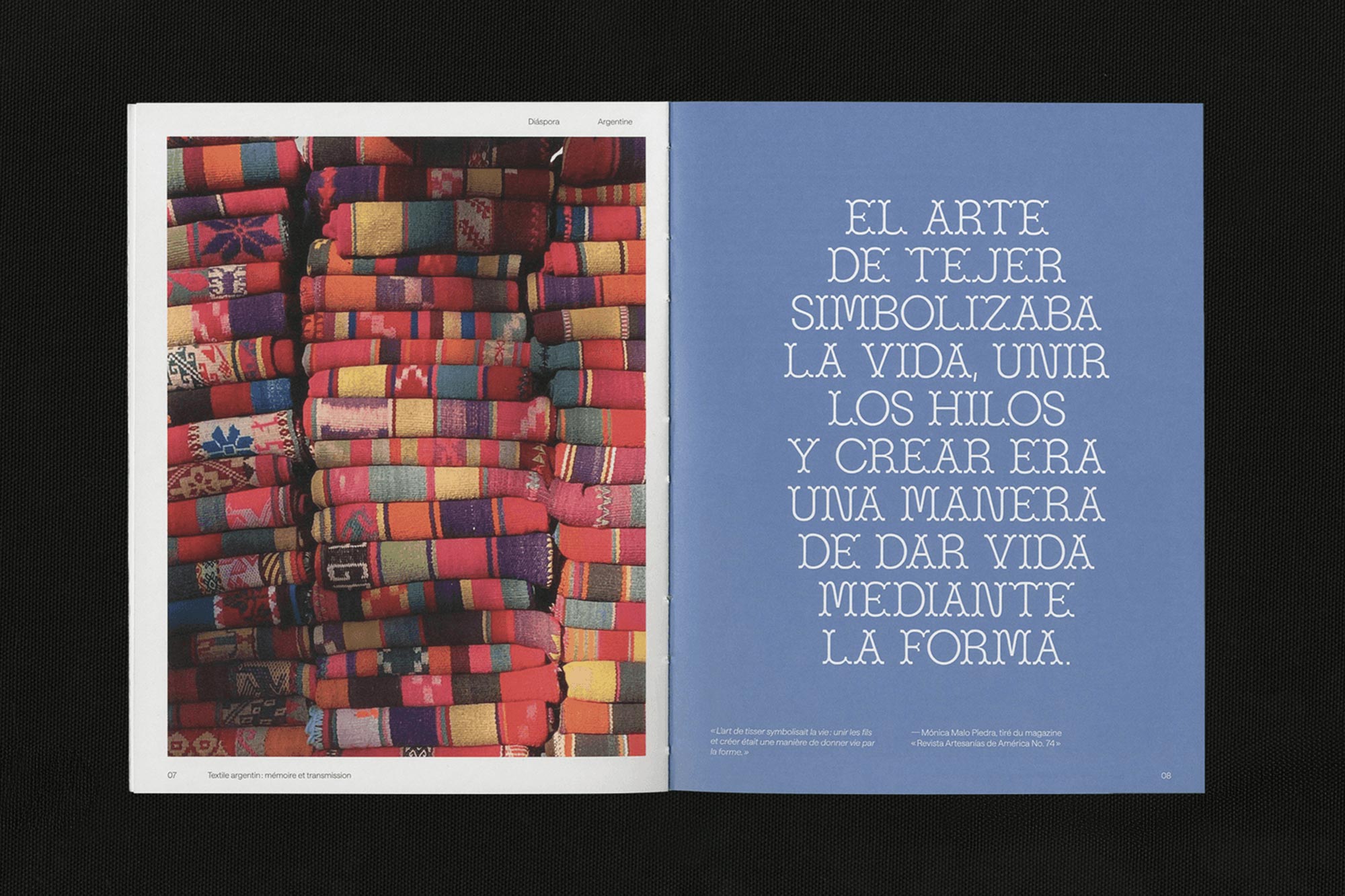
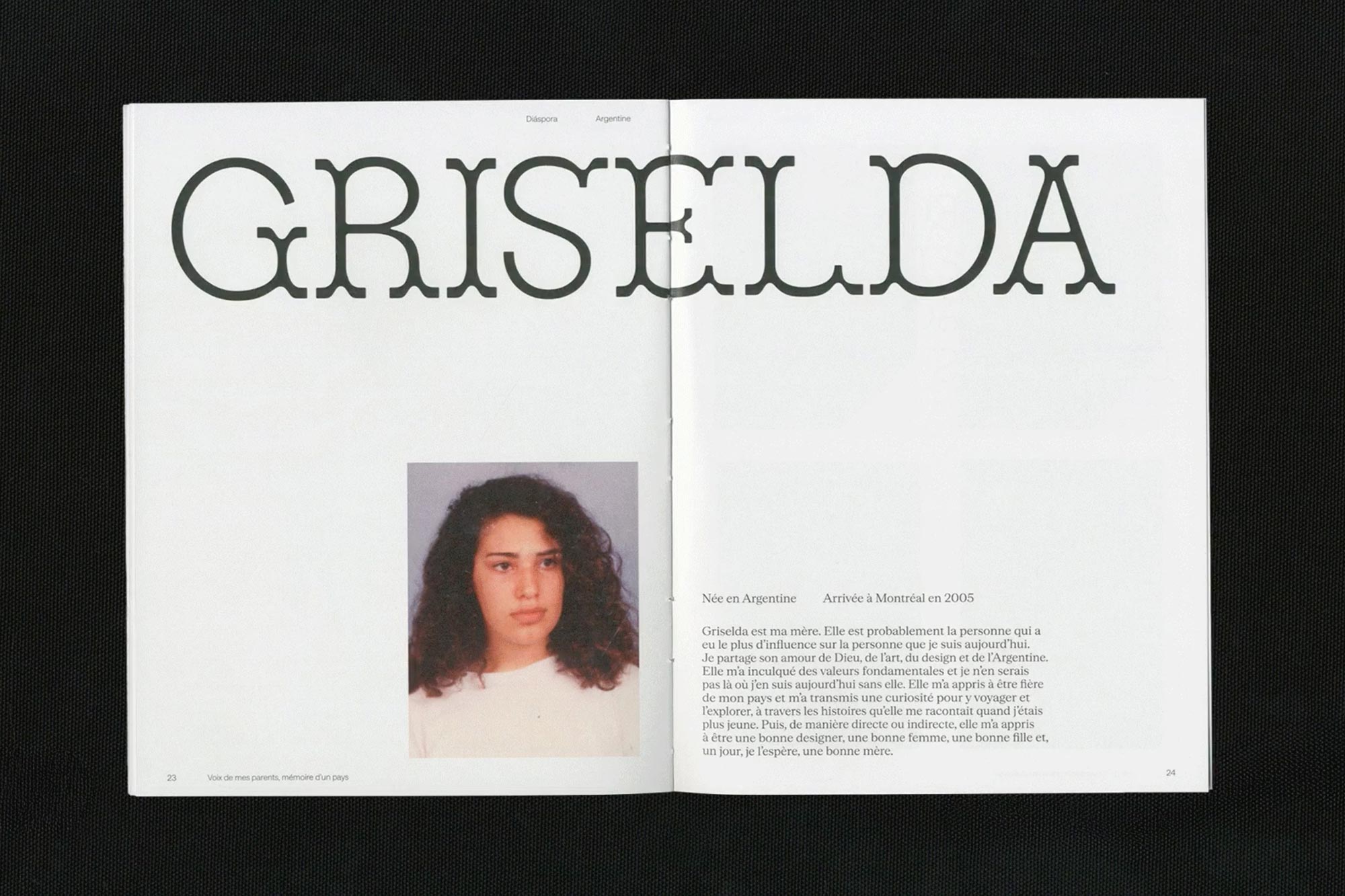
Dyaspora Diáspora is a publication that highlights Darline Sophie’s Argentine and Haitian diasporic experience in Montreal. The project was realized as part of the Design Production course at Université du Québec à Montréal (UQAM) School of Design.
Darline Sophie is a graphic designer who also crochets and combined both passions on the cover of her publication which simply pairs beautifully with the prominently set display typeface.
Darline went with the full serif version of Bárur for the title as well as the alternate O with the little dot in the middle to create a distinct visual language. The expressive serifs complement the publication’s handmade and personal character very well.
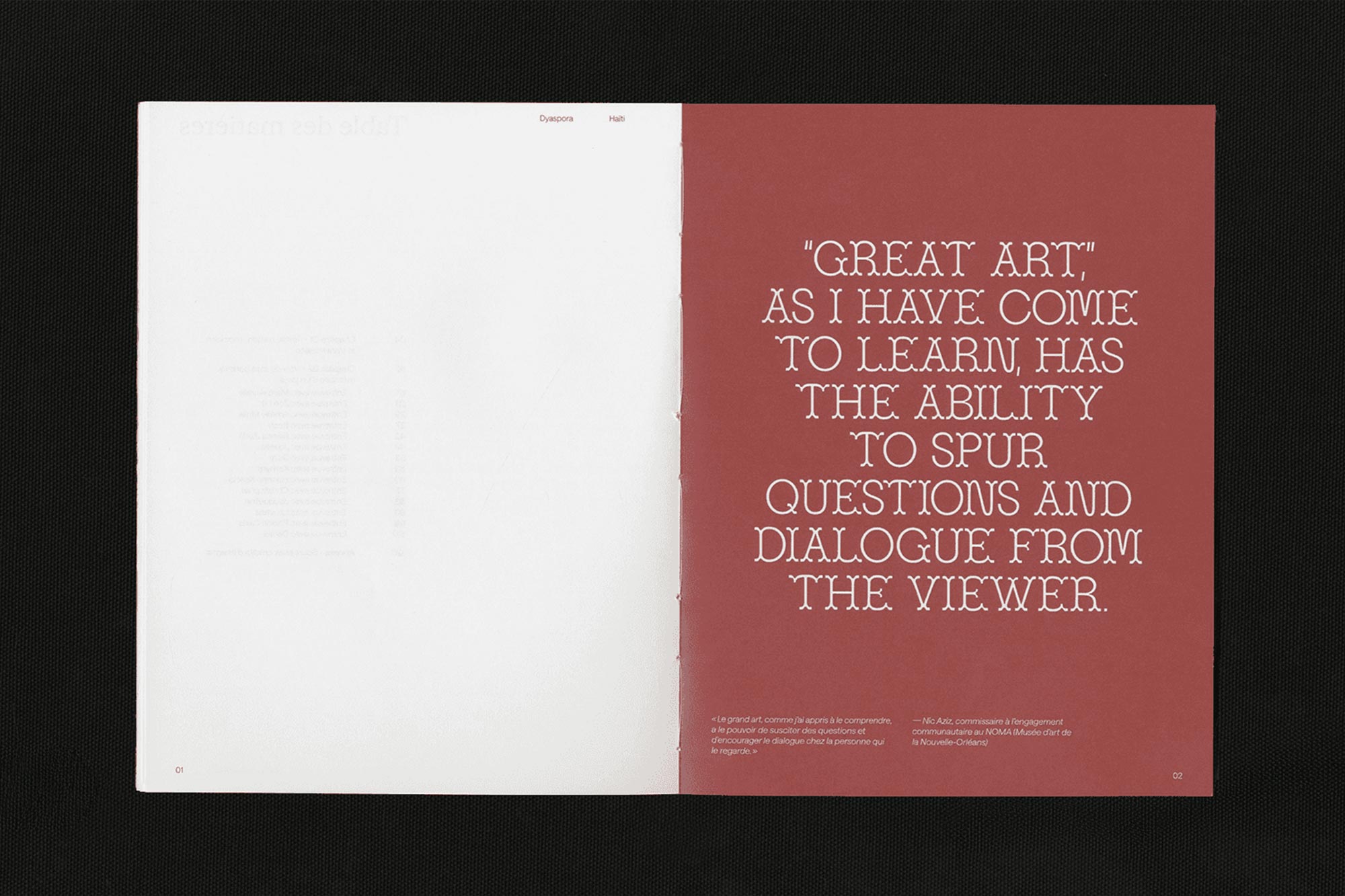
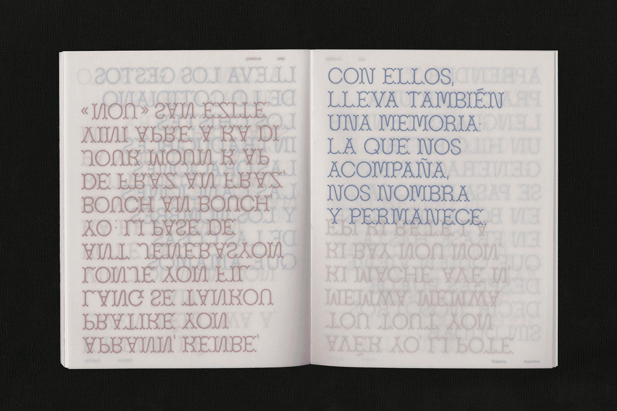
Throughout the publication, a playful interaction between red and blue unfolds across both image and typographic elements. The translucent paper stock creates subtle overlays, allowing content to shine through and adding another layer of visual depth.
Interviews are introduced with Bárur as well. All in all, a very thoughtful typographic design application and an absolutely stunning example of Bárur Font in Use—one of our favourite cases of Bárur Light so far. Check it out on Darline’s portfolio where you can read more on the whole project.
→ Get Bárur Light here
2 Retrospectively

Photos 1+2 © Andonis Kappas & Christina Styliara. Images 3–5 © Another Practice.
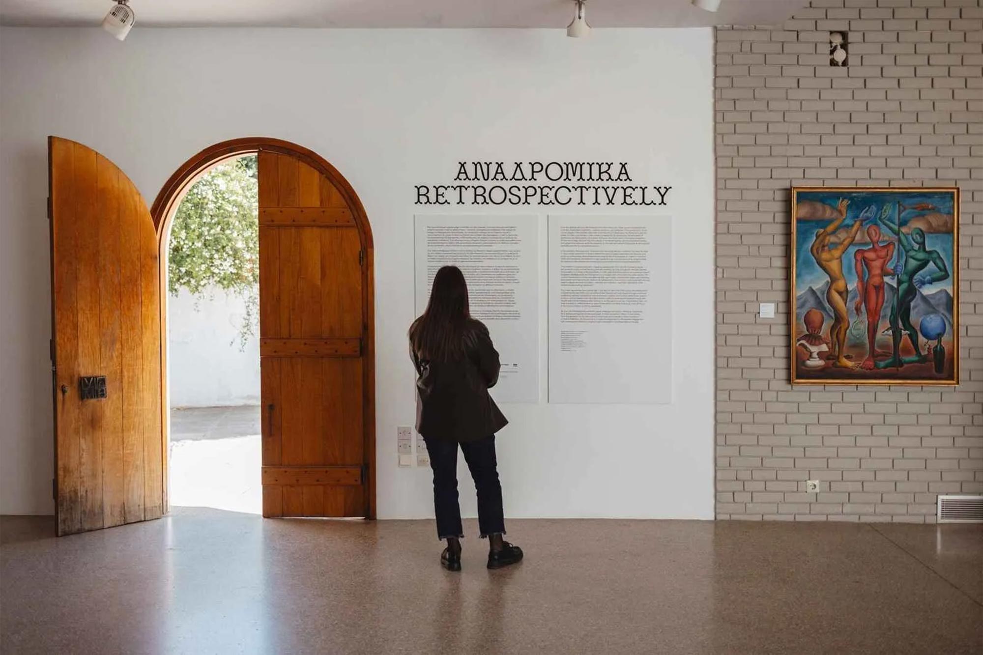
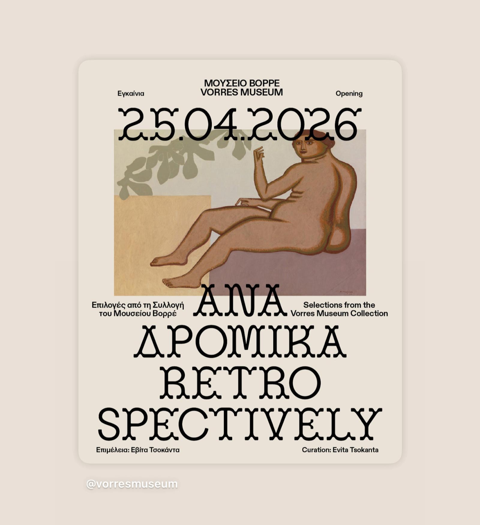
ΑΝΑΔΡΟΜΙΚΑ or Retrospectively is a current exhibition at the Vorres Museum in Athens showcasing their modern art collection.
It’s a contemporary interpretation of the collection through thematic units that highlight its relationship to the present. Works from different moments in modern Greek art meet in a dialogue that illuminates similarities, contrasts, and historical progressions, moving beyond a conventional chronological presentation.
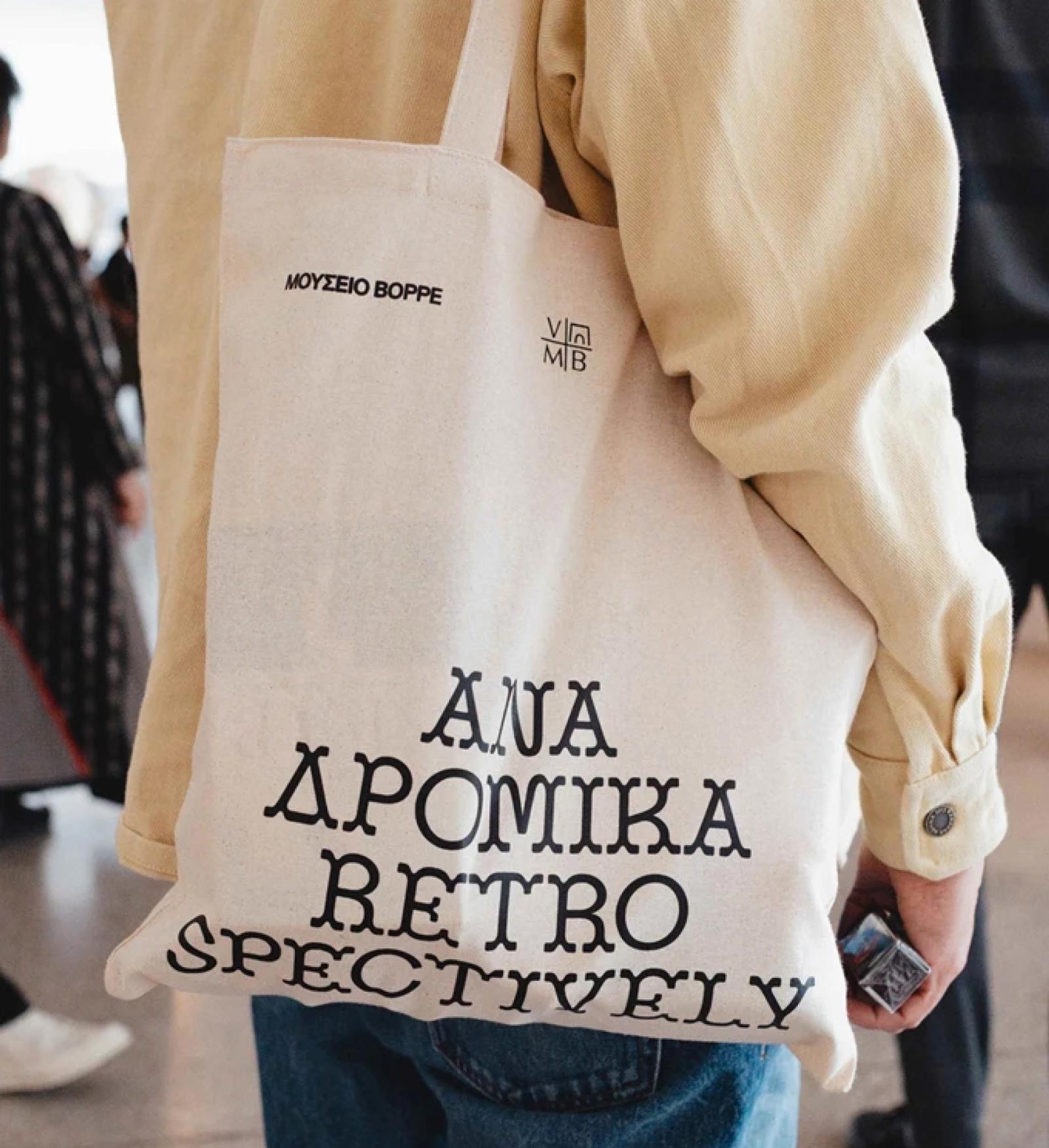
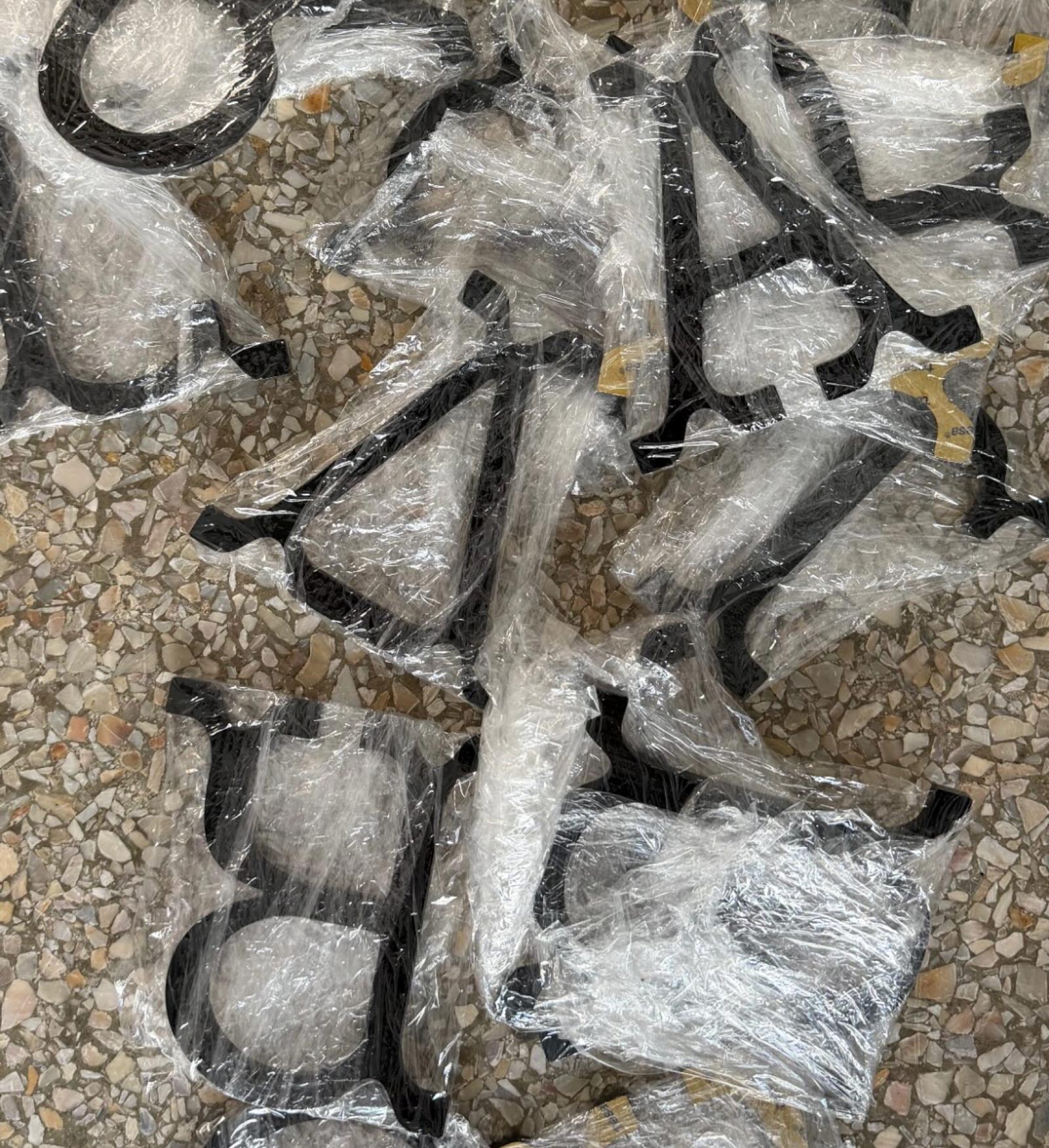
Another Practice designed the exhibition graphics and materials like tote bags and a catalogue using Bárur Regular. Due to a lack of language support (sorry, not quite there yet, although we support 30 languages) they added a Delta Δ themselves to complete the Greek word mark.
This project demonstrates how Bárur can move beyond print applications and work equally well in environmental and exhibition design contexts. We were especially thrilled to spot our glyphs as 3D objects for the wall installation at the museum.
The bold, sculptural forms of Bárur translate particularly well into the exhibition environment, where typography needs to operate simultaneously as information, identity, and spatial object. Bárur’s strong display forms help establish a contemporary visual layer alongside historical artworks.
If you’re in Athens, make sure to pay a visit.
→ Get Bárur Regular here
3 Eight
© Samantha Cai
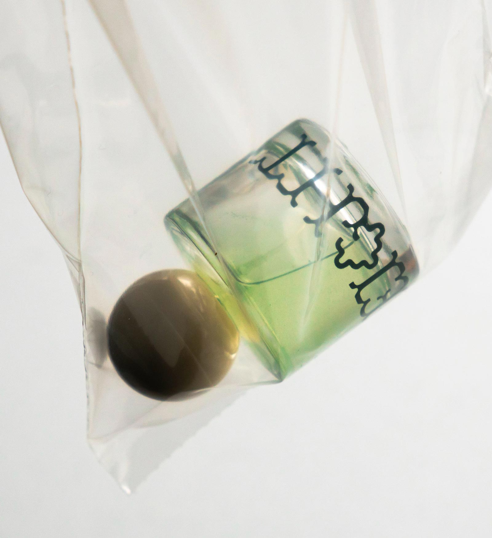
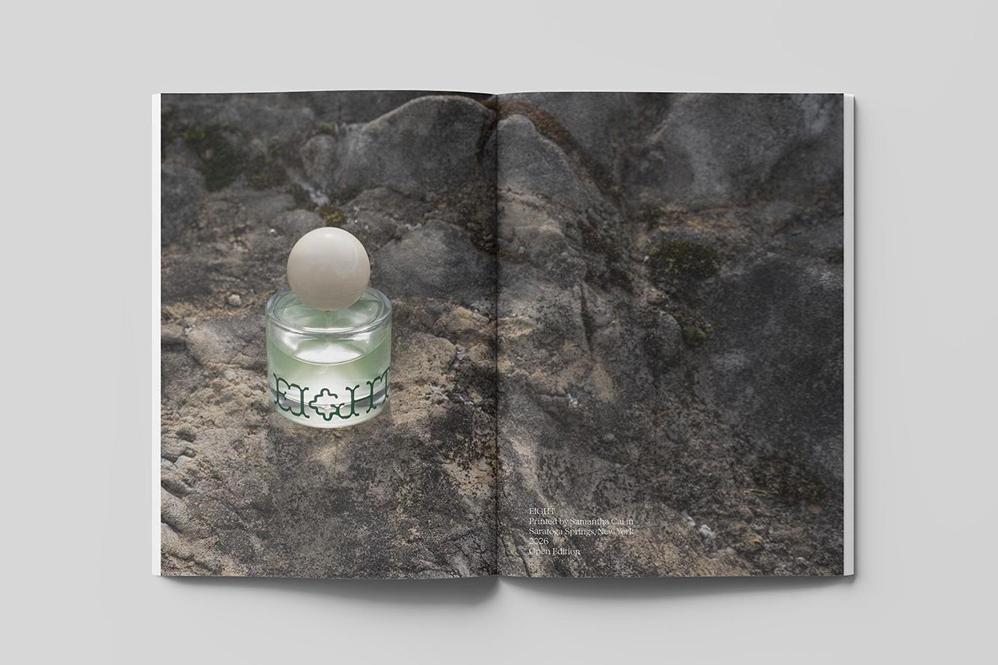
Eight is the thesis by Samantha Cai, a graphic designer and artist based in Boston and New York.
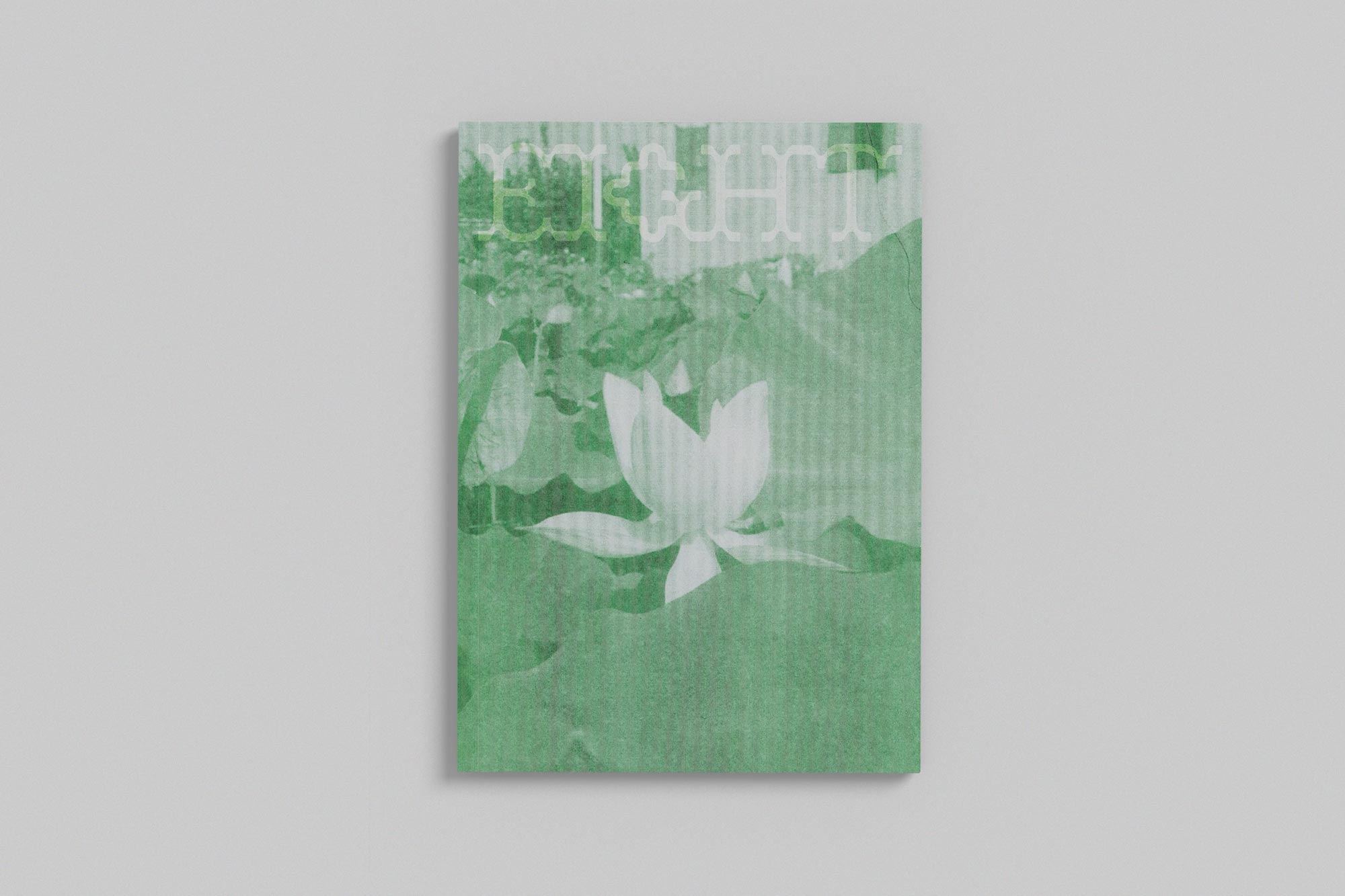
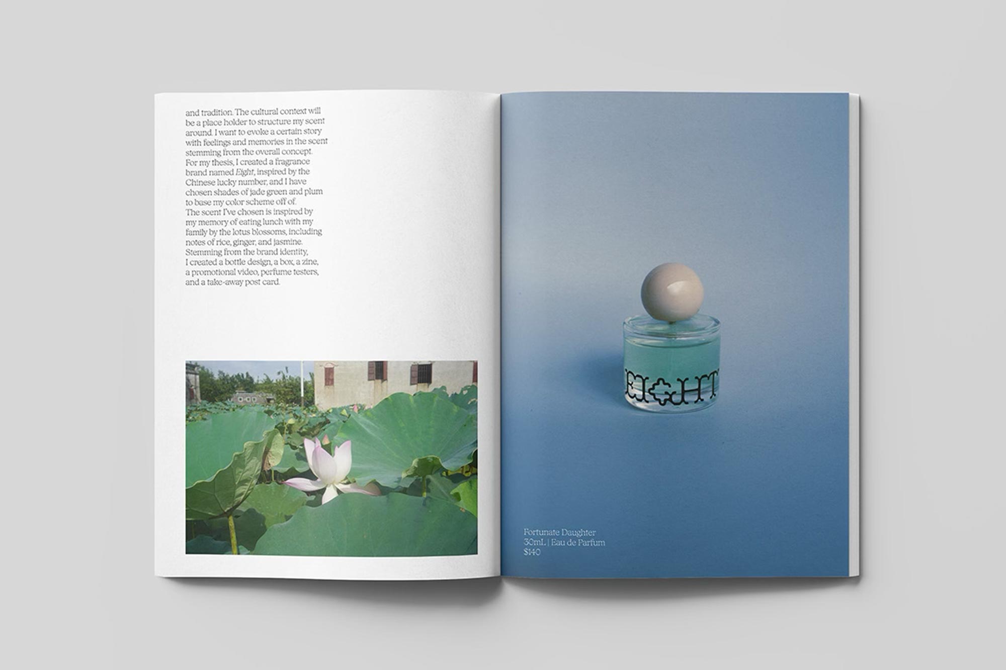
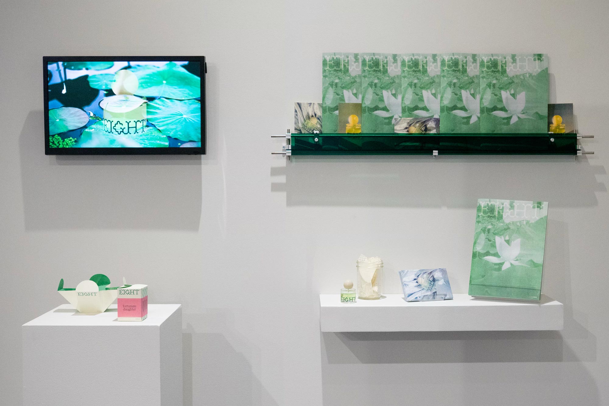
The project is inspired by Chinese culture and symbols of luck, especially lotus, while relating back to memory and scent.
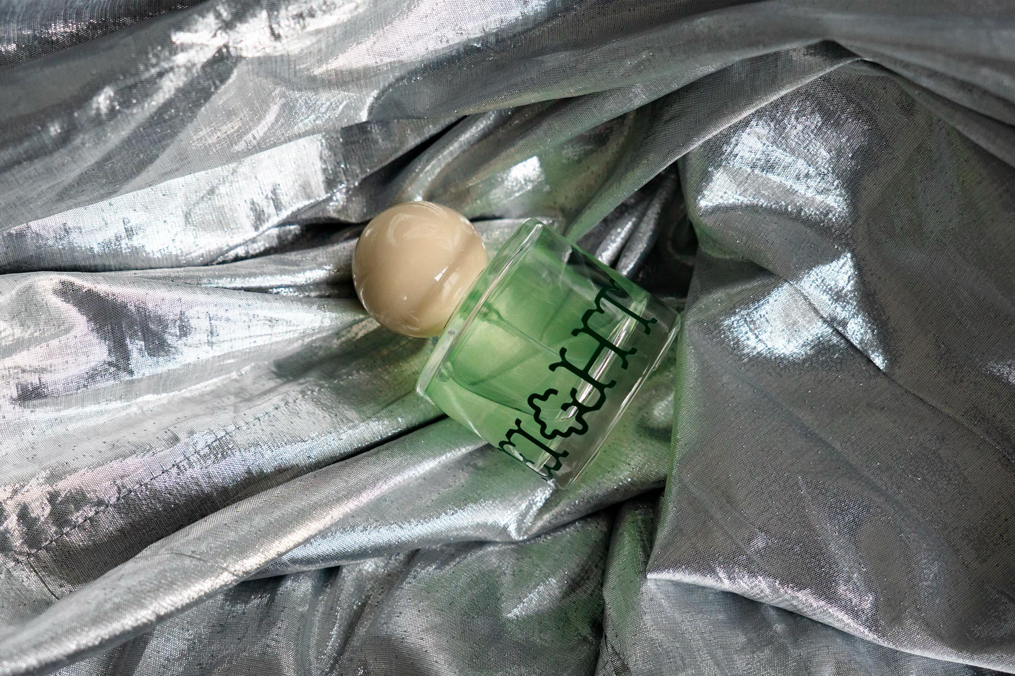
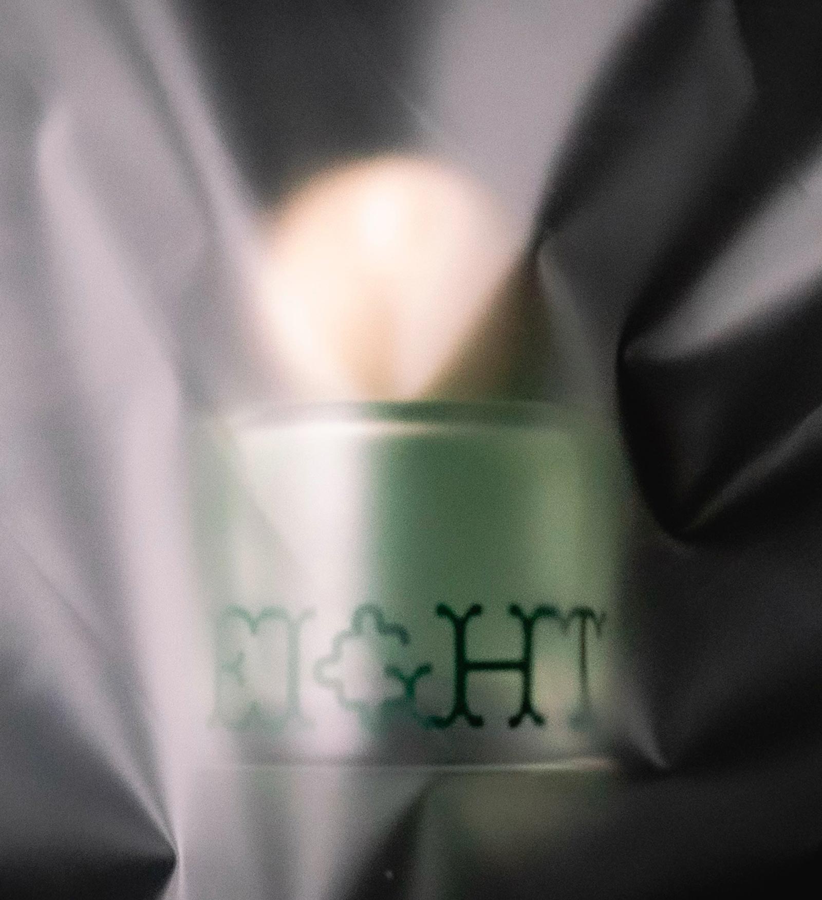
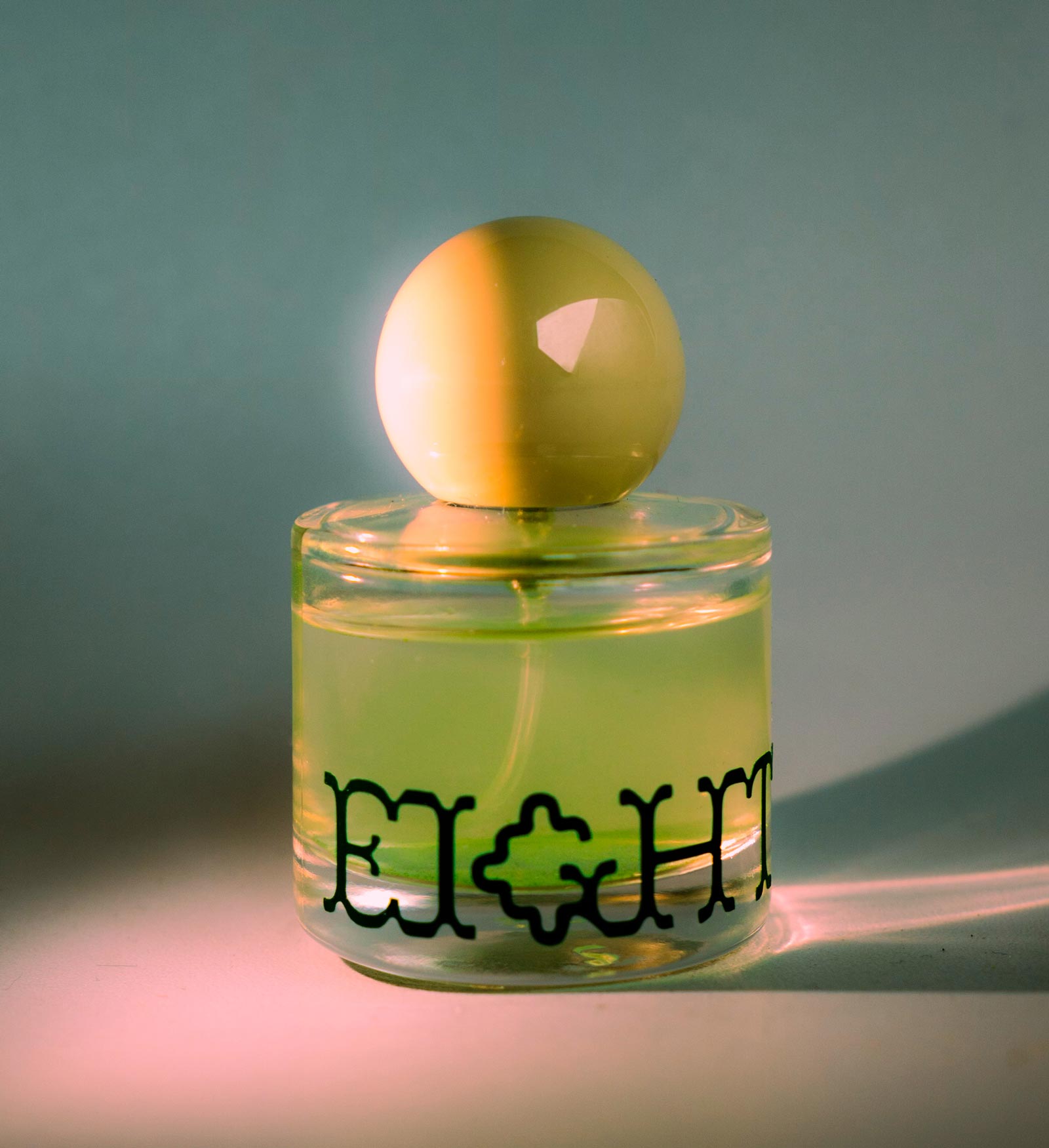
The visual identity revolves around a glass bottle containing the fragrance. It stands out for its big, round, yellow cap and the word mark Eight. Samantha integrated a custom G that flows naturally with Bárur’s visual codex and adds another layer of personality to the product design.
We were especially enthralled by the atmospheric photos that are used to present the bottle, where color, light, and materials create a unique vibe.
Apart from that, Samantha built a whole world for Eight, with a packaging concept like a perfume box for the glass bottle, perfume testers, a magazine, a promotional video, and Risograph postcards.
A great example of how Bárur can help shape a distinctive brand world across packaging, print, and product design. Bárur’s soft geometry and distinctive details contribute to the product’s premium yet approachable feel.
→ Get Bárur Regular here
These three projects show just how flexible Bárur can be—from editorial storytelling and exhibition graphics to packaging and brand identities. Seeing Bárur Font in Use across such different contexts is incredibly rewarding and gives us a glimpse of where the typeface might go next.
Have you used Bárur in one of your projects? We'd love to see it and potentially feature your work on the Mindt® Studio blog. Please get in touch.
No Comments.