What Is a Logo Suite?
Everyone knows what a logo is, but what exactly is a Logo Suite, and why is branding so much more than just a logo?
At Mindt® Studio, we aim to make branding clear and accessible. That’s why we’ve created a branding glossary to break down key terms and help you understand the process better. Let’s start with what’s often considered the core of a brand identity—the logo, or rather, a Logo Suite!
Why Is Branding More Than Just a Logo?
When you think of major brands like Nike, the first thing that likely comes to mind is their iconic swoosh logo. But there’s more to it, right? How about their tagline, “Just Do It”? And doesn’t the swoosh often appear alongside a specific wordmark? Plus, the imagery of active individuals in their campaigns follows a distinct style. All of these elements plus more (think brand fonts and colors ...) build the brand’s personality. This is why we emphasize Brand Strategy before any design work begins. But more on that in another blog post…
The Different Logo Variants Within a Logo Suite
Today, we’re focusing on the various logo variations that make up a Logo Suite and how these elements help create a cohesive, versatile brand.
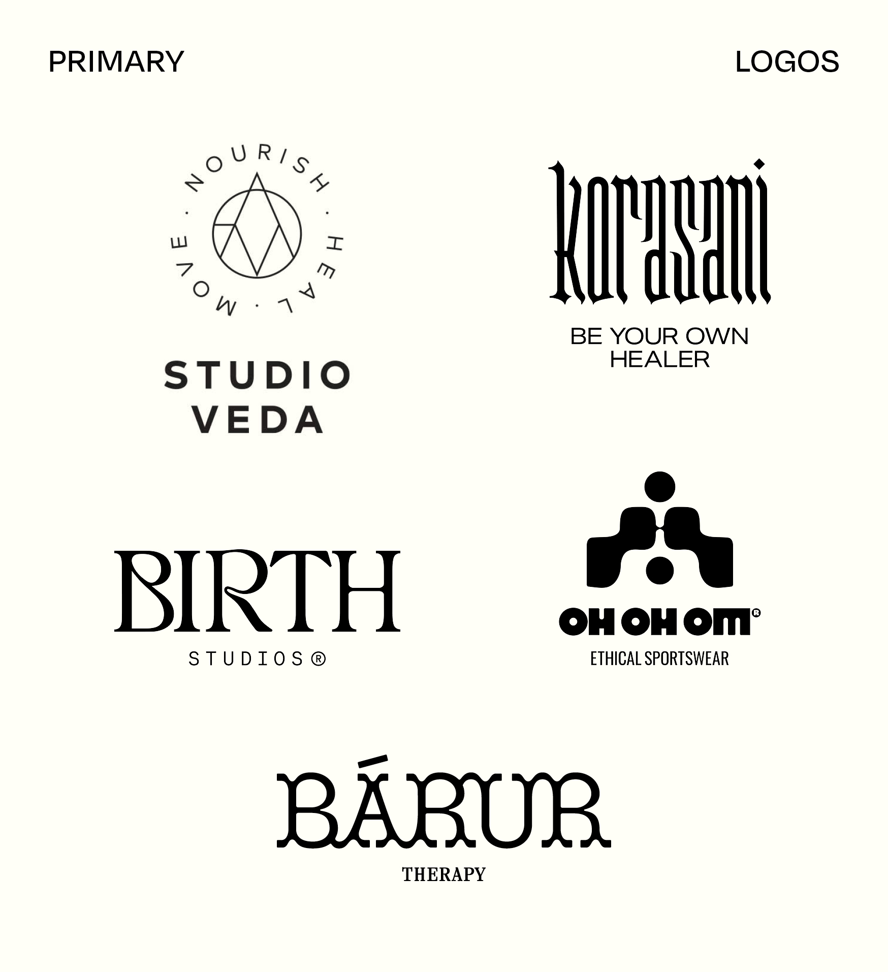
Primary Logo
The Primary Logo is your brand’s most prominent mark. It often takes up the most space and typically combines both a wordmark and a symbol or icon.
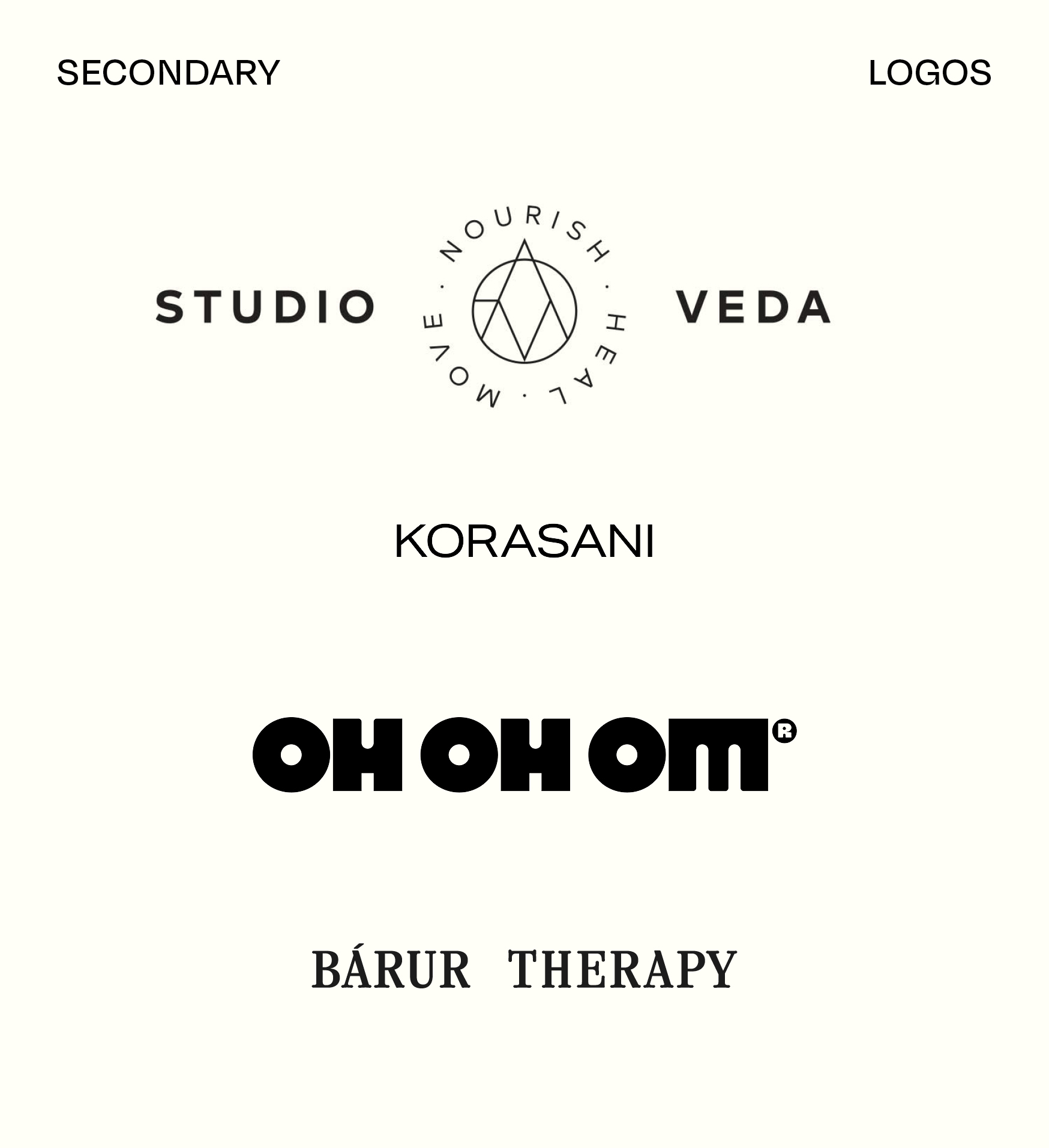
Secondary Logo
A Secondary Logo is a variation of your Primary Logo. If the Primary Logo is horizontal, for example, the Secondary Logo might be square or vertically aligned, or vice versa.
At Mindt®, we don’t adhere to rigid terminology because every brand is different. We assess each project individually to decide what works best as a Secondary Logo. Sometimes it’s simply a part of the Primary Logo, like a standalone wordmark. Other times, it’s a completely different variation. In short, the Secondary Logo serves as an alternative when the Primary Logo is too large or detailed for certain formats, such as on a business card. It also introduces variety to your brand’s visual elements, ensuring your designs never feel repetitive or overwhelming.
Submarks: Signets, Monograms, Taglines, and More
But a Logo Suite doesn’t stop at the Primary and Secondary Logos. Different designers and projects may have varying terms for these elements, but what matters is that they exist and play a key role in building a well-rounded brand.
Variety is where things get interesting. Imagine a product lookbook where the same logo appears on every page—it would be repetitive and overwhelming. This is where additional brand elements like Submarks, Signets, Monograms, and Taglines come into play.
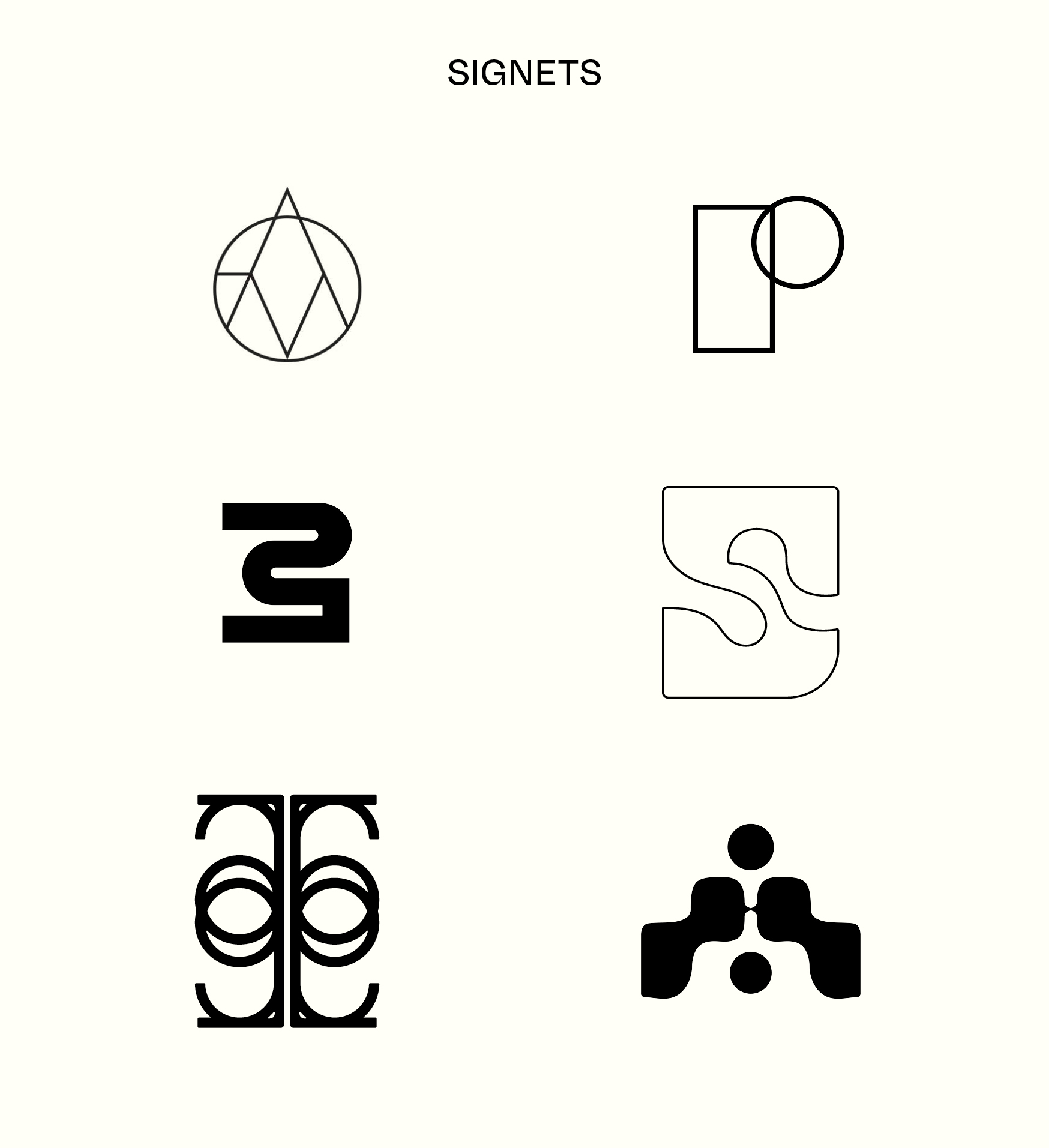
Signet
In the context of branding, a Signet is a distinctive graphic or abstract symbol. It could be an illustration or a simplified design that fits neatly into a circular or square format, making it ideal for stamps or avatars.
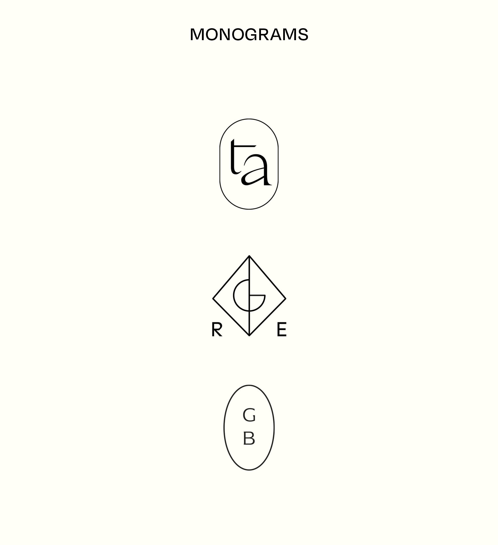
Monogram
A Monogram is composed of the initials of your brand name and can vary in complexity. From intricate, detailed designs reminiscent of traditional print techniques to minimalistic, modern versions, monograms add a personal touch to your Logo Suite.
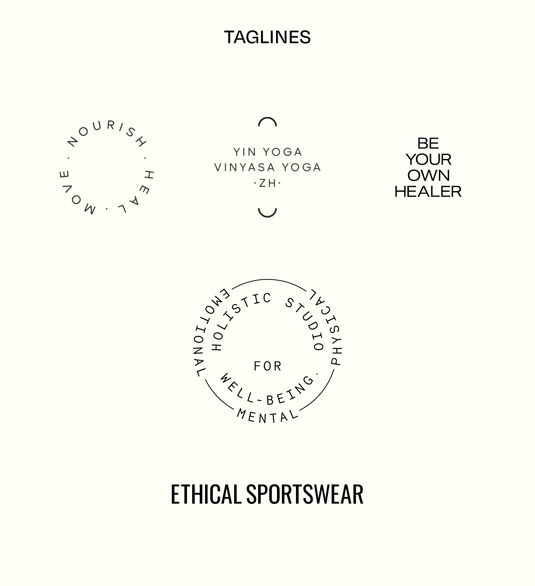
Tagline
A tagline like “Made in California,” “Est. in 1975,” or “Move. Nourish. Heal.” is another key element of your Logo Suite. It offers a concise, memorable description of your brand and adds flexibility to your branding.
Applying a Logo Suite
Let’s go back to the lookbook example. You might place your Primary Logo on the cover, include a Monogram on the first page, and sprinkle in a Tagline throughout. The Secondary Logo could go on the back cover. By thoughtfully placing these brand elements, the final product feels cohesive, balanced, and polished—an intentional design that strengthens your brand presence.
So, What Exactly Is a Logo Suite?
A Logo Suite is the complete set of logo variations that help you create a versatile, well-rounded brand. In other words, it’s the collection of logos designed for different purposes and formats.
When we create a brand identity for you at Mindt® Studio, we don’t just hand over individual logo files. You’ll also receive a comprehensive Brand Style Guide that explains when and how to use each version of your logo. It includes everything from the best formats for print and web to recommended minimum sizes for optimal readability.
For us as designers, the Logo Suite is invaluable. Designing a website, packaging, or print materials using only one logo variant would limit creativity and make it challenging to maintain a balanced, aesthetically pleasing brand image. That’s why the Logo Suite, along with your color palette and typography, is the heart of any branding project. In fact, we often develop even more logo formats and brand marks than those depicted in this post.
Want to stay updated on our latest news, insights, and tips? Subscribe to our newsletter and never miss an update from us!
This article is an adaptation of an OG post, written by our Founder and Creative Director Sarah, with translation and editing assistance from AI technology (ChatGPT).
No Comments.