
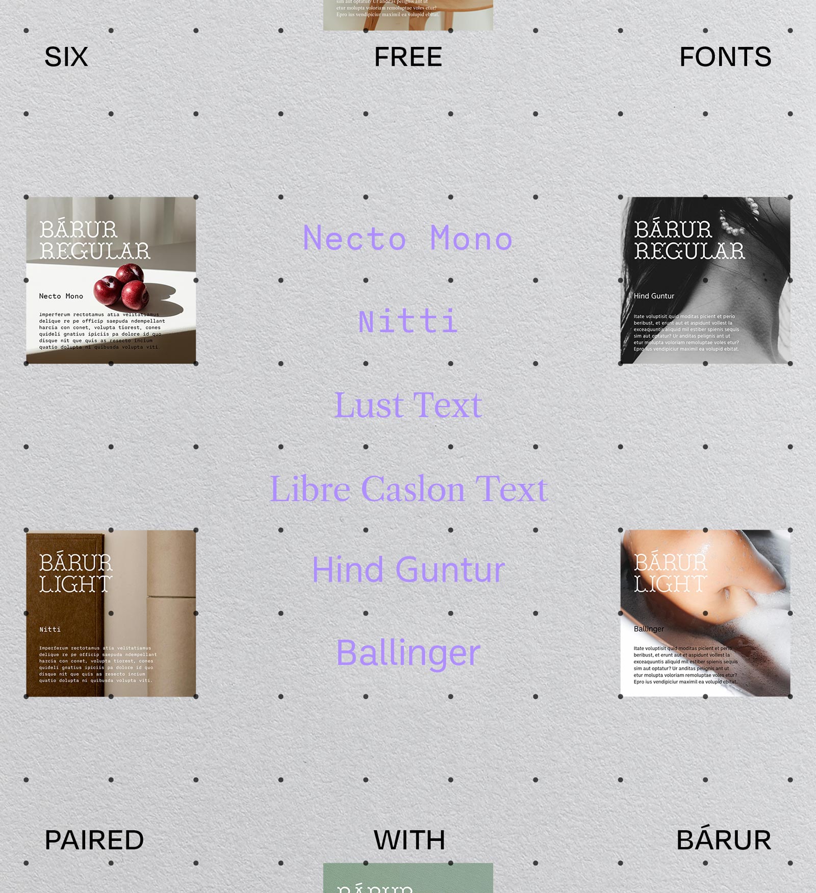
6 Free Fonts That Pair Beautifully With Bárur
Free Font Pairings for Display Typefaces
→ Get Bárur Here
Bárur has a particular kind of quiet confidence—a display typeface that holds its ground without demanding attention. Its details are precise, its character unhurried. Which means finding the right pairing isn’t about matching energy, it’s about choosing a voice that knows when to step back.
Here are six free typefaces that do exactly that—grouped by style, so you can find the right register for your project.

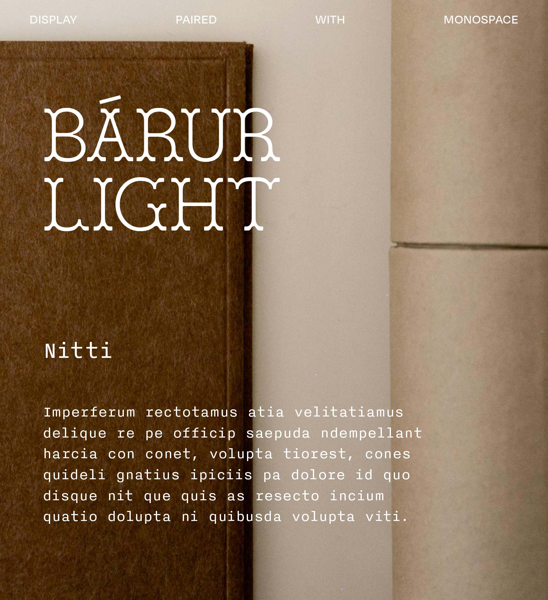
— Monospace
Necto Mono & Nitti
There’s something unexpectedly right about setting Bárur alongside a monospace. The fixed rhythm of Necto Mono or Nitti creates a structural counterpoint—functional, deliberate, a little utilitarian—that makes Bárur’s craft-led forms feel even more intentional by contrast.
This pairing reads well in editorial systems, packaging with technical details, or any layout where you want warmth and precision to coexist. Think: ingredient lists, product specs, small captions. Let Bárur carry the headline; let the mono do the quiet work underneath.
Try it when your project lives between artisanal and considered—craft goods, studio branding, anything with a materials-led aesthetic.
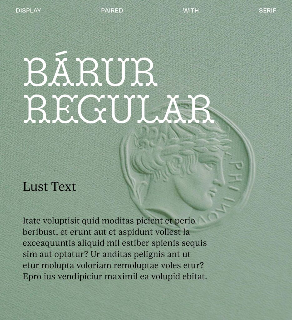

— Serifs
Lust Text & Libre Caslon Text
Both Lust Text and Libre Caslon bring a literary quality that sits in genuine conversation with Bárur—not competing, but corresponding. Lust Text leans slightly more contemporary in its tension; Libre Caslon has a longer, more grounded pedigree. Either way, the result is a system that feels layered and considered.
Use these for long-form contexts: editorial, book design, brand storytelling that needs sustained reading. Bárur in the display position, the serif holding body copy with the same level of quiet seriousness.
Try it when you want the whole system to feel authored—like someone made real decisions about every line of type on the page.
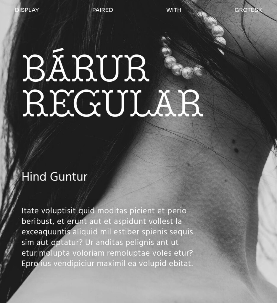
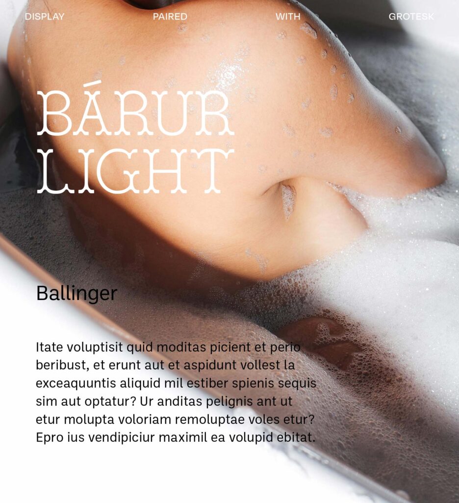
— Grotesks
Hind Guntur & Ballinger
Grotesks are the most versatile pairing territory for Bárur, but not all of them work. Hind Guntur brings a warmth that prevents the combination from reading too cold—its proportions are slightly humanist, which harmonizes with Bárur’s own character. Ballinger is more structured, with the kind of geometric neutrality that lets Bárur breathe.
Both work well across digital and print, and both give you enough weight range to build a proper typographic hierarchy. Use them for branding systems, websites, or campaign work where you need the pairing to scale.
Try it when the project needs to move—across formats, across scales, across contexts—and you need a secondary typeface that holds up everywhere Bárur can’t be.
→ All six fonts are available free via Google Fonts, Adobe Fonts, and Collletttivo. Bárur Regular and Bárur Light are available at Mindt® Studio—try it in your next project!
No Comments.