

Designing and Launching a Typeface for the First Time
The Story Behind Bárur, My First Published Font
→ Get Bárur Here
If you had told me a year ago that I’d design and publish my first typeface, I probably would have laughed. Type design was never part of the plan. But today, Bárur is out in the world—my very first typeface—and many of you have already started using it in your own beautiful projects.
So I thought it was finally time to tell the full story of designing and launching a typeface. The real one. The long one. The messy one. The one where I try something completely new, wait for months, question myself more than once, and eventually end up launching independently anyway.
Here’s how Bárur came to life and what I learned while launching a typeface for the first time.
How a Branding Project Sparked My First Typeface Launch
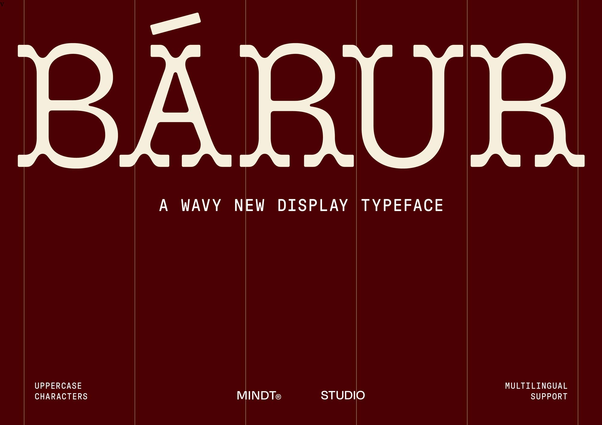
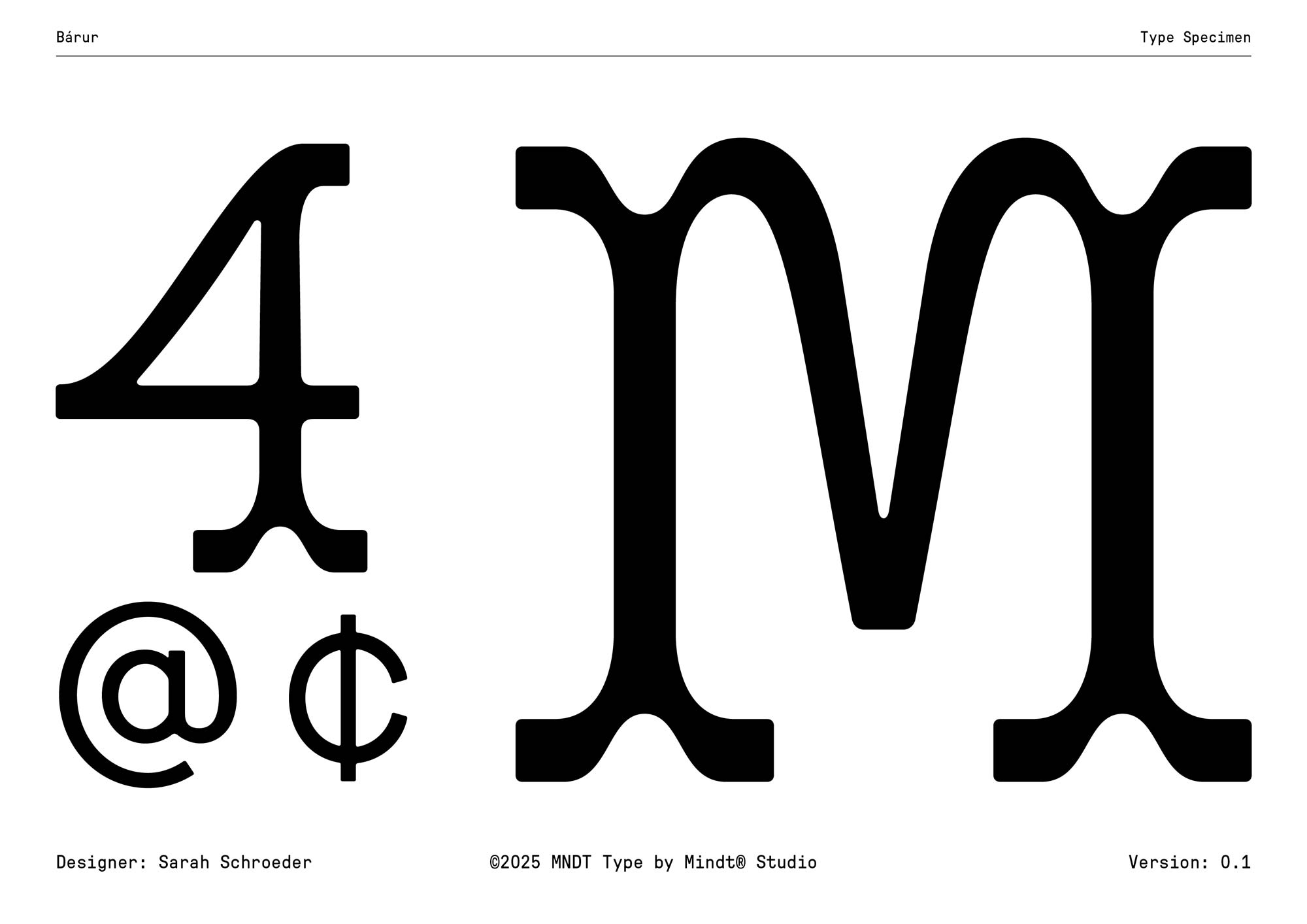
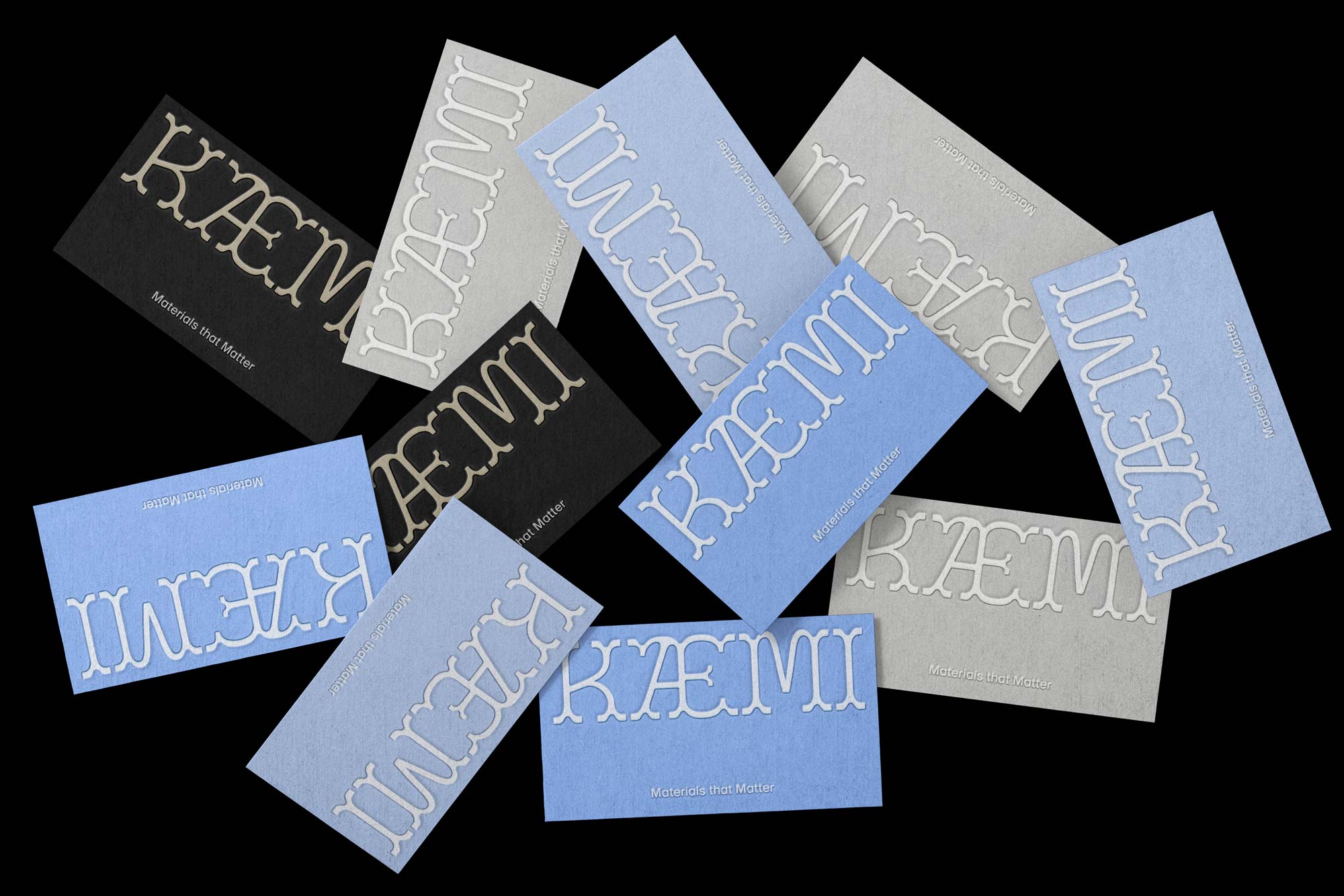
Back in 2023, I worked on the bárur therapy branding project for my wonderful client, Johanna. While developing that identity, I sketched a set of serif forms that simply felt right for her brand’s tone: organic, warm, slightly unconventional. They were based on the legacy typeface »Two Lines Brevier Viennese« which can be found in »The specimen book of the Fann Street Foundry« by Reed and Fox of London from 1874. Ellmer Stefan and Johannes Lang digitized that typeface in 2013.
I kept very few of the basic shapes of the original typeface like the curves in the B and R, but mostly changed everything else to create this new and wavy display font: Bárur is rounder, more feminine, more organic, and with less line-contrast due to the soft, distinct serifs that shape its vibe. They connect each letter with the following one, generating a fluent appearance.
At first, those letters were absolutely not intended to become anything more than part of a logo exploration. But then, I began to draw more letters and even included them in the client presentation. It was a feeling.
After finishing the project, I shared the visuals on Pinterest as usual—and that’s when everything started to shift. One particular pin took off. Views, clicks, repins… it all skyrocketed.
That was my sign. A gentle nudge that said:
»Maybe there’s something here. Maybe you should take this seriously.«
Luckily, I still had Jen Wagner’s (retired) online course »Sans Serif Font Design« lying around from ages ago. It wasn’t the perfect fit (Bárur is definitely no sans!), but it gave me exactly what I needed: a foundation. Because no—I never learned type design at uni, and I had no formal background. Just curiosity.
After that course, I closed the drawer again for a little while. It still felt really hard to work on the project.
Early 2025: When I Finally Committed to Designing a Typeface
It wasn’t until early 2025 that I truly committed. I took Viktor Baltus’ Type Design Class (not sponsored) and everything suddenly aligned. Well—not everything. There were still lots of question marks. But enough made sense that I said: »Okay. Let’s actually do this.«
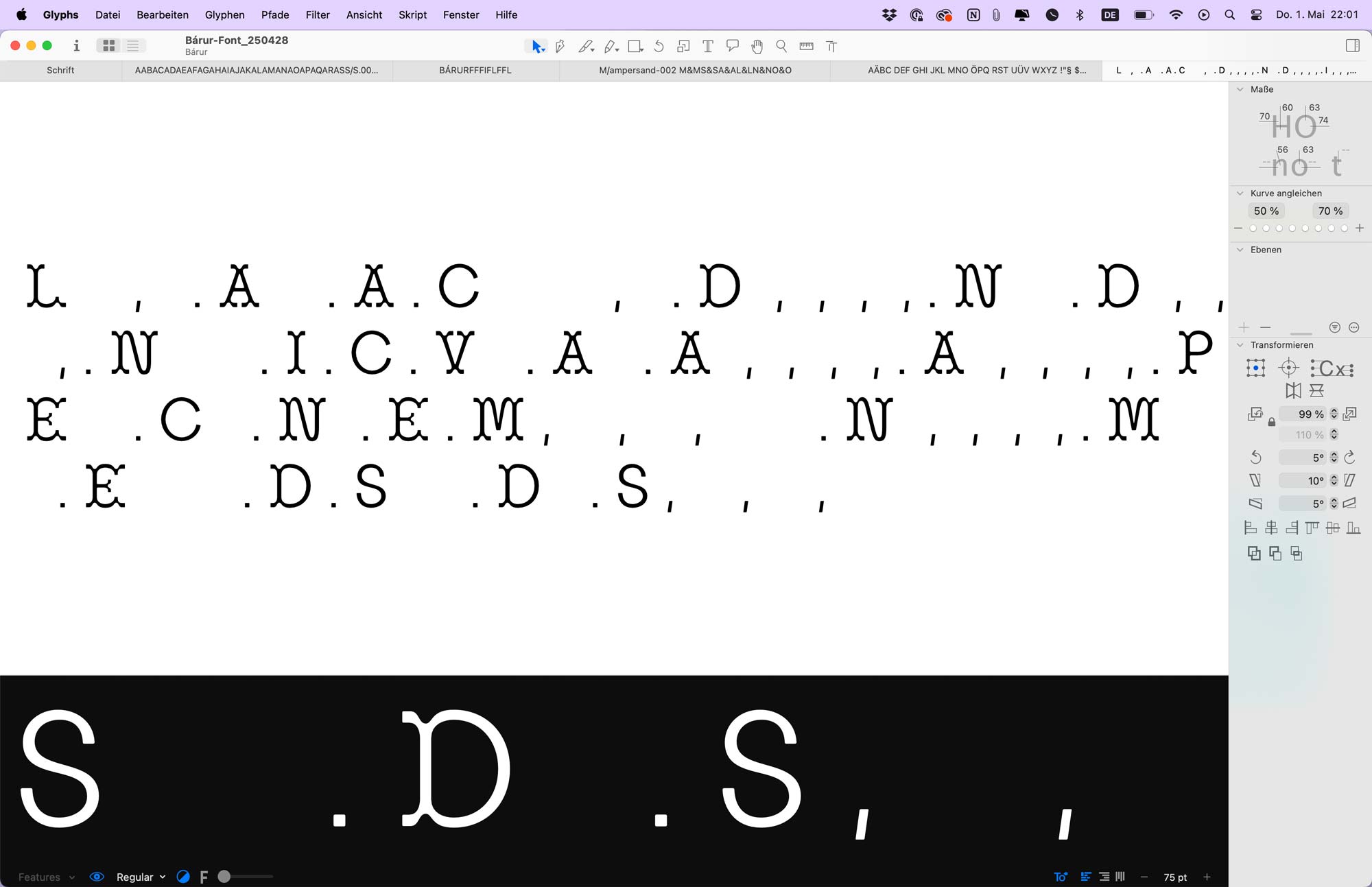
Bárur, as it turns out, is not your typical serif to design. It challenged me at every corner. Twice I thought, »This might be finished!« Both times, it was… not.
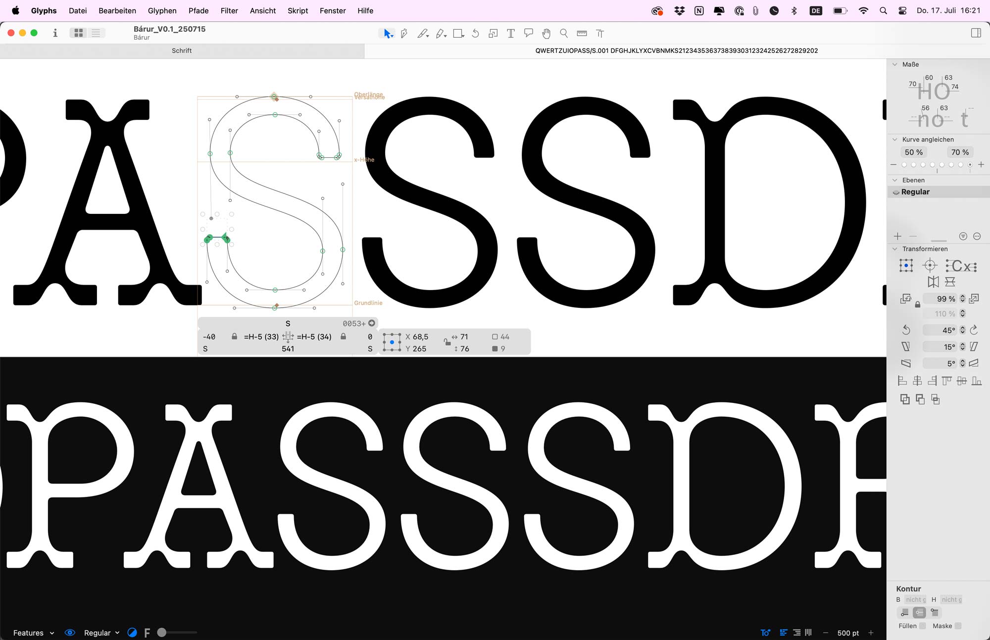
At the perfect moment, a few generous, experienced type designers offered feedback. Their insights elevated Bárur in ways I could never have achieved alone. Again, I was reminded of the value of details and how much learning is genuinely part of the process.
What Applying to Future Fonts Taught Me (aka The Waiting Room)
One of those designers encouraged me to try a more professional publishing route. Specifically, Future Fonts.
Their model allows type designers to release work early, refine it in the open, and grow alongside a real audience. It aligns beautifully with how I like to work: transparently, iteratively, honestly.
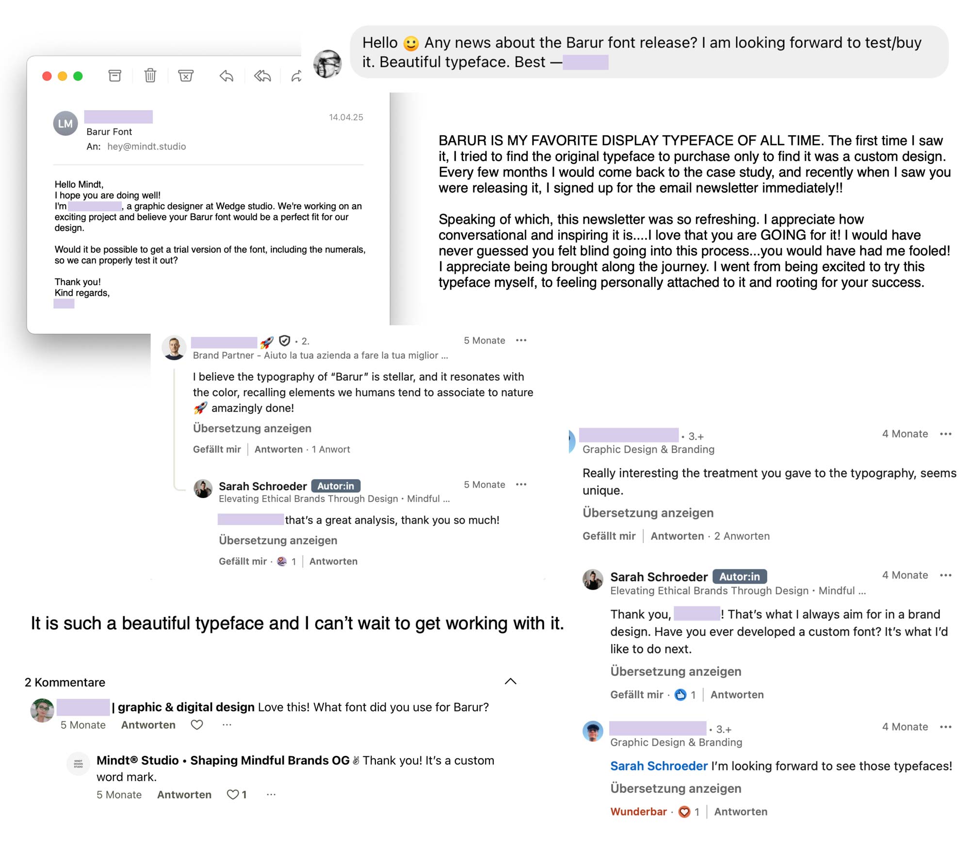
This was my first real attempt at type design. And yet, your feedback, your enthusiasm, your messages about »feeling attached to the story« gave me courage. So I prepared the submission.
Future Fonts reviews submissions only four times a year, and acceptance rates are low. It was a wait-and-see situation… and I waited. And waited. And waited. And in the end?
Bárur wasn’t selected.
Surprisingly, I wasn’t devastated. But the wait set the launch back by months. When you pin your hopes on one platform, you naturally don’t invest the same time and energy into Plan B. And because Future Fonts focuses on fresh, unreleased fonts, I held back on preparing my own release… just in case. In hindsight, that wasn’t ideal. But it taught me something important.
Taking Control: Independently Launching a Typeface
Not being selected didn’t feel like a rejection. It felt like a release. Another sign. A little reminder that:
I don’t want my creative work to depend on someone else’s approval, technical setup, or timing.
So I switched gears. Fast. Suddenly I was:
- Setting up a new type department: MNDT Type by Mindt® Studio
- Designing a type-specific section on the website
- Learning Shopify
- Building a digital-product shop
- Integrating a type preview tool
- Diving into the very deep rabbit hole of licensing and EULAs
- Improving the Regular weight
- Developing a Light weight on top
- Creating a full set of mock brands and visuals
- Preparing Pinterest assets
- Tweaking tiny details I thought were done (they weren’t)
I worked intensely behind the scenes. And somewhere in between, I realized: I love this work. I love this independence. I love not being dependent on anyone else to get Bárur into the world.
Licensing & Pricing: Essential Steps Before Launching a Typeface
One of the most challenging parts of launching a typeface was figuring out licensing and pricing. There is no universal model.
Old-school structures didn’t suit the way people now use fonts. So I created my own system, based on company size and intended use. A lot of foundries now do it that way, but pricing the tiers is another task. I wanted it to be fair, flexible, and manageable with the (basic) tools I have.
I won’t go into full nerd mode here (another day, maybe!), but I learned so much building a licensing model from scratch. It’s funny how many invisible structures sit behind something as simple as »download font.«
I now offer:
- Desktop/Print licenses
- Web licenses
- Logo licenses
- Social & Broadcast licensing (included for smaller companies!)
- Combo Desktop + Web
- App & ePub licenses
- Additional seats for collaborators
It was a lot. But now that it exists, it feels right. And it makes using Bárur clear, transparent, and manageable for designers and brands.
The Final Steps Before Launching a Typeface
At some point, I considered doing a dramatic countdown or a big multi-step launch…
But honestly? It was time. This launch had been going on long enough. The website was ready. The shop was working. The files were polished for version 0.1. The visuals were done.
And so, with very little fanfare but a whole lot of relief…
Bárur is officially out.
You can now find Bárur Regular in our brand-new type shop. The very first release under MNDT Type.
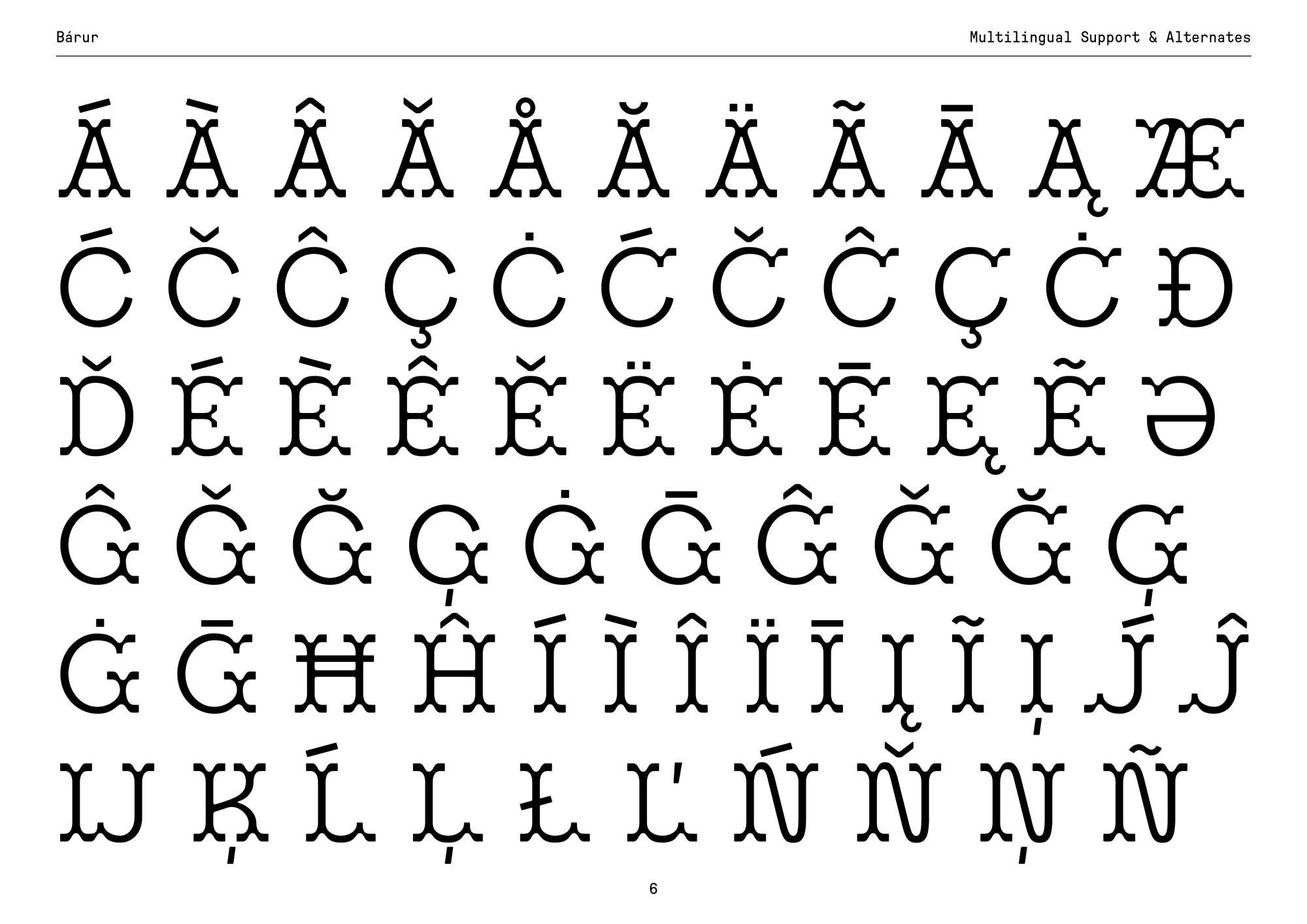
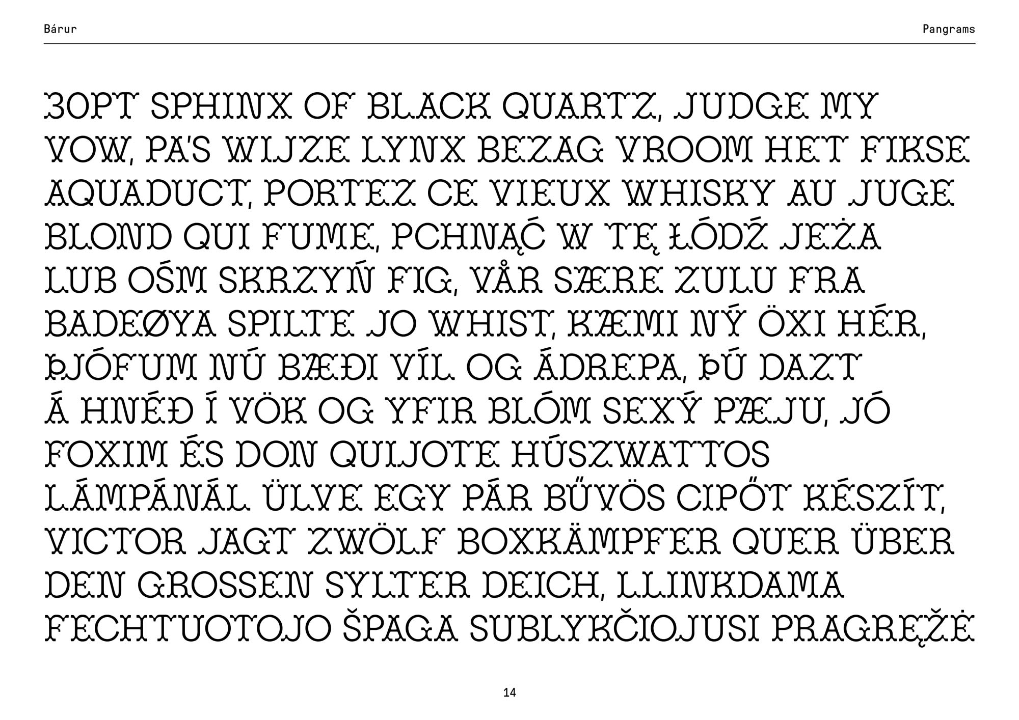
This typeface has 298 glyphs, supports 30 languages, and is currently only at version 0.1, because I fully intend to keep improving it, similar to the Future Fonts approach. Updates will always be free for past buyers.
The Light AND Bold weights are already in progress.
And seeing people actually buy Bárur, write to me, and tell me they feel personally attached to the story—that’s the most rewarding part of this entire journey.
Thank you, truly, for your patience, your support, and for cheering Bárur on from the very beginning. I can’t wait to see what you create with it.
If you end up using Bárur, feel free to share your work. I’d love to feature it.
Here’s to first releases, brave leaps, and the unexpected places a single branding project can take you.
→ Get Bárur Here
P. S.: I even got featured in Viktor’s newsletter, such a proud moment for me: »And the last one I wanted to share with you is from German based designer Sarah whose debut typeface Bárur I first found on Pinterest and absolutely loved. Only to found out it's actual student work from one of my courses when she contacted me with some questions about constructing certain letterforms.«
No Comments.