Holistic Branding for a Holistic Healing Practice
A Wave of Transformation
☺︎ Services
Brand Strategy
Brand Identity
Print and Digital Collateral
☺︎ Client
bárur therapy
Context
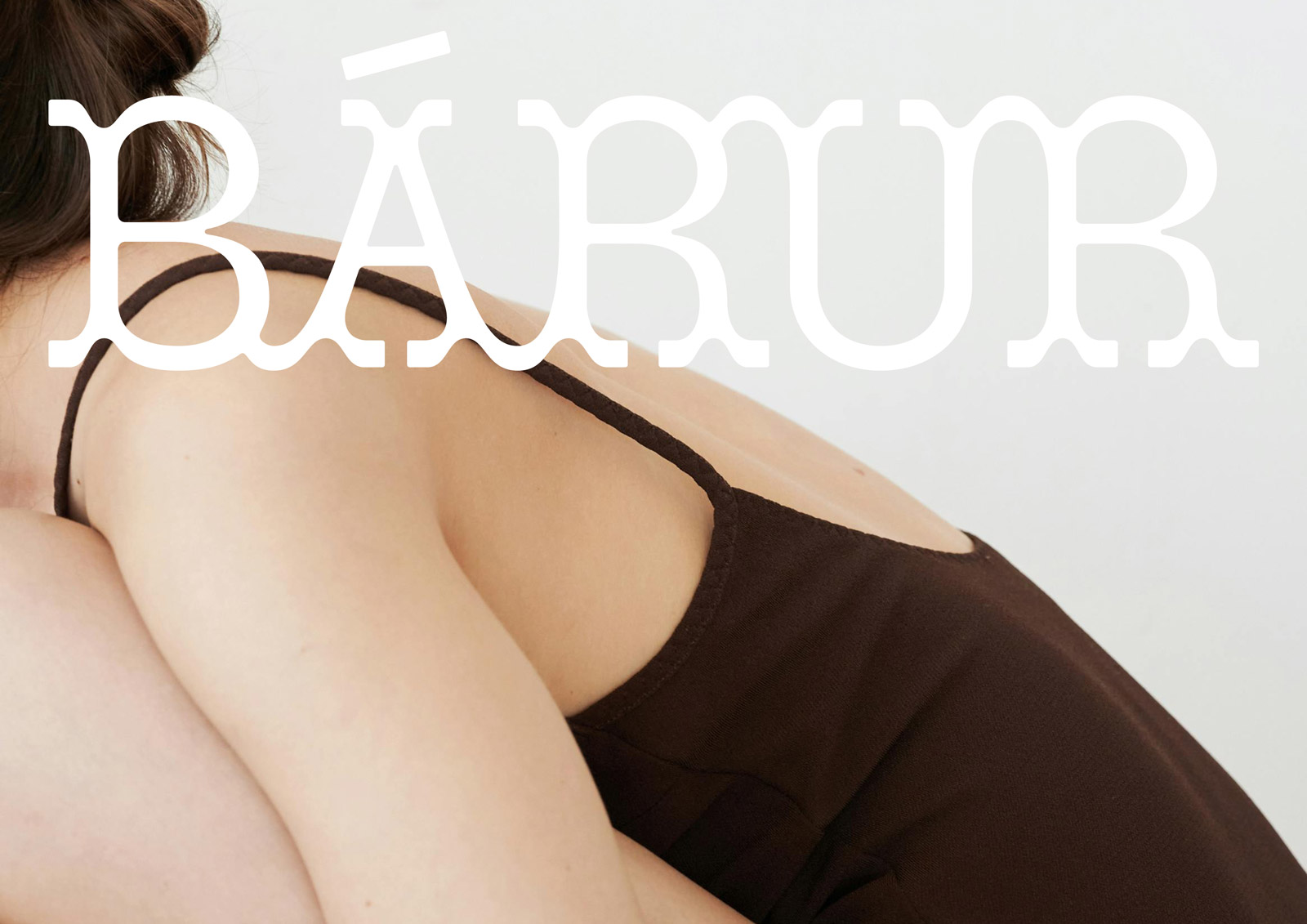
bárur therapy is a holistic wellness and health brand founded by a visionary practitioner who weaves osteopathy, yoga, and sound into a tapestry of healing. Rooted in the philosophy of individualized care, the brand offers a sanctuary where medical expertise and alternative methods converge, empowering clients to find balance, transformation, and a deeper connection with themselves. A space designed to foster self-healing while providing support, guiding people to unfold, and creating a sense of security.
Our Approach
Every wave starts with a shift. For bárur therapy, this means recognizing the individuality of each client. This attentiveness was woven into every detail of the brand identity—harmonizing grounding values with an uplifting aesthetic. Our creative direction drew inspiration from bárur’s namesake—waves—representing balance, motion, and transformation. Minimalist design meets natural shapes and textures. Every element—from logo to color palette—was crafted to ensure the message of deep consciousness-raising.
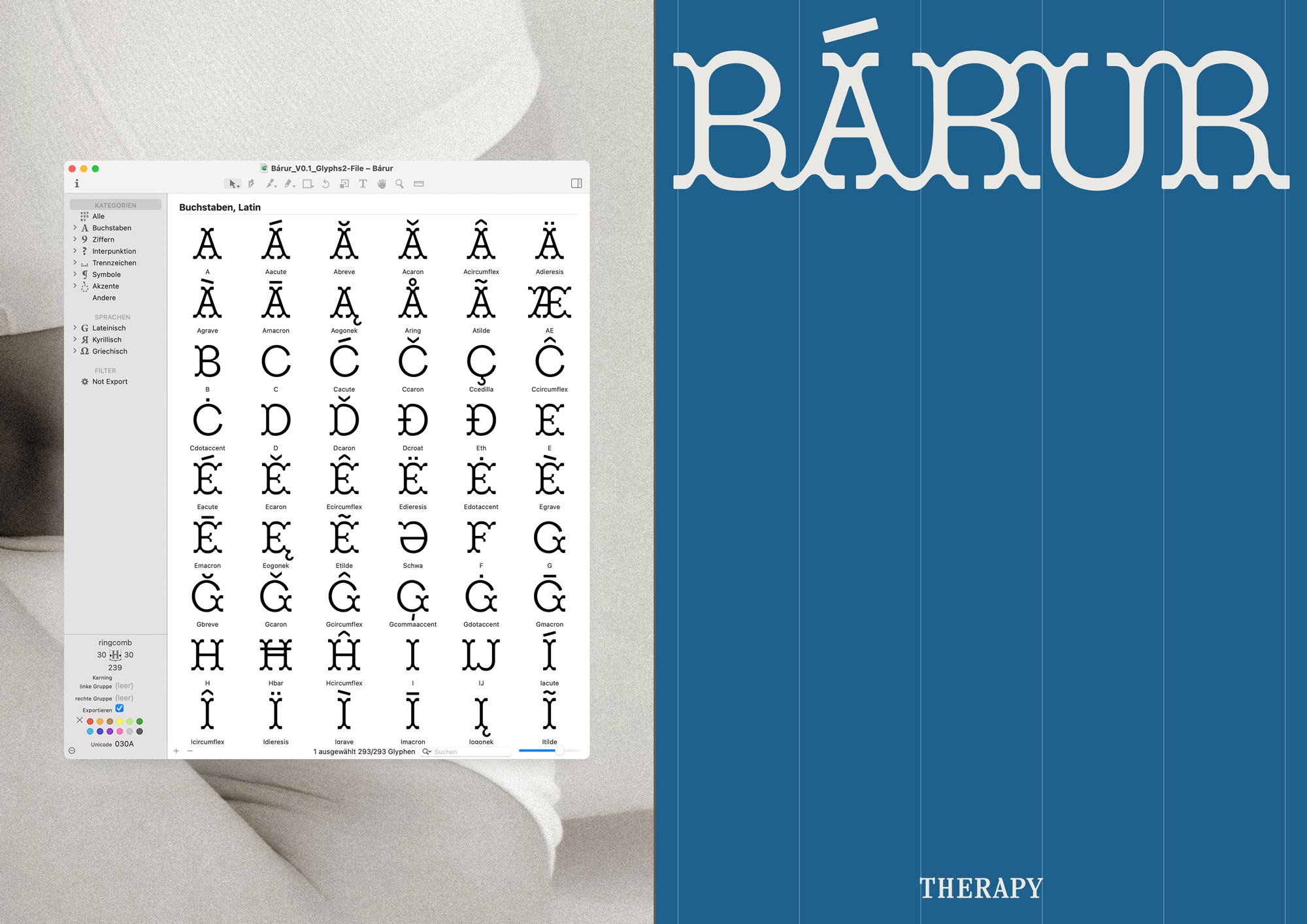
◦ EXCITING NEWS ON THE BÁRUR TYPEFACE
The Bárur typeface is now available exclusively on our website. Thank you for your interest!
This is a progressing creative project beyond the bárur therapy brand identity. → Get it Here



◦ THE BRAND DIRECTION
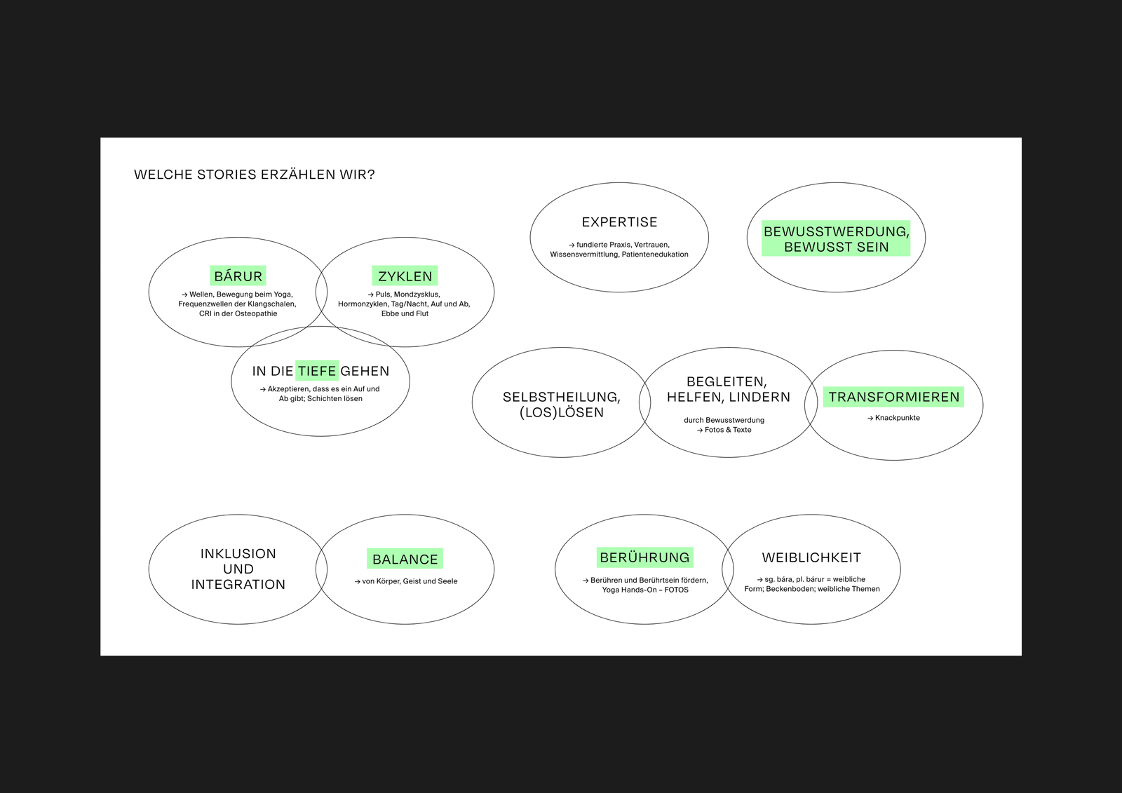
Through our Manifesting Session, we identified the key aspects of the brand—values, mission, impact, audiences, market positioning, and USPs. This guided us to a refined brand vision, starting with a strategic framework and then translating it visually.
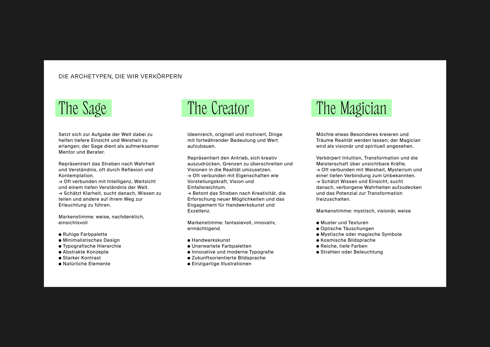
We also explored Archetypes, assigning The Sage, The Creator, and The Magician to bárur therapy, which provided us further insights for the design approach. Above all, we aimed for a brand identity that felt empathetic, connected, holistic, present, and radiant.
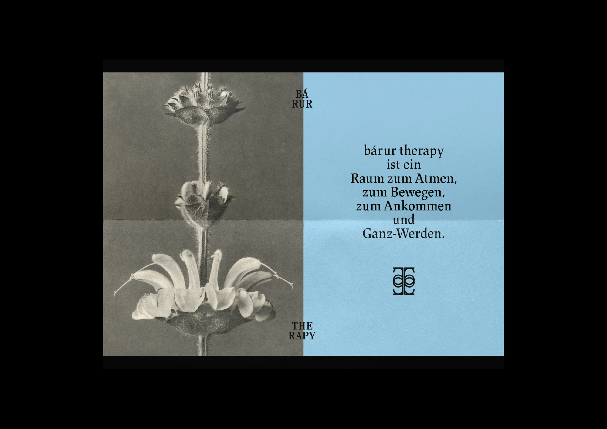
»bárur therapy is a space for breathing, for movement, for arriving, and for becoming whole.«


◦ THE BRAND DIRECTION
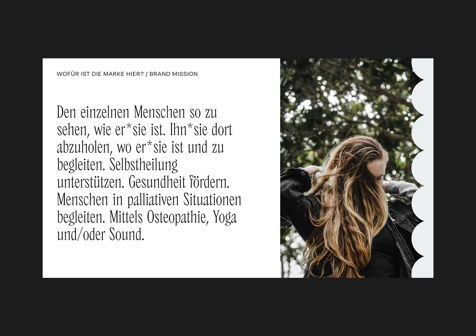
Brand Mission: To support self-healing and foster health through a personalized approach, meeting people where they are.
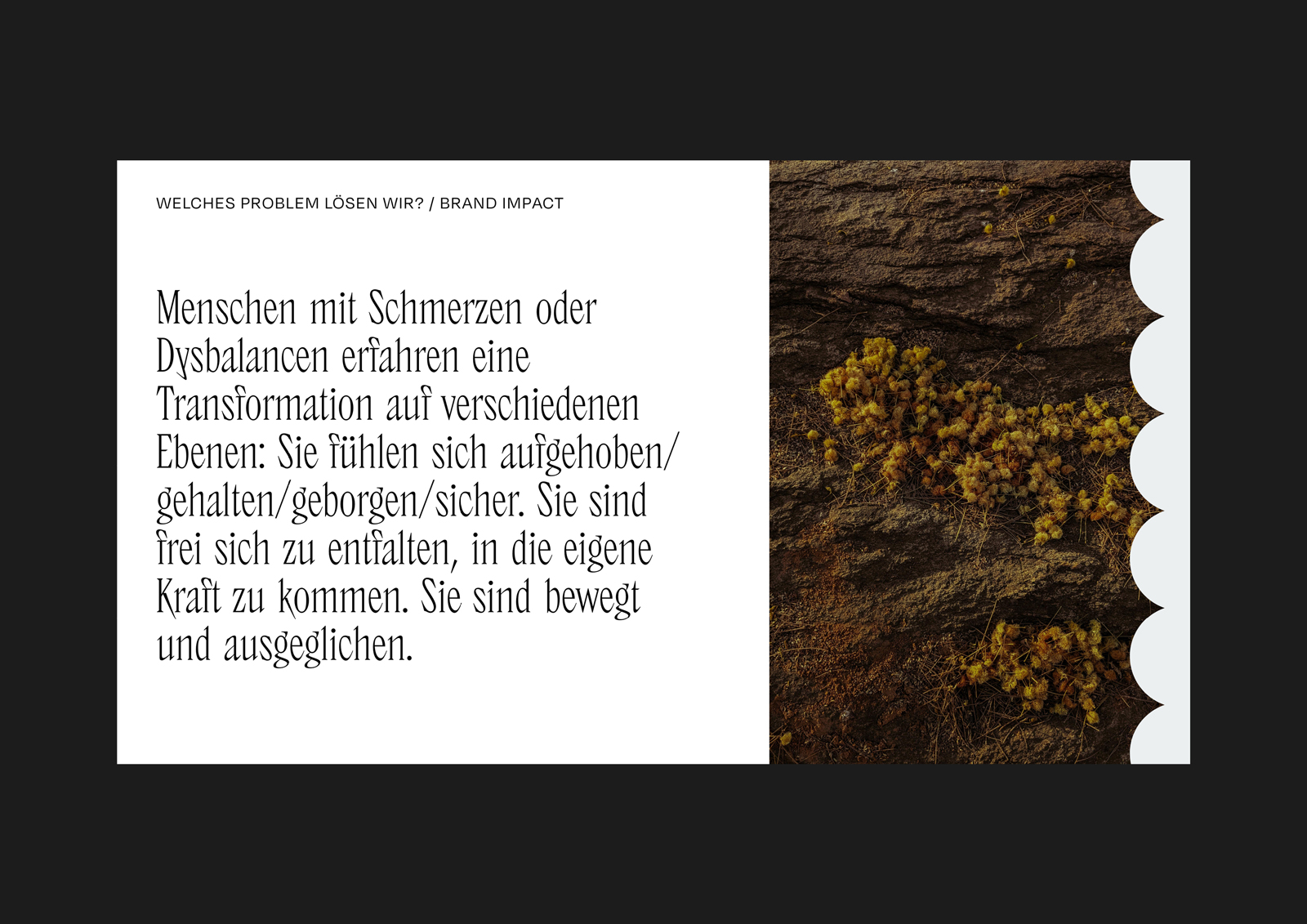
Brand Vision: Create spaces of safety, balance, and connection, empowering individuals to embrace transformation.
Core Values: Holism, sustainability, balance, ethics, touch, inclusivity, flow, and knowledge transfer.
Brand Stories: The name »bárur« (meaning »waves« in Old Norse) embodies the essence of movement and flow, seen in yoga asana, the frequencies of singing bowls, and the rhythmic shifts in osteopathy. We also embraced the concept of cycles—whether it's the human pulse, the phases of the moon, or natural ebbs and flows—as integral to the brand’s energy. Depth was key, aiming to reveal and crack open layers, as was the embodiment of expertise, awareness, detachment, and femininity.
◦ THE BRAND DIRECTION
Market Research: Through our research, we discovered a gap in the market—many local brands lacked a distinct visual identity or strong positioning. This gave us the opportunity to create something truly unique for bárur therapy, setting it apart in an industry that can feel uninspiring. While we found some commonalities in color schemes, our design ensures bárur therapy stands out with its own vibrant and distinct personality.
Audience: bárur therapy’s offerings—osteopathy, yoga, and sound therapy—reach a diverse audience, from young children to seniors, embracing all genders and backgrounds. The design reflects this inclusivity, ensuring every touchpoint feels personal and accessible. By incorporating flexible design elements, we were able to craft a brand that speaks to each individual’s unique journey, creating a welcoming space for everyone.


◦ Creative Direction
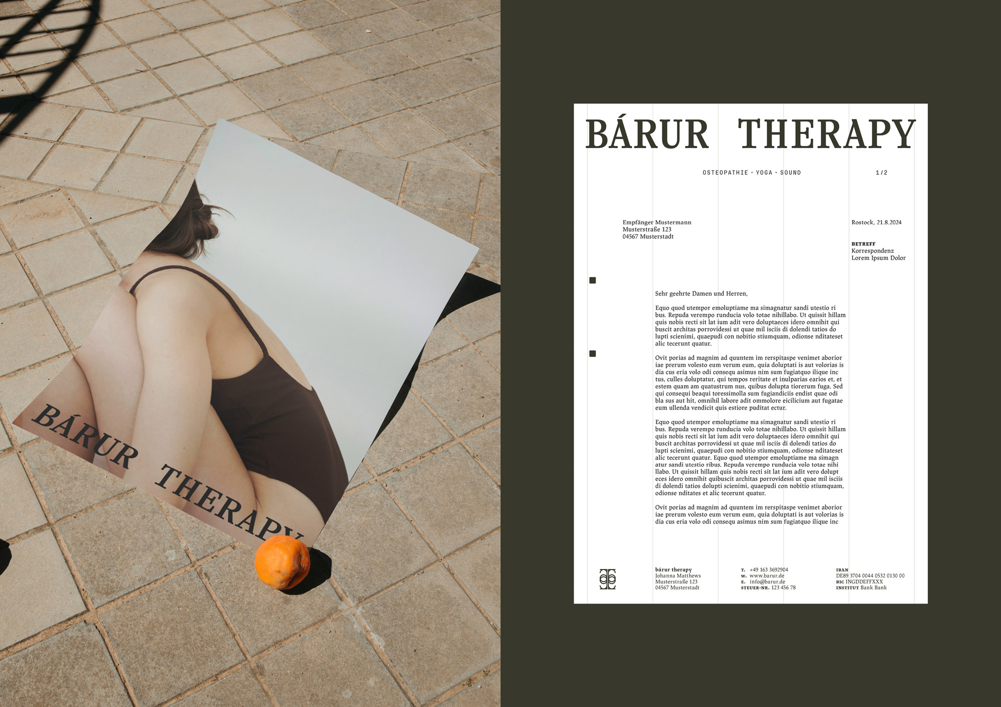
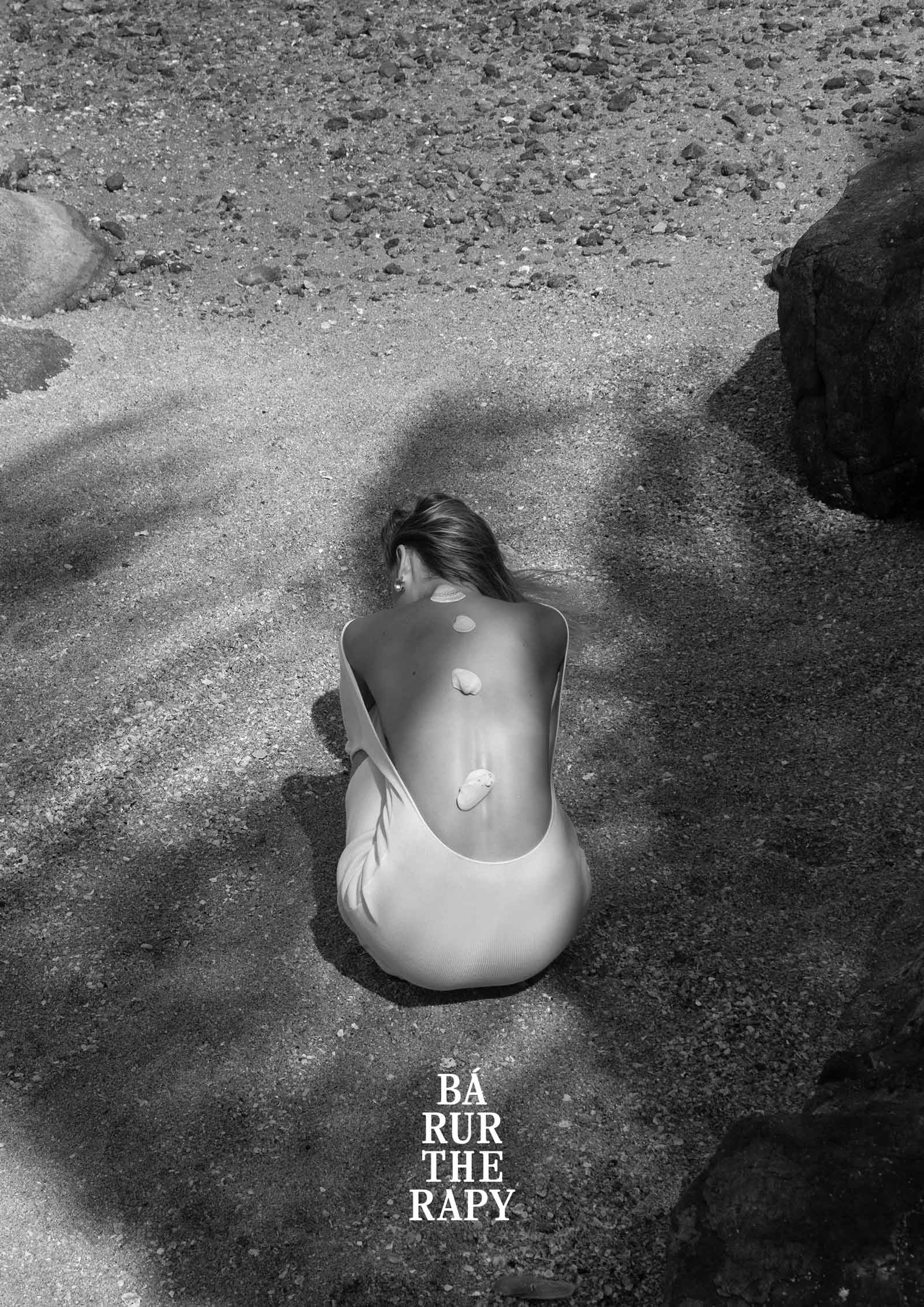
The creative direction is rooted in harmonious design and balanced compositions, reflecting the brand’s core philosophy. The use of contrasts—light and shadow, radiance and depth—creates a dynamic visual language that feels alive and tactile. Organic textures and patterns introduce vibrancy, while maintaining a sense of structure and clarity for accessibility, with room for meaningful breaks to encourage exploration. Naturalness remains a guiding principle, with a palette of calm, earthy tones paired with rich, deep hues,
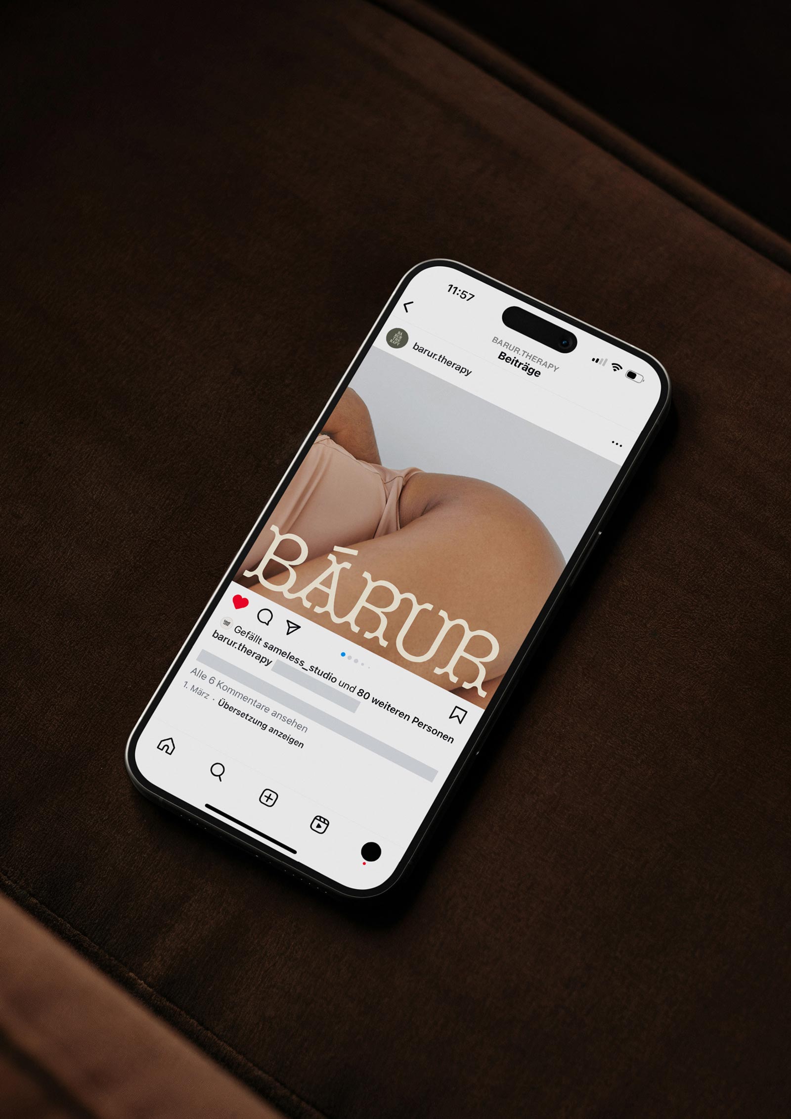
evoking a sense of grounding and connection. Subtle references to mystical, magical, and cosmic symbols are embraced without being overly literal, fostering a sense of wonder. High-quality photography, including black-and-white imagery, enhances the emotional resonance of the brand, favoring abstract concepts over repetitive symbolism. This fluid approach—mirroring the movement of waves—combines dynamic elements with clean typography, resulting in a visual identity that feels both grounded and transformative.


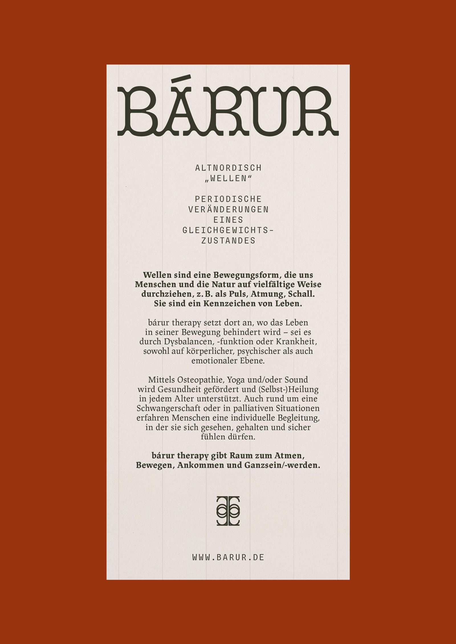
◦ Primary Logo (Word Mark)
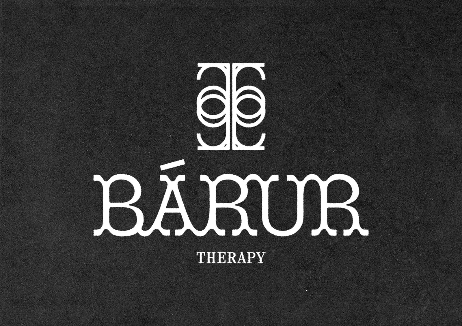
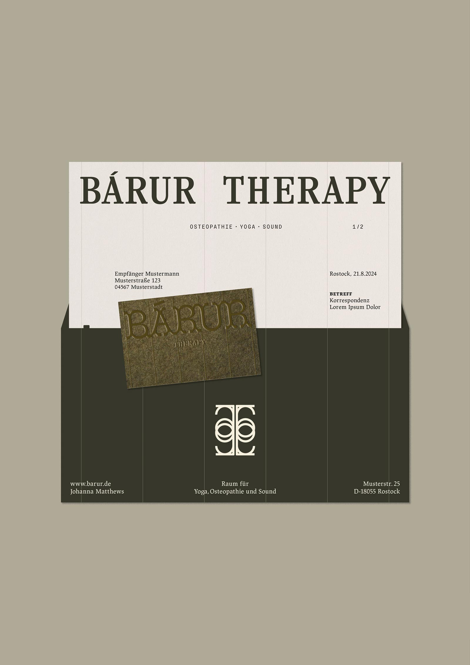
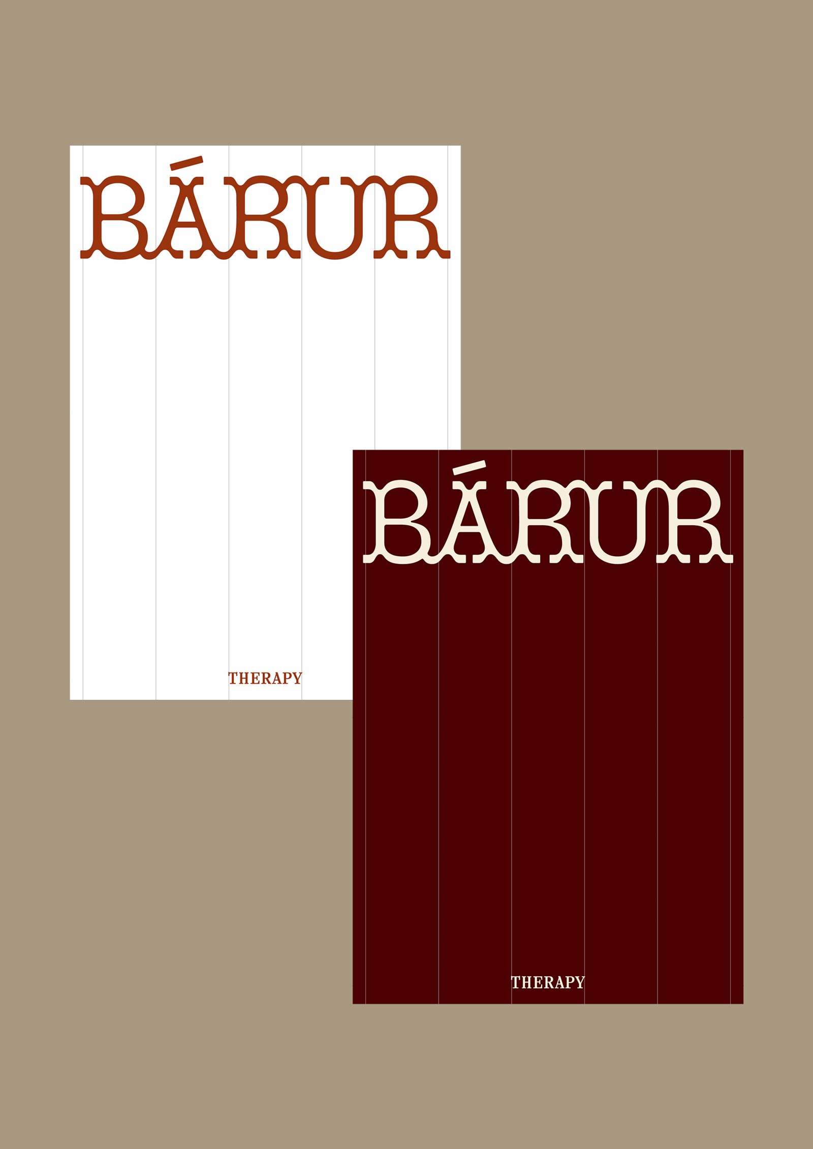
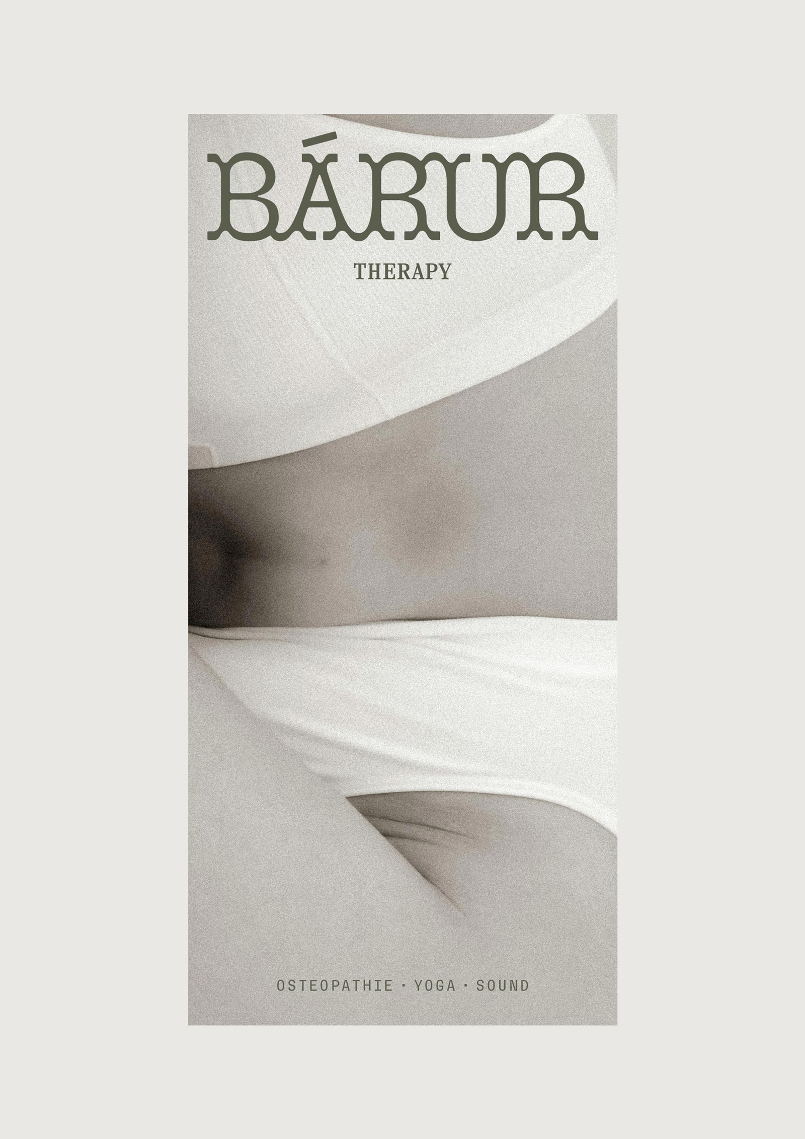
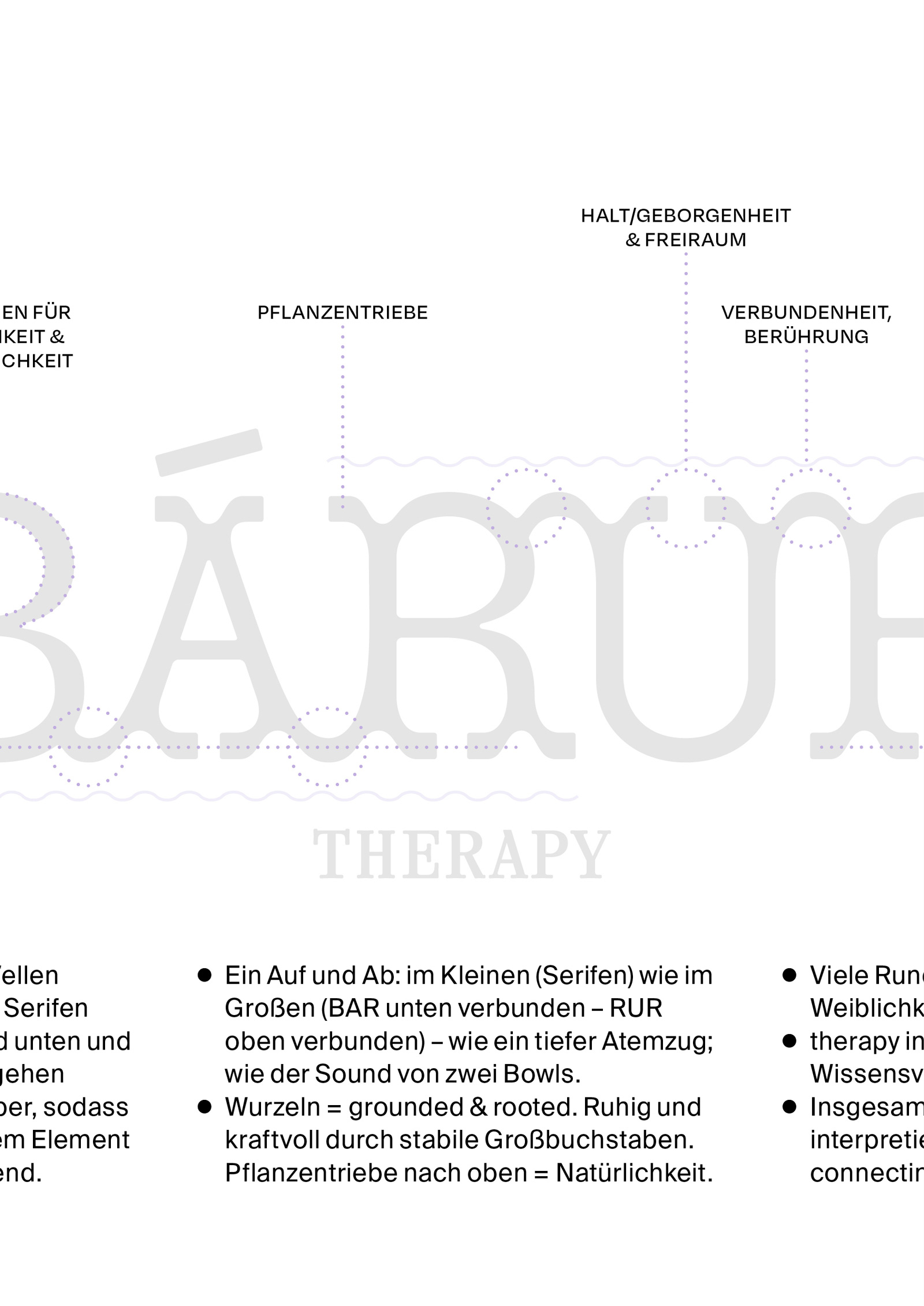
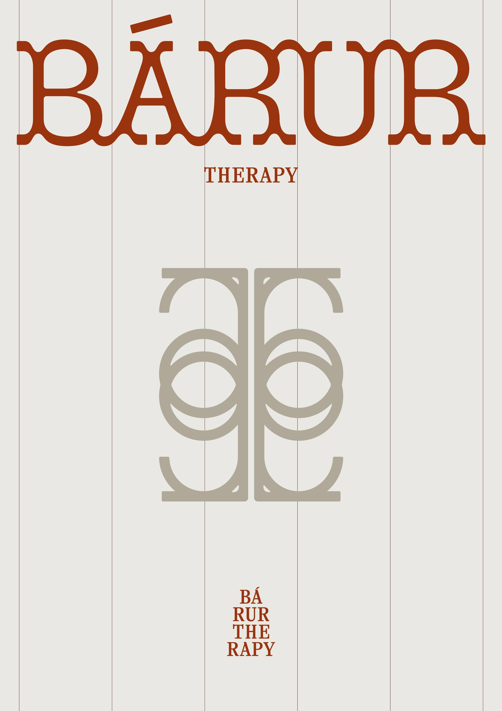
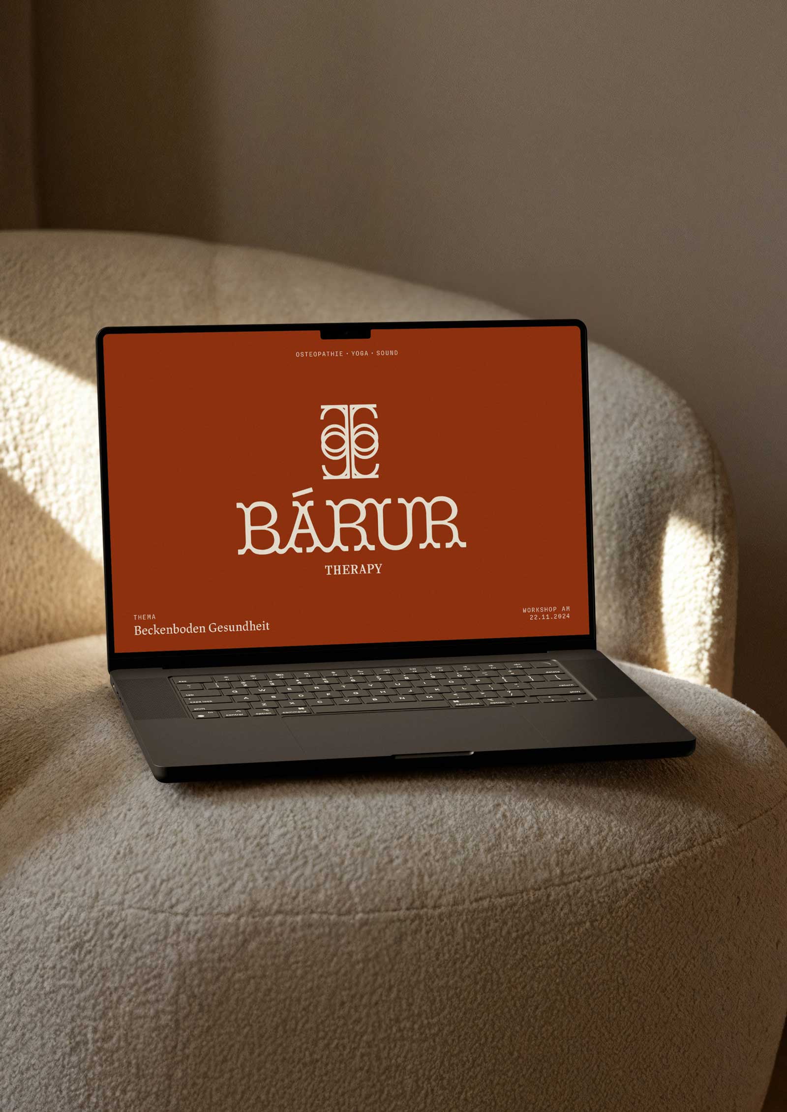
A custom word mark designed with intentionality to convey movement, connection, and grounding: Inspired by waves, its design uses ligatures to seamlessly unite individual elements, creating an harmonious whole. Serifs evoke the ebb and flow of breath and sound, grounding the mark while maintaining a sense of motion. Rounded forms suggest femininity, humanity, and trust, while sturdy uppercase letters root the design in stability and strength. Subtle upward movements, like plant shoots, symbolize growth and natural vitality.
The typewriter font used for »therapy« underscores medical expertise, balancing the softness of the rounded forms with a professional touch. Together, these elements create a logo that resonates deeply with the brand’s values—interpretable as high-quality, present, connecting, dynamic, and vibrant.
The primary logo is versatile and timeless, serving as the anchor of the visual identity. It encapsulates the brand’s holistic mission in one timeless, clean, and minimalist design while offering a sense of depth that can be felt.
The word mark can be combined with the signet to create a composite mark for more elaborate applications. To ensure adaptability across formats, we’ve developed additional versions of the logo: an XXL version for large-scale use, a plain version for simplicity, small and compact variations, as well as horizontal and vertical orientations.
This flexibility ensures that the logo works seamlessly across any format, size, or medium, from digital to print, while maintaining its essence, impact, and readability.
◦ SIGNET
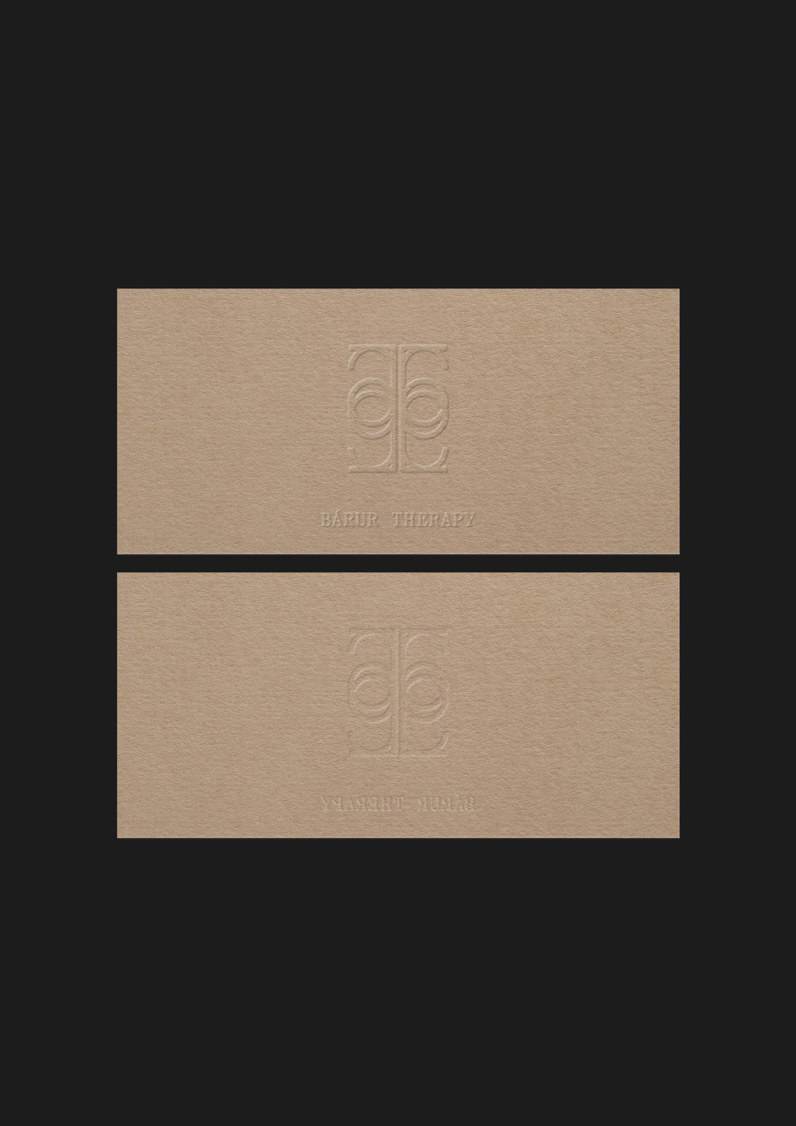
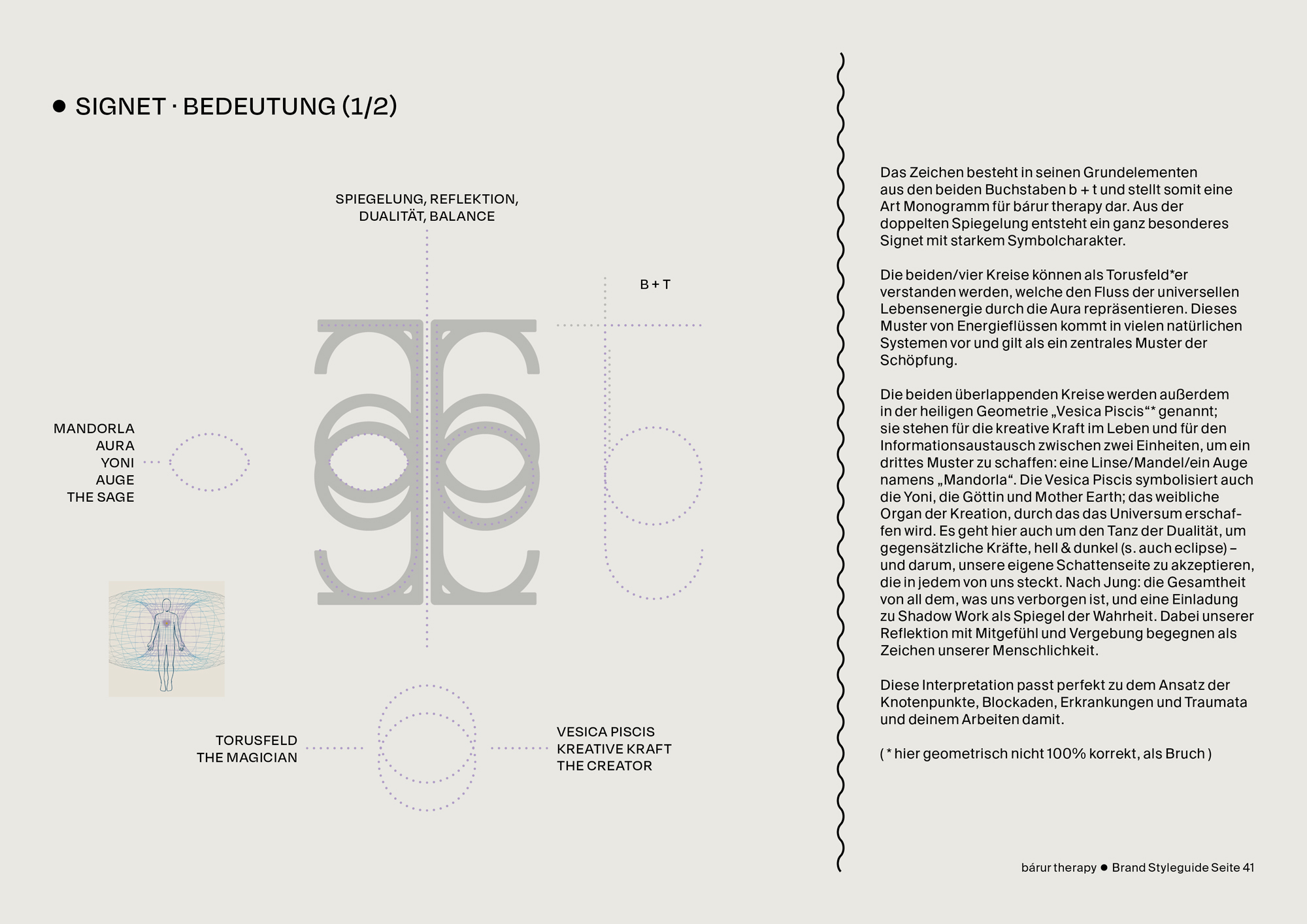
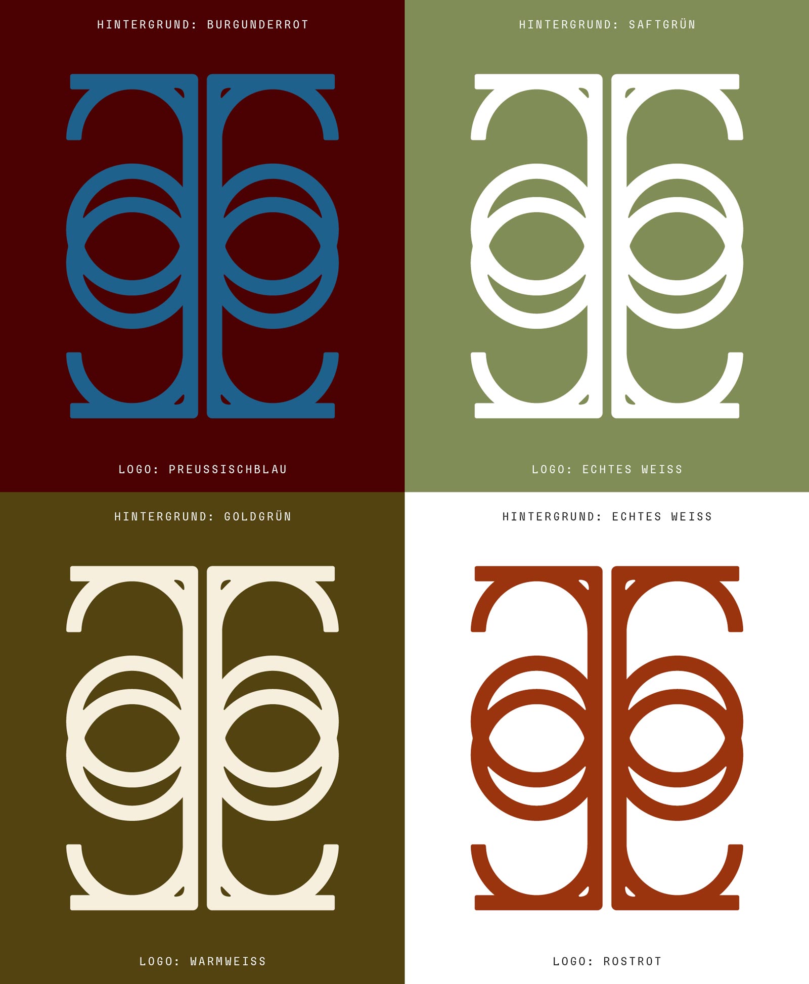
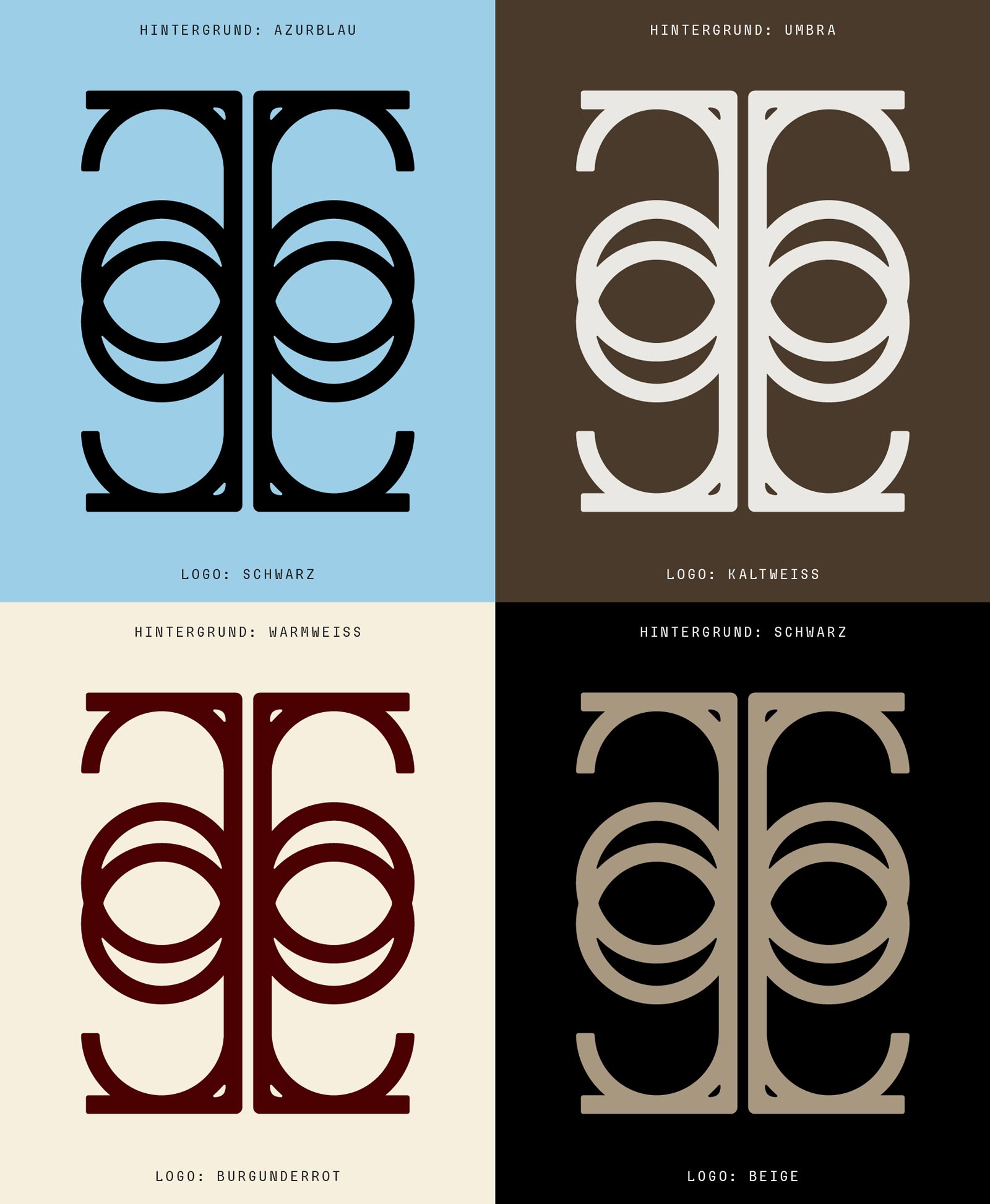
The signet for bárur therapy is a powerful and versatile symbol, functioning both as a standalone mark and in combination with the primary logo to form composite designs. At its core, the signet is a monogram formed from the letters b and t for »bárur therapy«, elegantly mirrored to create a unique geometric structure with profound symbolic resonance.
The overlapping circles evoke the Vesica Piscis from sacred geometry, a form representing creation, connection, and balance. This shape carries layered meanings: the flow of universal life energy through the aura, the interplay of opposites like light and shadow, and the lens or »mandorla« formed where two entities intersect to create something new. It resonates with the essence of duality—accepting and integrating all facets of self, including shadow work, reflecting the brand’s therapeutic approach to healing and growth.
It also suggests waves radiating outward, symbolizing the ripple effects of transformation. Its open, flowing form conveys both support and freedom—representing a safe space where clients can expand and unfold.
On a more grounded level, the design feels Nordic and organic, referencing Viking symbols or runes. Its upright structure suggests a tree: rooted, growing, and reaching upward, linking it to nature, sustainability, and the nurturing power of the elements. Subtly tactile and handcrafted, the signet carries a sense of natural, creative energy. Whether seen as a representation of singing bowls, an eye, or even a mask—each interpretation is layered with meaning, adding mysticism and depth. The openness and human touch of the signet make it a welcoming, inclusive symbol of transformation and connection, perfectly embodying the spirit of bárur therapy.

◦ Secondary Word Mark
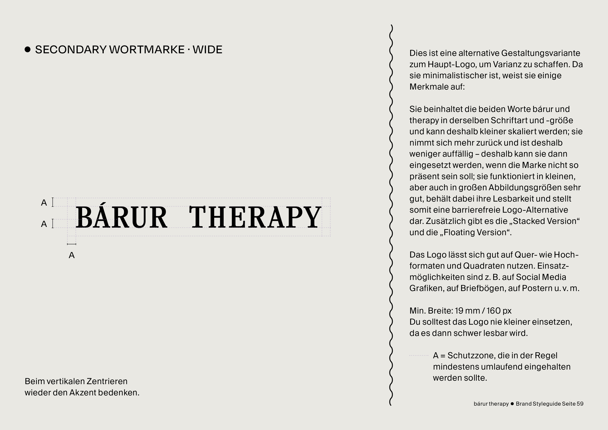
The Secondary Word Mark provides a versatile alternative to the Primary Logo, designed for subtlety and flexibility. It retains the brand's core identity while adapting to different layouts and scales. Three distinct variants ensure adaptability across formats, providing diversity:
Wide Version: A horizontal layout designed for accessibility and minimalist appeal.
Stacked Version: A vertical arrangement ideal for compact uses, adding depth through layering.
Floating Version: Symbolizing a frame and thinking beyond boundaries.

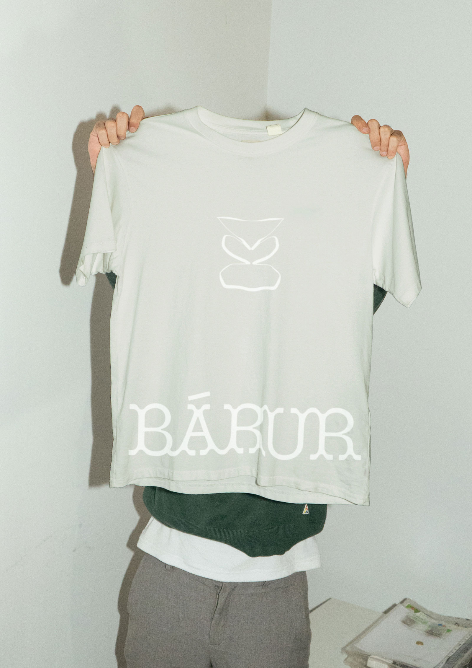

◦ Icons
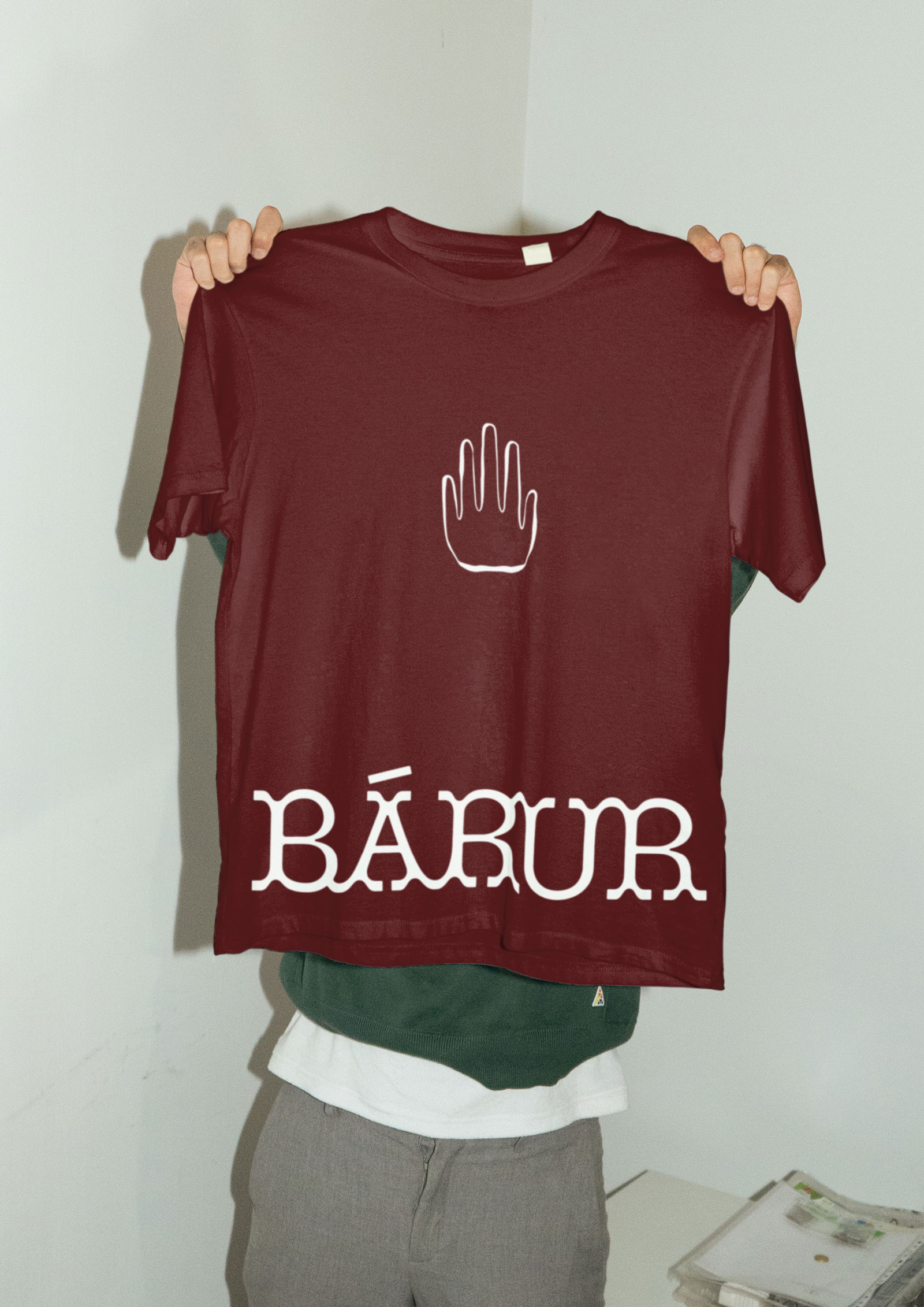
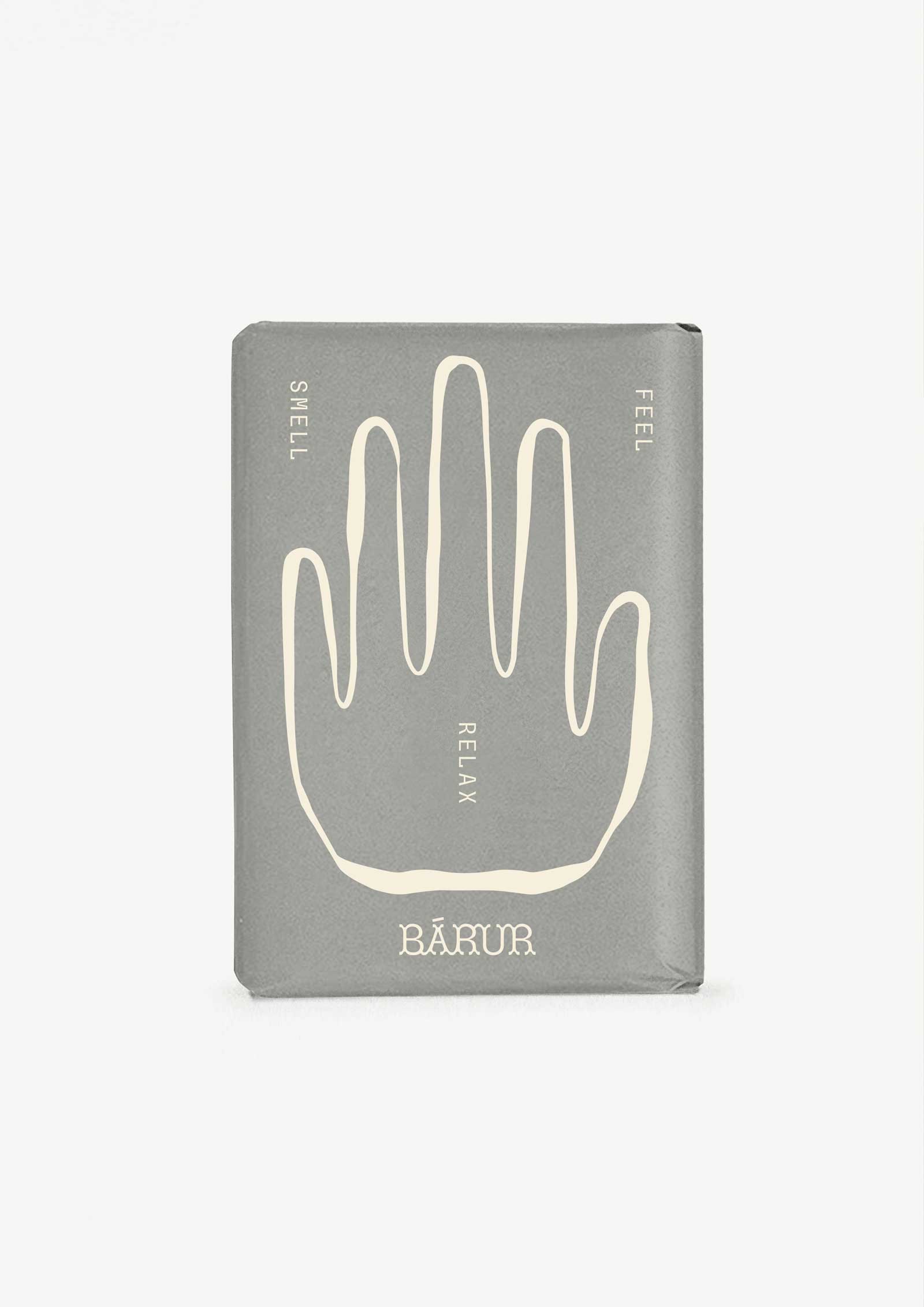
For the three business areas—Osteopathy, Sound, and Yoga—we created distinctive icons that clearly represent each field. Unlike the other elements of the brand which use a rather subtle symbolic, the icons are designed in a more specific style: handmade, rough, and simple.
We use these icons at a relatively large scale to emphasize their unique details and ensure they stand out. Each icon reflects a high degree of individuality, such as the floral heart-shaped bowl for Sound and the simplified wave representing a mat for Yoga. The hand for osteopathy speaks for itself.
◦ COLOR SYSTEM
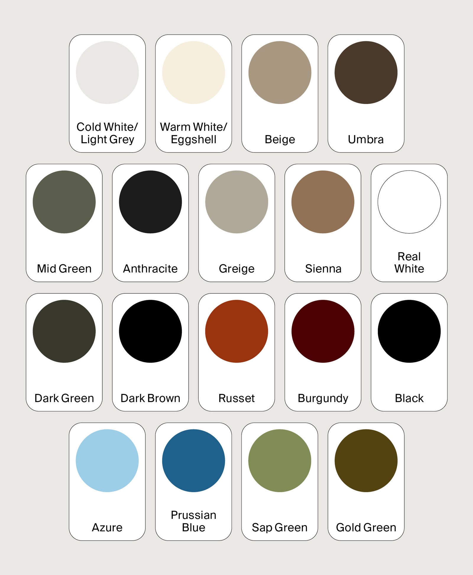
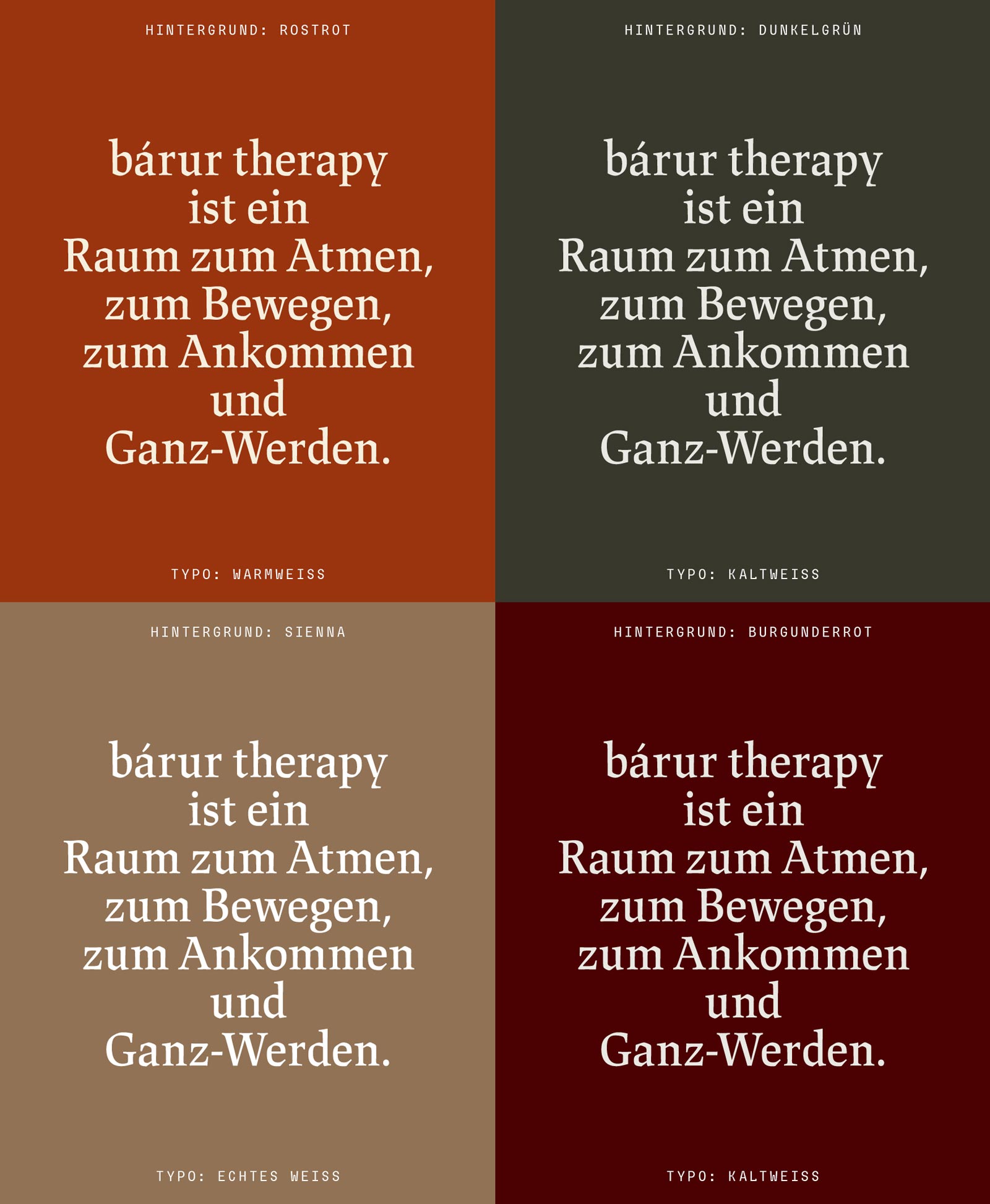
The color system features a rich, expansive palette, incorporating a wide range of earthy tones. This includes shades of beige, brown, green, and red, representing the natural world and the diverse colors of the earth. To complement this, two shades of blue are added, symbolizing air and water, completing the four elements.
Black and three variations of white are used strategically to enhance readability. The system also includes four core colors, six accent colors (in red, green, and blue), and four substitute colors. This thoughtfully curated color system gives the brand a unique, natural feel while offering flexibility for various design applications.

◦ FONT SUITE
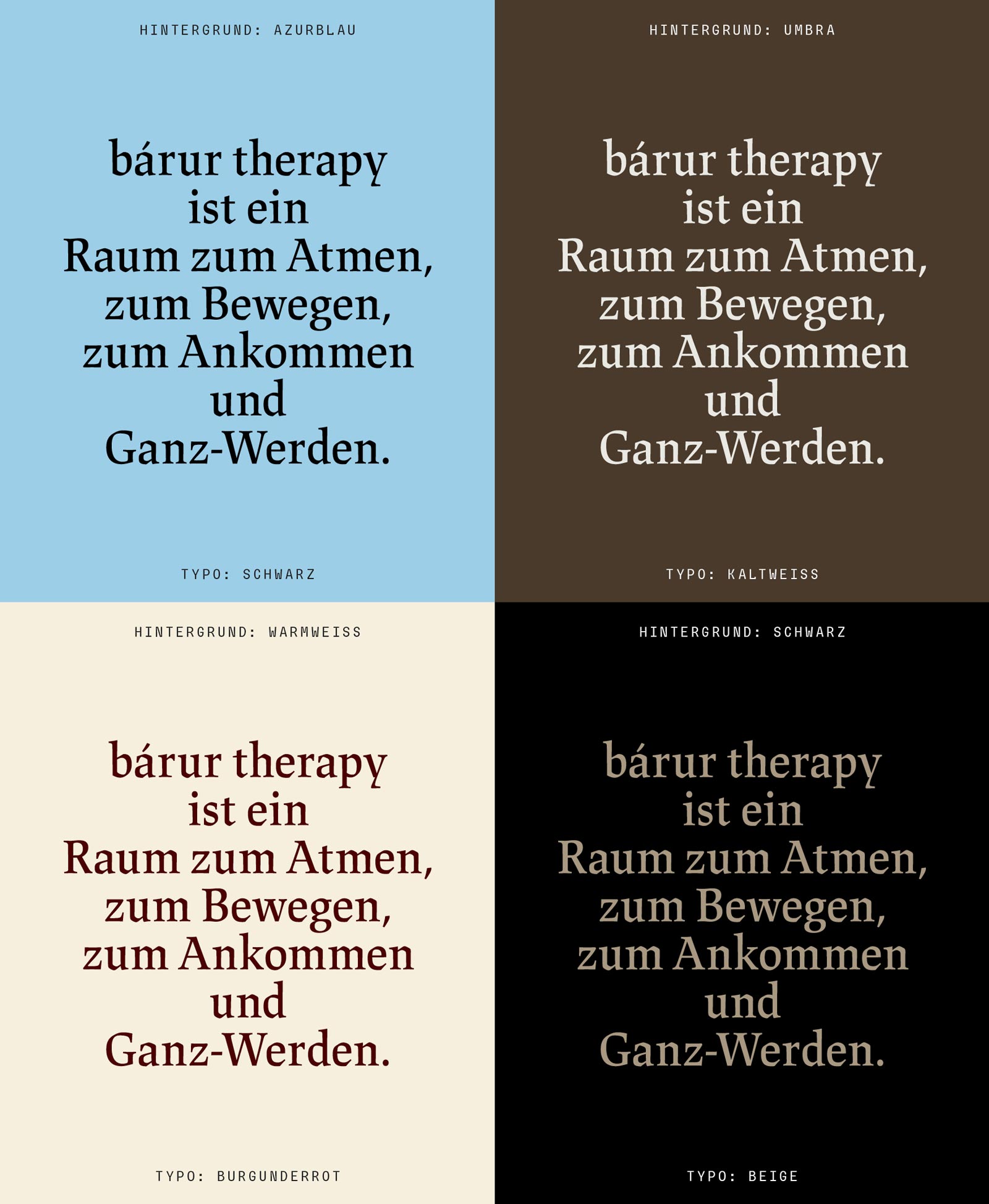
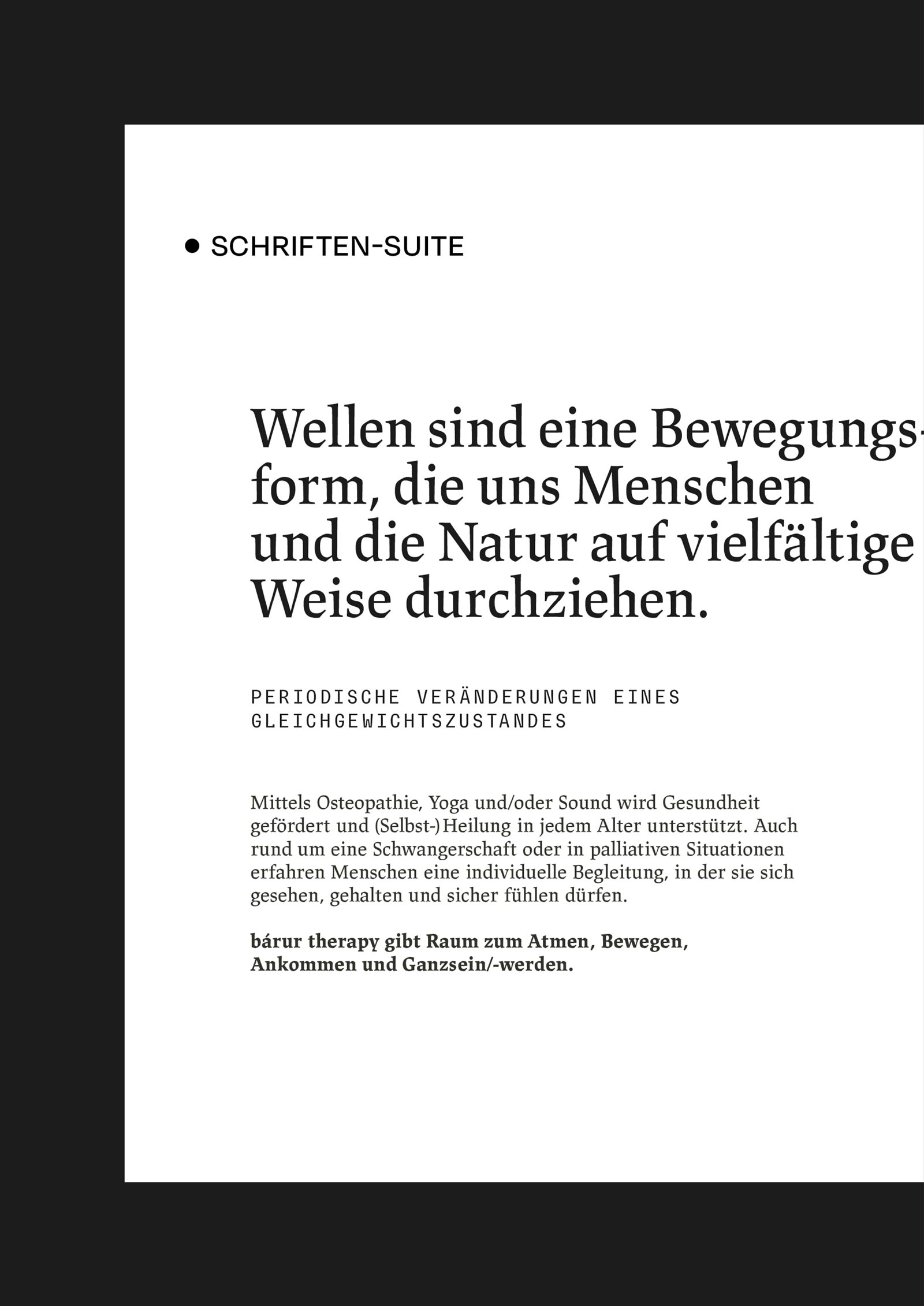
The font suite for bárur therapy combines balance, inspiration, and aesthetic appeal, seamlessly integrating into the broader brand identity. The headline font is based on Albert Kapr’s 1971 Leipzig Antiqua, known for its broken letterforms and calligraphic features, which add a unique and rough texture. This style contrasts with the rounded Primary wordmark and complements the Typewriter font used in the Secondary wordmark, symbolizing the imperfections, blockages, and emotional scars of the human experience. The text type, also from the same font family, is optimized for readability in longer passages. Slightly thinner than the display version, it offers a sophisticated, classic look with a touch of angularity that sets it apart from more conventional serif fonts, creating an empathetic connection with the target audience.
For subheadlines, a monospace font with an Inktrap character adds a nod to British cultural influences, providing a medical-scientific edge.
The font suite includes multilingual support and high accessibility. Additionally, the custom Bárur font is a work in progress and will further personalize the brand identity for future uses, such as posters and other promotional materials.
Fonts used:
- Headlines/Quotes: Lapture Display Semibold
- Claims/Subheadlines: Sligoil Micro
- Body Text/Paragraphs: Lapture Regular
- Highlighted Body Text: Lapture Bold

◦ PATTERNS
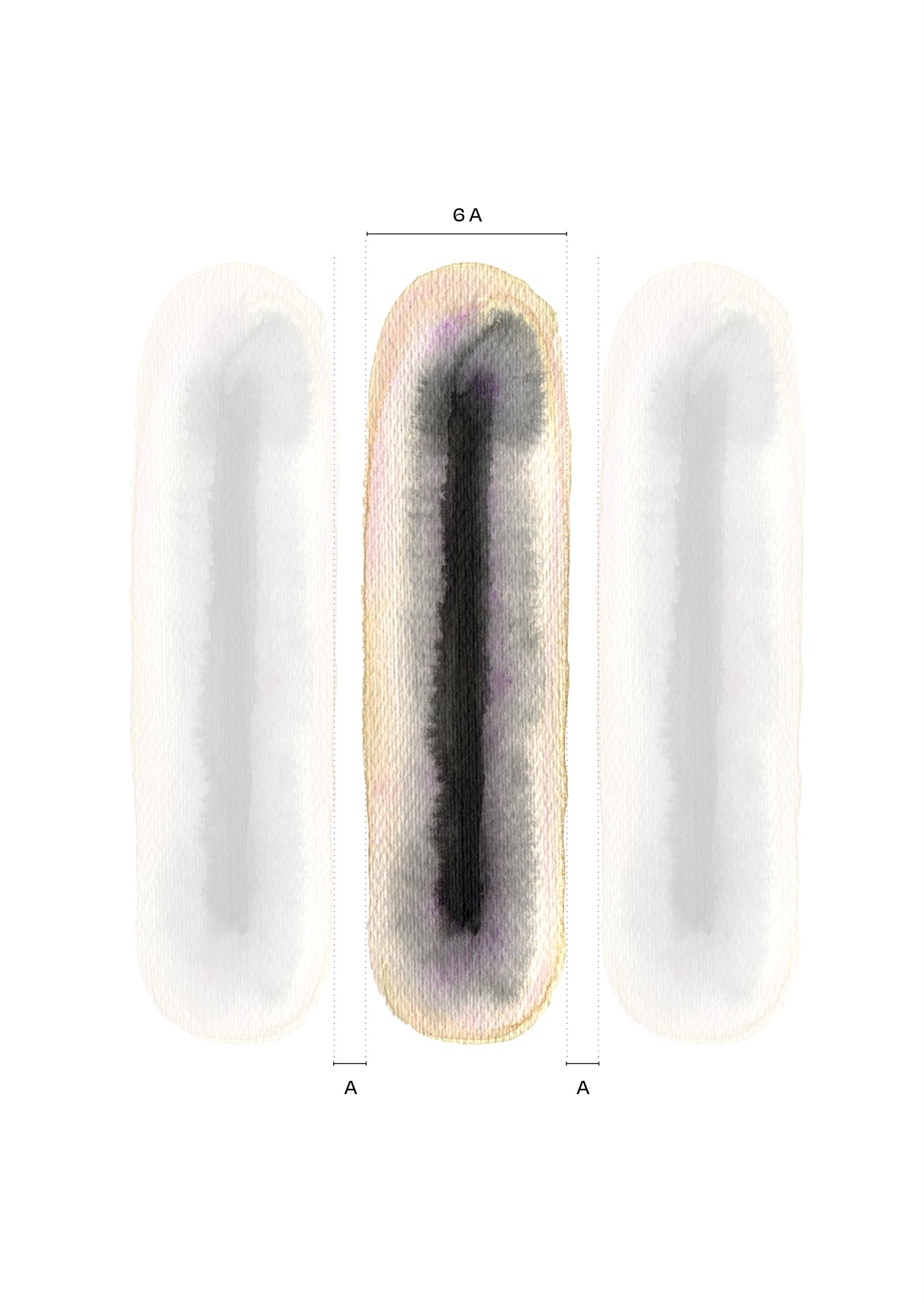
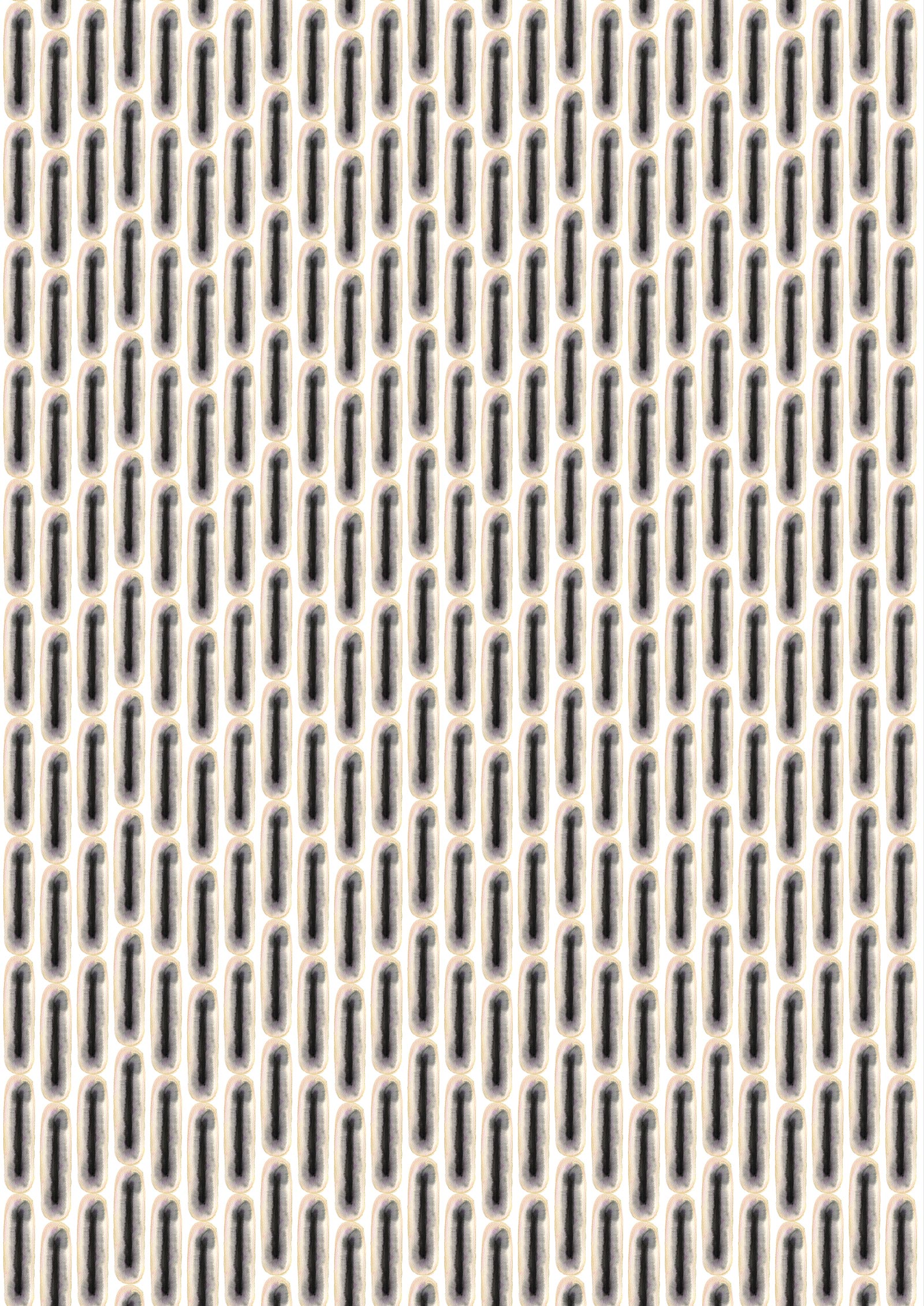
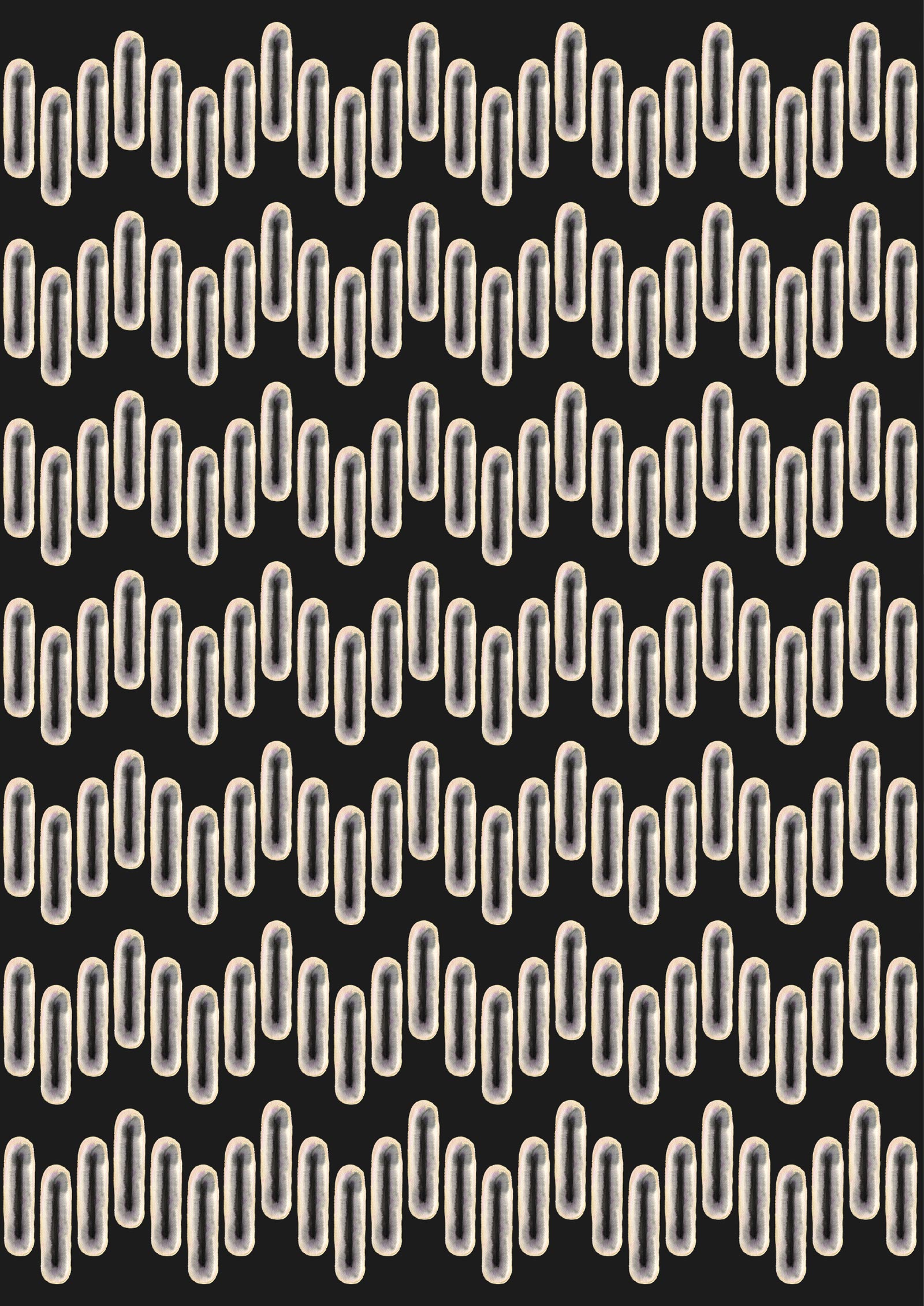
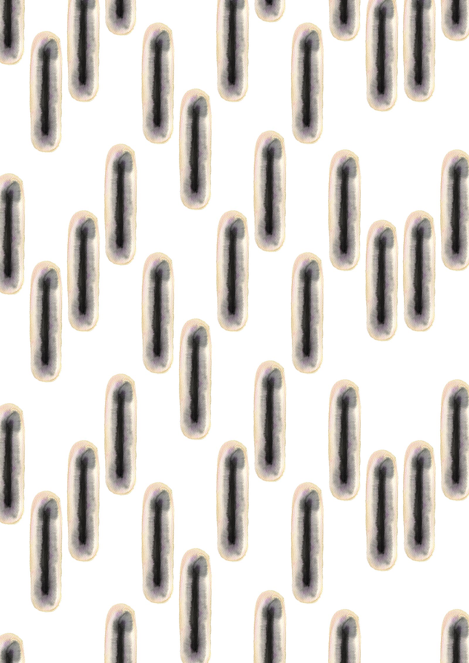
The patterns for bárur therapy are based on a single watercolor element, which is used either individually or repeated to create various pattern structures. There are three distinct variants with transparent backgrounds that can be placed over different brand colors, offering a wide range of design possibilities.
The watercolor medium evokes associations with waves, water, and movement, reflecting the fluid, sometimes unpredictable nature of the medium—perfectly aligning with the brand’s philosophy.
The pattern elements work harmoniously with all colors in the brand’s color palette, offering flexibility for diverse design applications.
Pattern Element – Single: This element symbolizes openness, flow, and the act of allowing things to unfold, creating a sense of gentle space and support. It also evokes the image of a cell or water droplet, both of which are deeply influenced by sound. With its strong recognition value, this element becomes a key visual for the brand.
Pattern Element – Wave: This is a pre-arranged sequence of the pattern element forming a wave (reflecting sound or frequency). It can also be stacked vertically to create a new pattern.
Pattern Element – Drops: This variant forms a free-flowing pattern reminiscent of water droplets.
◦ The Concept of Lines
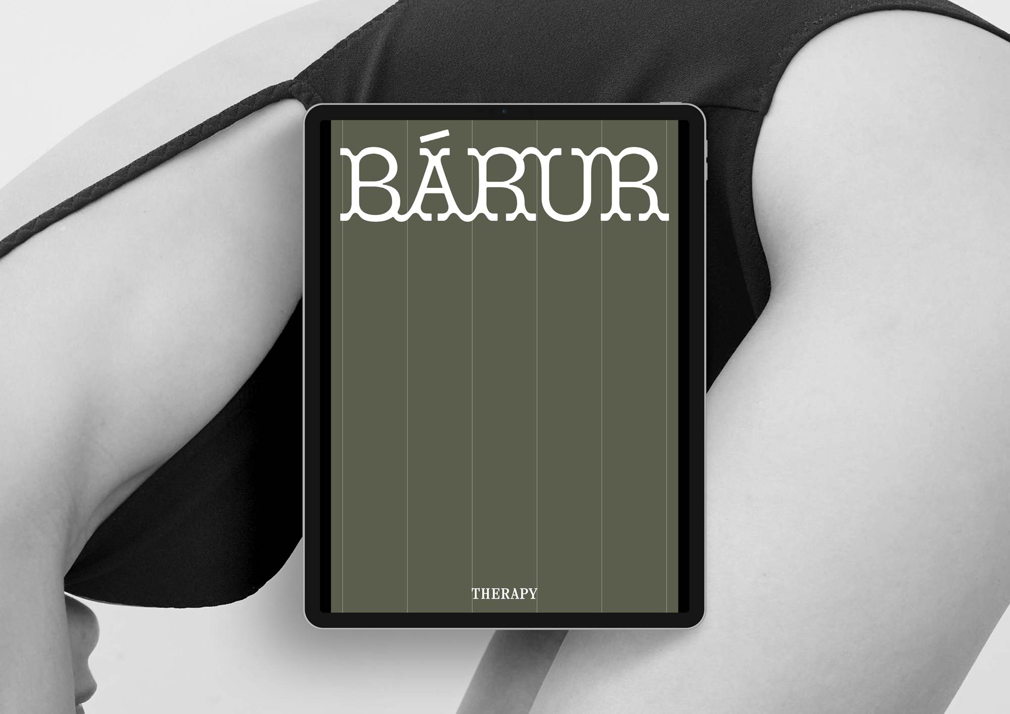
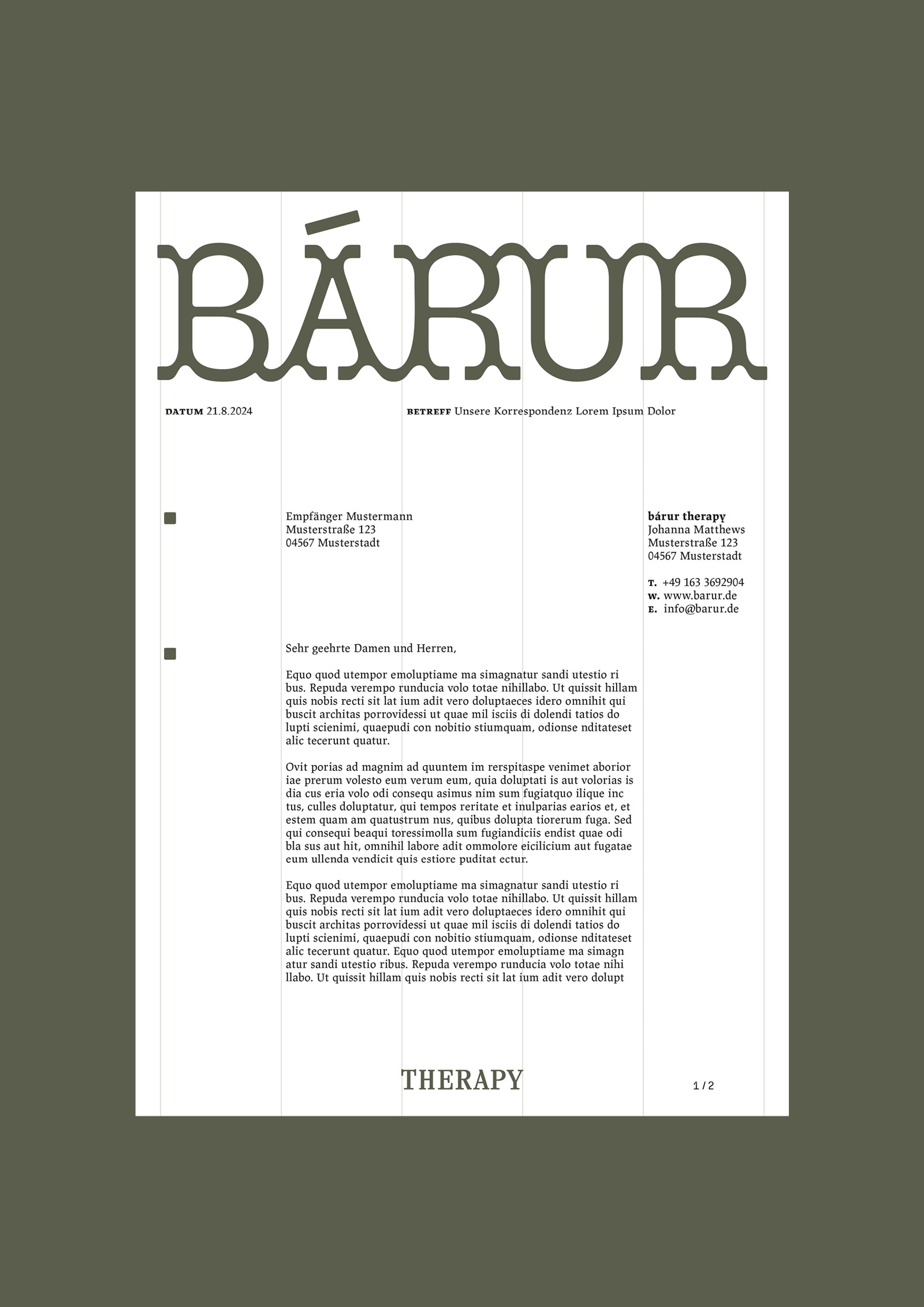
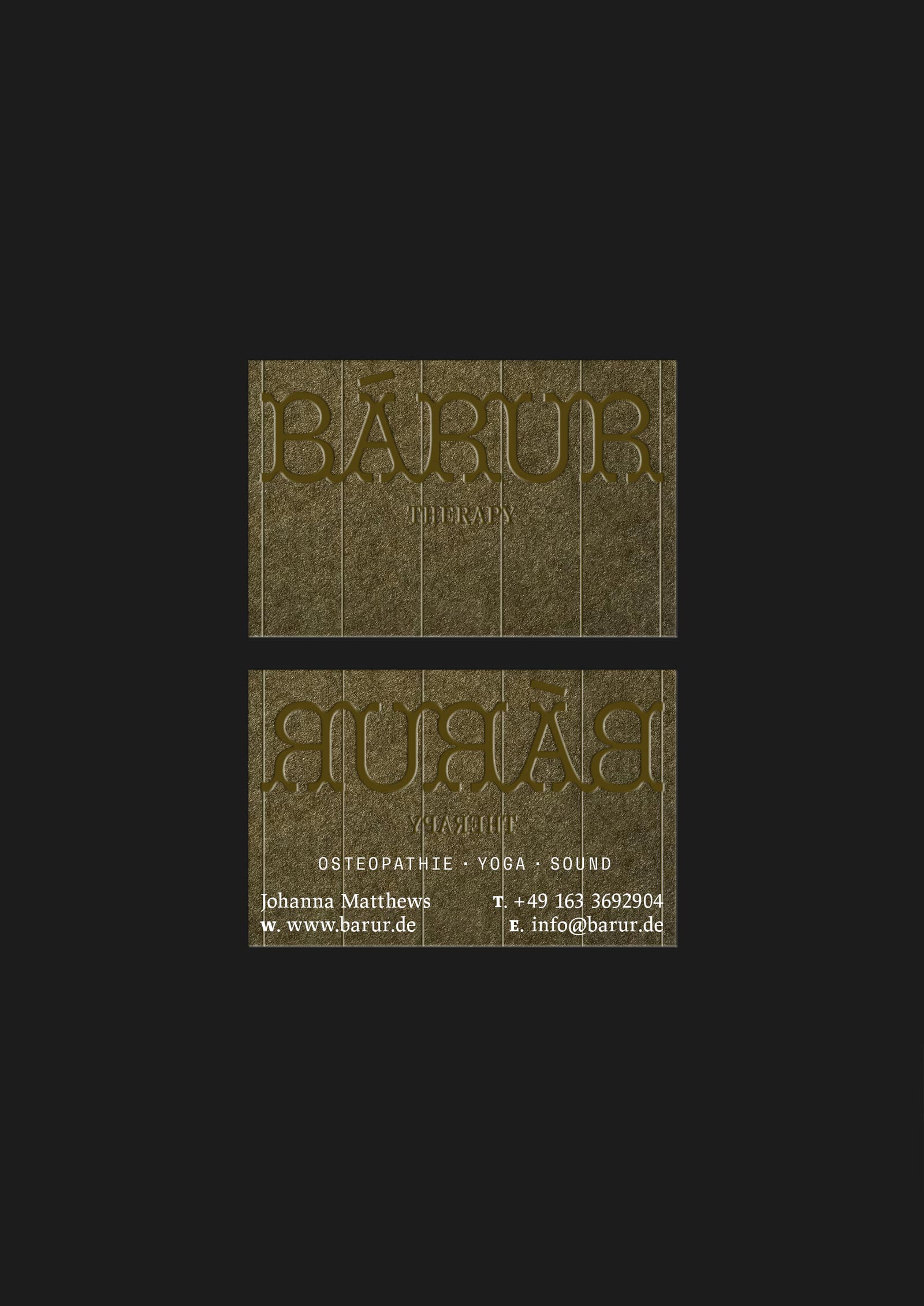
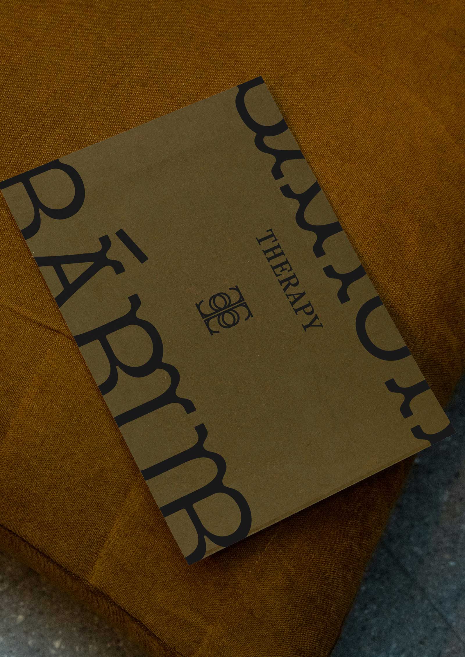
The concept of lines in the design system introduces structure and meaning through the use of six vertical lines, dividing the page into five columns. This approach is inspired by the symbolism of the »life thread« in Greek and Roman mythology, where the Moirai (Fates) weave the life path of individuals, representing the human journey. The number five, found in both the columns and the word »bárur,« symbolizes the forces that shape a person’s life
and is associated with freedom, change, growth, and self-discovery. The lines also serve a functional purpose, creating a graphic grid for organizing content, as seen in letterheads, business cards, and other materials. Drawing from Kandinsky’s idea that »the line is the trace of a moving point,« these lines move from static to dynamic, representing the transition from stillness to motion and reflecting the brand’s core value of flow.


◦ Osteopathy, Yoga, and Sound
Through a thoughtful combination of colors, typography, patterns, and stylistic elements, we have created a unique and cohesive visual language that speaks to the brand’s essence.
The design system offers flexibility for future applications while maintaining a strong, recognizable presence that resonates with the audience on an emotional and aesthetic level.
☺︎ Vibe
Empathetic・Connected・Holistic
Present・Radiant・Balanced・Inclusive
In Flow・Ethical・Knowledgable
☺︎ Like What You See? Let’s Start Your Project!
Selected Projects

OH OH OM ® Ethical SportswearBrand Strategy & Design
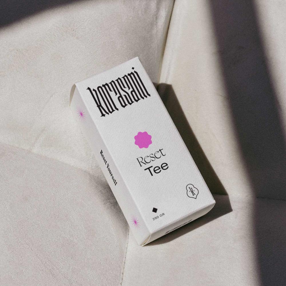
Korasani ®Brand Identity, Collateral & Web Design
Praxis Rabea KielProject type
Drink OXY.Project type
britta weisserProject type

Birth Studios ®Brand Strategy & Identity, Collateral, Web Design
→ Explore Resources
Join The Designers’ Well-Being Hub
Subscribe to the Mindt® Letter
Get Our Photo Bundles & Graphics
→ Explore Resources
Join The Designer’s Well-Being Hub
Subscribe to the Mindt® Letter
Get Our Photo Bundles & Graphics
→ Explore Resources
Join The Designer’s Well-Being Hub
Subscribe to the Mindt® Letter
Get Our Photo Bundles & Graphics
☺︎ We’re happy if we can inspire you—mutually be kind and professional and don’t copy or use any of our content without giving credit. This includes brand designs developed by us, the layout of this page, as well as any published texts.—Or, as Brian Collins has put it: »Be careful of doing too much work that copies the people you admire. Start out that way to see what feels right. But aim to seek what they were seeking instead of doing what they were doing.« ✌︎