An Energetic, Empowering, and Aware Brand Identity
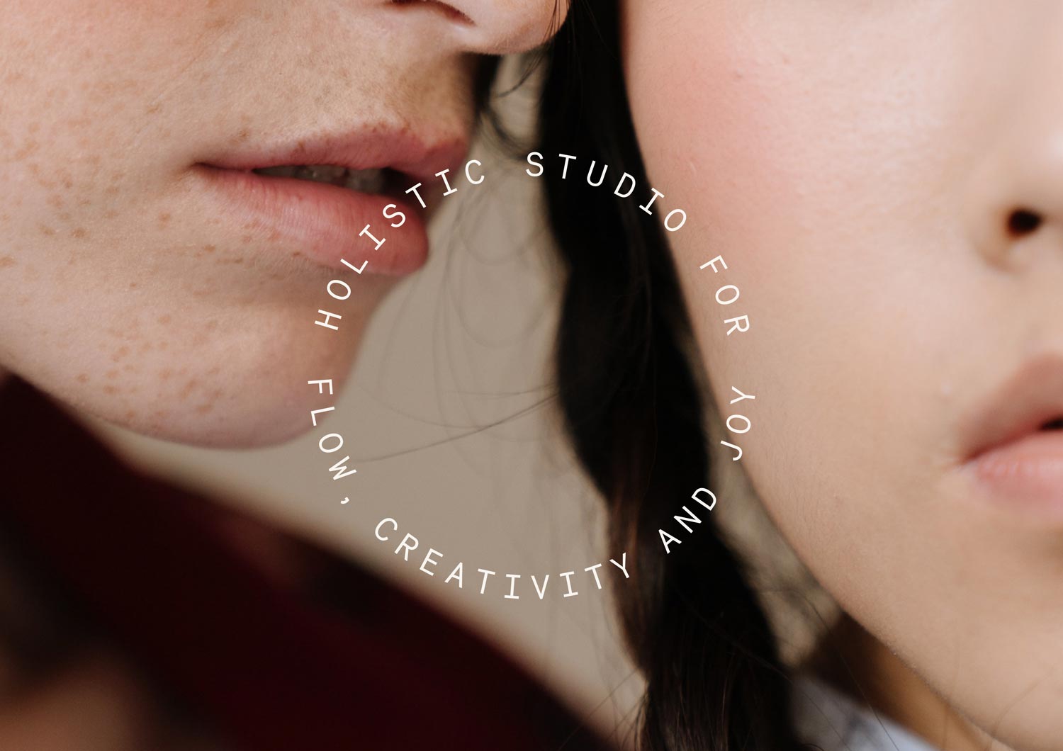
Holistic Studio for Flow, Creativity, and Joy
☺︎ Services
Brand Strategy
Brand Identity
Web Design
Social Media Design
☺︎ Client
Birth Studios ®
birth-studios.com
Context
Support for your emotional, mental, and physical well-being: BIRTH is the studio founded by Julia Lenska, focusing on creating a space for awareness and unfolding one’s potential. The studio aims to engage all the senses through physical, mental, and emotional practices, offering yoga classes, massage therapy, and mentoring. It appeals to individuals seeking a safe space to break free from old patterns and structures, wanting to experience flow and joy. Sensuality and aesthetics are two of the brand’s core values.
Our Approach
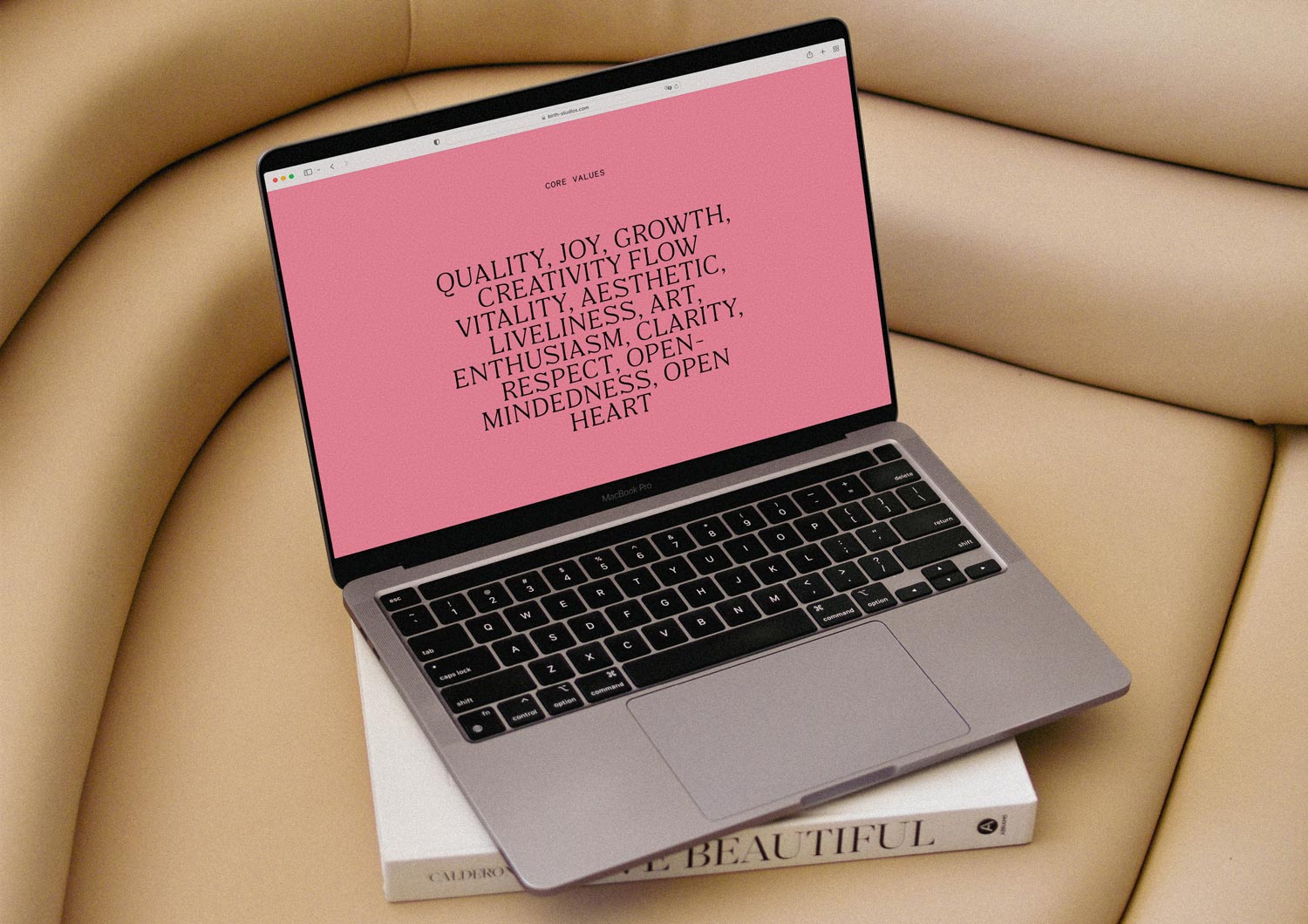
Through an in-depth brand strategy, we identified the brand’s strengths and opportunities, positioning it effectively in the market and defining how to connect with its ideal audience. We wanted to craft a brand identity that is energetic, empowering, and aware. The audience should feel safe and authentic when engaging with the brand. Values of well-being, joy, transformation, creativity, and aesthetics guided the branding process. This comprehensive approach enabled us to develop a visual roadmap that ensured a smooth branding journey.
◦ Birth Studios ® Logo Concept
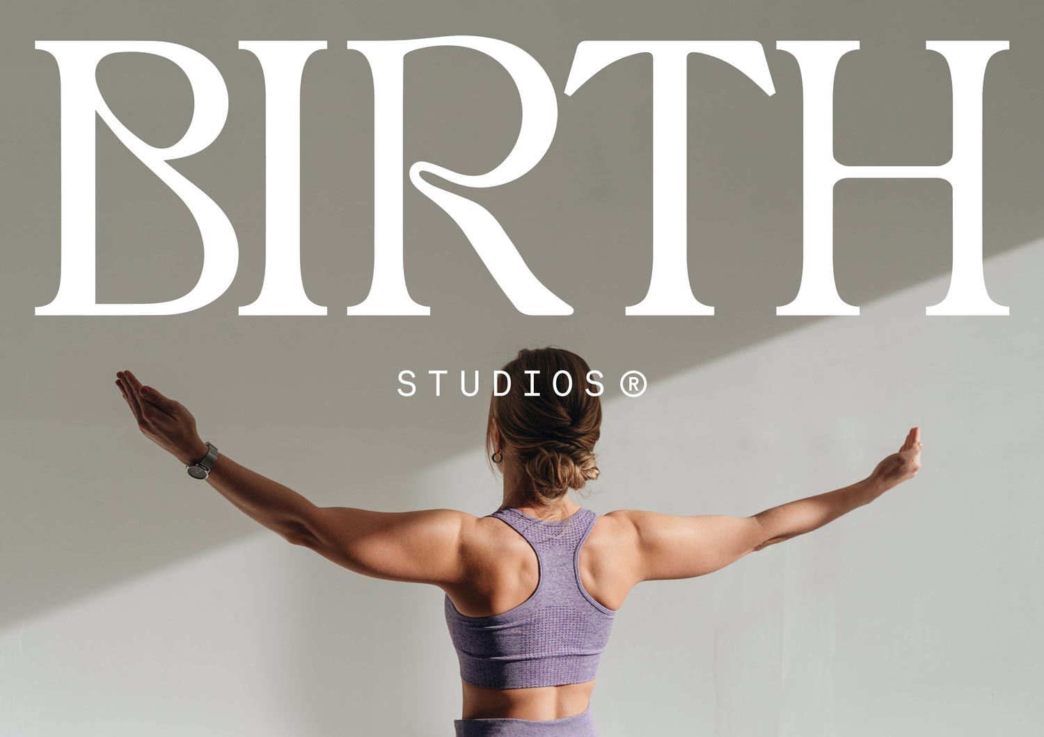
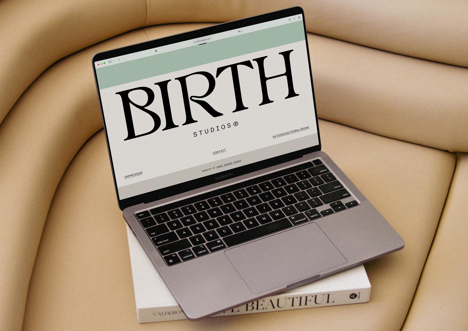
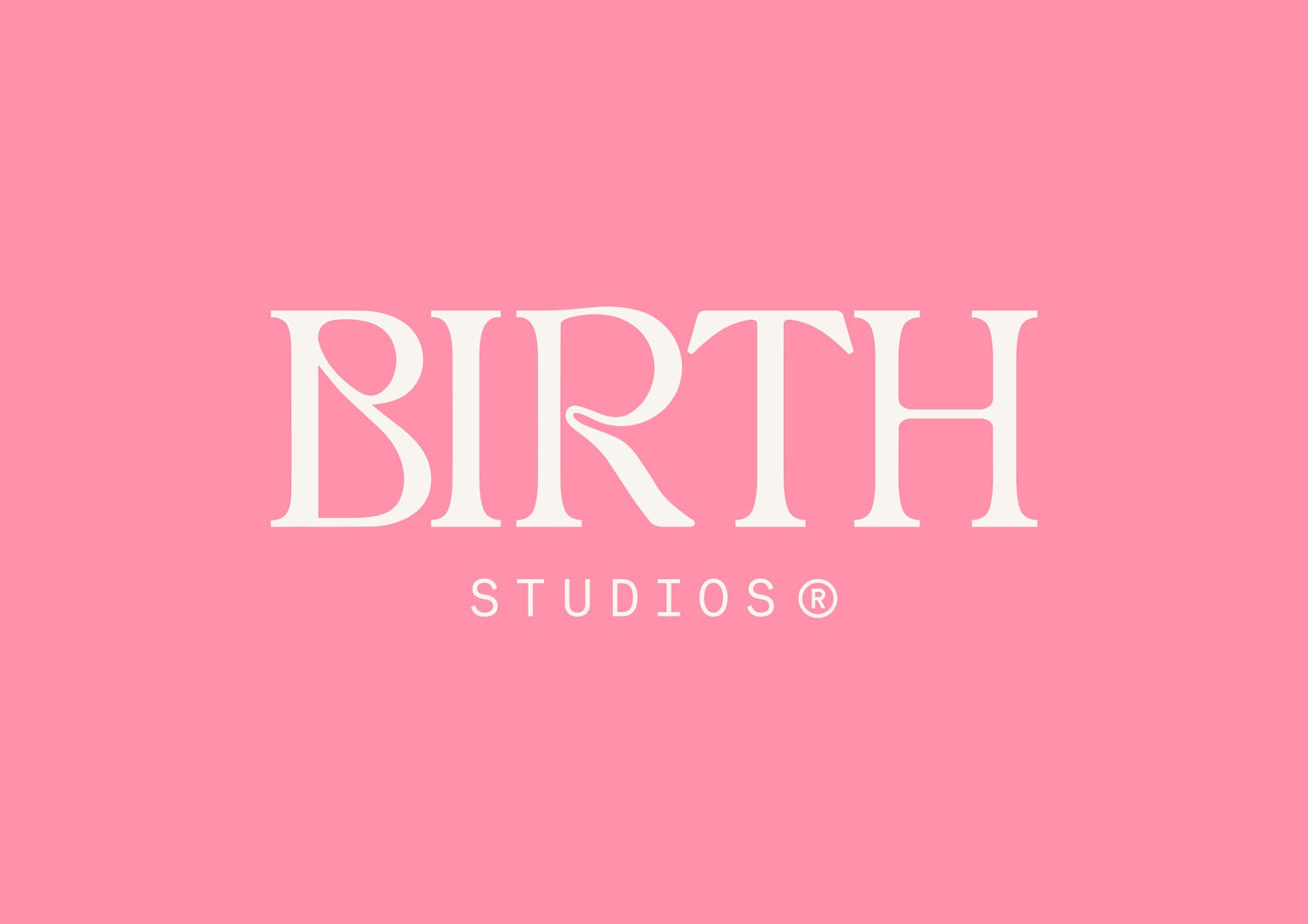
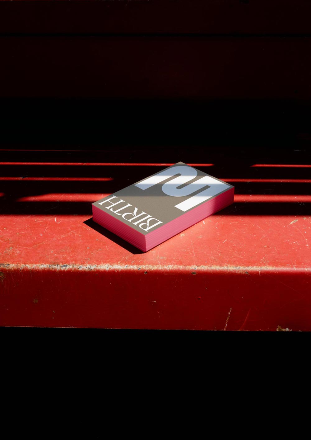
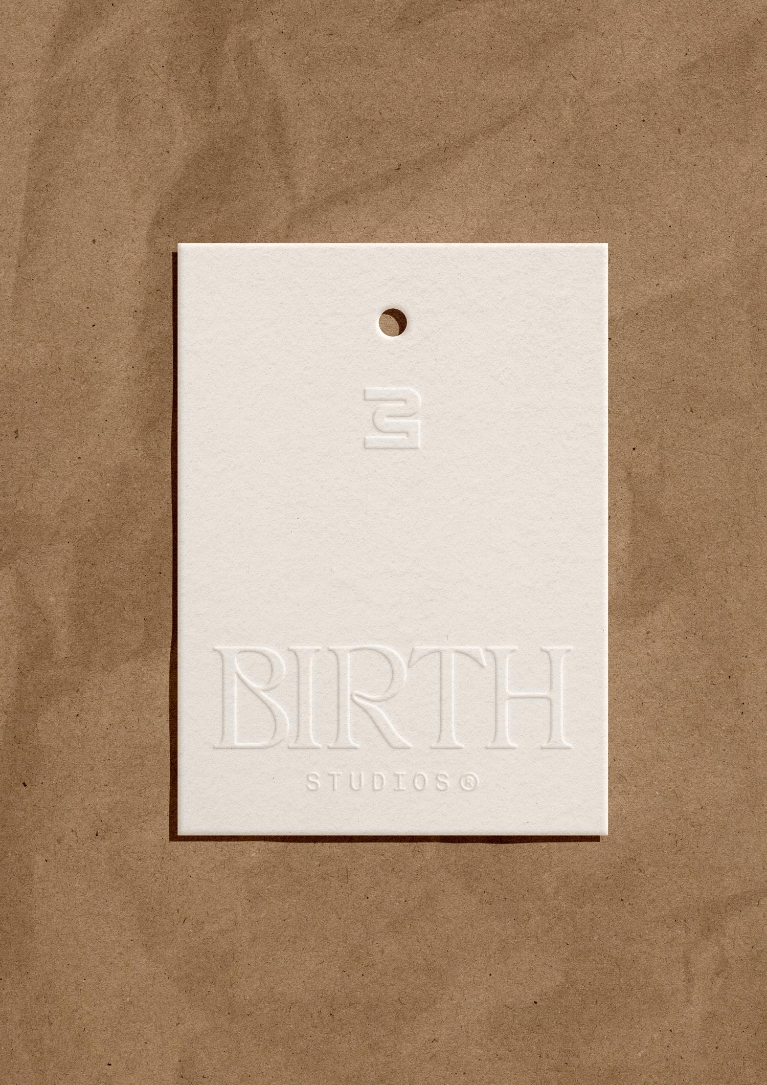
The wordmark was created using two fonts, then individually adjusted. Each letter stands out due to the stable serifs and capital letters, yet together they form a gentle unity. The letters B and R are particularly notable, connecting the other letters and adding uniqueness to the wordmark.
In a figurative sense, you can recognize a “birthing process” in the typography, as the B resembles a women’s body during pregnancy, while the R suggests an umbilical cord, subtly conveying the brand’s name. The addition of STUDIOS can be included or omitted as needed.
◦ Secondary Logo
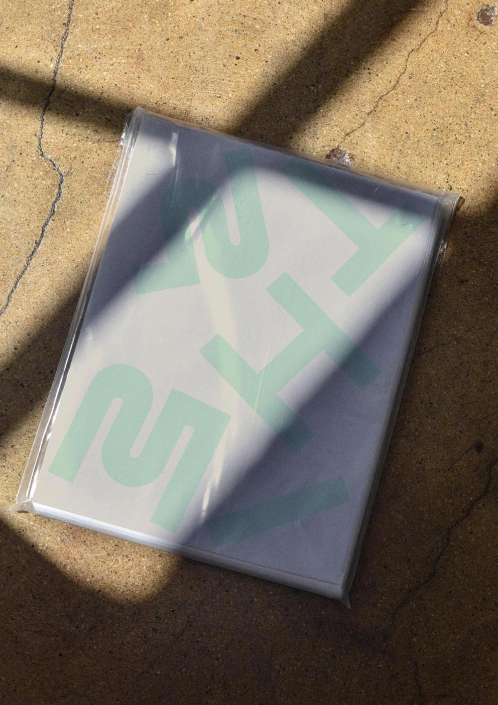
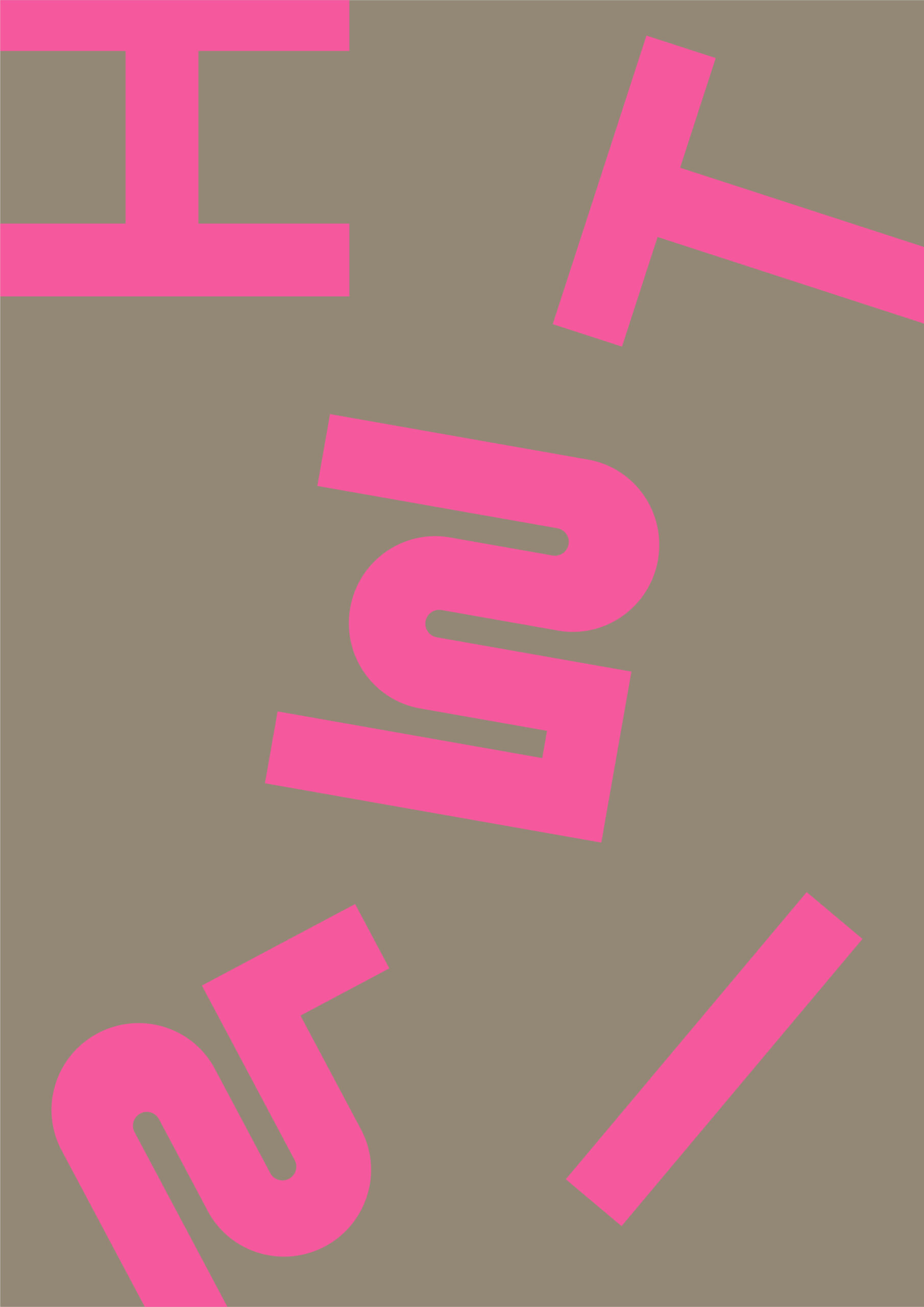
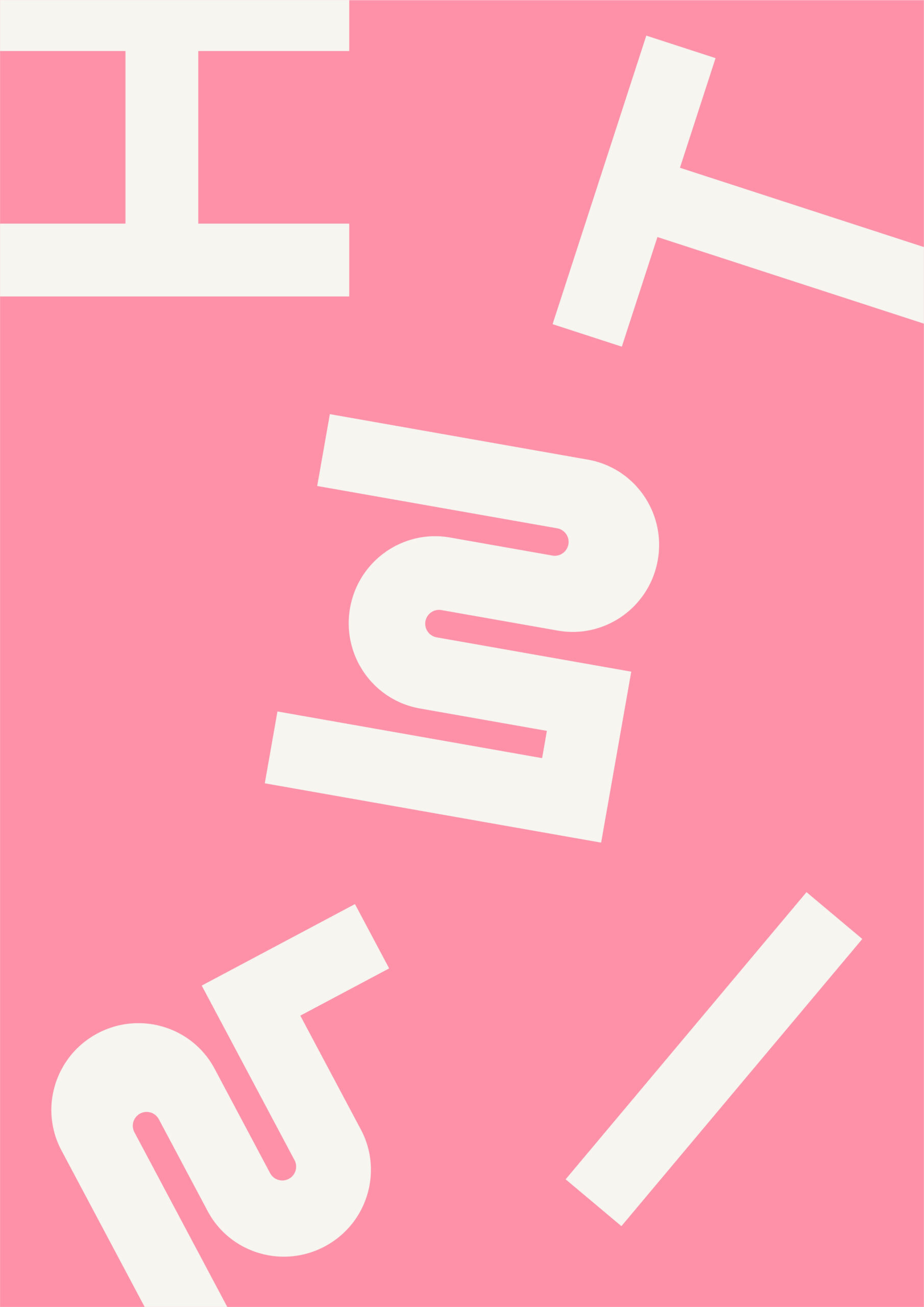
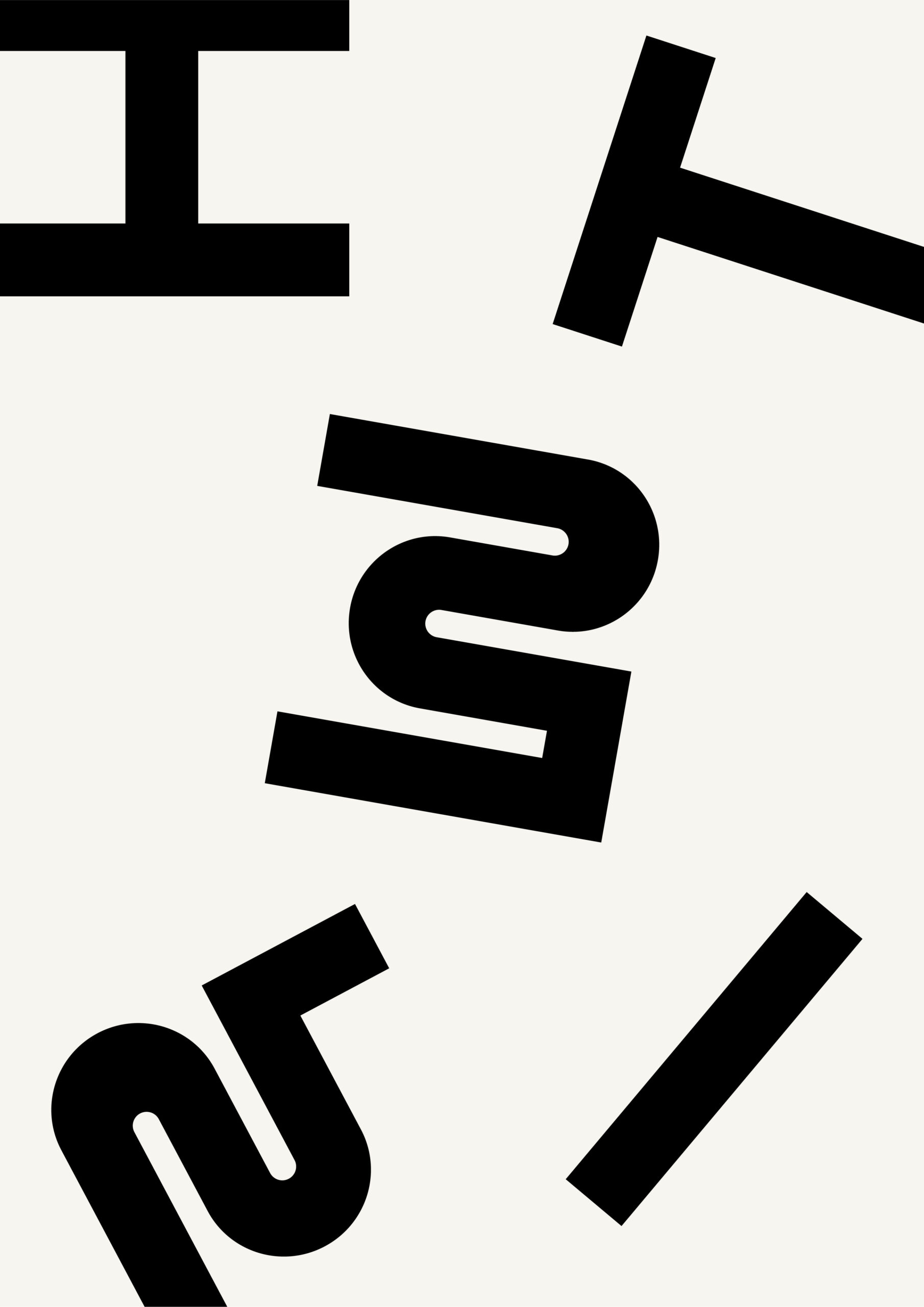
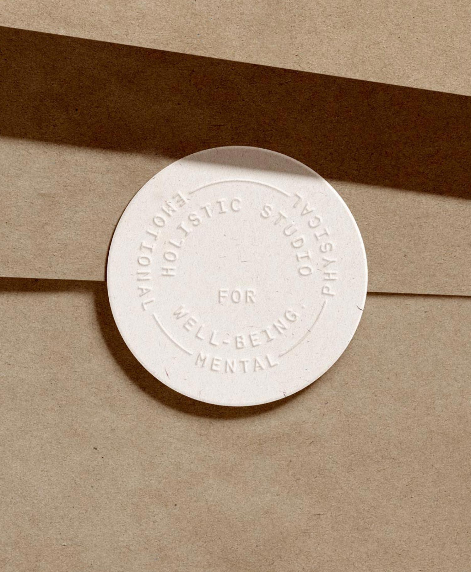
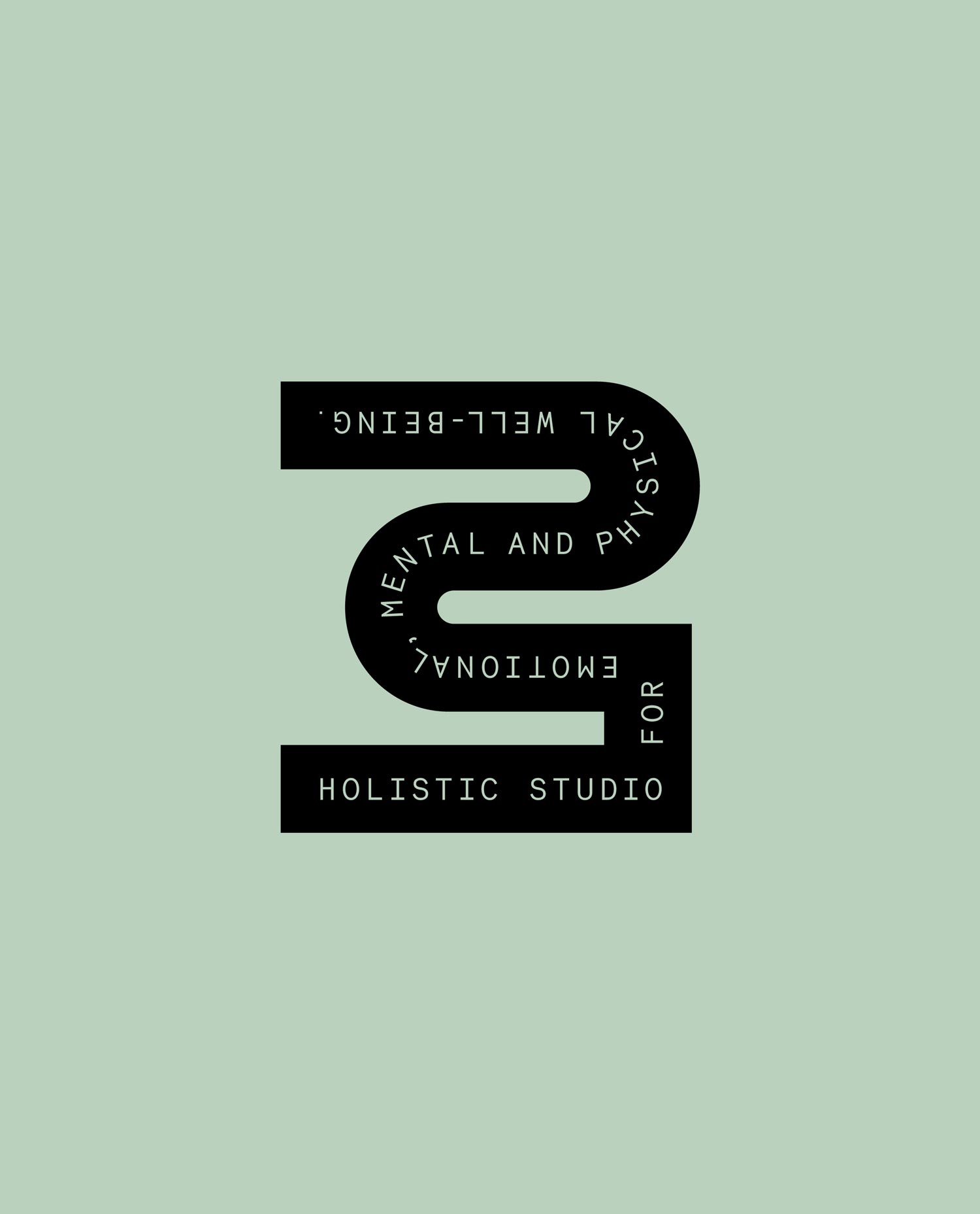
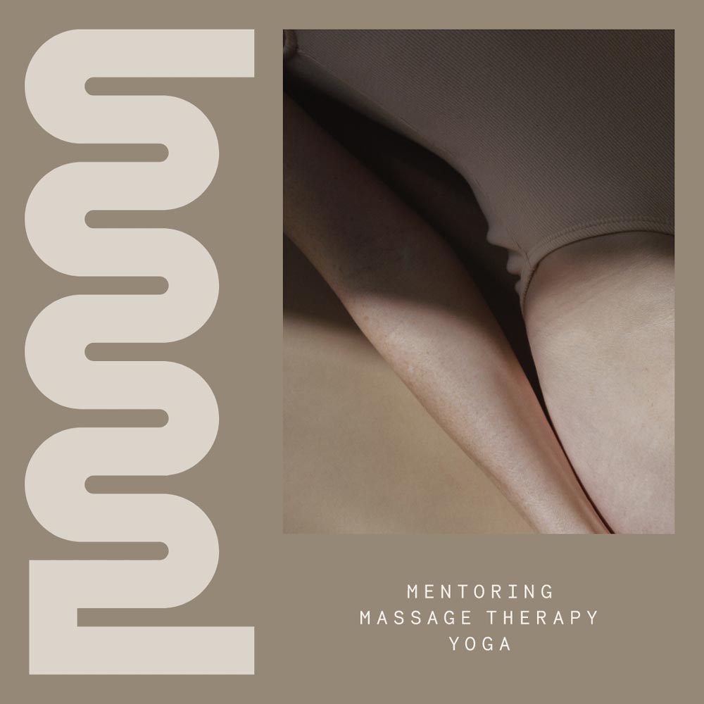
The secondary logo serves as a versatile brand pattern, providing letter components that form the basis for individual design elements within the visual identity. The B can be extracted as a signet or monogram, and all letters can be used to create playful shapes and patterns.
The B and R, again, stand out for their noticeable combination of clarity & stability with flow & movement. They echo the subtle “birthing process” concept. Each letter, when rotated, offers an engaging visual interaction, which makes the design process not only flexible but also enjoyable.



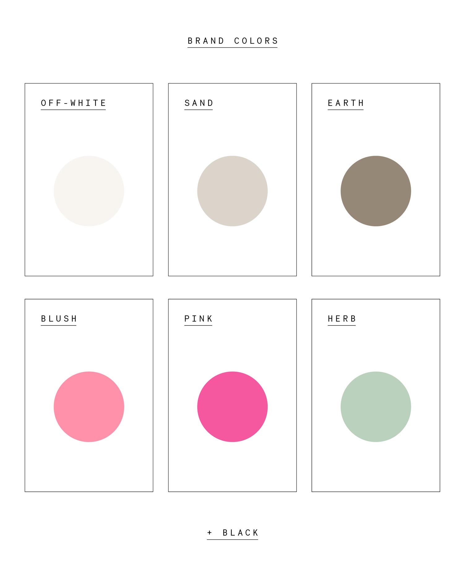
◦ Birth Studios ® Color Palette
The color palette reflects both the joy and fun, as well as the calm and grounding that BIRTH represents. Powerful colors are paired with tranquil tones: two shades of pink symbolize abundance and positivity, while herbal green evokes wellness and relaxation. These vibrant yet soothing hues are designed to engage the senses.
Earth tones ground the brand and the viewer, promoting peace and well-being. Off-white signifies clarity and health, and black provides contrast, particularly for text and similar elements. This harmonious blend of colors reinforces the brand’s commitment to holistic well-being and aesthetic appeal.
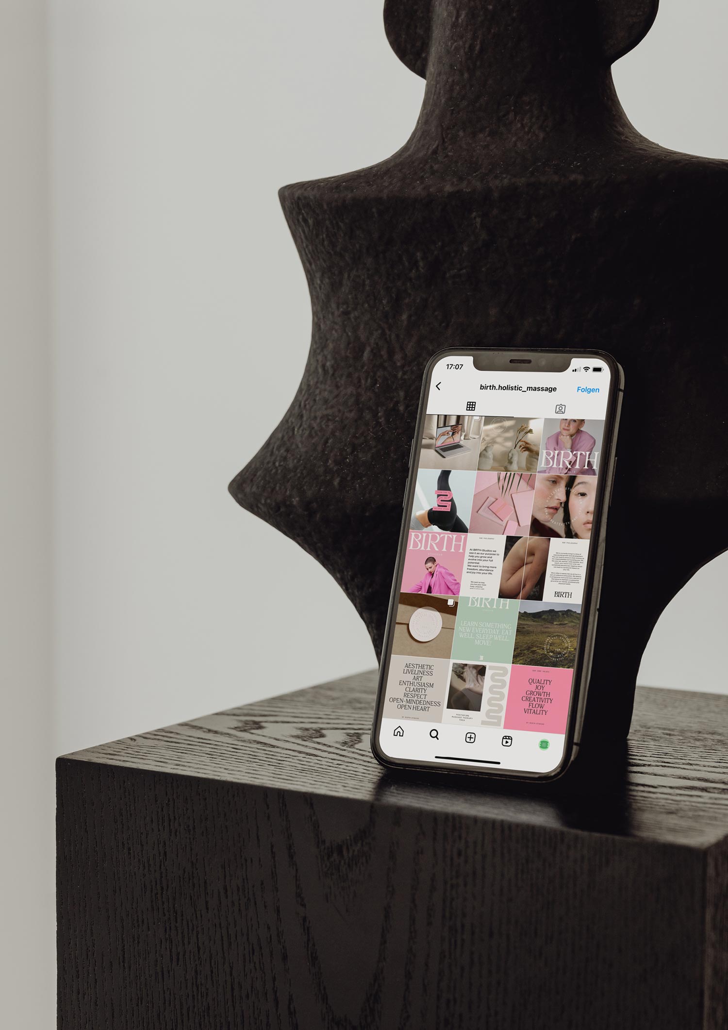
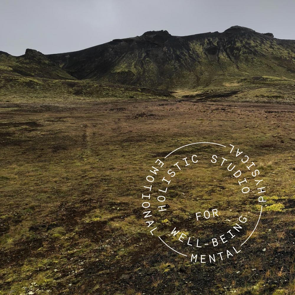
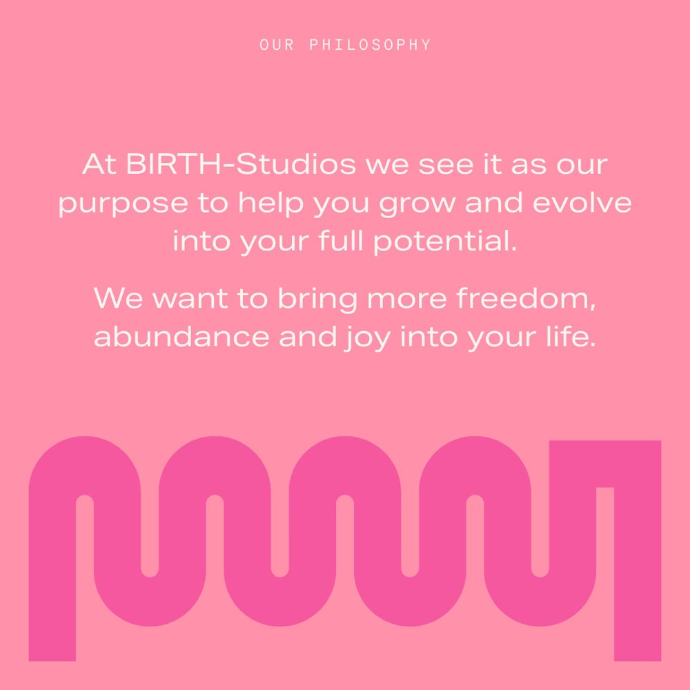
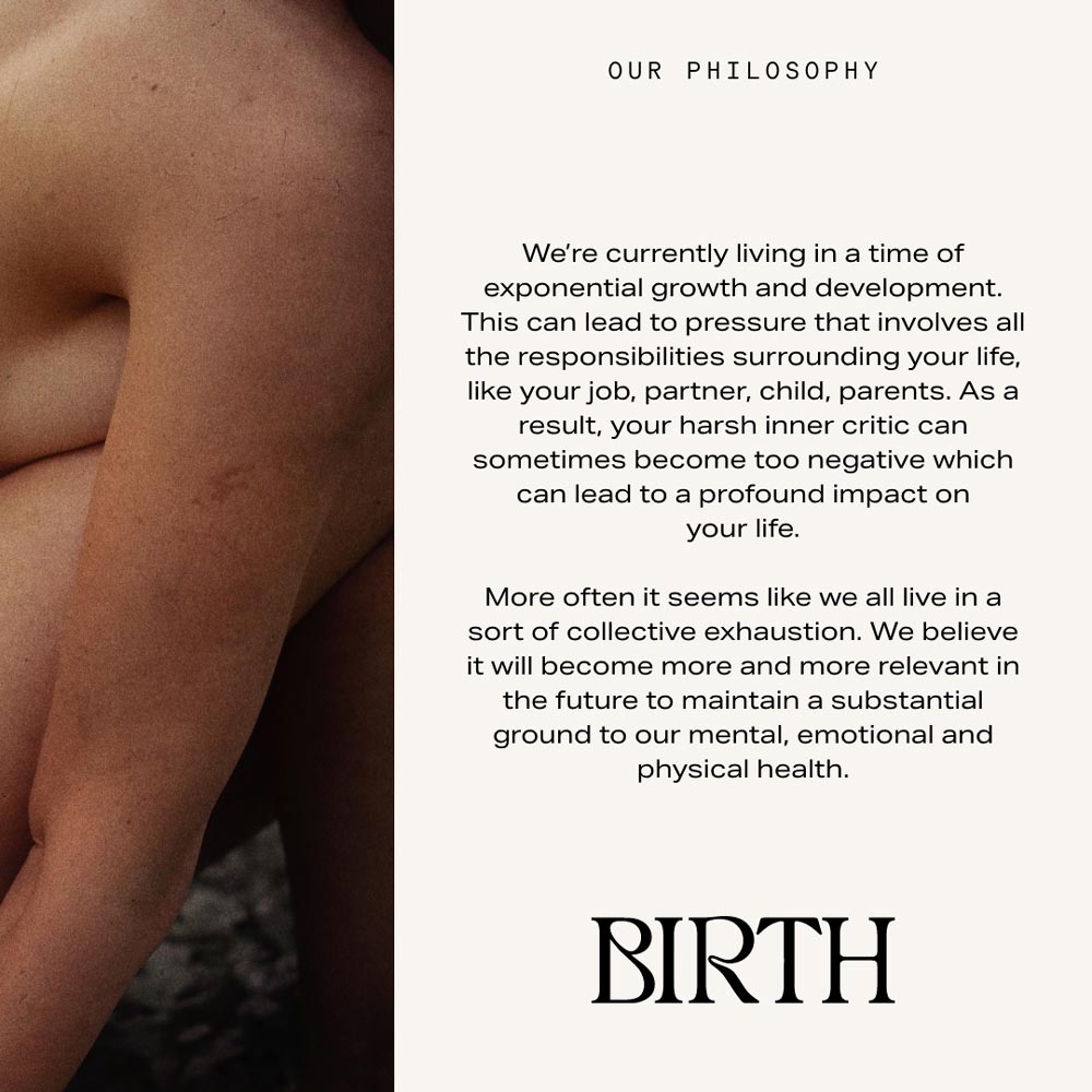
◦ Instagram Concept
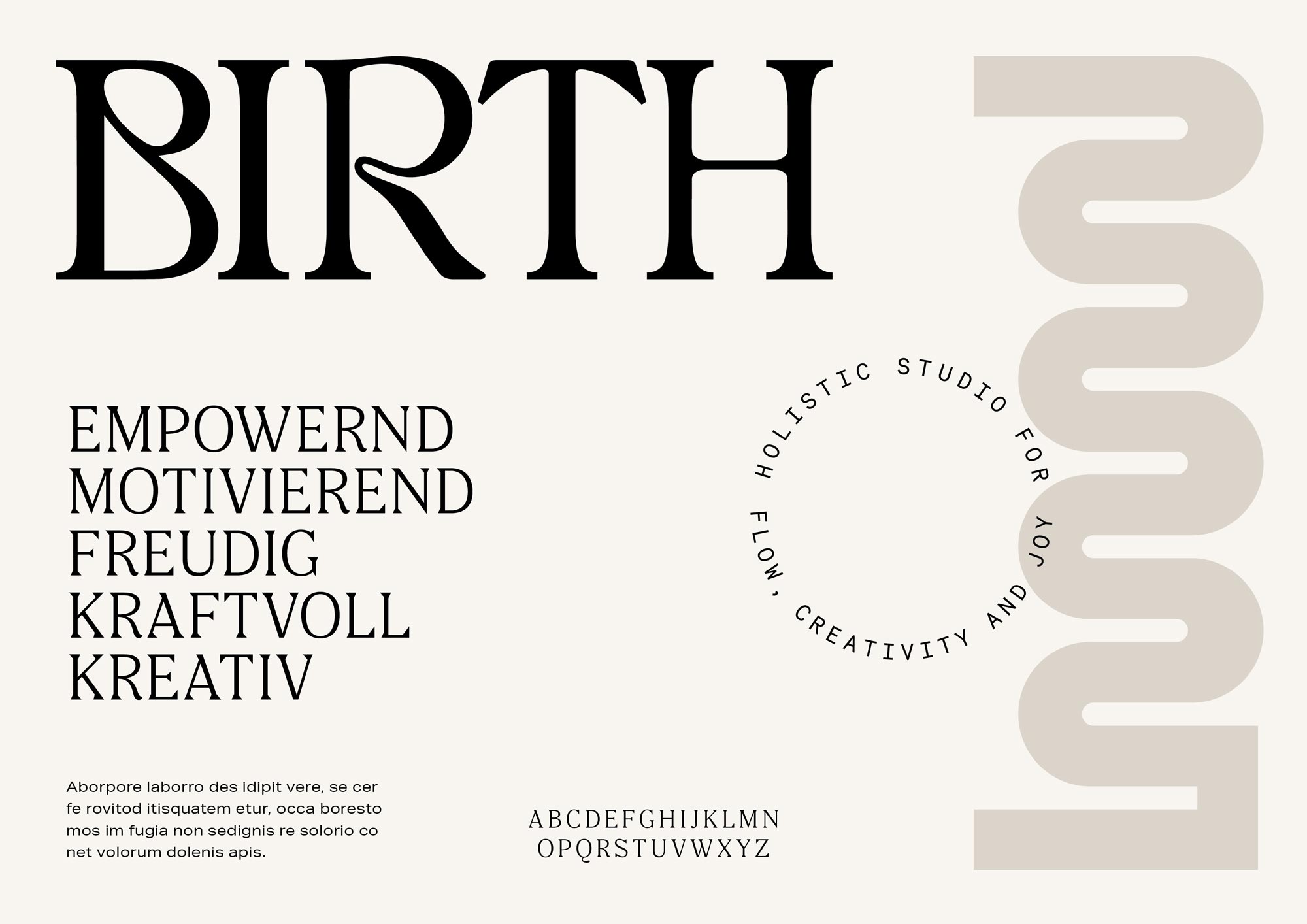
◦ Brand Typography
The font selection is gentle, lively, and strong. The headline font formally connects the wordmark with the other two fonts and represents balance by uniting various font characteristics.
The extended body text font adds grounding to the visual identity, while the subheadline font complements the glyphs of the secondary logo due to its uniform stroke width.

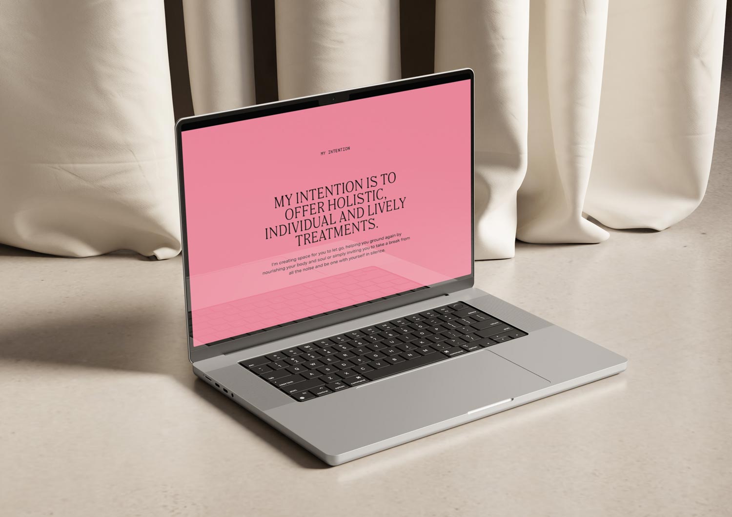
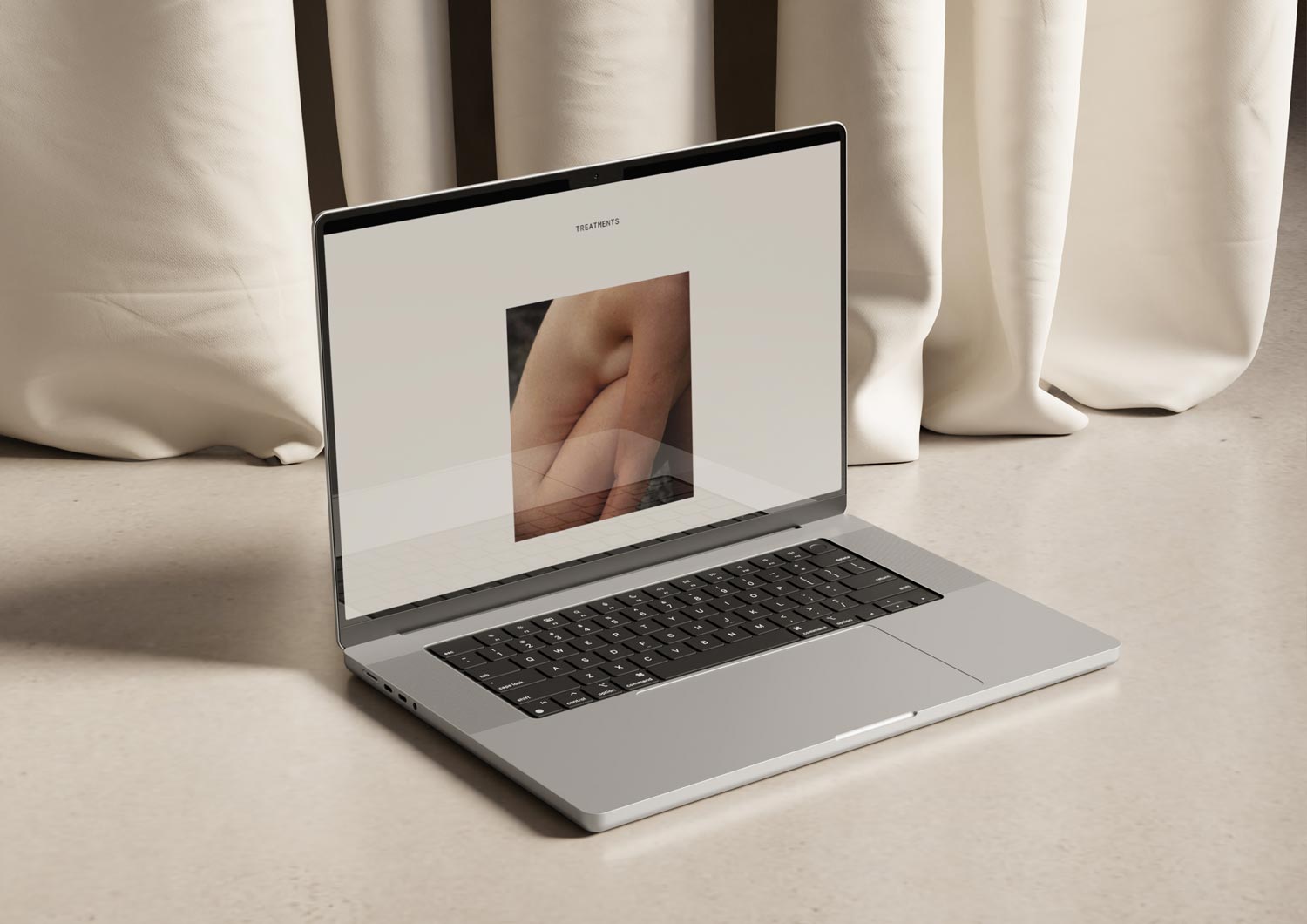
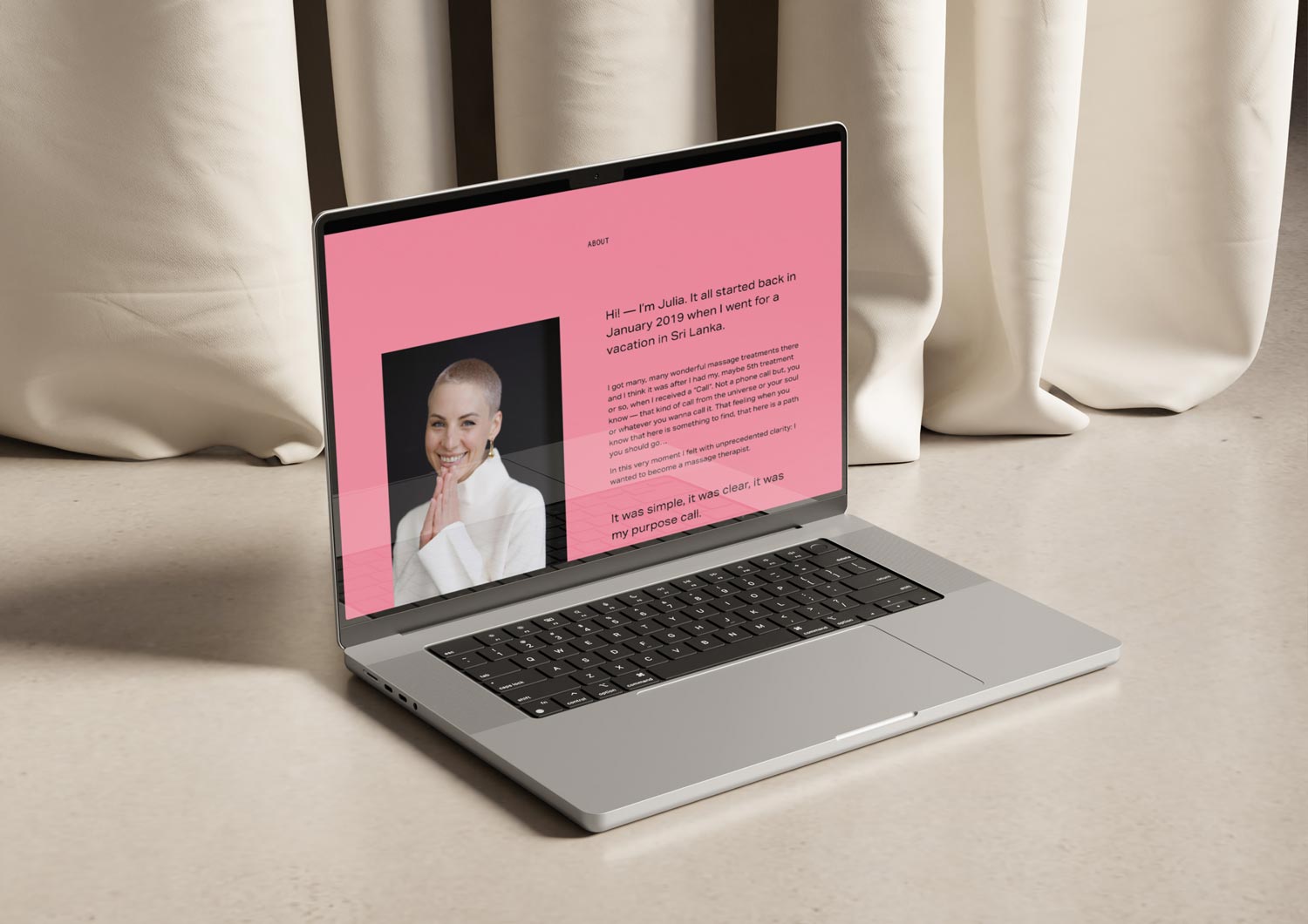
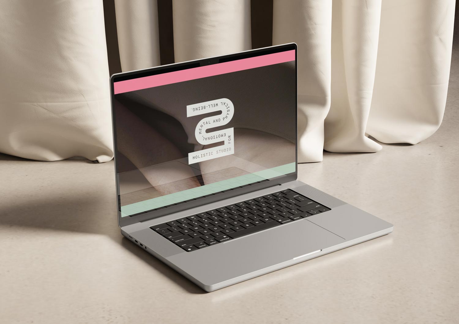
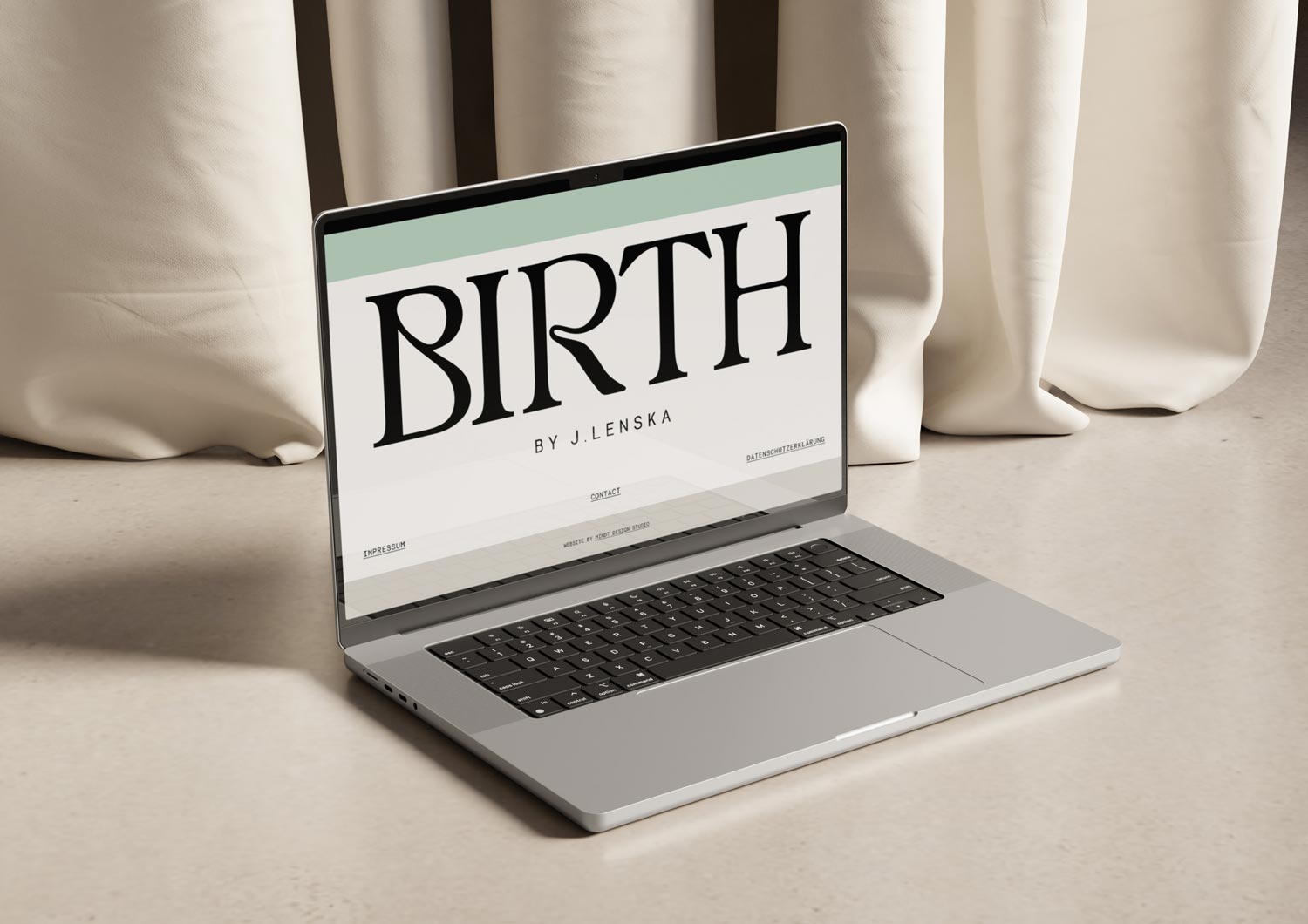
◦ Web Design
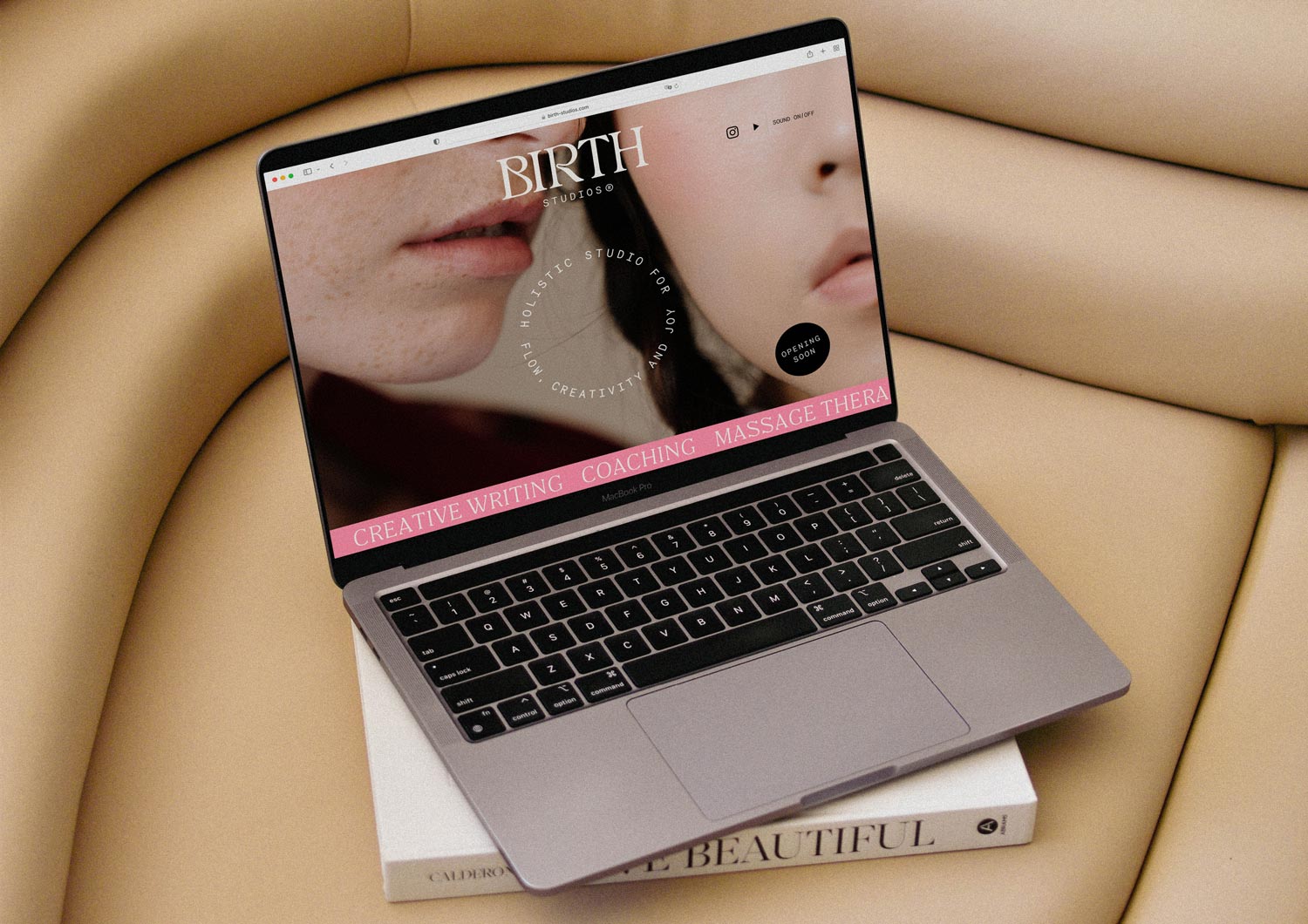
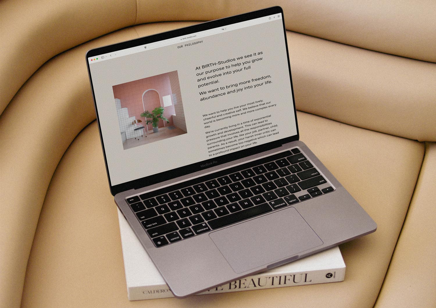
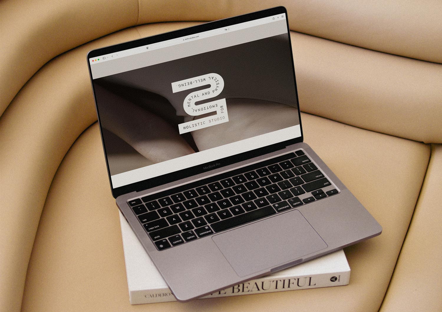
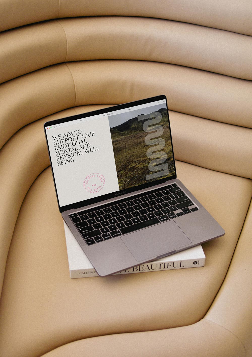
Our goal was to create an inviting, aesthetically pleasing digital space that attracts the target audience to the studio. Visitors should feel the grounding and relaxation that awaits them. Through the website, they can sense that the brand exudes holistic well-being and vitality.
In 2023, the branding and website received a conceptual update to reflect the brand’s increased focus on massage therapy. We seamlessly adapted the visual language without substantial changes, ensuring consistency and coherence across the entire brand experience.
☺︎ Vibe
Cheerful・Delightful・Alive
Aware・Motivational・Forward・Strong
Empowering・Creative・Gentle
» I’m deeply impressed by what you do. Your aesthetic perception coincides with mine 100%. Your expression involves a sublime amount of aesthetics and sensitivity. I love it. Thank you for everything! « Julia Lenska, Founder
☺︎ Like What You See? Let’s Start Your Project!
Selected Projects

OH OH OM ® Ethical SportswearBrand Strategy & Design
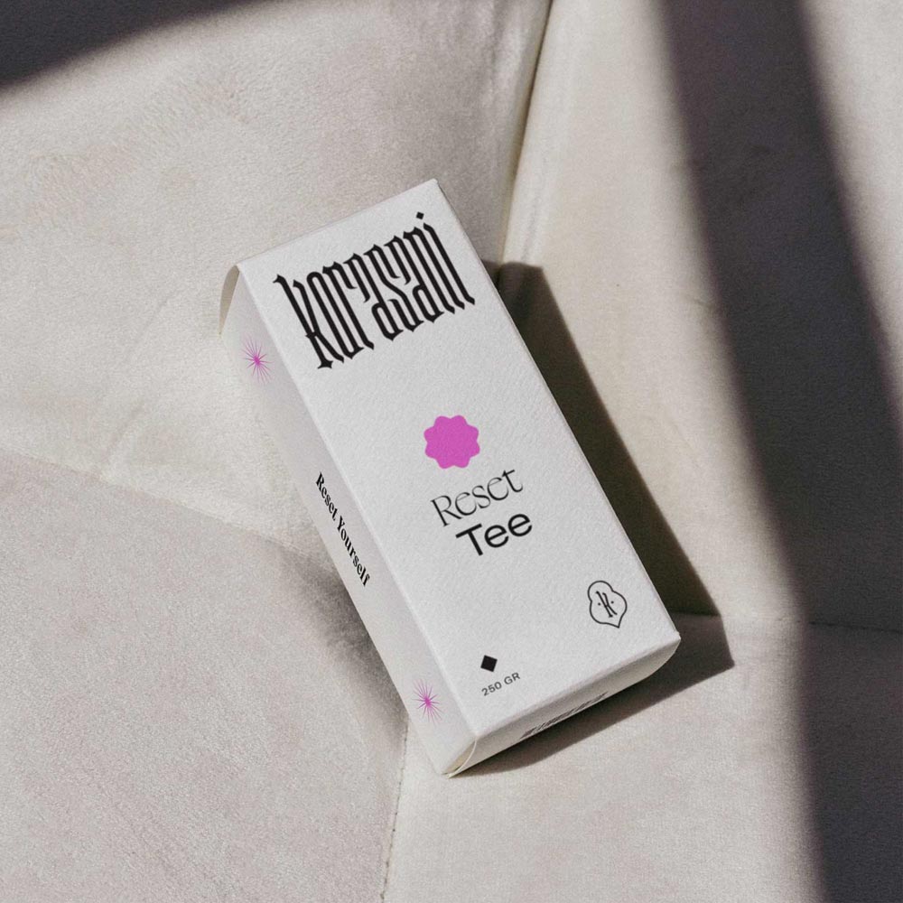
Korasani ®Brand Identity, Collateral & Web Design
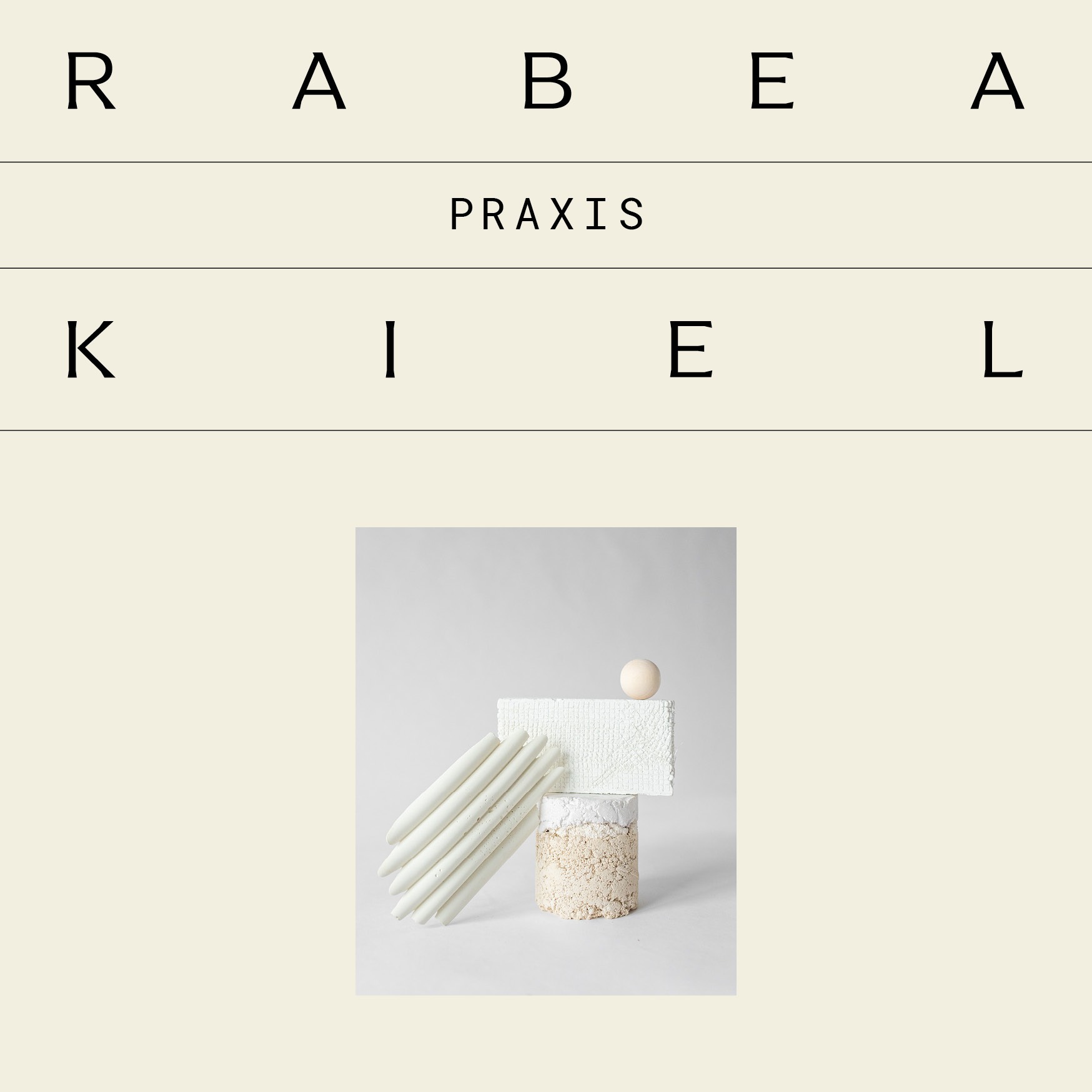
Praxis Rabea KielProject type
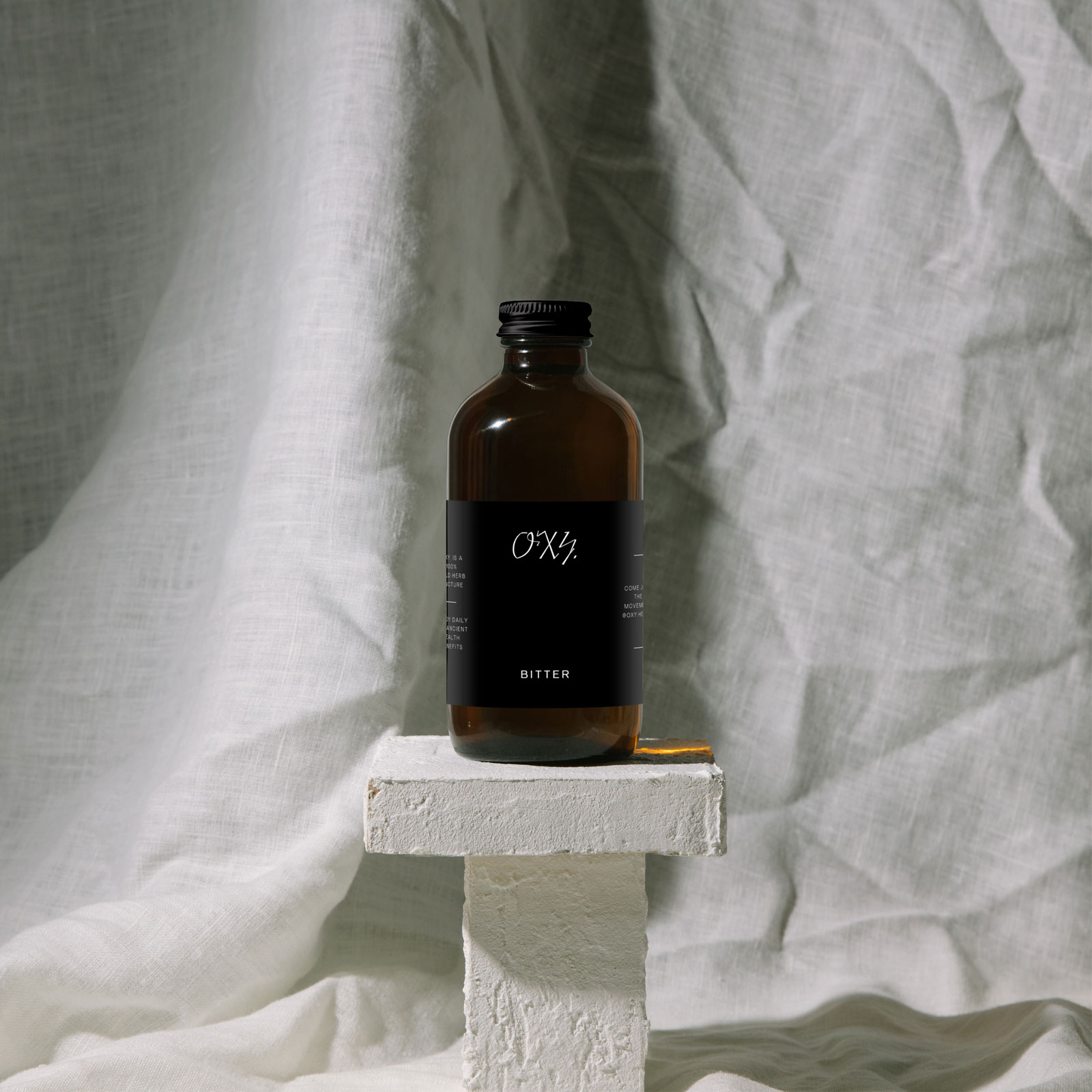
Drink OXY.Project type
britta weisserProject type
bárur therapyBrand Strategy & Identity, Collateral

Join The Designer’s Well-Being Hub
Subscribe to the Mindt® Letter
Get Our Photo Bundles & Graphics
☺︎ We’re happy if we can inspire you—mutually be kind and professional and don’t copy or use any of our content without giving credit. This includes brand designs developed by us, the layout of this page, as well as any published texts.—Or, as Brian Collins has put it: »Be careful of doing too much work that copies the people you admire. Start out that way to see what feels right. But aim to seek what they were seeking instead of doing what they were doing.« ✌︎