Minimalist Corporate Design
Holistic Coaching & Trauma Therapy
☺︎ Services
Creative Direction
Brand Identity
Social Design
Collateral
☺︎ Client
Praxis Rabea Kiel
On Instagram

Context
Rabea Kiel is a holistic coach and trauma therapist who combines expertise from various areas such as art, coaching, spiritual values, and personal experiences. This unique integration creates an innovative offering. Her goal is to educate about trauma and trauma-related disorders, helping clients overcome their issues to rediscover joy and inner peace. By addressing and leaving behind old, blocking patterns, clients are empowered to live courageously and powerfully.
Our Approach
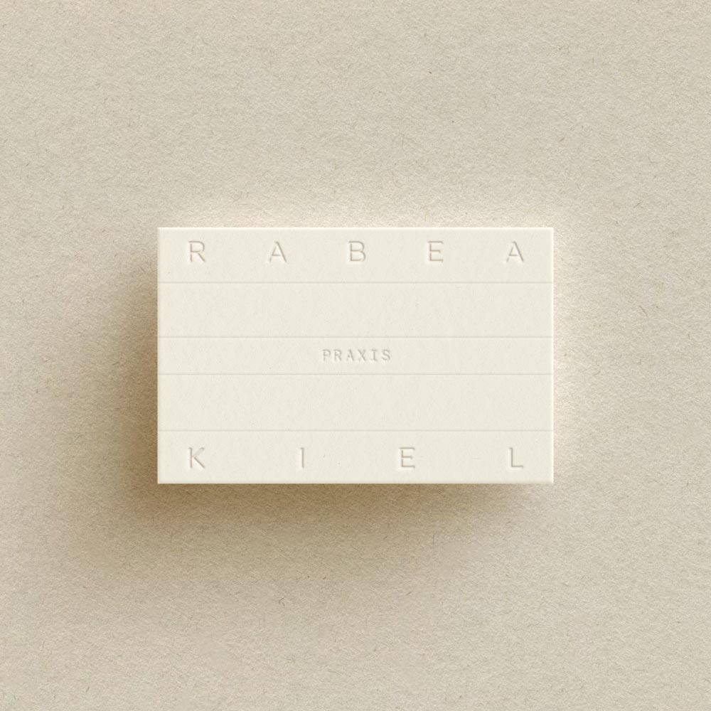
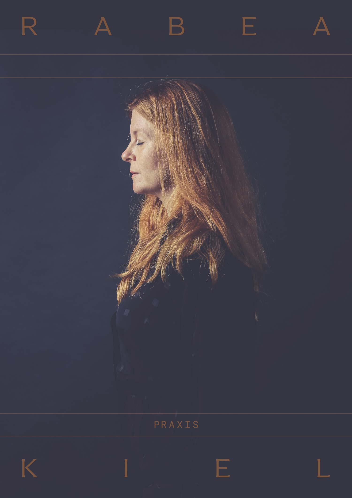
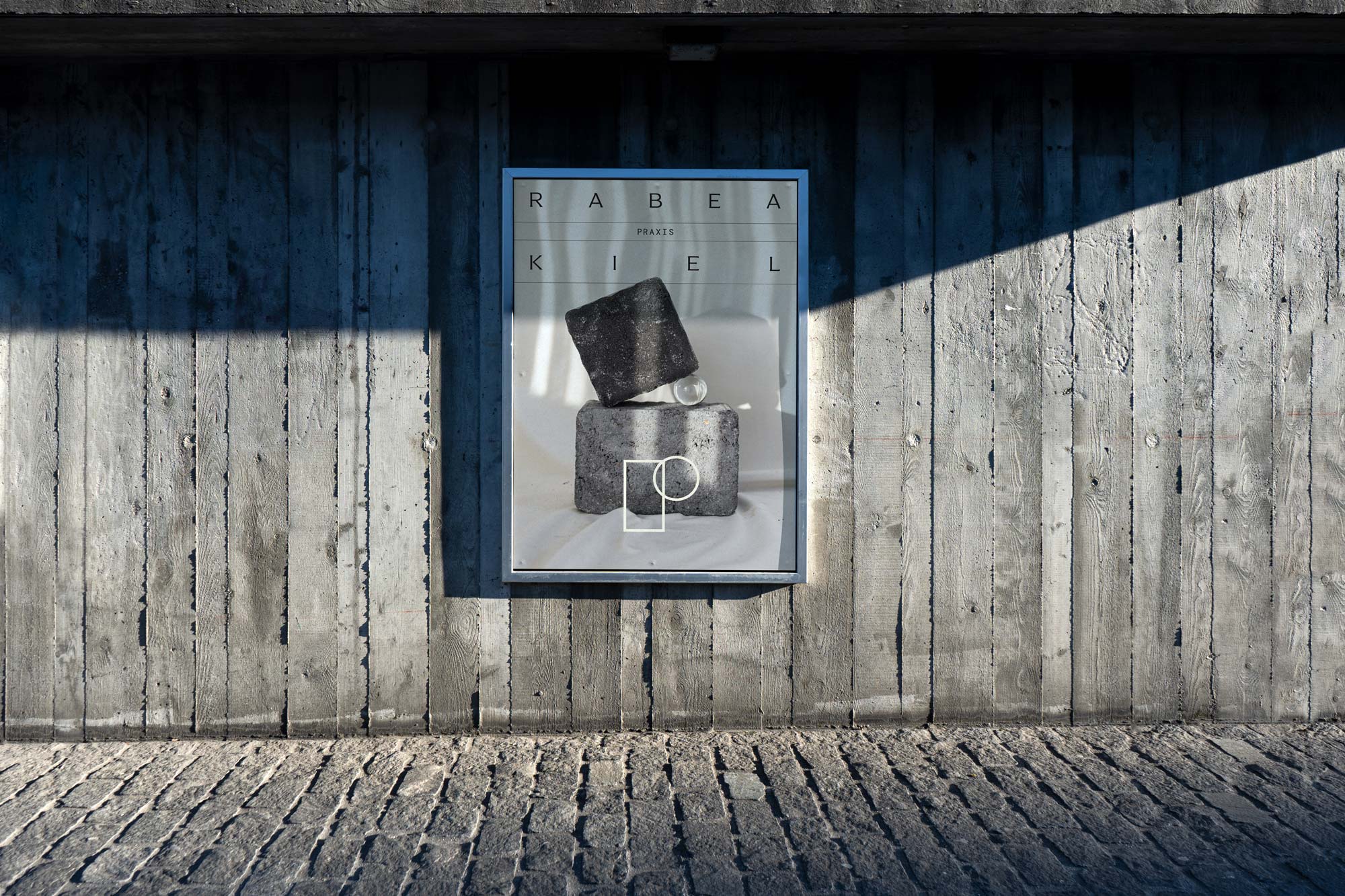
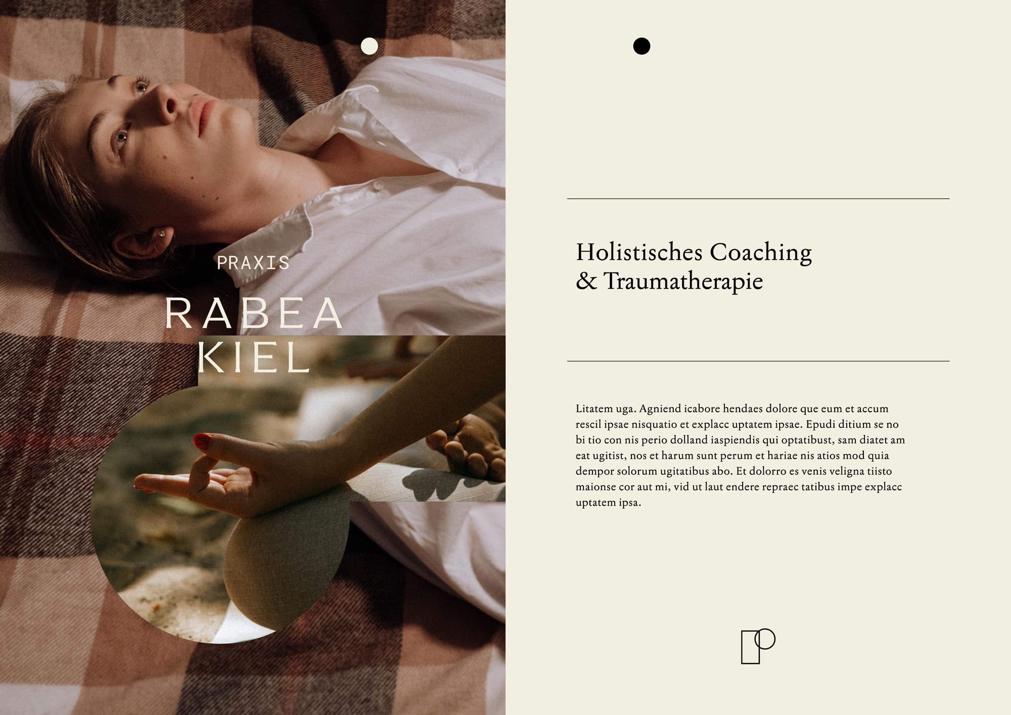
For this brand identity, we leaned into the concept of a “private practice” and crafted a premium visual experience with a simple design vocabulary. Emphasizing transformation and profound knowledge, the design had to reflect the level of exclusivity since Rabea’s clients purchase her services in addition to what is covered by insurance. We aimed for a brand design that is trustworthy, sensual, and intellectual, utilizing clean forms and typography to achieve this.
◦ Creative Direction
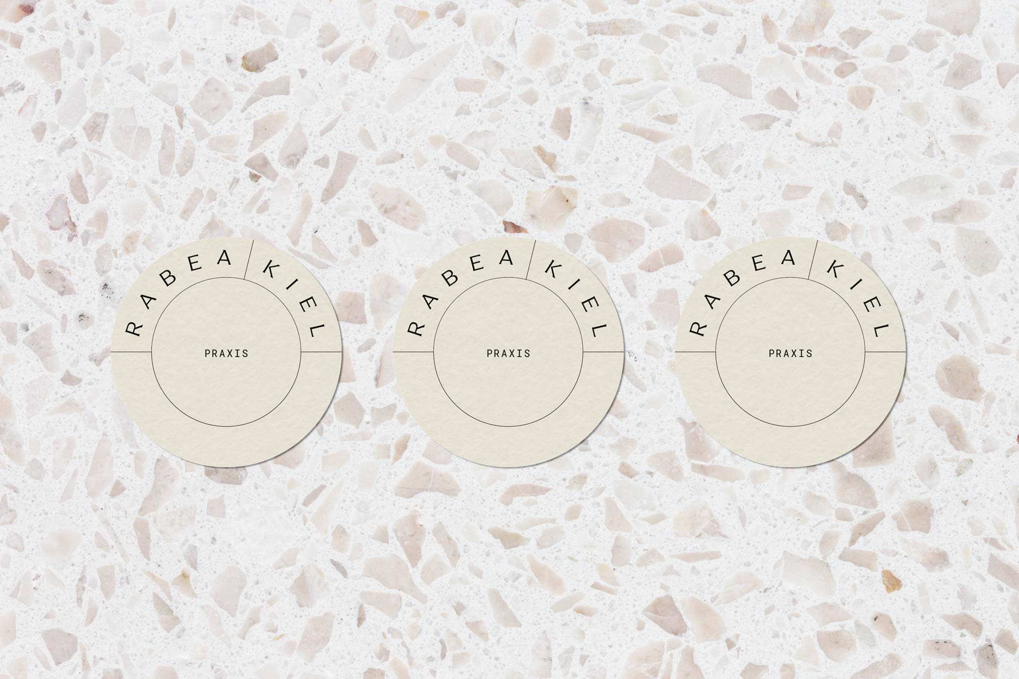
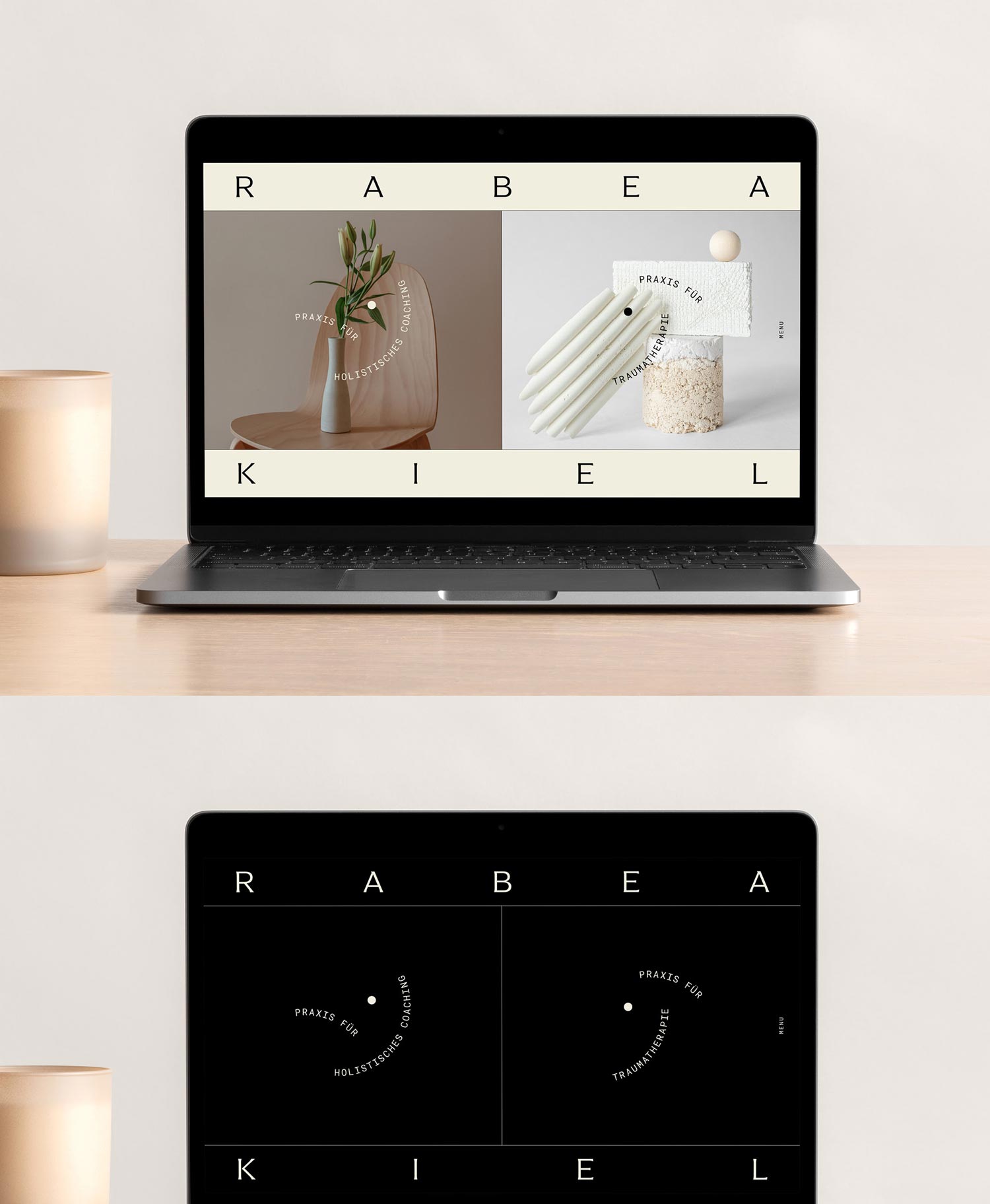
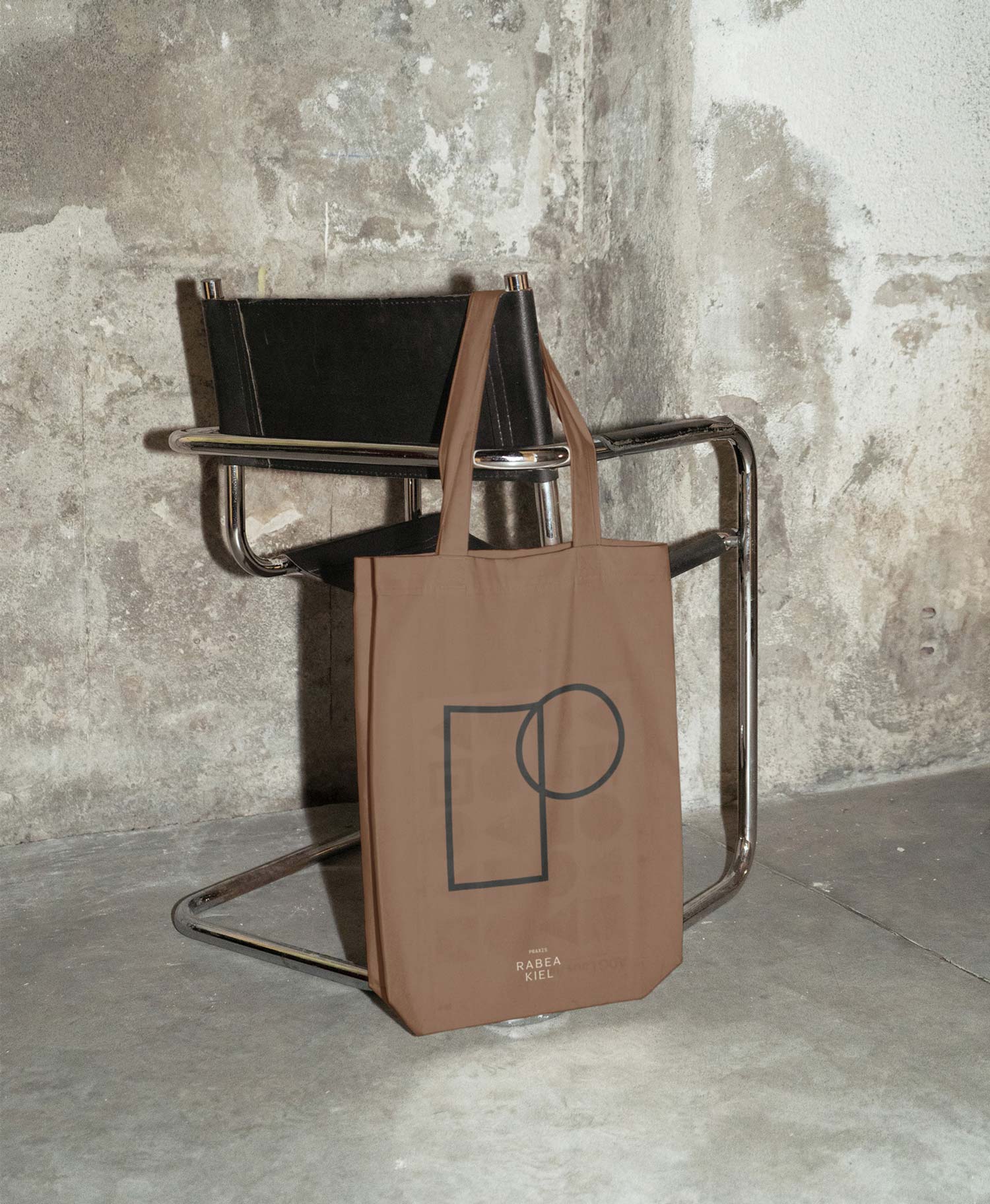
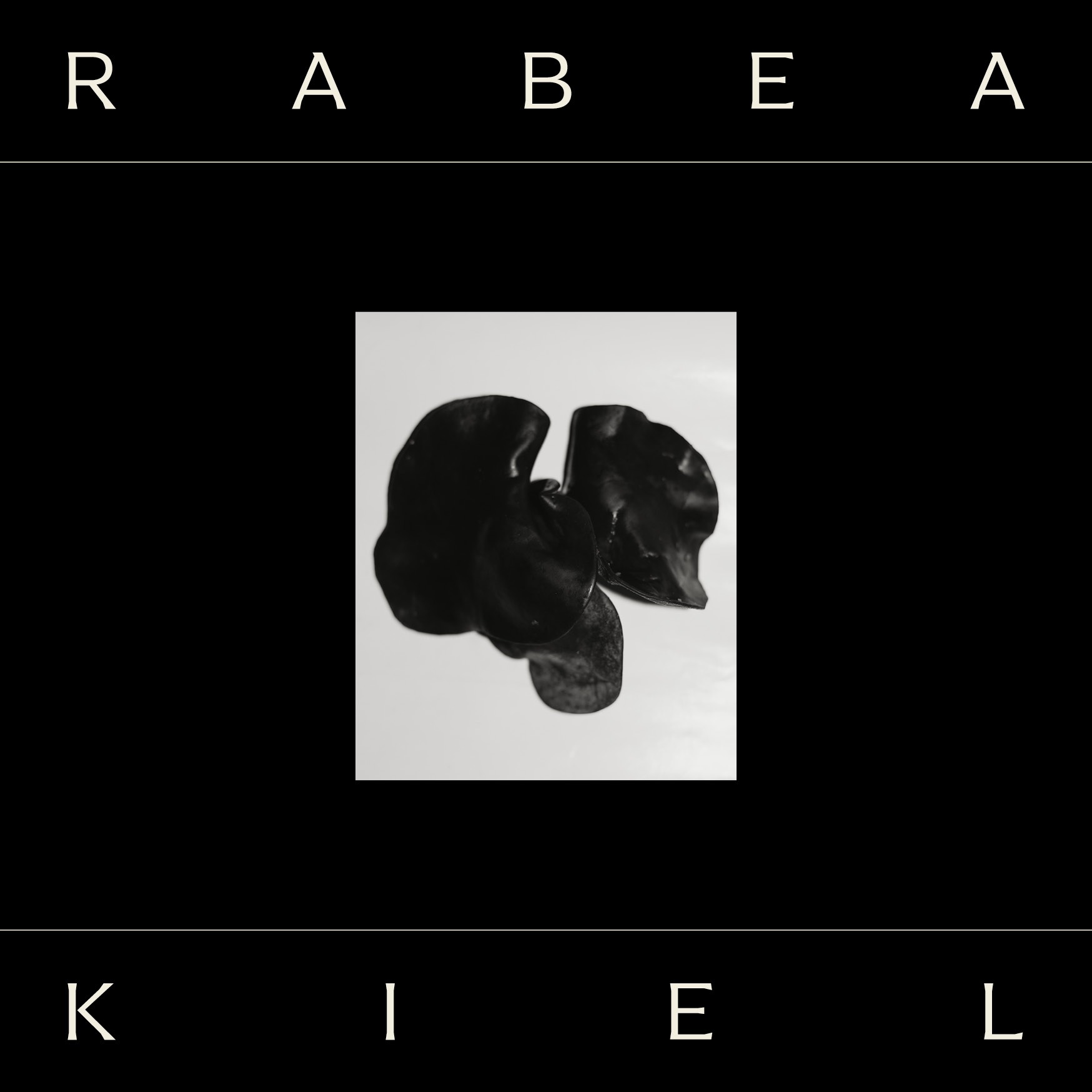
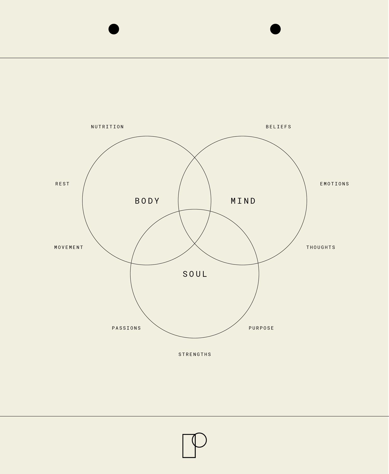
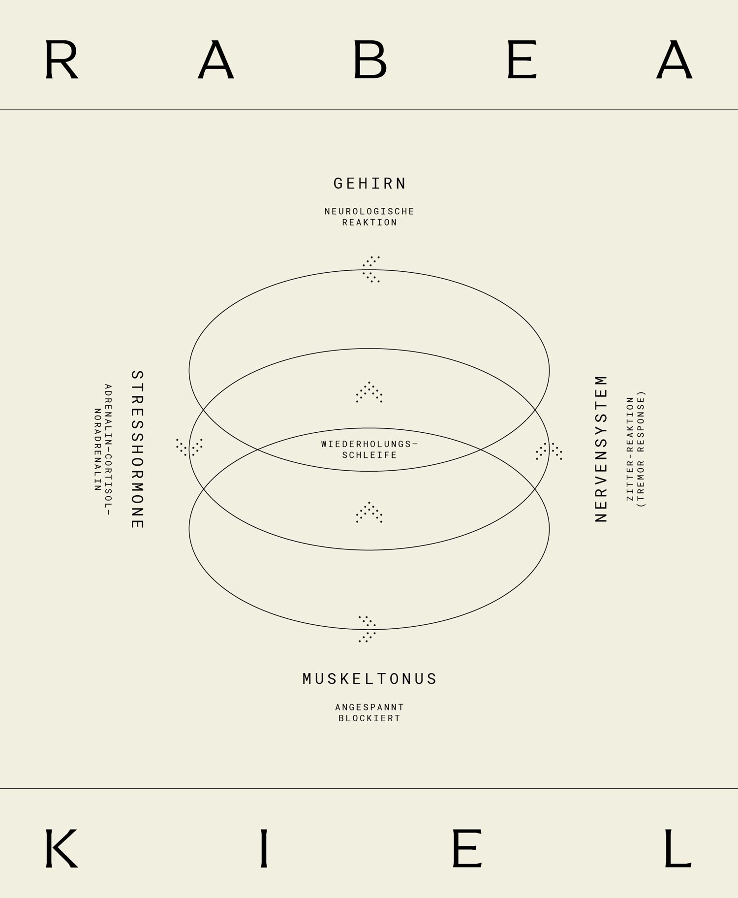
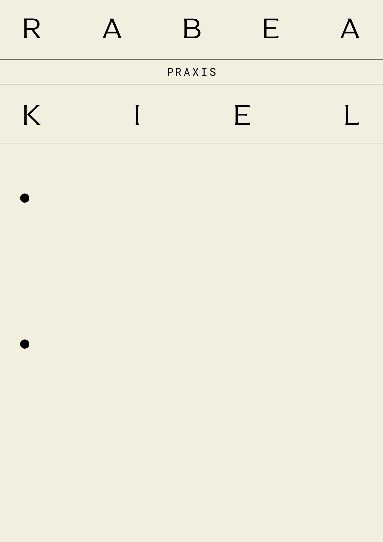
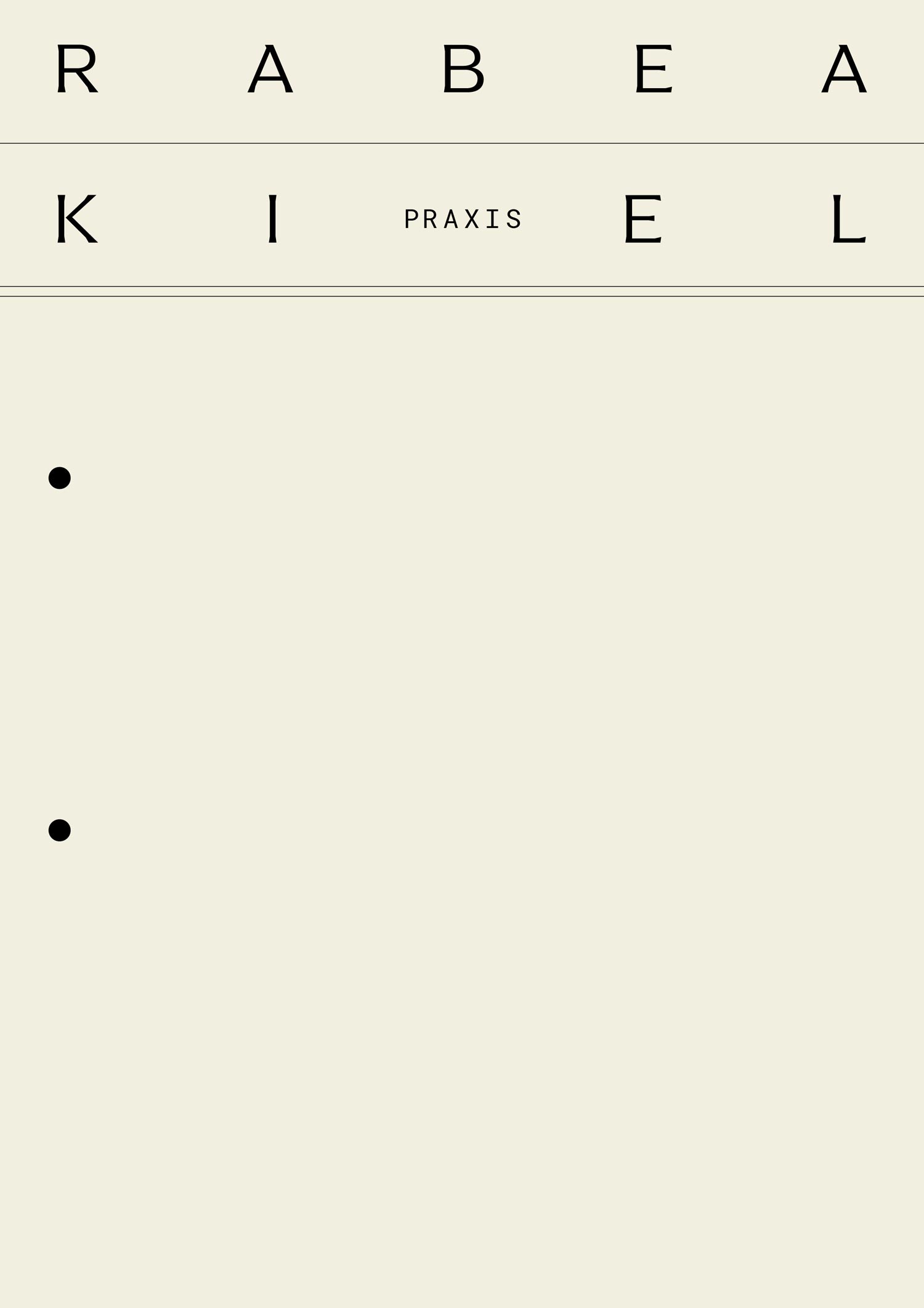
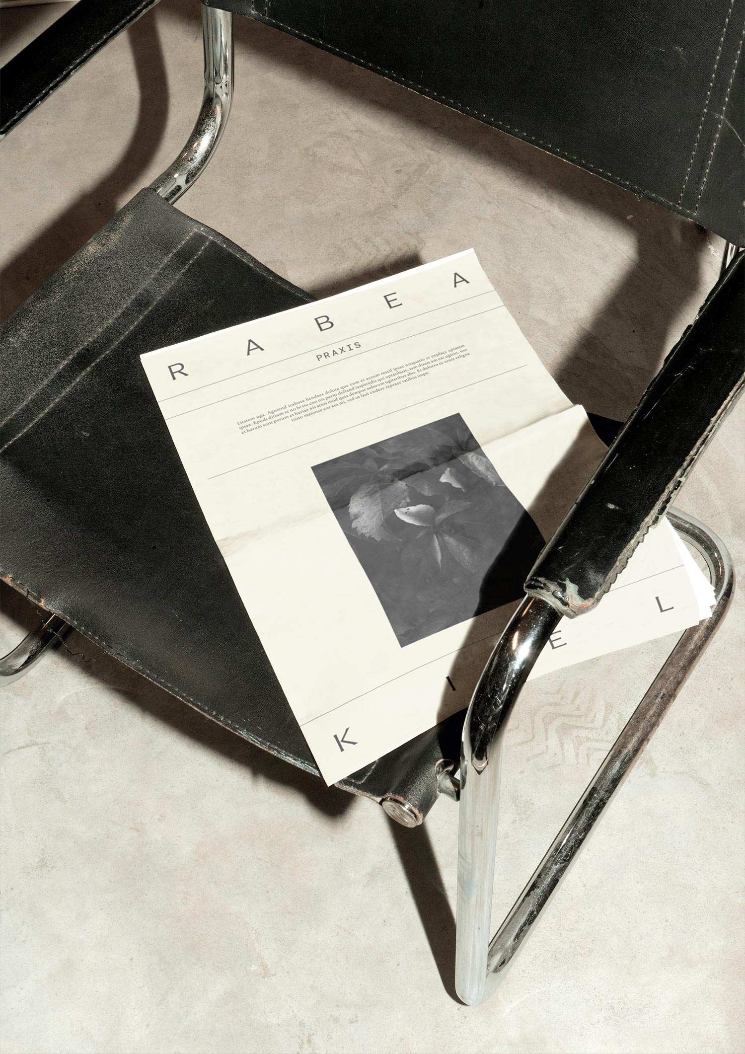
The term "practice" (dt. Praxis) was redefined in a modern and stylish way. The minimal style evokes associations of an archive or patient charts due to the lines, simple graphics, and ring binder appeal, radiating Rabea’s knowledge and competence. We went beyond this clinical component to create a feel-good atmosphere, akin to a boutique hotel, with attention to details such as door hangers and coasters.
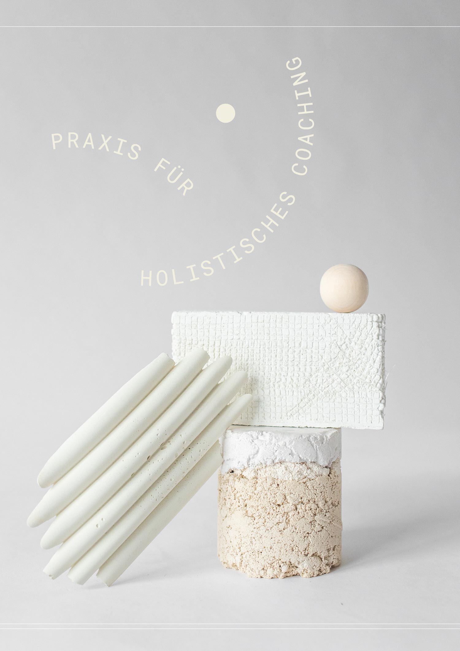
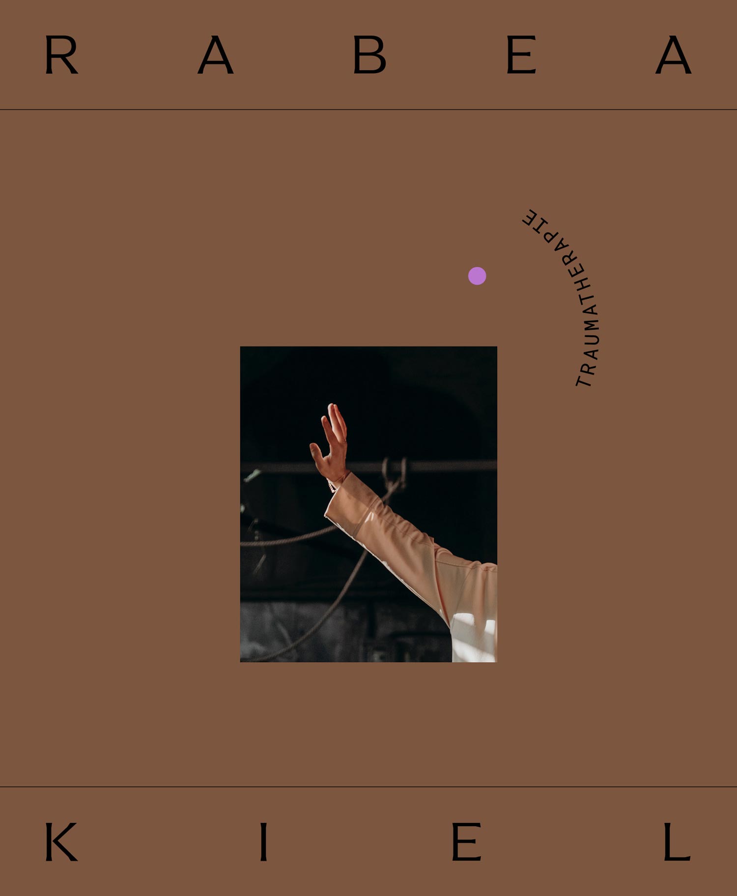
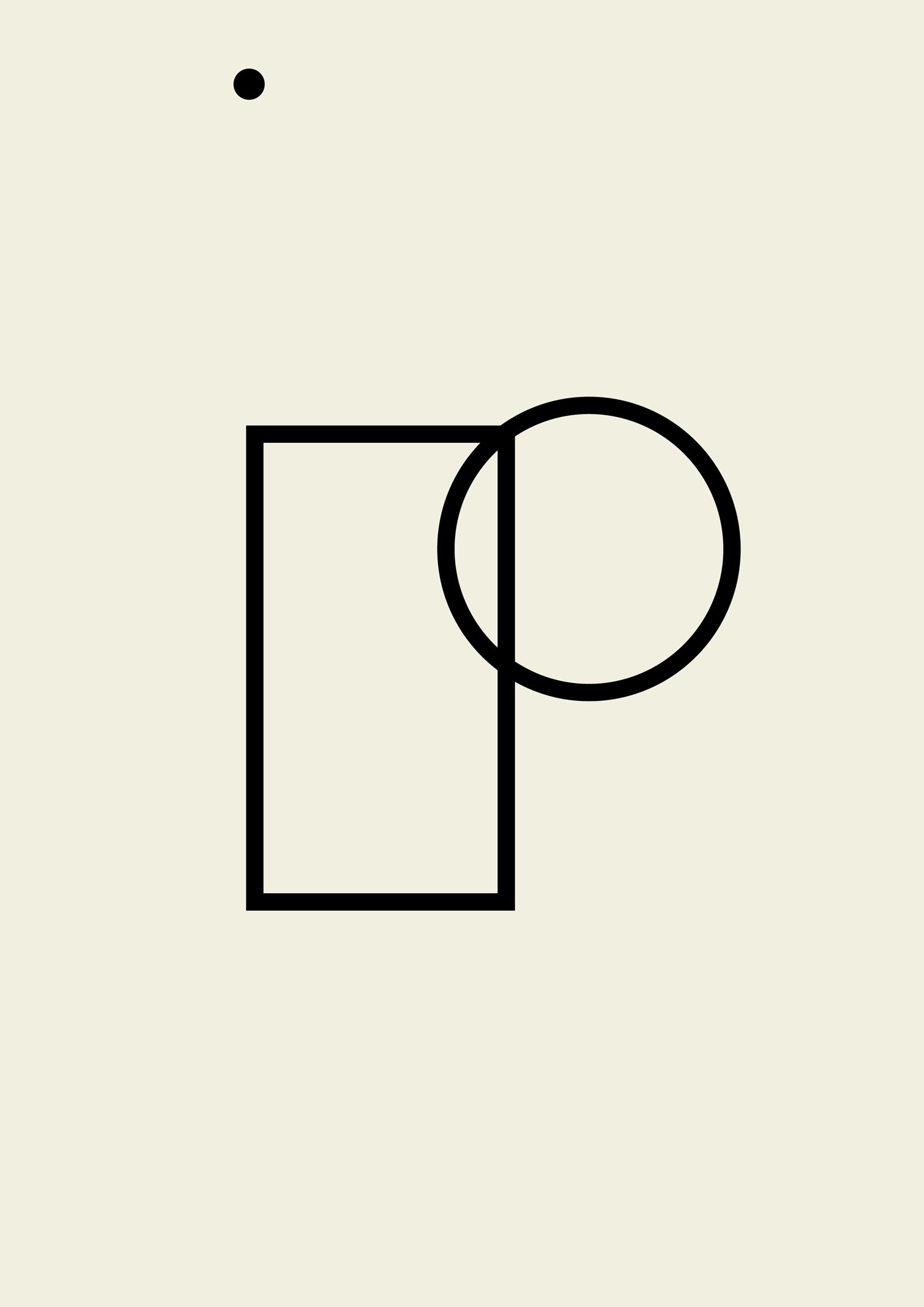
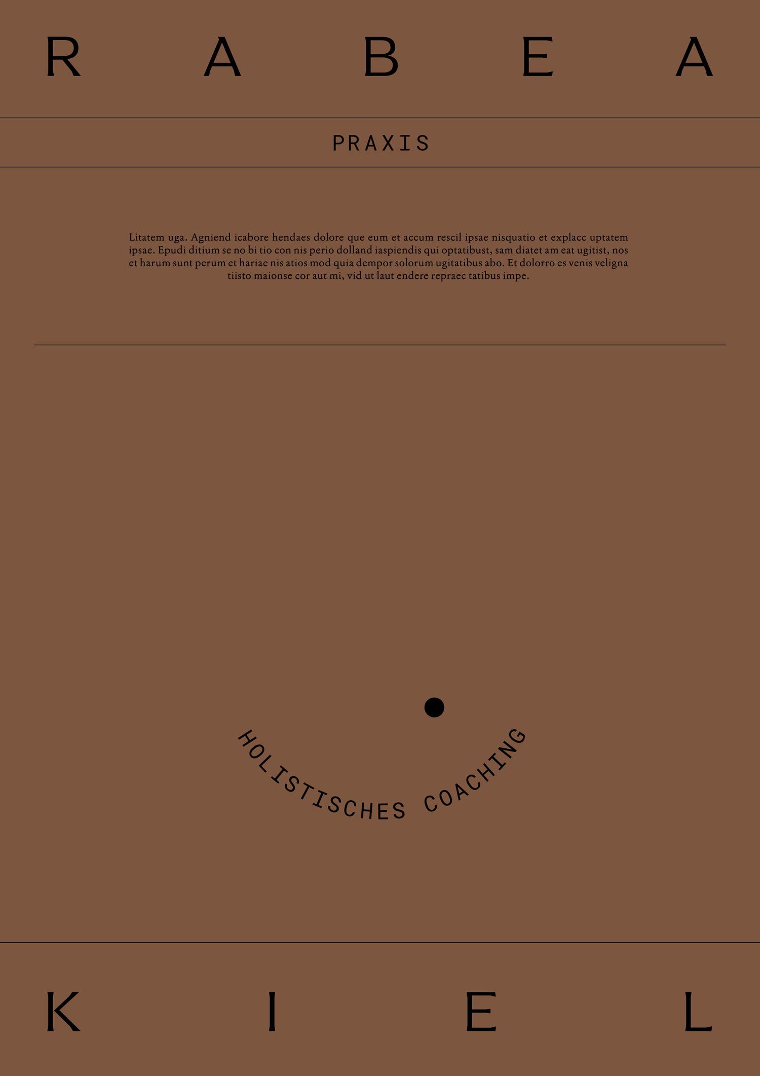
The imagery concept includes still-lives, mobile sculptures, or sculptures inspired by Alexander Calder, bringing a sense of lightness. With Rabea’s background in art and stage direction, this acts as the perfect contribution to the brand feeling minimalistic yet one-of-a-kind. This is further referenced in the kinetically designed taglines and signet. The overall mood inspires trust, with the depth of Rabea’s work reflected in the imagery, forms, and shapes.
◦ Instagram Concept
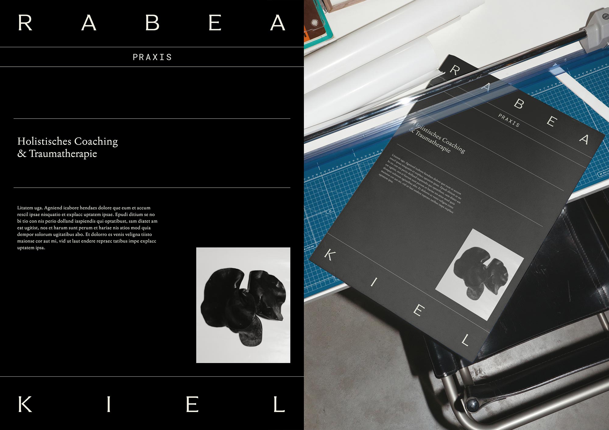
For Instagram, we incorporated infographics to showcase the scientifically proven concepts behind Rabea’s work. These visual elements enhance the audience’s understanding and appreciation of the holistic and trauma-informed approaches she employs.

◦ Brand Typography & Color Palette
The typography supports the effectiveness of the coaching and therapy, being clean with subtle personality traits and enough diversity to feel intellectual and confiding.
The brand colors are warm, precious, and profound, maintaining the overall premium experience of the brand, so that the audience perceives the brand as sophisticated, valuable, and trustworthy.






☺︎ Vibe
Powerful・Radiant・Profound
Valid・Unique・Spiritual・Emotional
Editorial・Minimal・Sensuous
» Thank you so much for your work. Your ideas are conceptually very strong and that feels so good!!! The aesthetics follow a core idea—this is exactly what I was looking for. Excellent! I feel totally seen and it’s right on point … I find myself in the design. « Rabea Kiel, Founder
☺︎ Like What You See? Let’s Start Your Project!
Selected Projects

OH OH OM ® Ethical SportswearBrand Strategy & Design

Korasani ®Brand Identity, Collateral & Web Design

Drink OXY.Project type

britta weisserProject type

Birth Studios ®Brand Strategy & Identity, Collateral, Web Design

bárur therapyBrand Strategy & Identity, Collateral

→ Explore Resources
Join The Designers’ Well-Being Hub
Subscribe to the Mindt® Letter
Get Our Photo Bundles & Graphics
→ Explore Resources
Join The Designer’s Well-Being Hub
Subscribe to the Mindt® Letter
Get Our Photo Bundles & Graphics
→ Explore Resources
Join The Designer’s Well-Being Hub
Subscribe to the Mindt® Letter
Get Our Photo Bundles & Graphics
☺︎ We’re happy if we can inspire you—mutually be kind and professional and don’t copy or use any of our content without giving credit. This includes brand designs developed by us, the layout of this page, as well as any published texts.—Or, as Brian Collins has put it: »Be careful of doing too much work that copies the people you admire. Start out that way to see what feels right. But aim to seek what they were seeking instead of doing what they were doing.« ✌︎