
A New Visual Vibe for a Circular Fashion Label
Timeless Quality • Wearing Sensation • Style
☺︎ Services
Brand Strategy
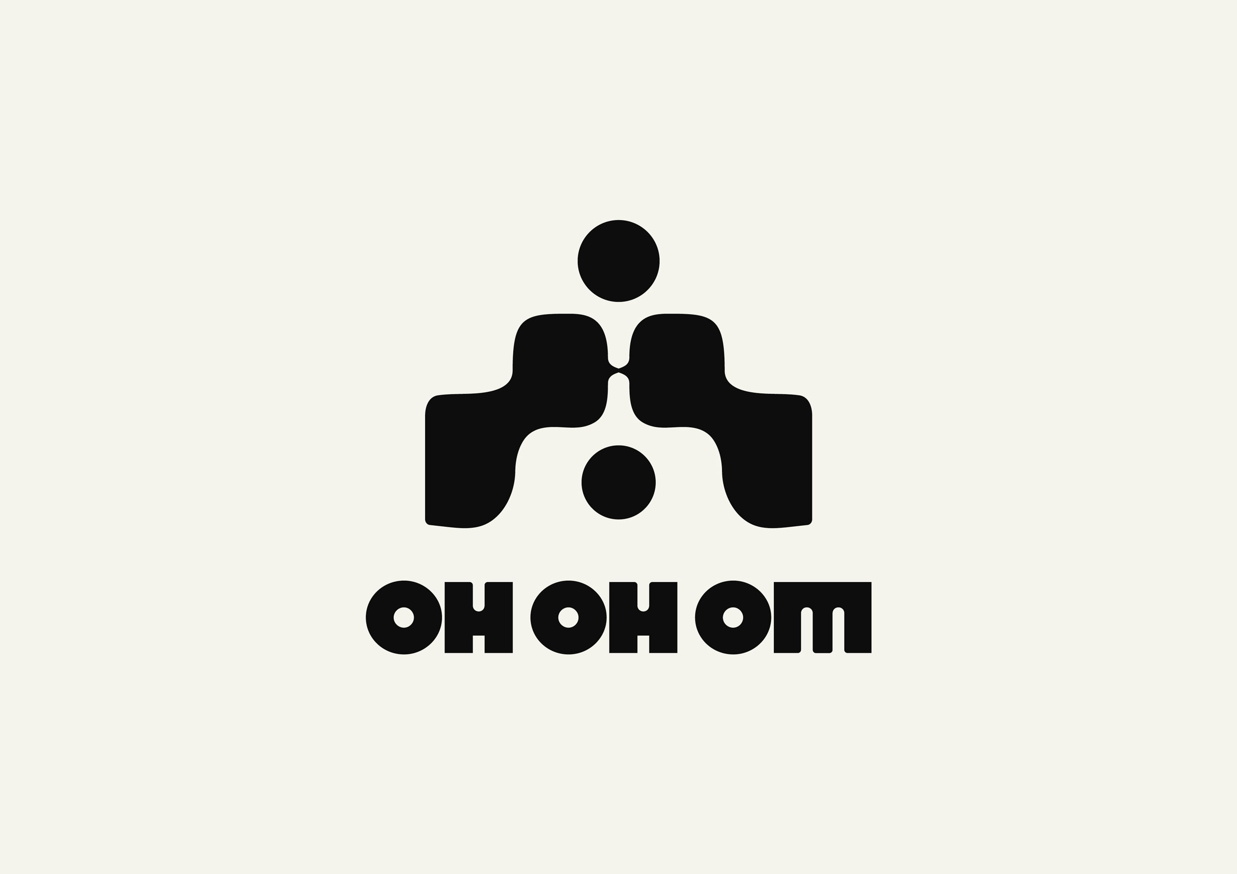
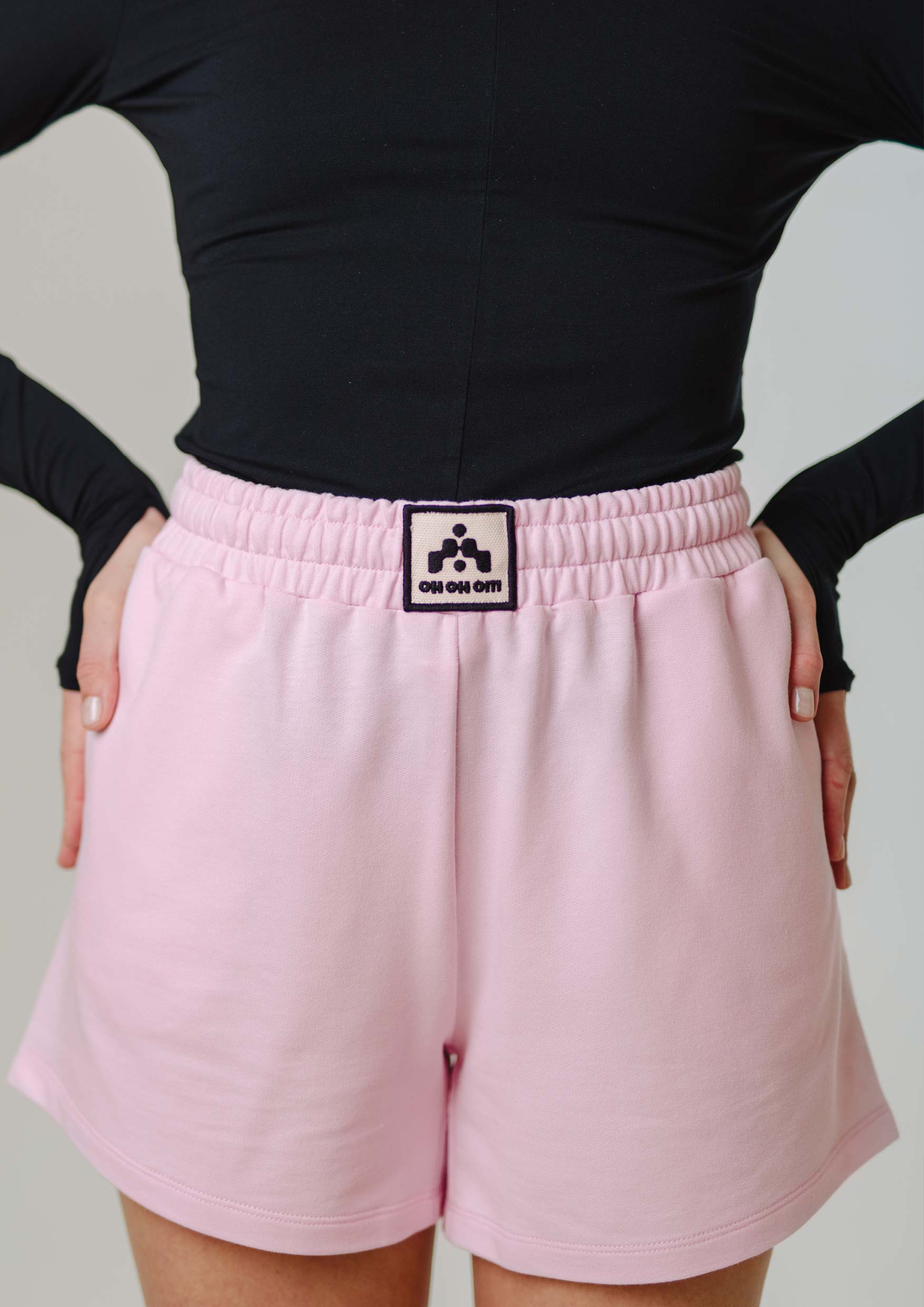
Brand Signet
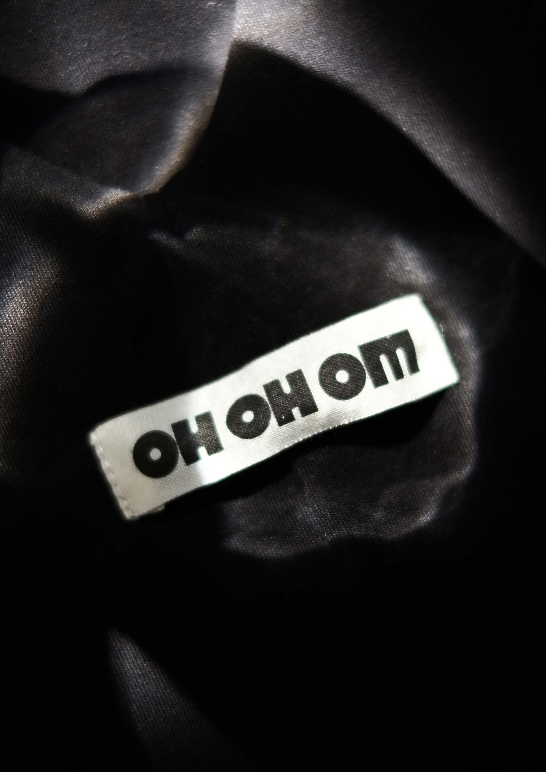
Wordmark Rebrand
☺︎ Client
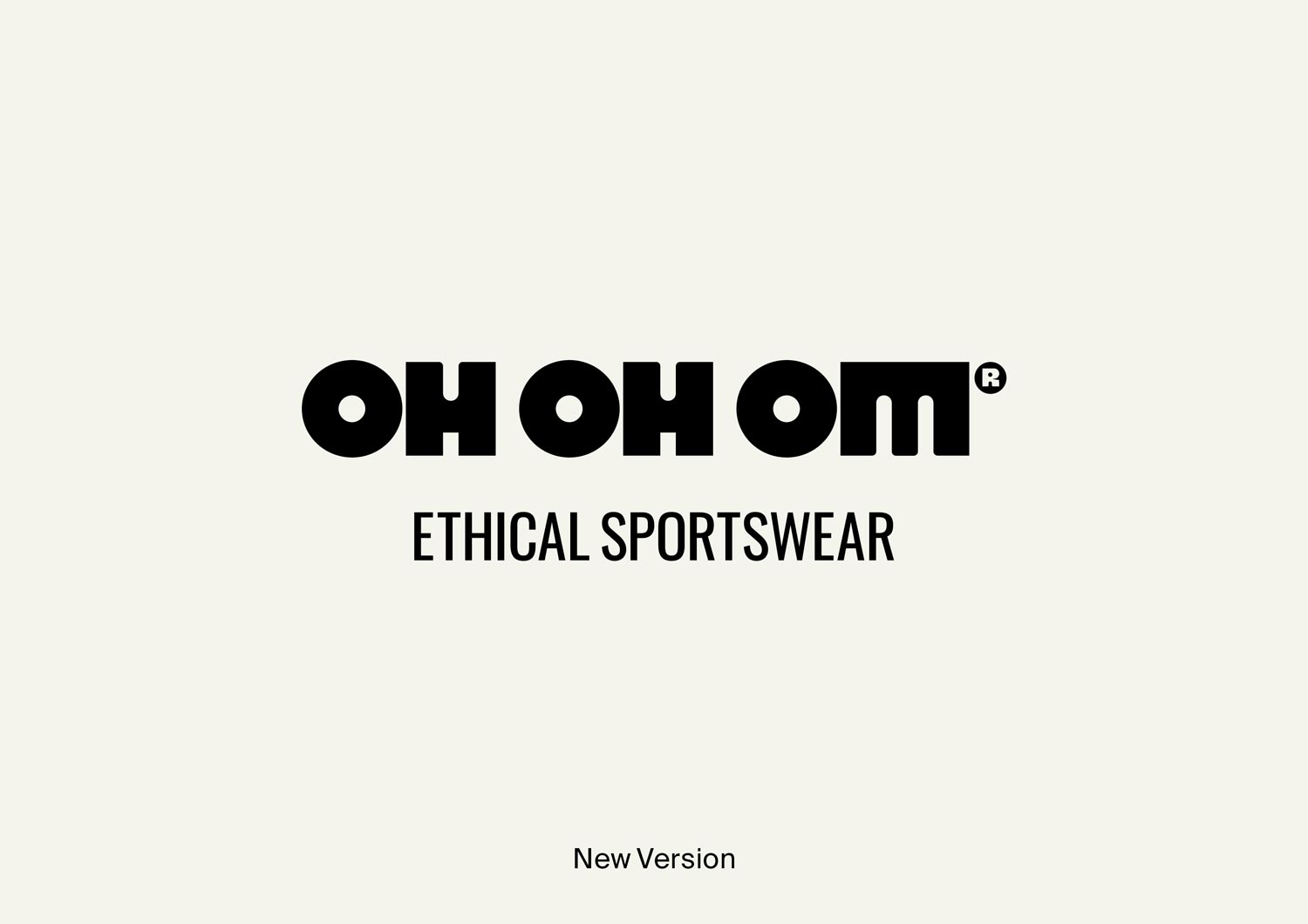
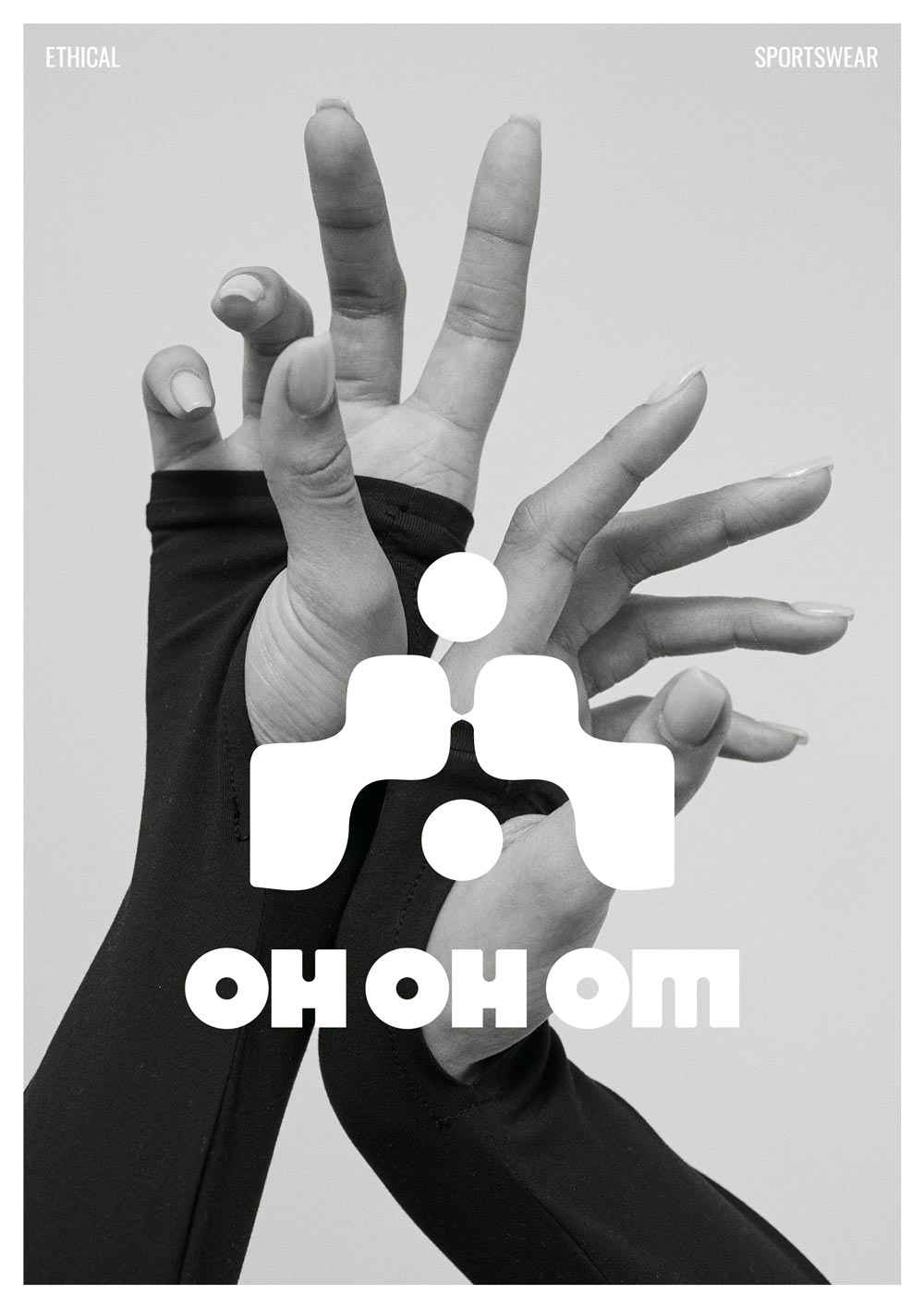
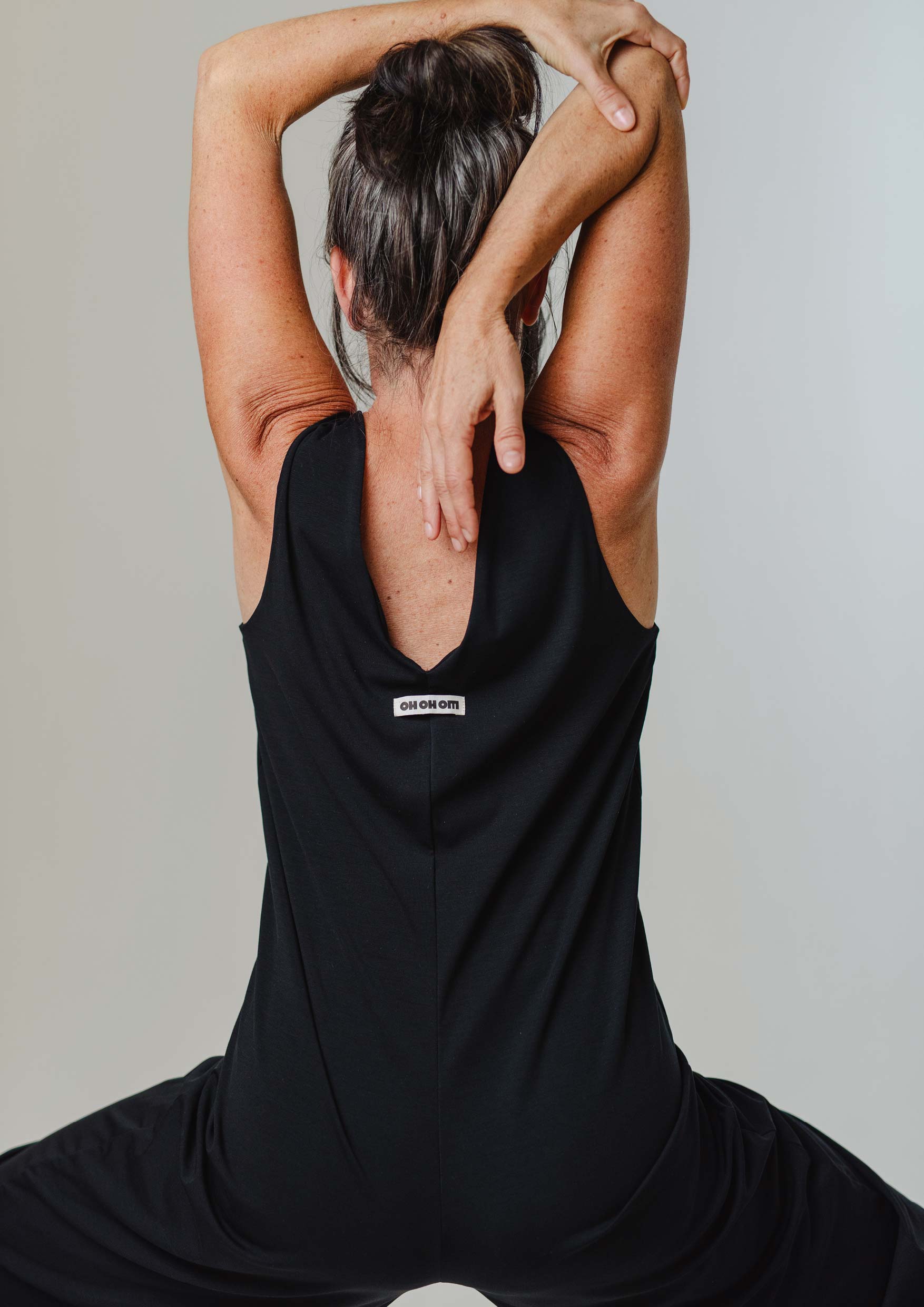
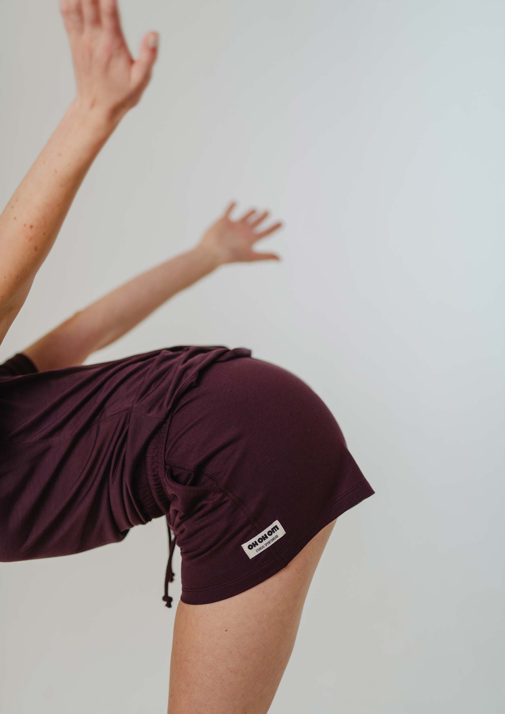
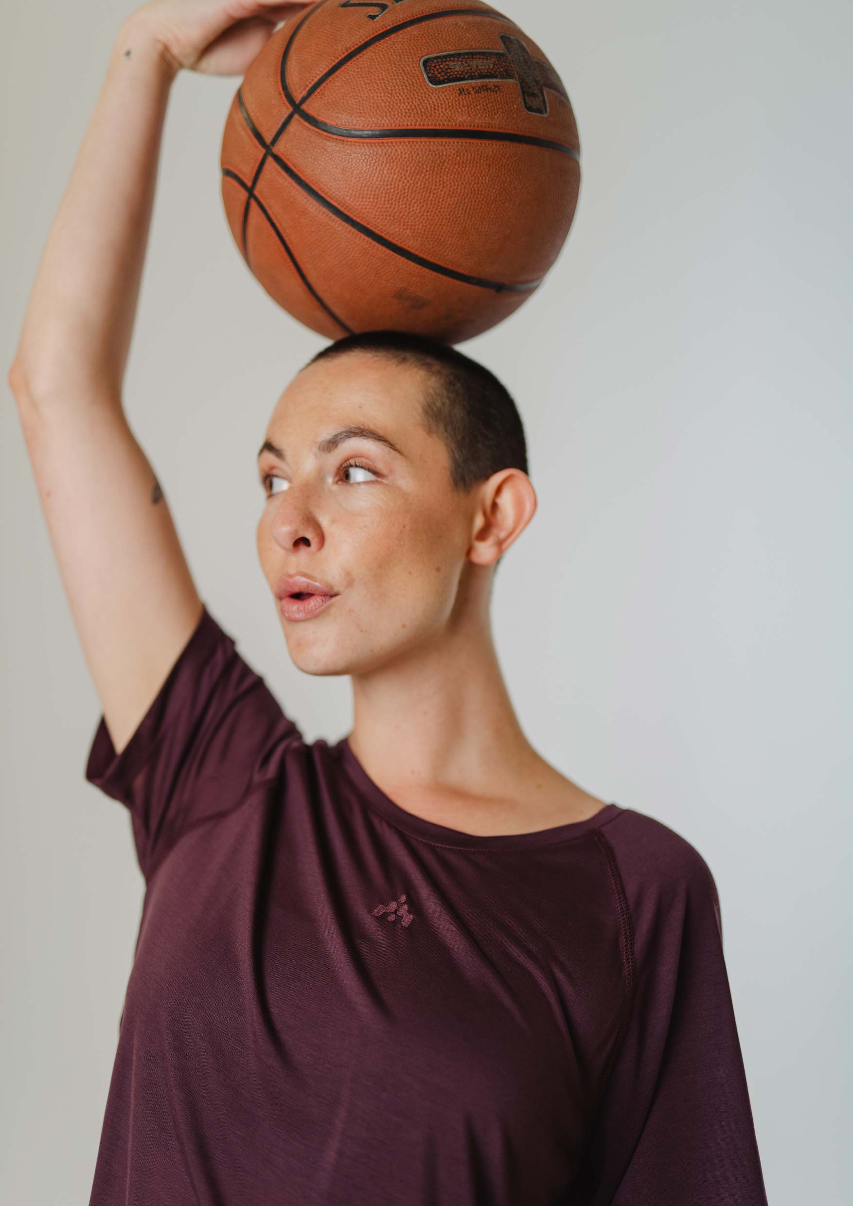
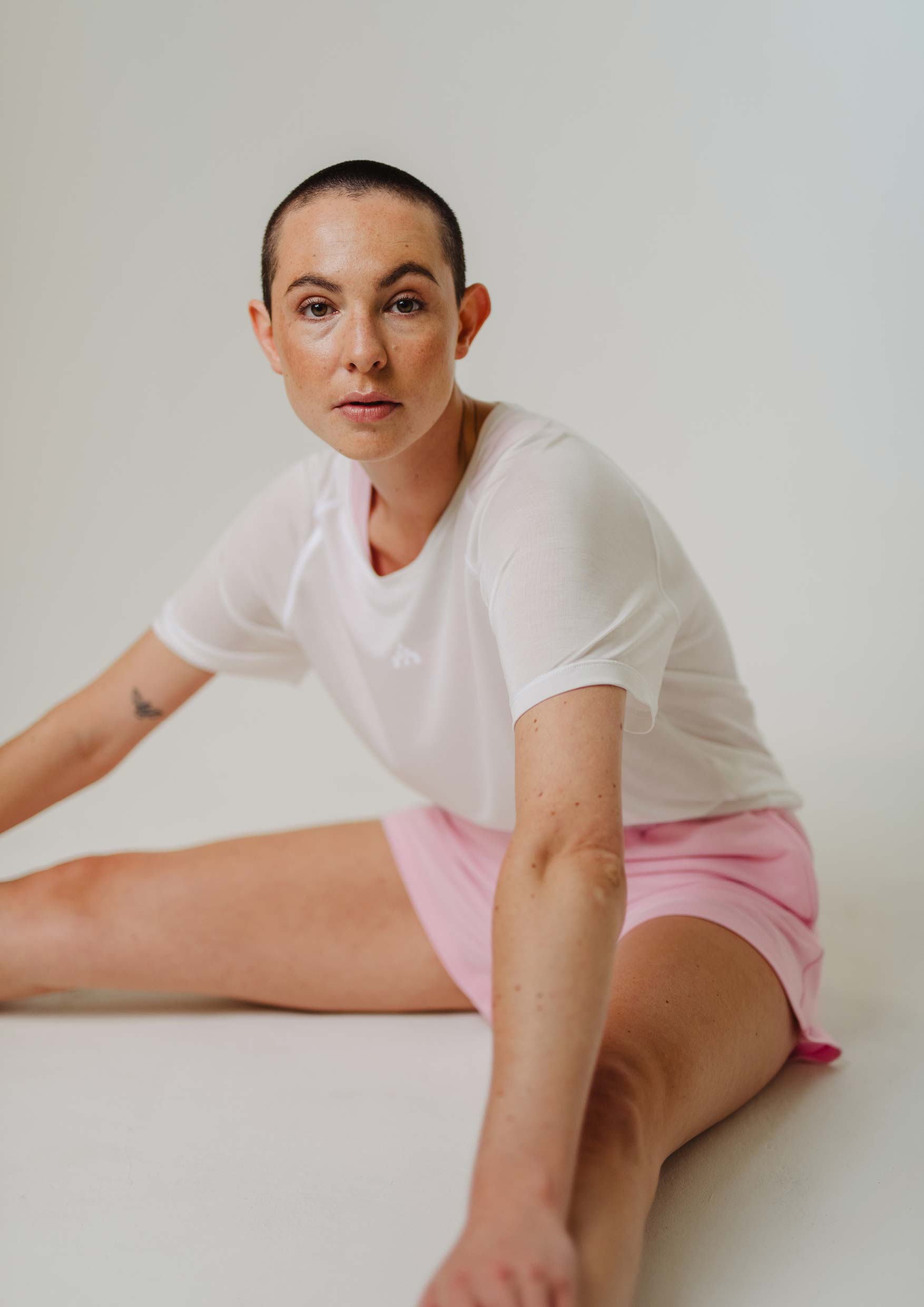
OH OH OM ® Ethical Sportswear
ohohom.com

Context
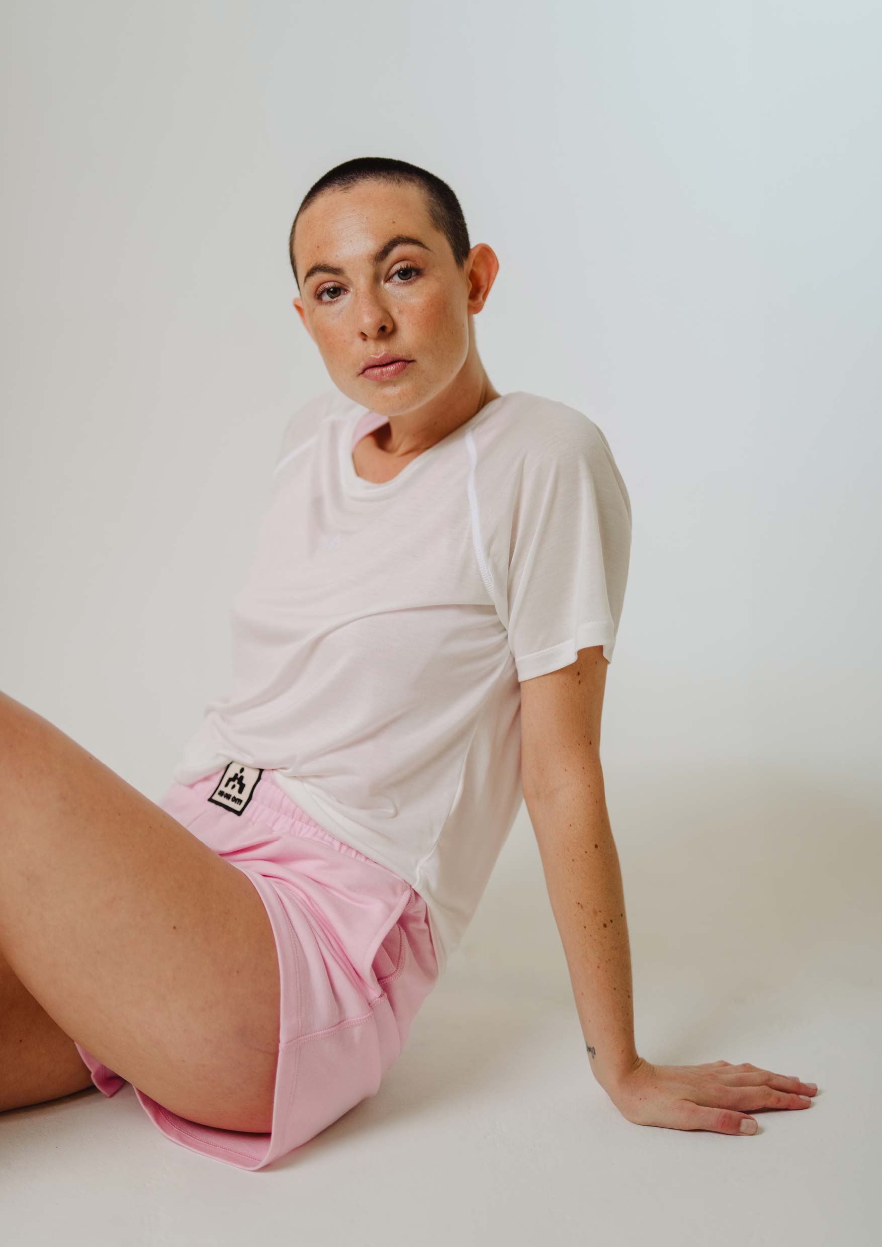
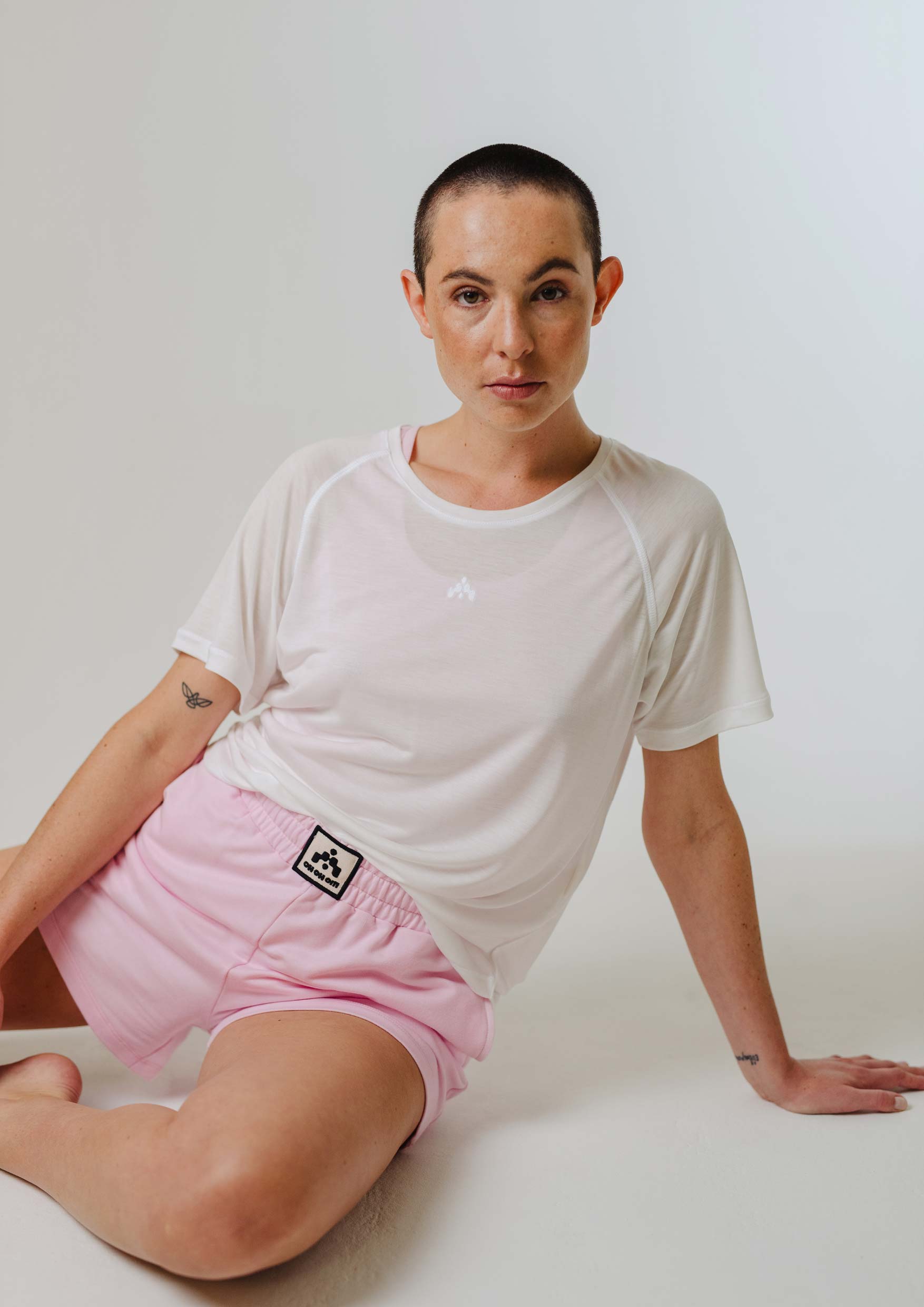
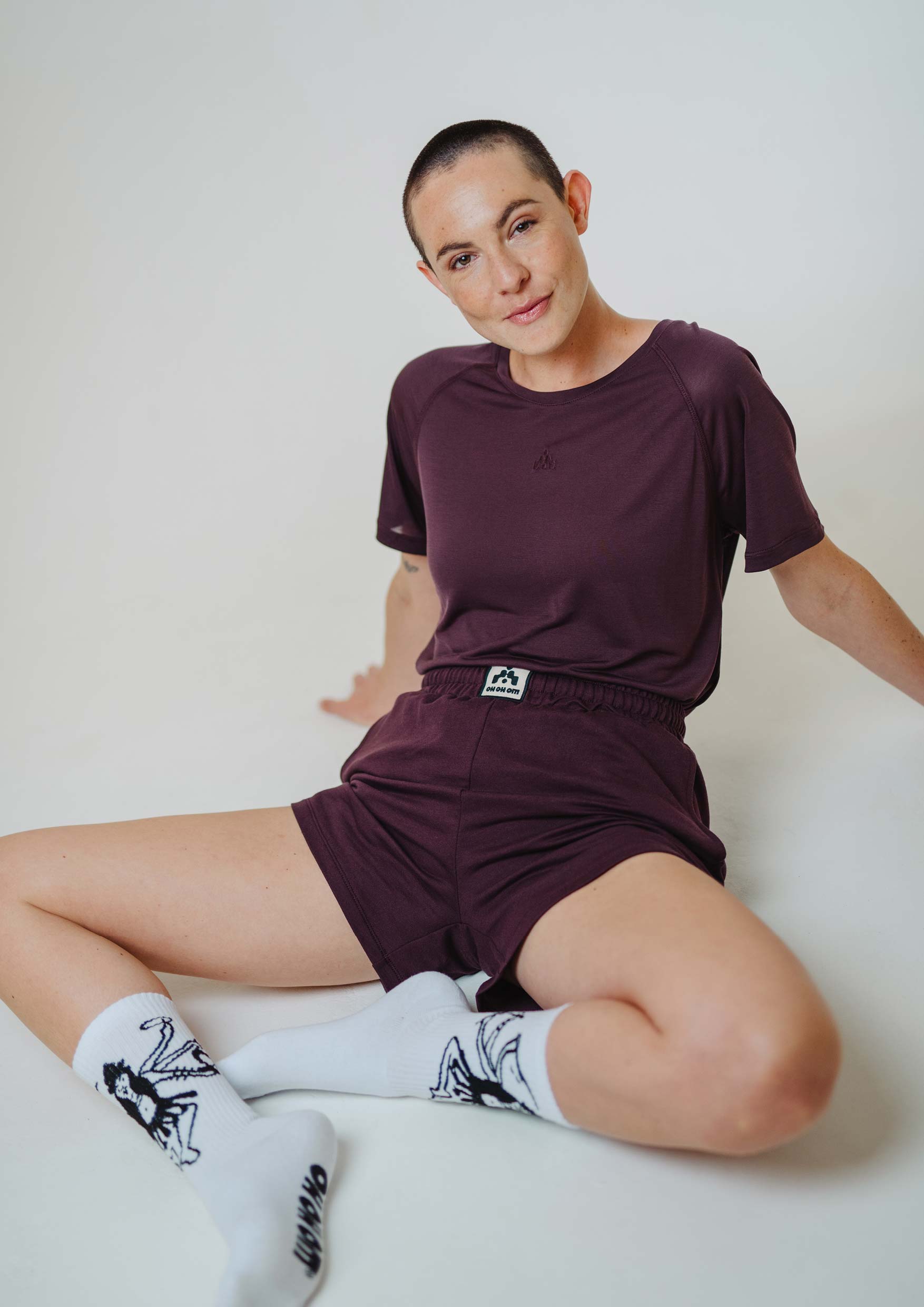
OH OH OM ® Ethical Sportswear, based in Hamburg, Germany, is a sustainable label offering functional, casual, and stylish apparel. Committed to the Cradle to Cradle principle, the brand ensures every piece is not only visually appealing but also promotes well-being, softness, and multifunctionality. Experience the perfect blend of aesthetics and sustainability.
Our Approach
We were tasked with developing a new logo suite, and we captured the “New Basics” essence of the brand through variable design elements: an iconic signet inspired by ’80s sports culture, which invites interpretation and resonates with the target audience, and a strong yet soft wordmark that highlights the timeless quality of the apparel.
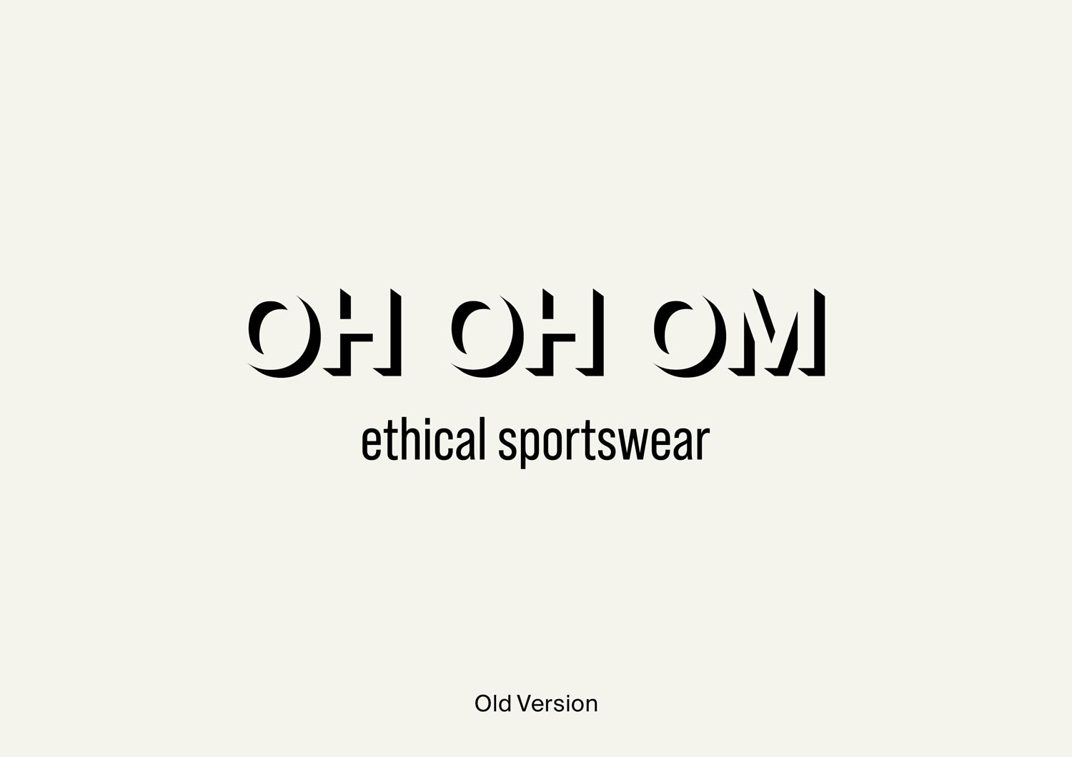
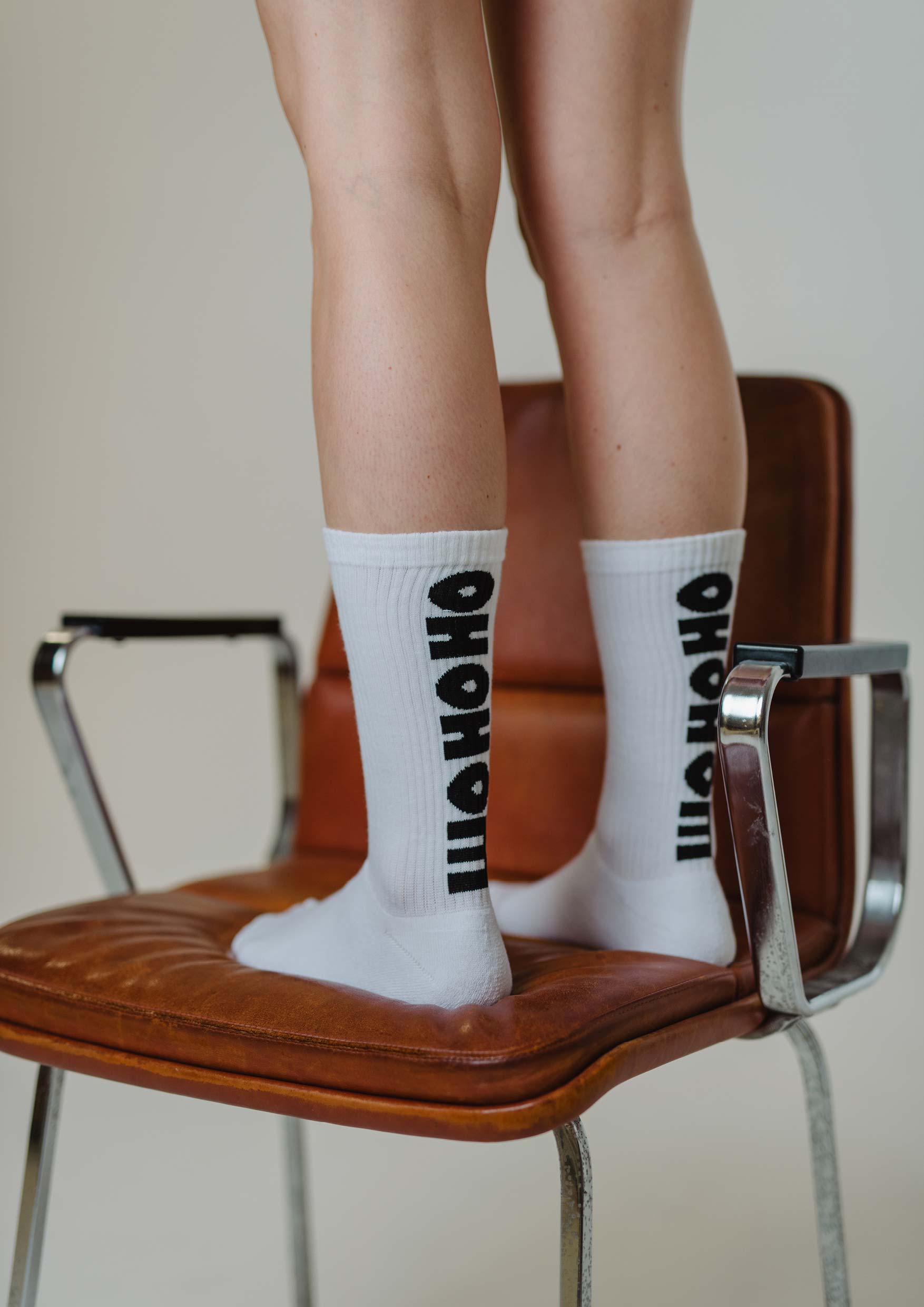
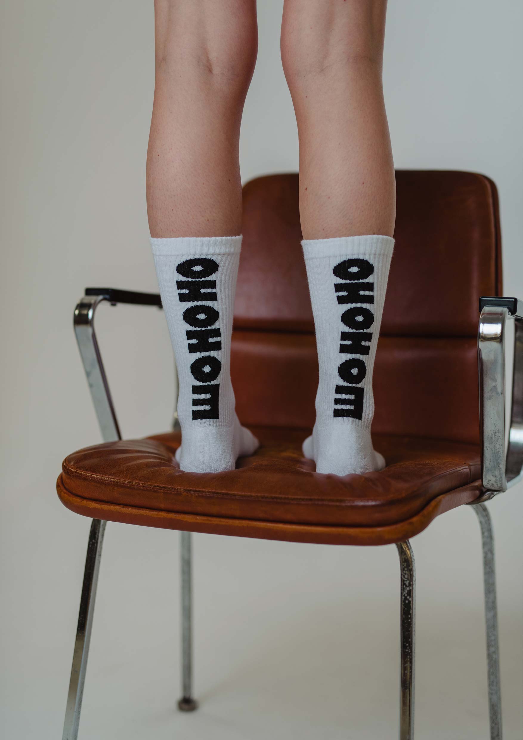
◦ Wordmark Rebrand
The new wordmark is bold, clear, and timeless, yet it possesses a unique charm: partly rounded edges convey the brand’s softness and joyfulness. The geometric and structured shapes reflect the brand’s values of mindfulness and a clean aesthetic.
In contrast to the empty space that made the old wordmark feel reserved, the new design exudes personality, courage, and self-esteem through its strong presence. This confident appearance is further emphasized by the all-caps tagline.
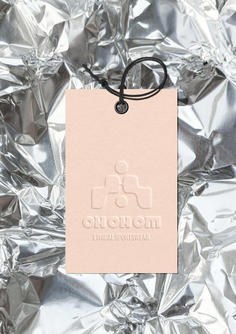

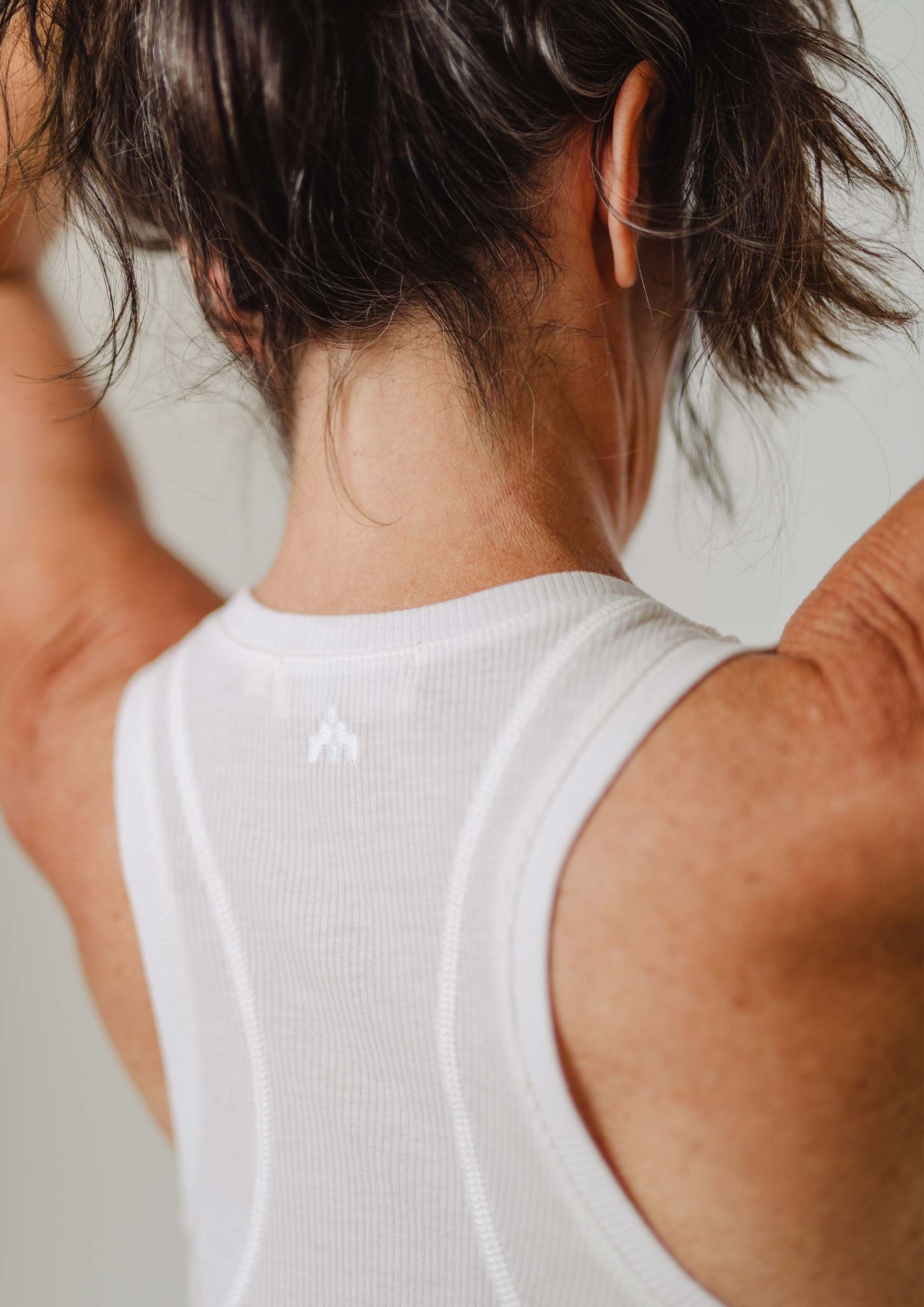
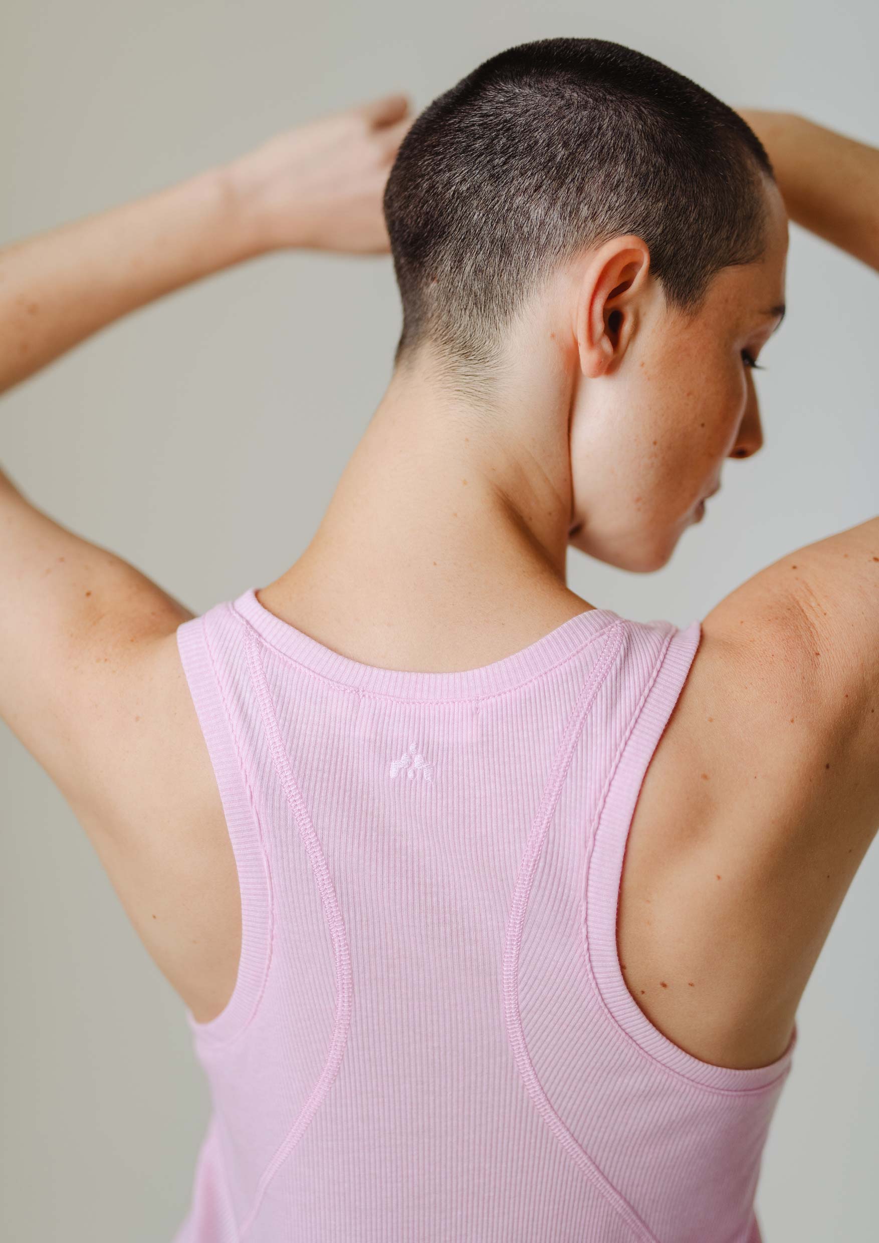
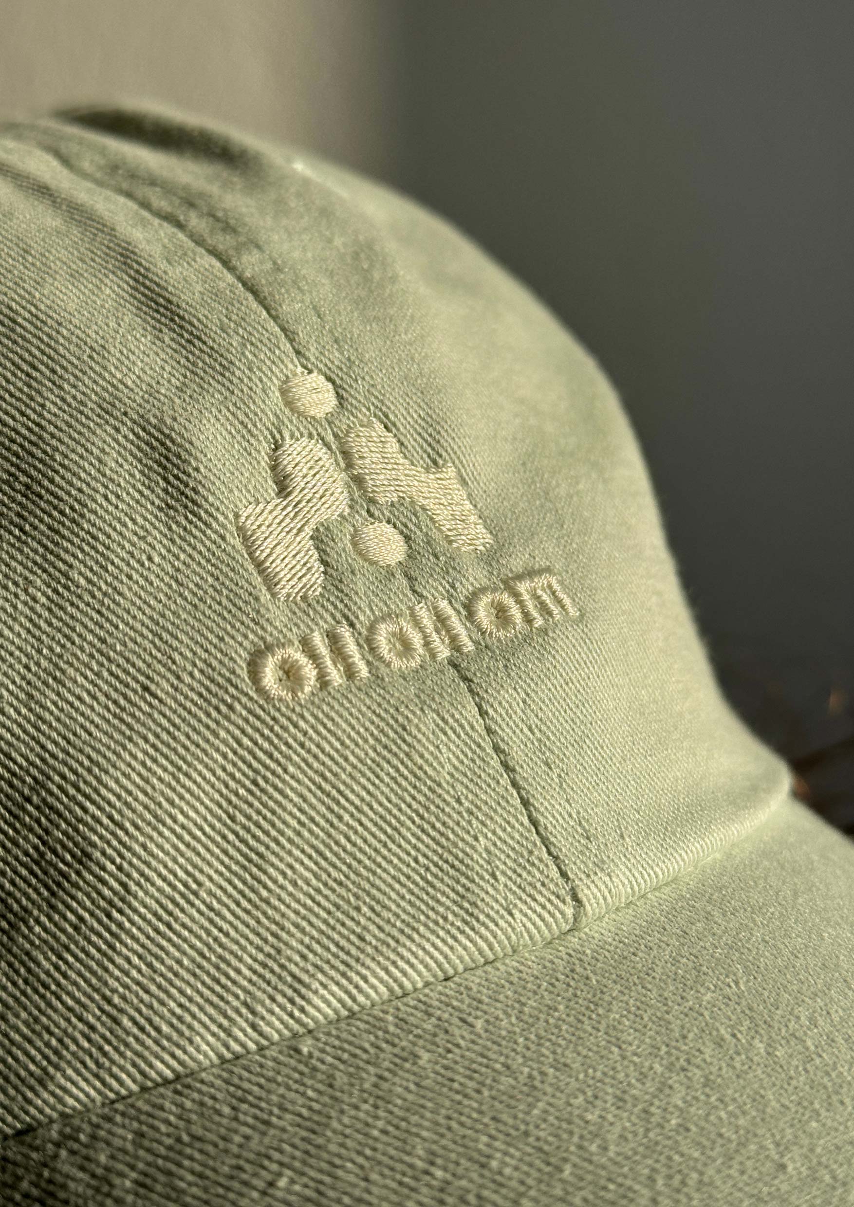
◦ The Brand Signet
The brand signet is designed for versatility, functioning seamlessly across various sizes from small-scale embroidery to large-scale advertising prints. It symbolically represents flow, the apparel, its fabric, and an abstracted human figure, inviting a range of interpretations within the sportswear industry. Whether it evokes a yoga asana or a basketball player is up to the observer, adding a dynamic layer to the brand’s identity. The signet can also be seen as an iconic symbol with multiple layers of meaning:
• A triangle representing the unity of body, mind, and soul—or creation, preservation, and destruction, aligning with the brand’s ecofriendly philosophy. • In numerology, the number 3 symbolizes creativity, energy, and innovation. • The image of stairs or a pyramid, suggesting the path to responsibility as a fair fashion brand, and balance through the consistency of ascent and descent. • This multifaceted approach allows the signet to resonate deeply with the brand’s audience while reflecting its core values.

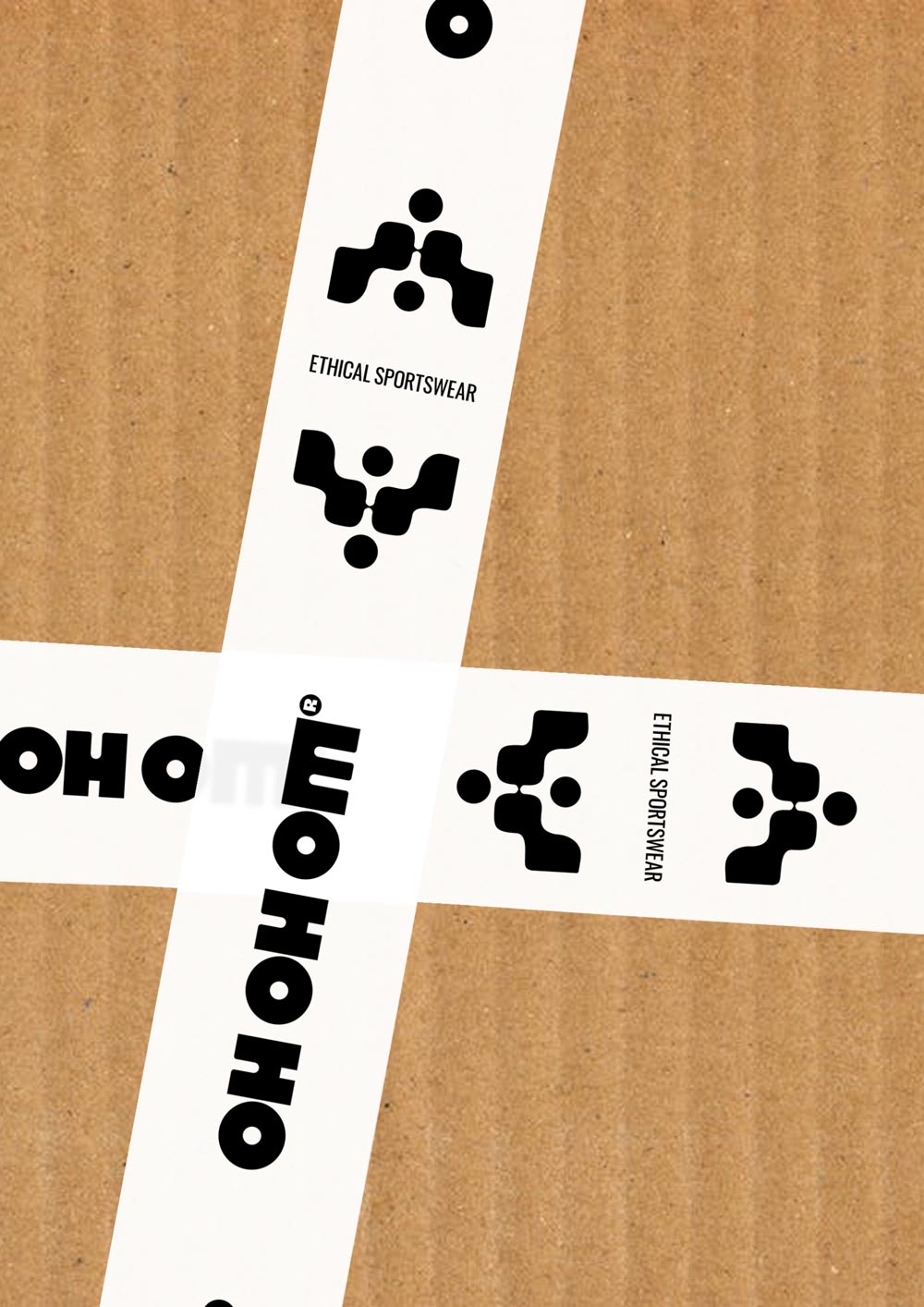

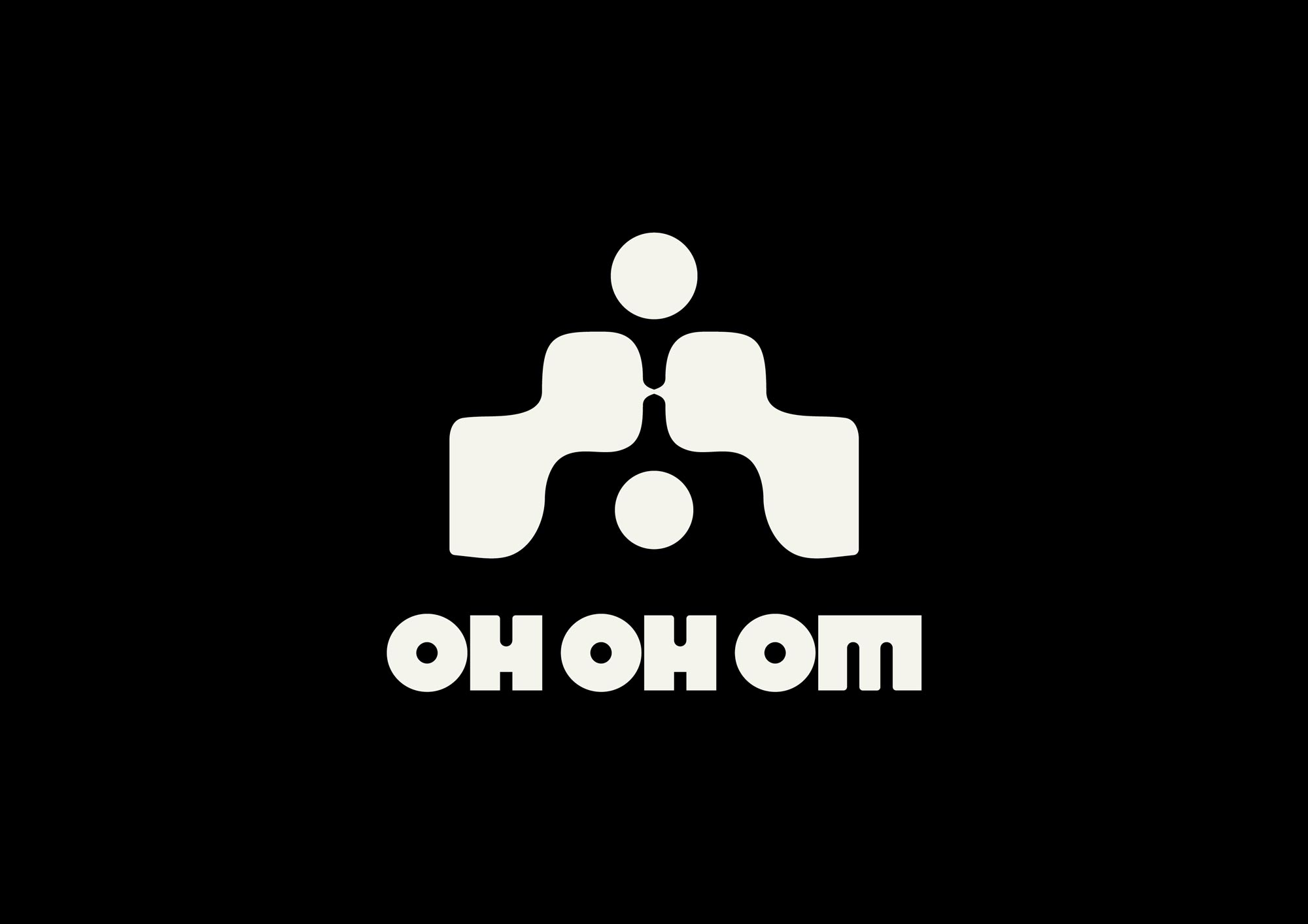
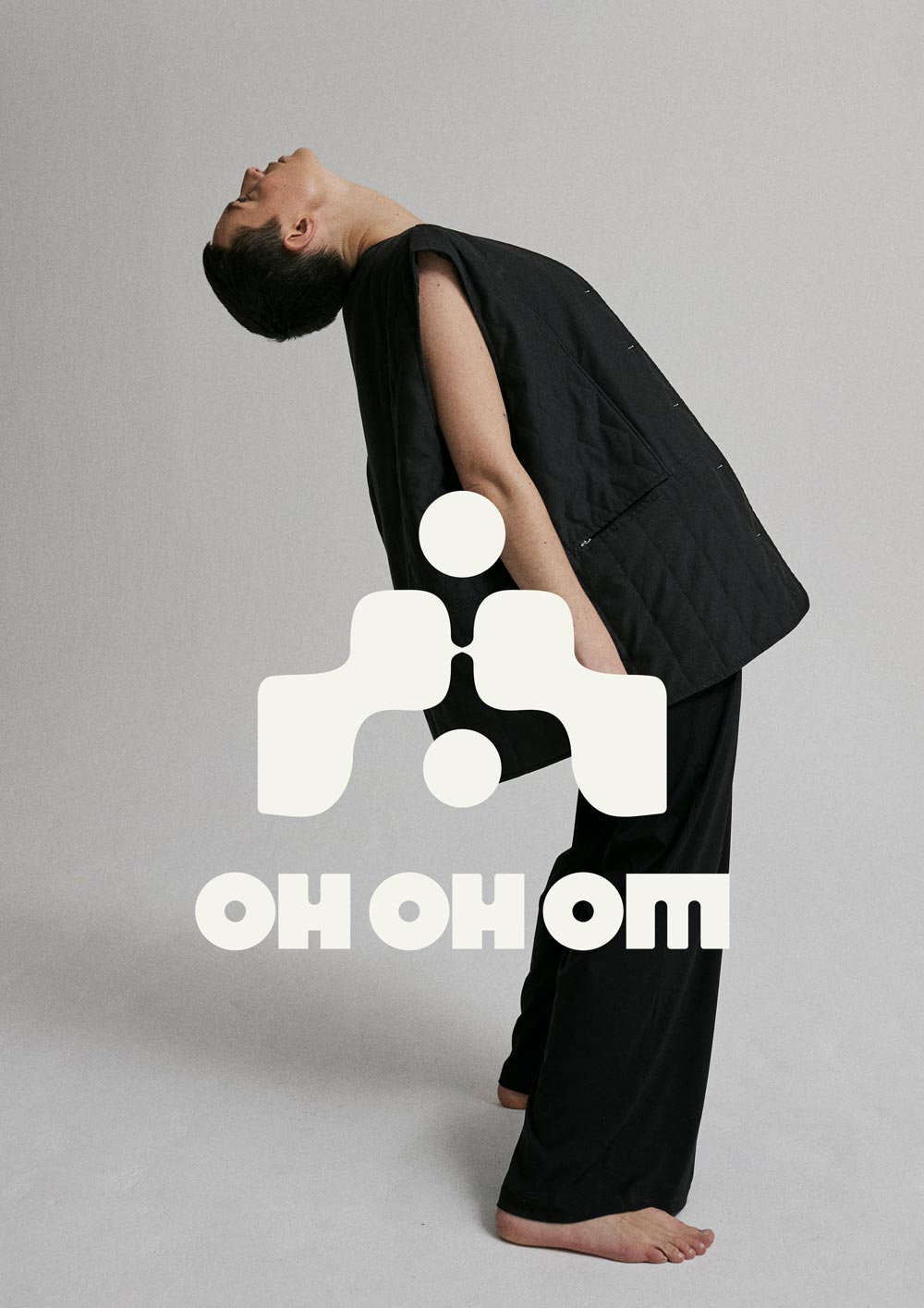
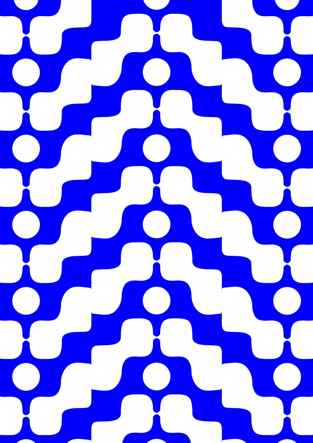
◦ Pattern & Logo Suite
The brand signet excels as a standalone mark or combined with other elements, and it can also be used as an all-over brand pattern, enhancing the visual identity across various applications.
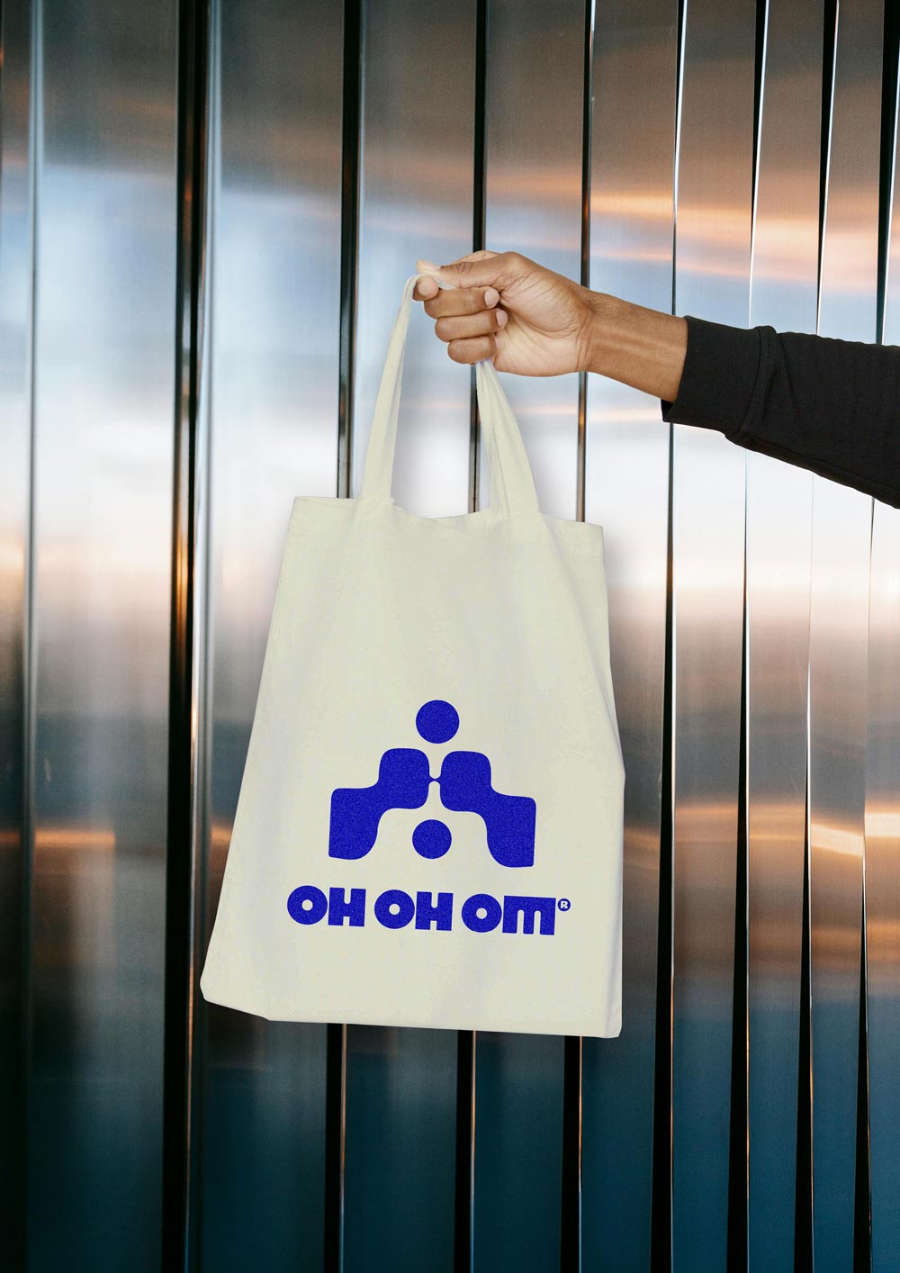
We developed an extensive logo suite comprising multiple versions to accommodate both small and large-scale uses. Each version ensures consistency and adaptability.

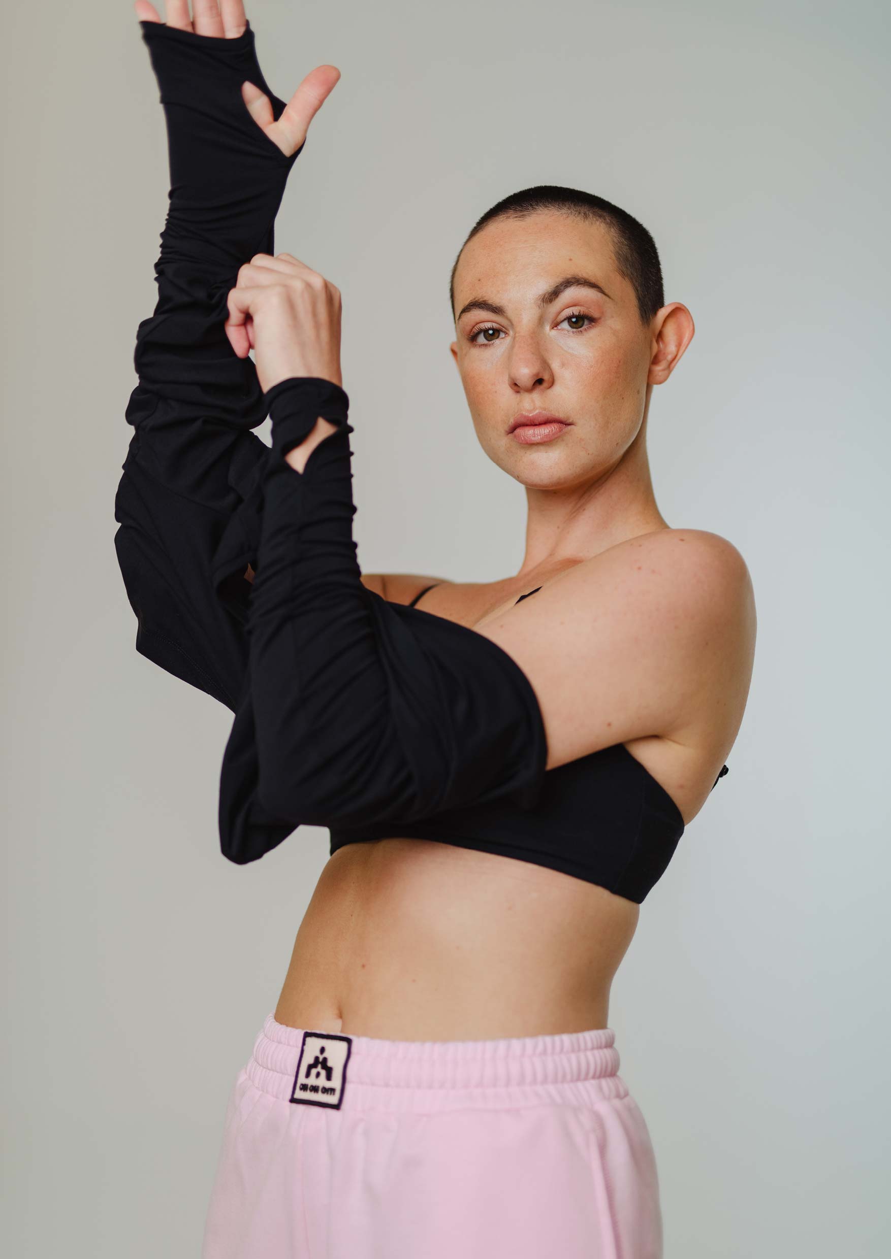

☺︎ Vibe
Feel Good
Cool
Aesthetic Basics
Witty
Super Soft
Mindful
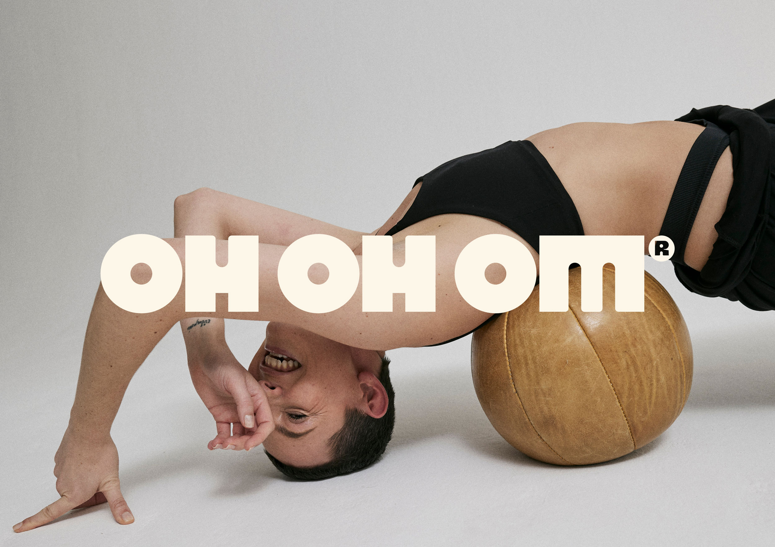
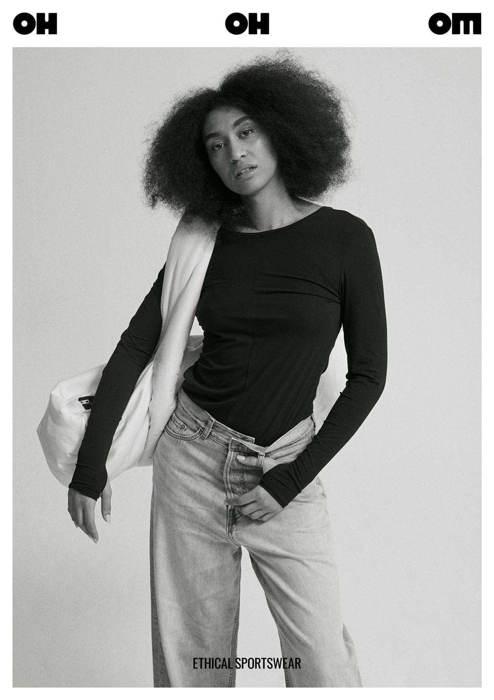
☺︎ Brand Photography
Jaan-Eric Fischer
Sarah Buth
☺︎ Models
Leandra & Miriam
☺︎ Founder Jenne on our Collaboration
What were some previous challenges for your brand?
I liked my branding, but something was missing. The logo didn’t always work with clothing, and I needed more versatility and room to play.
Why did you chose Mindt® Studio?
I love Sarah’s work and aesthetic, and I knew she would understand my taste and capture exactly what I was looking for.
How do you feel after our collaboration?
I love the new branding! It’s timeless, bold, versatile, unisex, not overly feminine, but still feminine enough—exactly as I wanted. The process was incredibly insightful, especially seeing things from an outside perspective. It made me realize my old logo wasn’t conveying what I wanted.
What did you particularly like?
Sarah’s execution, strategic thinking, and organization were outstanding. The workflow she created was so fun, and I learned so much about my brand through her thoughtful questions. Before, I always resisted the analysis and saw it as a waste of time. But now, I see my label through a completely new lens and work more strategically myself.
What impact has the rebranding brought?
I love how the new branding looks on my products. I could finally create items like caps and socks, which didn’t work with the old logo. Sarah also inspired ideas for posters, packaging, and more, and I can use that as a guide.
Do you have some final thoughts?
I’ve never regretted a cent I spent because the process and results were worth it. Sarah inspires and delivers exceptionally good work and I mean the entire process that she’s built. I’ve rarely worked with such a professional and caring person. She helped me find the right branding for my label and guided me step by step. Giving feedback and assessing creativity can be so difficult and subjective. Sarah manages to support you in giving her the feedback she needs and delivers the result you’ve been dreaming of. Working with her was not only fun but also deepened my understanding of my brand. Her external perspective on the label, considering what I want to express with it and who I want to target, is priceless. If you’re considering working with Sarah, do it! It’s an investment that pays off.

☺︎ Like What You See? Let’s Start Your Project!
Selected Projects
Korasani ®Brand Identity, Collateral & Web Design
Praxis Rabea KielProject type
Drink OXY.Project type
britta weisserProject type

Birth Studios ®Brand Strategy & Identity, Collateral, Web Design
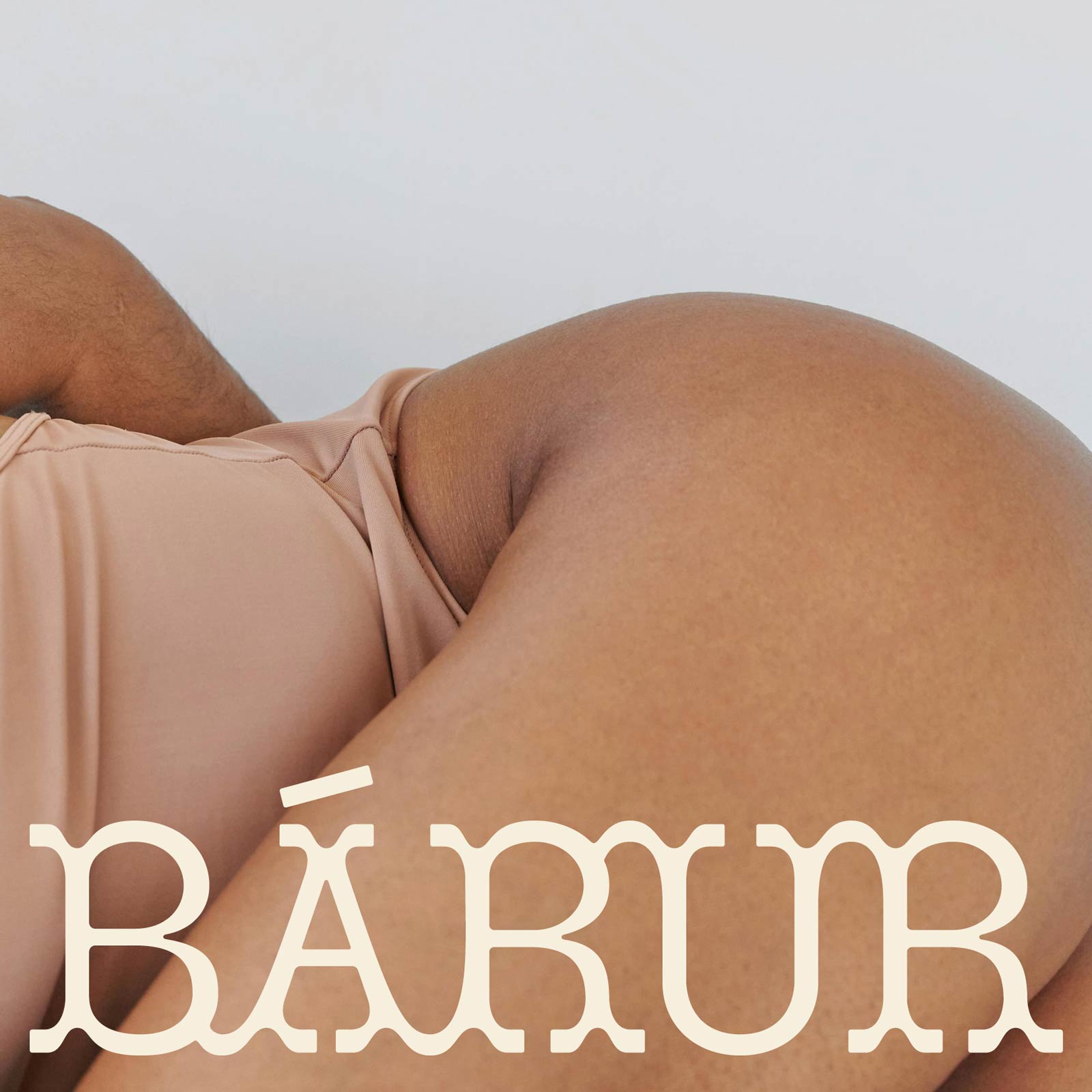
bárur therapyBrand Strategy & Identity, Collateral
→ Explore Resources
Join The Designers’ Well-Being Hub
Subscribe to the Mindt® Letter
Get Our Photo Bundles & Graphics
→ Explore Resources
Join The Designer’s Well-Being Hub
Subscribe to the Mindt® Letter
Get Our Photo Bundles & Graphics
→ Explore Resources
Join The Designer’s Well-Being Hub
Subscribe to the Mindt® Letter
Get Our Photo Bundles & Graphics
☺︎ We’re happy if we can inspire you—mutually be kind and professional and don’t copy or use any of our content without giving credit. This includes brand designs developed by us, the layout of this page, as well as any published texts.—Or, as Brian Collins has put it: »Be careful of doing too much work that copies the people you admire. Start out that way to see what feels right. But aim to seek what they were seeking instead of doing what they were doing.« ✌︎