
Font Pairing Ideas with the Bárur Display Typeface
Font Pairing Ideas & Inspiration
→ Get Bárur Here
Font pairing is one of the most essential and enjoyable parts of typography. The right combination of typefaces can elevate a brand identity, add depth to packaging design, and shape how a brand feels long before a single word is read.
Over the past months since launching the Bárur typeface, I’ve created various mock brands, packaging designs, and graphic applications to explore exactly that: font pairing ideas using a display font in different contexts. To showcase its versatility and range of use. I personally find it incredibly interesting to see how a typeface behaves in different contexts—especially when paired with another typeface or even a whole font system.
Bárur is a characterful display serif typeface, designed to stand out. And as with most display fonts, the real challenge—and beauty—lies in how it’s paired. What supports it best? What contrasts it without overpowering it? And how does it behave across industries, moods, and visual systems?
Below, I’m sharing a curated selection of font pairing inspiration, using Bárur as the focal point. I hope you enjoy them! The examples show how a strong display typeface can work alongside neutral workhorses, refined sans-serifs, monospaced fonts, and even other serifs, depending on intention and tone.
If you’ve used Bárur in any of your own projects, we’d love to see what you’ve created. Send us your work, we’re always excited to see how others interpret and expand on its versatility, and what you bring to life with it.
How to Pair a Display Font
Display fonts are designed to attract attention. They carry personality, rhythm, and emotion. When pairing a display typeface, the goal is often balance: letting the display font lead while supporting it with a more neutral, highly legible companion. In the following examples, Bárur takes on this leading role, most often even as logotype, while its pairings provide structure, clarity, or contrast depending on the brand context.
Discover Our Font Pairing Ideas for Bárur
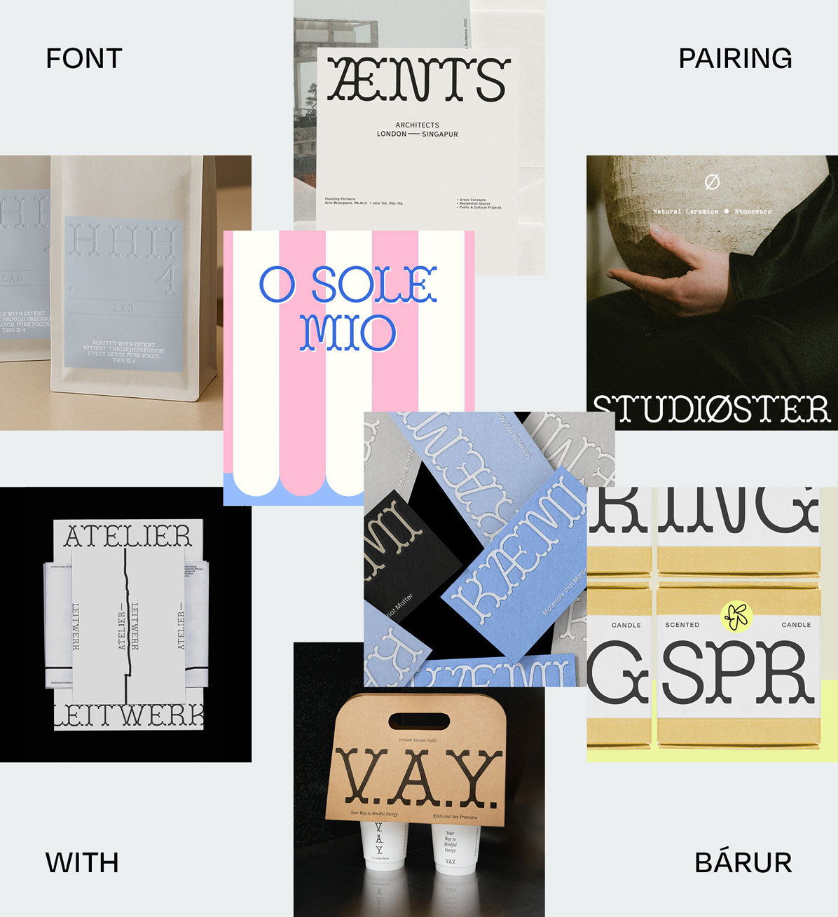
1 ÆNTS Architects — Brand Identity
using Bárur Regular + Munken Sans Regular by Arctic Paper
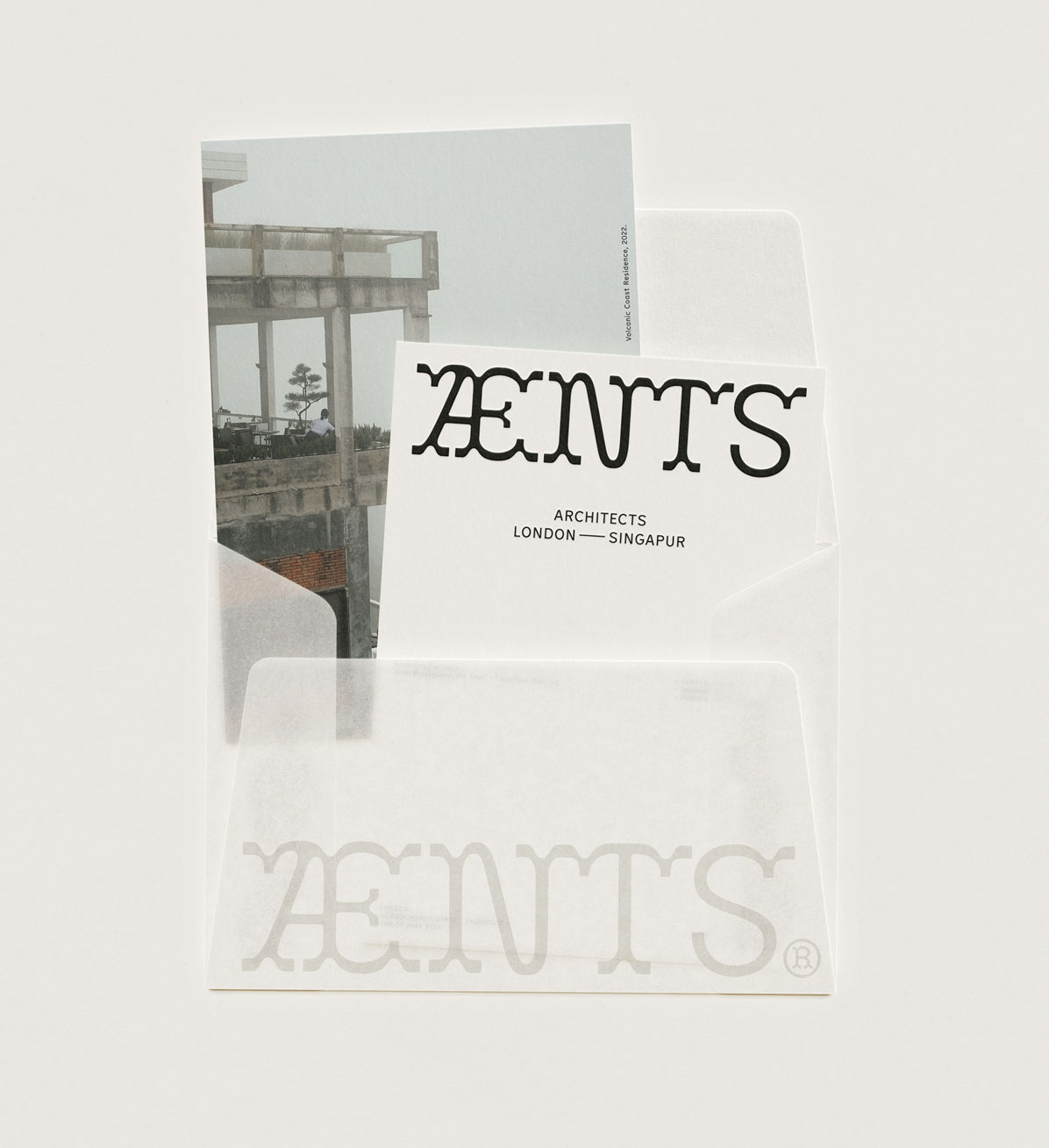
As a display typeface, Bárur is a fitting choice for a brand or logo type for an architecture firm. Designed to echo movement and structure, it combines clarity with character. For the ÆNTS Architects mark, it balances bold precision with refined personality. Flowing forms rooted in geometry.
I paired it with the elegant and modern Munken Sans Regular by Arctic Paper—a perfect match.
Munken Sans was inspired by the Swedish typeface Tratex from the 1960s. It’s timeless, clean, and features lovely details such as angular transitions, low crossbars, and blunt terminals. Like Tratex, which was originally designed for national road signs, Munken Sans offers high legibility, making it a natural fit for an architecture studio.
I love how Bárur adds personality and depth to this font pairing. Its rounded shapes and wave-like forms create a strong contrast. I also applied two OpenType features to the wordmark: the NT ligature and the alternate S with a serif.
→ Get Bárur Regular to recreate a similar vibe!
(Have you spotted my photo from Kintamani, Bali, in the mockup? It’s included in my Tropical Lifestyle Photo Bundle on Creative Market. Find it here.)
2 Atelier Leitwerk — Brand Identity
using Bárur Light + Lemur Medium by TIGHTYPE
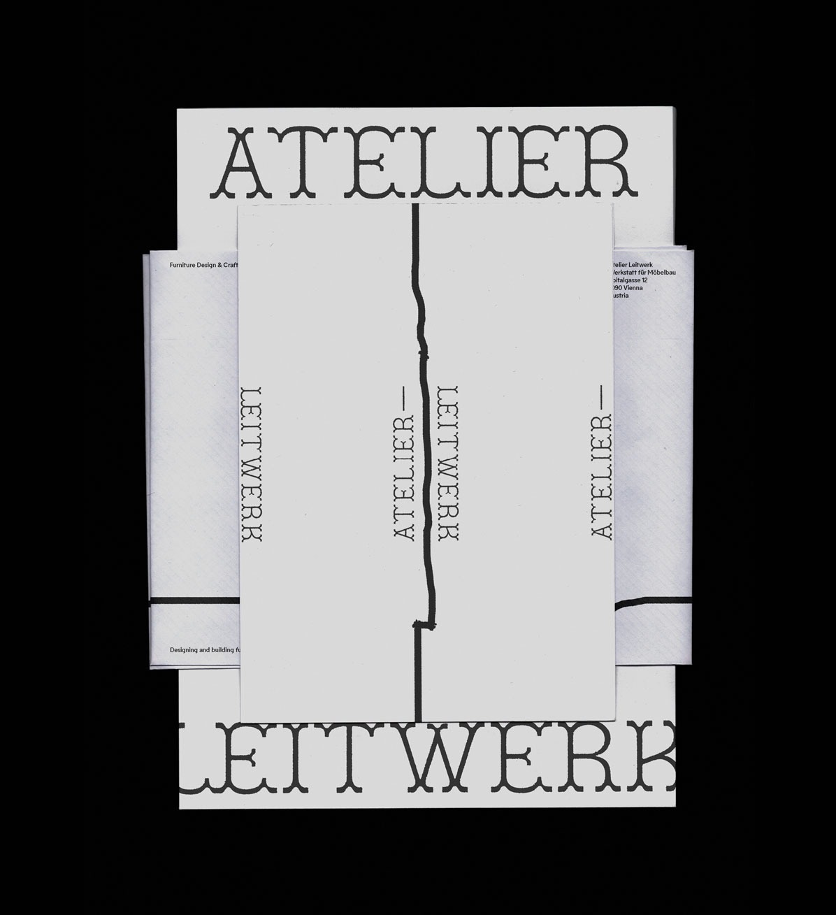
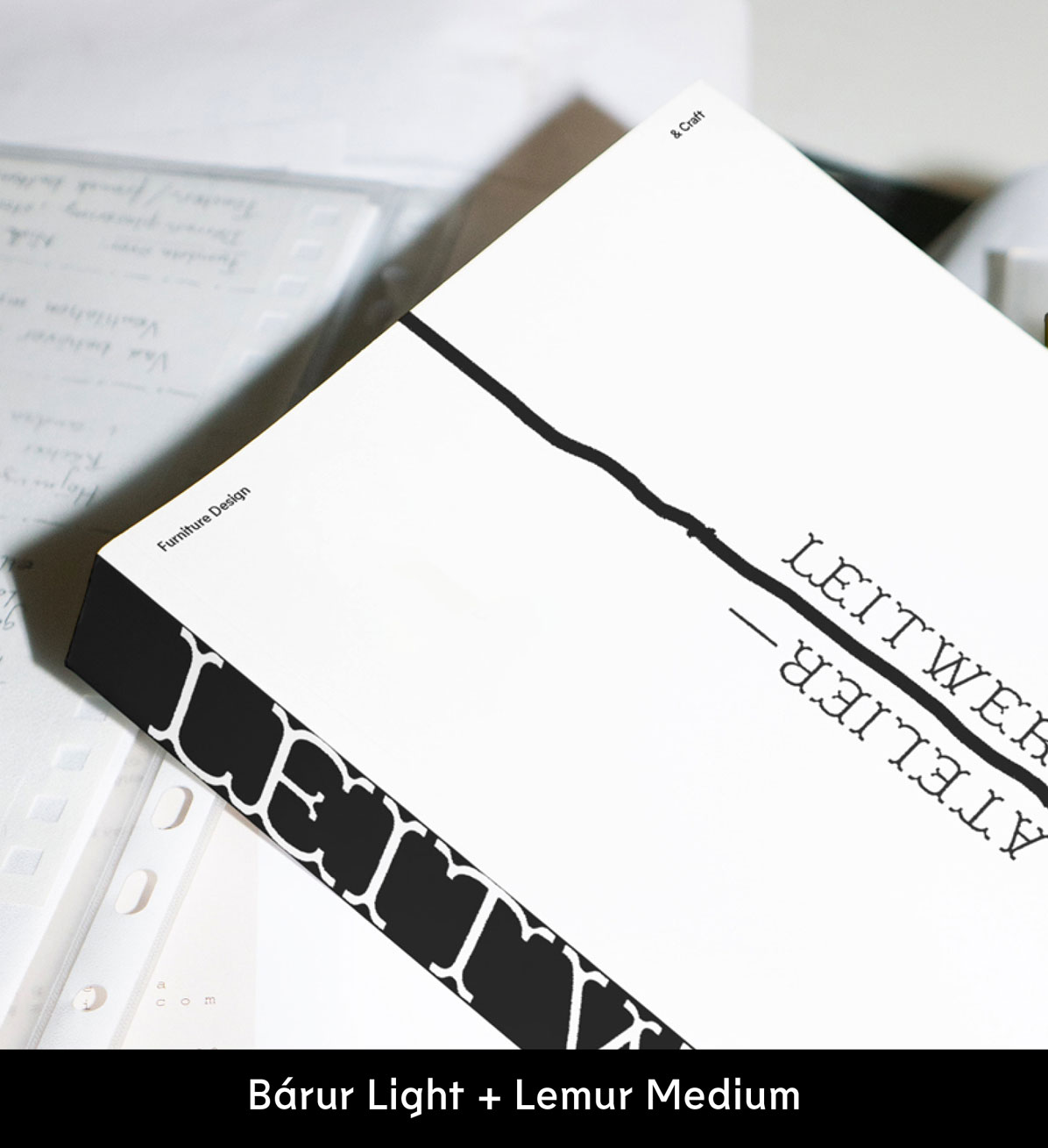
Bárur Light felt like an ideal choice for the world of craft and precision—specifically woodworking. I imagined a cabinetry workshop or furniture design studio where form truly follows craft.
Bárur’s strong, consistent line weight reminded me of the trace a saw leaves in wood. This inspired a distinctive line element that becomes part of the brand identity and can be applied across communication assets. I especially love how it works in print at large scale or when integrated directly into the logo.
For the font pairing, I looked for a typeface that resonated with this aesthetic and context. Lemur Medium continues this peculiar line quality, adding sharp edges and playful letterforms which are particularly visible in characters like f and g. This geometric sans-serif pairs just so well with Bárur Light.
→ Get Bárur Light to recreate a similar vibe!
3 KÆMI — Brand Identity
using Bárur Light + Suisse Int'l Regular by Swiss Typefaces
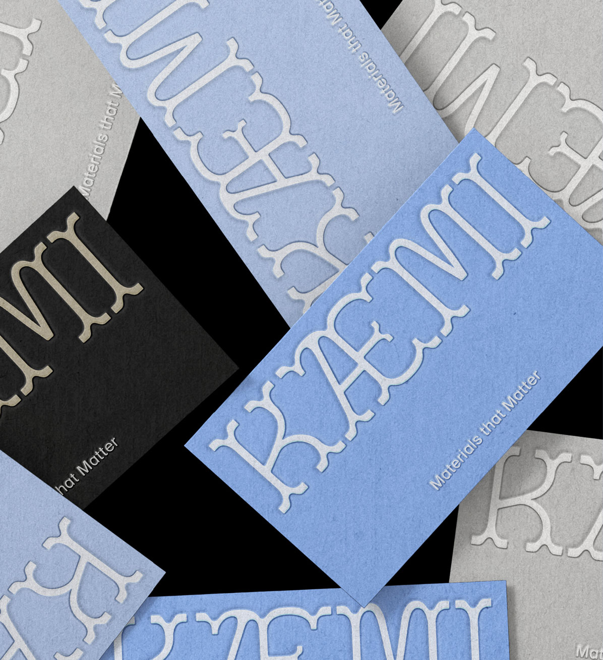
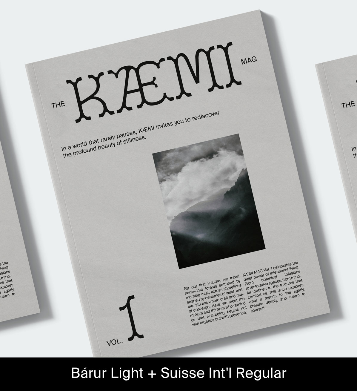
Suisse Int'l is one of my go-to sans-serif typefaces, and we actually use it in Mindt® Studio’s own brand identity. With its wide range of weights, it’s a highly functional Swiss-style font family. But let’s focus on the aesthetic reasoning here.
KÆMI is a modern Scandinavian wellness and lifestyle brand. Its tone is calm, airy, minimalist, and premium. The product range includes botanically infused teas, scented oils, linen goods, and slow-living journals. Their claim: Materials that Matter.
For this mock brand, color plays an equally important role as typography (did you notice the icy blue?). The aim was a fresh, wintery yet warm Scandi aesthetic. Layouts feature generous white space for breathing room and a calm visual rhythm. They even got their own magazine.
This font pairing shows how refined a display serif like Bárur can come across. Simply beautiful! And super aligned with the brand strategy. Suisse Int'l works as a calm, functional supporting font for the display typography, allowing Bárur to set the tone.
→ Get Bárur Light to recreate a similar vibe!
4 Verdant Ancient Yields (V.A.Y.) — Brand Identity & Packaging
using Bárur Regular + Freight Text Pro Book Italic by The Freight Collection
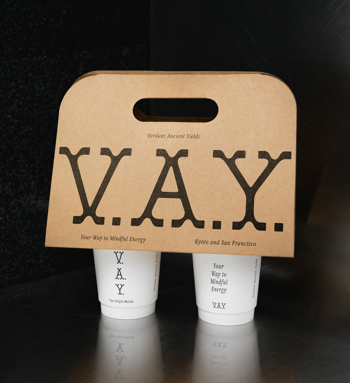
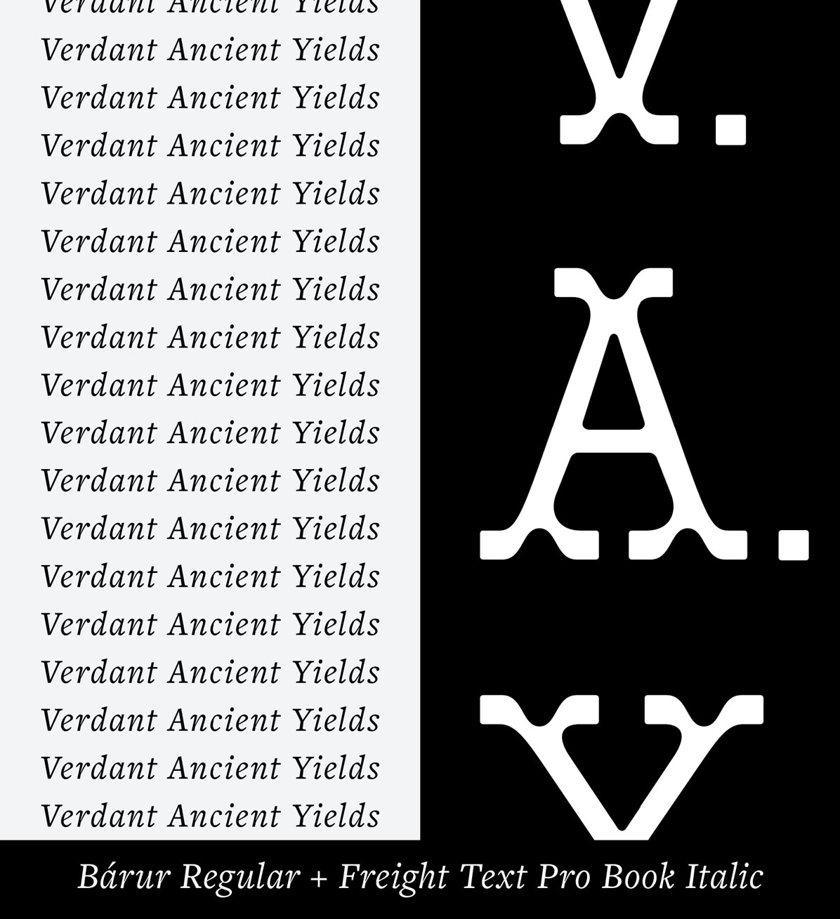
Finally, our first serif font pairing! Pairing a display serif like Bárur with another serif might seem challenging at first. Its own serifs are already so distinctive. Adding more could easily become overwhelming. But I think this pairing with Freight hits a sweet spot.
Freight Text is designed for reading and draws inspiration from the warmth and pragmatism of 18th-century Dutch typefaces. For this premium matcha brand—Verdant Ancient Yields, or V.A.Y.—that warmth felt essential. I love the calligraphic, slightly scribbly character, the line contrast, and the strong personality.
Pairing a display serif with a text serif in this way perfectly conveys the brand message: »Your way to pure matcha. Your way to mindful energy.« The result feels warm, intentional, and full of care. I get such a loving sentiment from the whole brand identity and packaging design.
→ Get Bárur Regular to recreate a similar vibe!
(Freight Text Pro is also available via Adobe Fonts, which is included in the Adobe Creative Cloud subscription.)
5 StudiØster — Brand Identity
using Bárur Regular + GT Alpina Typewriter Medium by Grilli Type

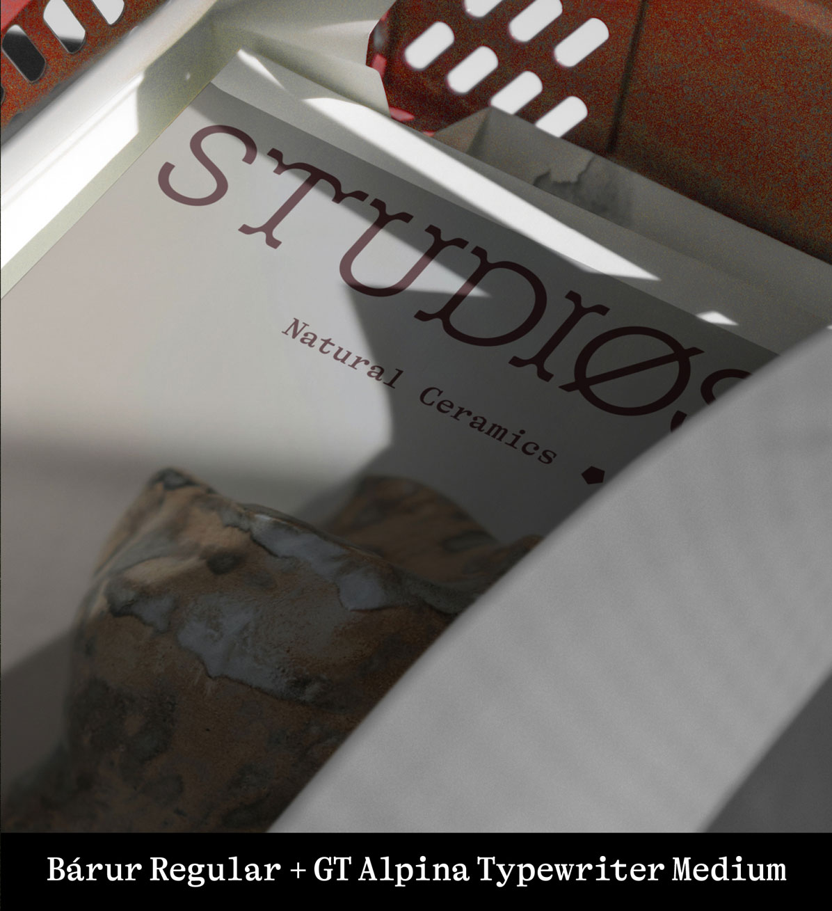
Another serif pairing which I absolutely adore. And I dare say, it’s very special. The self-proclaimed »workhorse serif« GT Alpina adds a new level of expressiveness with its typewriter style. It’s highly appropriate for a ceramics and stoneware brand grounded in natural materials.
For the wordmark, I stuck to Bárur’s original S (without the serif). The Ø became a visual highlight and was extracted as a secondary brand mark. Combined with the right imagery, this results in a beauteously crafted identity for the arts.
Ceramics is close to my heart, so imagining this mock brand was a joy, and it further proved how versatile Bárur truly is.
→ Get Bárur Regular to recreate a similar vibe!
6 Spring — Scented Candle Packaging Design
using Bárur Regular + Degular Medium by Ohno Type
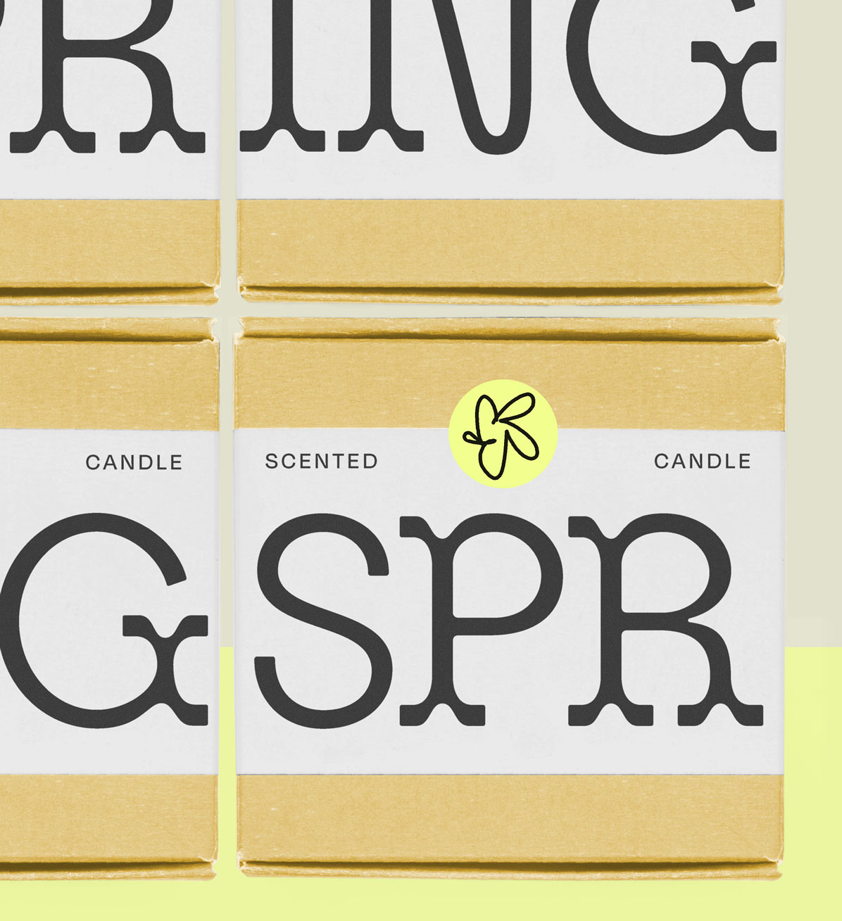
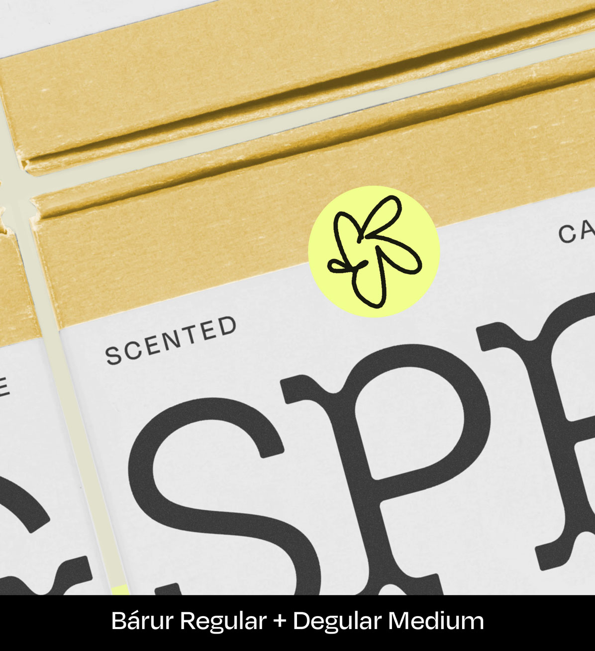
Notice a pattern? We love pairing Bárur with what Ohno calls »background fonts«, like Degular. While Degular can be expressive depending on weight and scale, within this composition it plays a subtle yet crucial supporting role. A true team player.
The color yellow is another key factor for this candle packaging, as is the little flower icon, but today, the focus is type. The candle name SPRING wraps around the carton in an oversized layout, revealing itself only when multiple packages are placed side by side. This creates a playful shelf presence and makes Bárur feel noticeably younger than in previous examples.
I cherish how the Degular C and the Bárur S connect through their similar arch. A subtle but stellar font pairing.
→ Get Bárur Regular to recreate a similar vibe!
(Degular is also available via Adobe Fonts, which is included in the Adobe Creative Cloud subscription.)
7 HHH.4 Lab — Specialty Coffee Brand Identity & Packaging
using Bárur Regular + Letter Gothic Std Bold by Adobe Originals
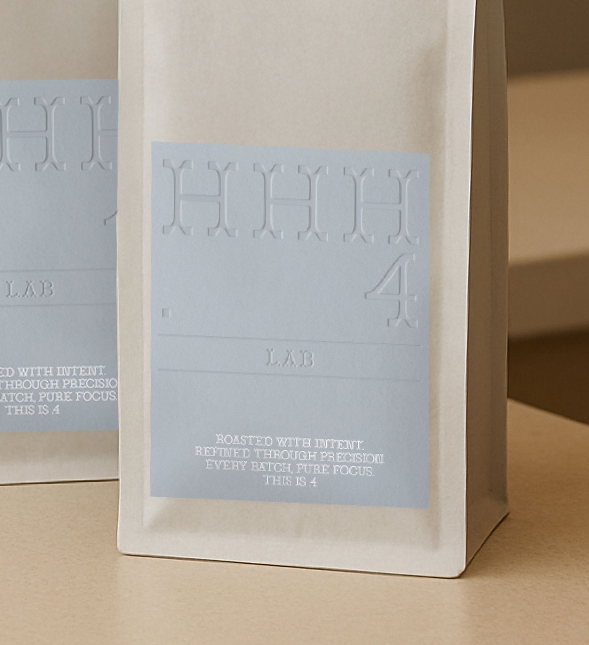
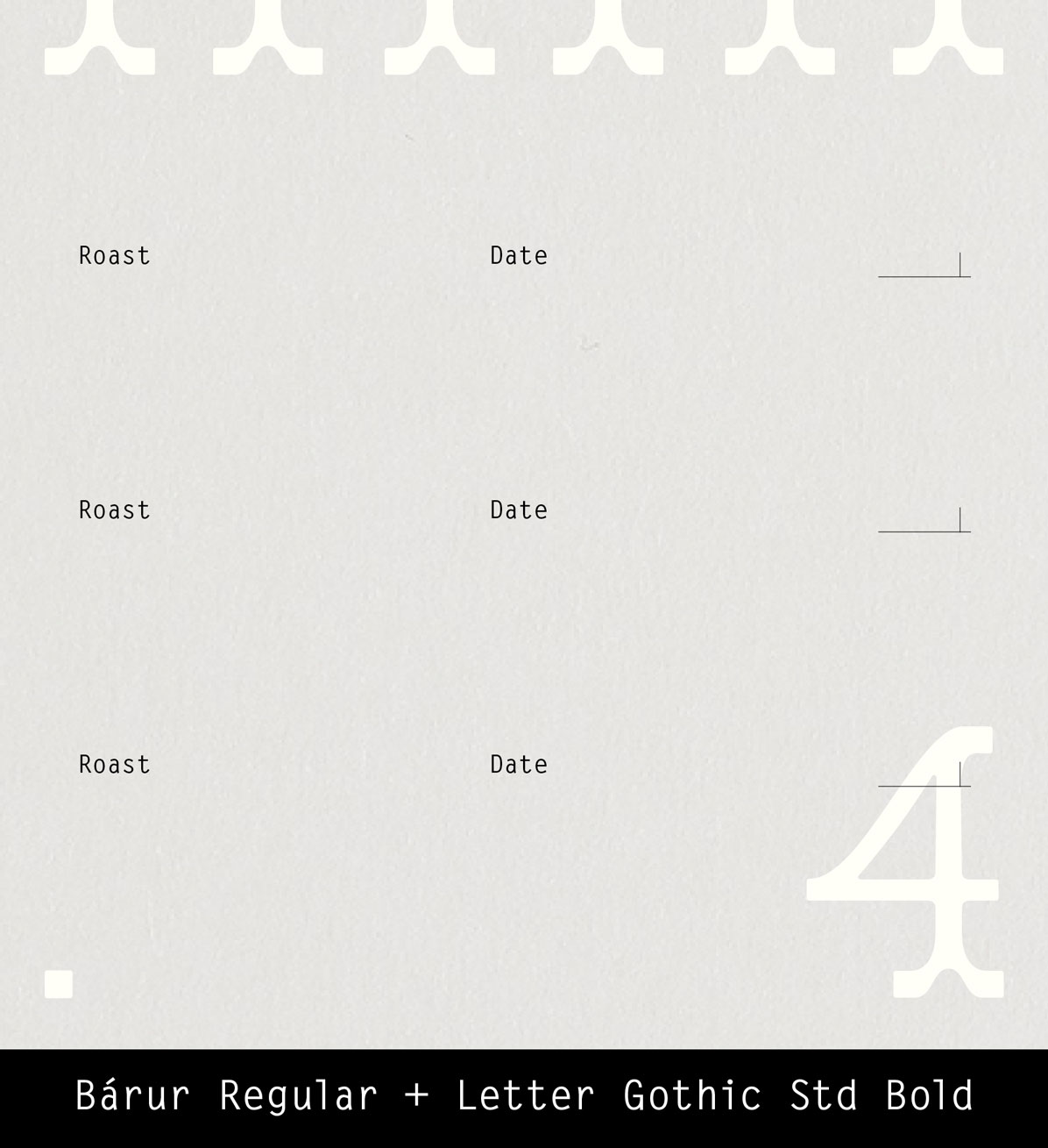
What was missing from our Bárur font pairing examples? A monospaced sans serif. Although we’re using the bold cut of Letter Gothic, it retains such an understated, fine spirit. An excellent pairing for a specialty coffee brand with scientific roots.
HHH.4 is a futuristic coffee lab blending barista craft with chemistry aesthetics. A minimalist, high-end brand focused on fourth-wave coffee culture, building on the third wave’s emphasis on quality while adding ethics, science, and technology.
While the packaging front works beautifully with just Bárur as a standalone display font, Letter Gothic supports brand communication through copy and context. Its technical feel adds credibility and precision. »Roasted with intent. Refined through precision. Every batch, pure focus. This is .4.«
→ Get Bárur Regular to recreate a similar vibe!
(Letter Gothic is also available via Adobe Fonts, which is included in the Adobe Creative Cloud subscription.)
8 Bárur in Solo Use
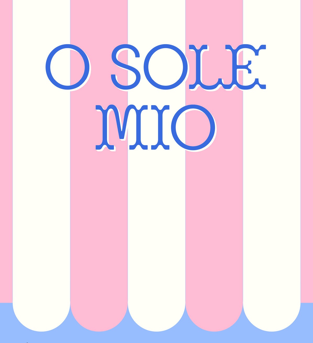
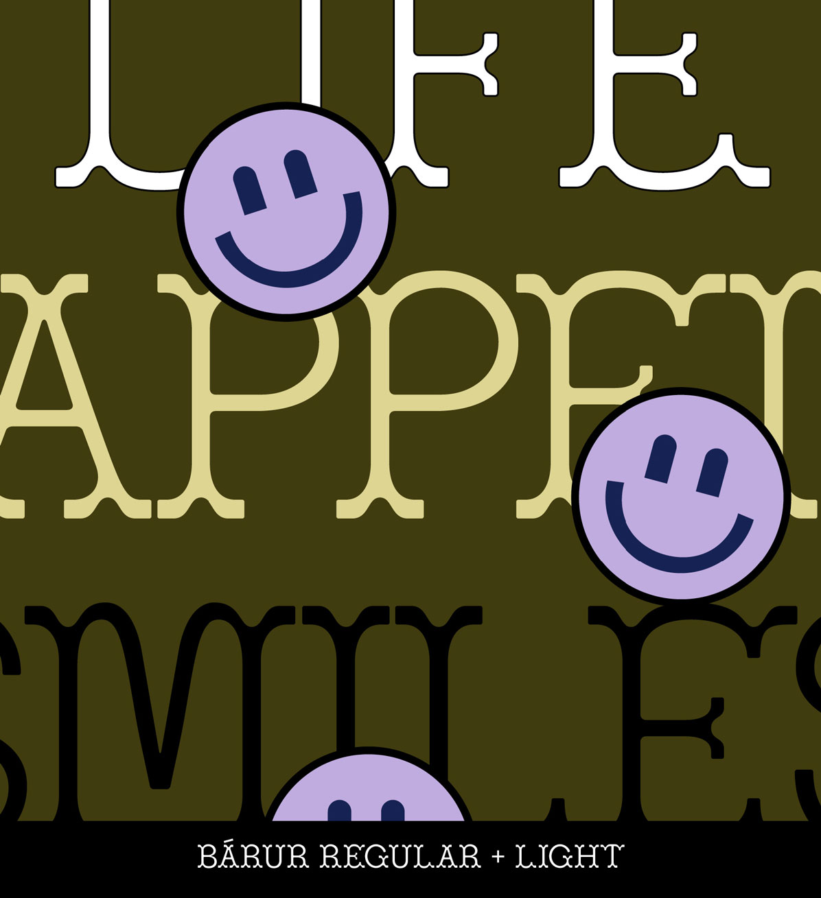
This final example isn’t a font pairing but an encouragement: Bárur (Light or Regular) also works really well on its own, depending on intention, format, and content. Especially for bold key visuals or expressive graphics.
See for example our Smiley graphics using Bárur Light, or the Italian Edit set in Bárur Regular. Happy moods, nostalgic moments, or sun-soaked summer feelings—there’s a lot you can do with this typeface.
→ Get Bárur to recreate a similar vibe!
Font Pairing Ideas with Bárur — Final Thoughts
As these font pairing examples show, there’s an incredible range of possibilities with Bárur. We’re grateful for every license you purchase and truly excited to see your creations. And a little reminder: all future updates of the typeface will always be free for past customers. Support early and grow with the font as it evolves.
Enjoy!
No Comments.