
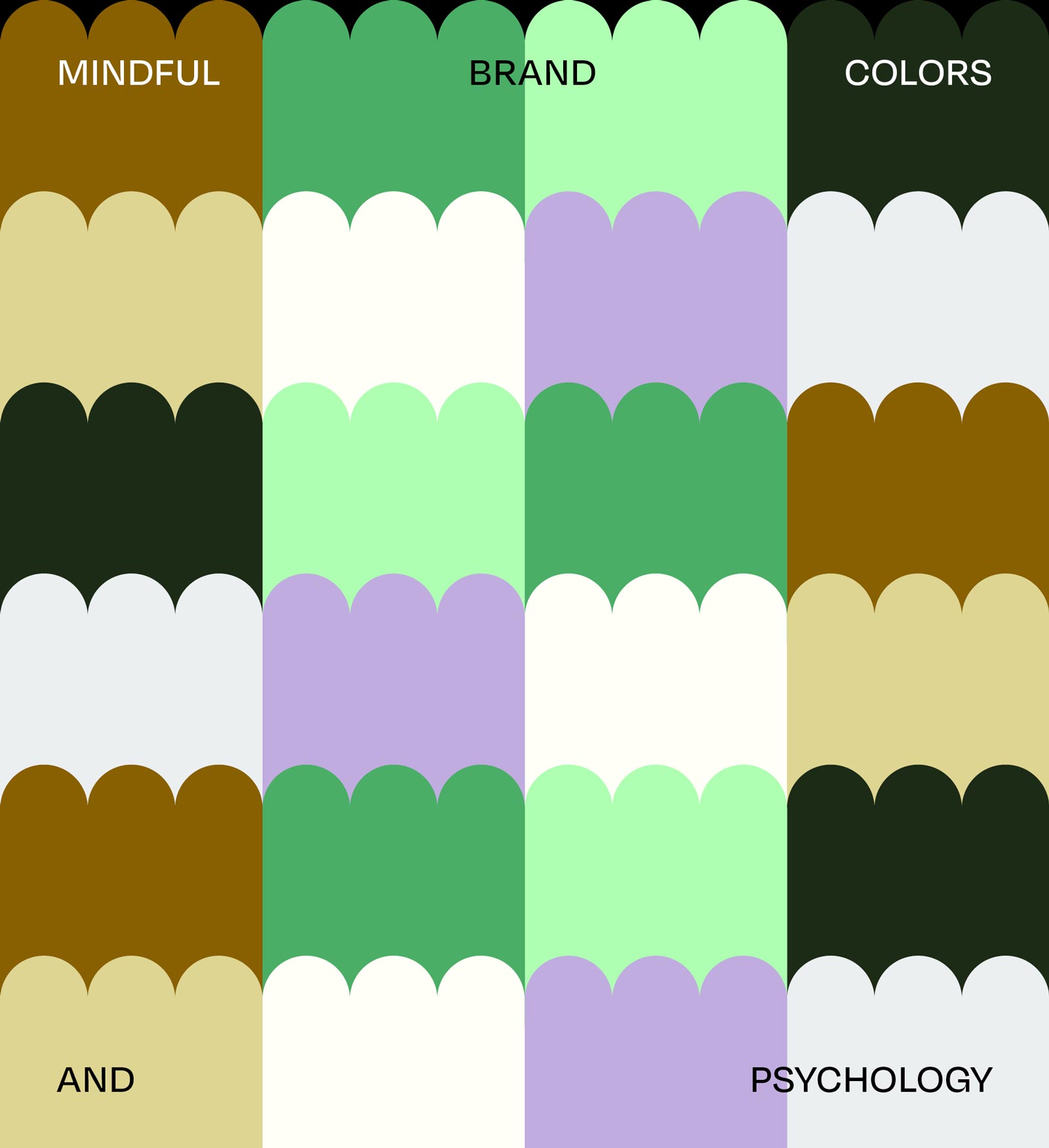
Mindful Brand Colors: The Psychology Behind a Purposeful Brand Palette
How a purposeful brand color palette works across every medium and what we actually think about when we build one.
Your brand’s color palette is the first thing people feel before they read a single word. Not see—feel. Color bypasses rational thought and lands directly in the body: calming, energizing, grounding, exciting. For founders building ethical, conscious businesses, that’s not just an interesting fact. It’s a strategic opportunity.
Our own palette is one of our favourite examples to reach for. It's been built with the same intention we bring to every client project. Here’s the full story behind it, and why every color earns its place.
»A mindful brand color palette isn’t chosen because it looks good. It’s chosen because it means something.«
The Psychology of Mindful Brand Colors: What Each Hue Actually Communicates
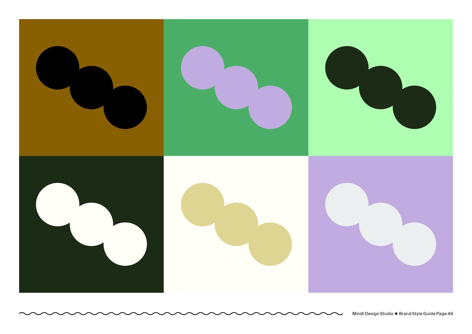
THREE GREENS・NATURE, CALM & CULTURAL SIGNAL
Green is scientifically linked to relaxation. The Japanese practice of Shinrin-yoku (forest bathing) has shown measurable reductions in cortisol simply from time spent among trees. Our three greens tap into that same physiological response, visually. A deeper botanical tone roots us in nature and sustainability, a mid-range green anchors the palette in the organic world, and a radiant neon green injects modernity and energy. That neon shade also carries cultural weight: it’s increasingly used across the mindfulness and wellness community, creating instant visual recognition for the audience we want to attract. Together, the trio reads as calm, considered, and current.
EARTHY BROWNS・GROUNDING & SPIRITUAL DEPTH
One lighter (almost golden) and one deeper brown. These are the colors of soil, clay, and raw earth—materials that feel ancient and trustworthy. In color psychology, warm earth tones create a sense of security and grounding. For a studio that works with ethical, conscious brands, they also signal a relationship with the material world that is thoughtful rather than extractive. They balance the brightness of the greens, bringing the palette back down to earth—quite literally.
VIOLET・DEPTH, CREATIVITY & INTENTIONAL POSITIONING
Violet is perhaps the most strategic color in the entire palette. Historically, it was the color of royalty, worn only by rulers because the dye was extraordinarily rare and expensive. Our founder Sarah, a Manifestor in Human Design, carries that archetype. Positioning Mindt® as a high-end creative studio, violet signals mastery and rarity without loudness. Psychologically it also evokes intuition, artistic sensitivity, and spirituality—all central to how we work. And it brings a distinctly feminine dimension to the palette. Hi, fellow female founders.
LIGHT GREY & OFF-WHITE・SOPHISTICATION & CLARITY
These two minimal tones do a lot of quiet work. They give the palette room to breathe, allow the accent colors to land with precision, and communicate a refined, considered aesthetic. Off-white and grey are the tones that let everything else speak clearly.
BLACK & WHITE・STRUCTURE & LEGIBILITY
Added for contrast, typography, and brand elements. True black and clean white are the scaffold the rest of the palette hangs on. Everything else shines because these two hold the ground.

How a Purposeful Brand Color Palette Works Across Every Medium
One of the palette’s greatest strengths is its range. Almost all combinations are possible: multicolored layouts feel young and expressive, while tone-in-tone applications (greens with greens, browns with off-white) feel minimal and refined. The same palette can dress a playful social media post and a serious client proposal without ever feeling inconsistent.
That adaptability is intentional. A mindful brand color palette isn’t just a set of pretty hues—it’s a system. And a system needs to work everywhere: on screen, in print, in a pitch deck, on packaging, in a brand film. The colors that hold up across all of those contexts are the ones worth building around.
Brand Color Psychology in Practice—A Real Client Example
CASE STUDY: bárur therapy
A wider palette, used with intention.
Not every brand calls for a tight, edited palette. Sometimes the brand’s world is rich enough to warrant more—as long as the logic underneath is solid. bárur therapy is one of those cases.
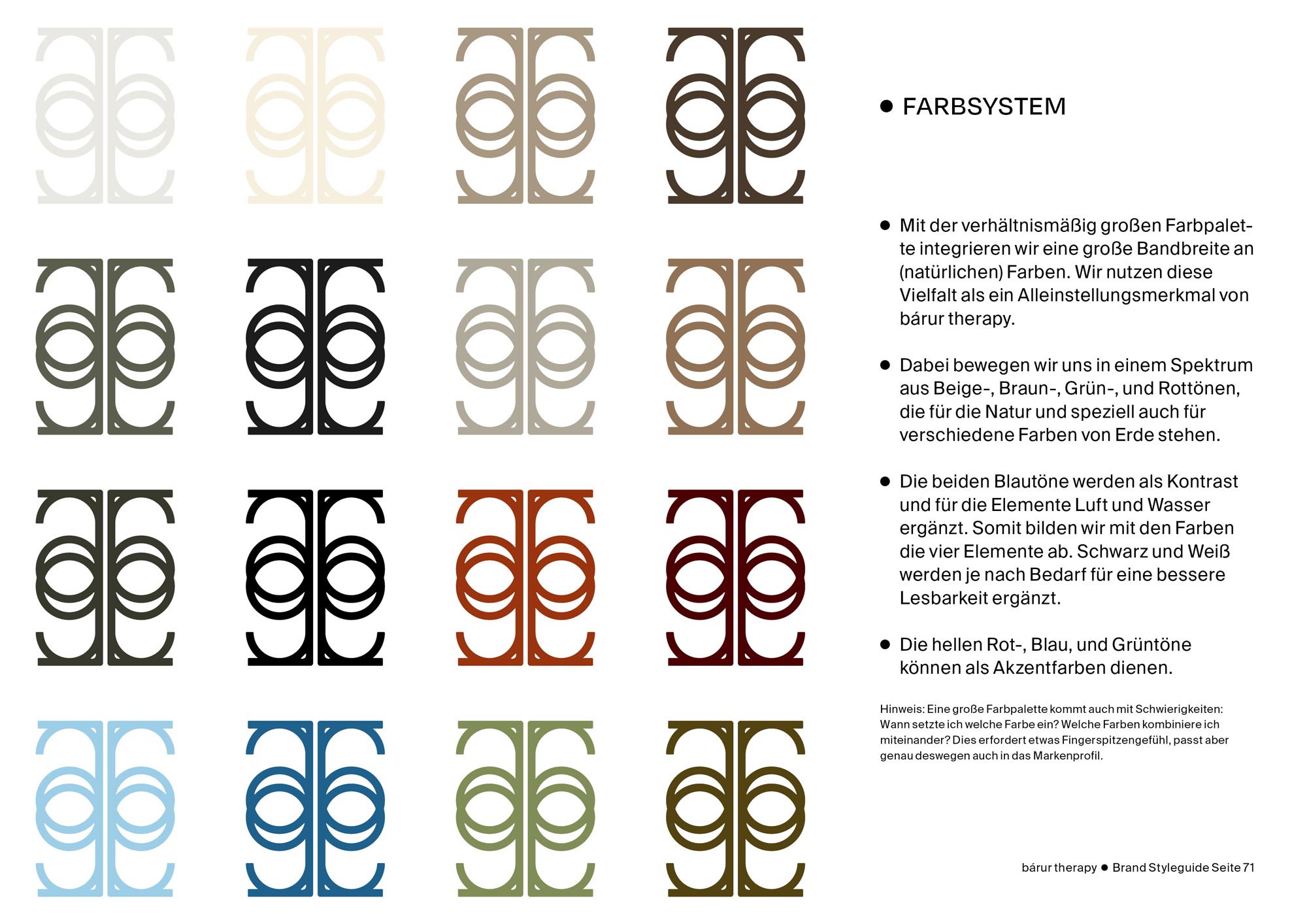
bárur therapy is a holistic practice offering osteopathy, yoga, and sound healing—three disciplines rooted in the body, in breath, and in a relationship with the natural world. When we developed their color system, we didn’t start with aesthetics. We started with a question: what does this brand stand for at its core? The answer pointed directly to the four classical elements—earth, water, fire, and air—and from there, the palette built itself.
- EARTH Beige & warm browns・grounding, stable, organic
- WATER Two blues・calm, flow, depth
- FIRE Terracotta & deep red・warmth, vitality, transformation
- AIR Green & off-white・breath, lightness, space
A NOTE ON LARGER PALETTES
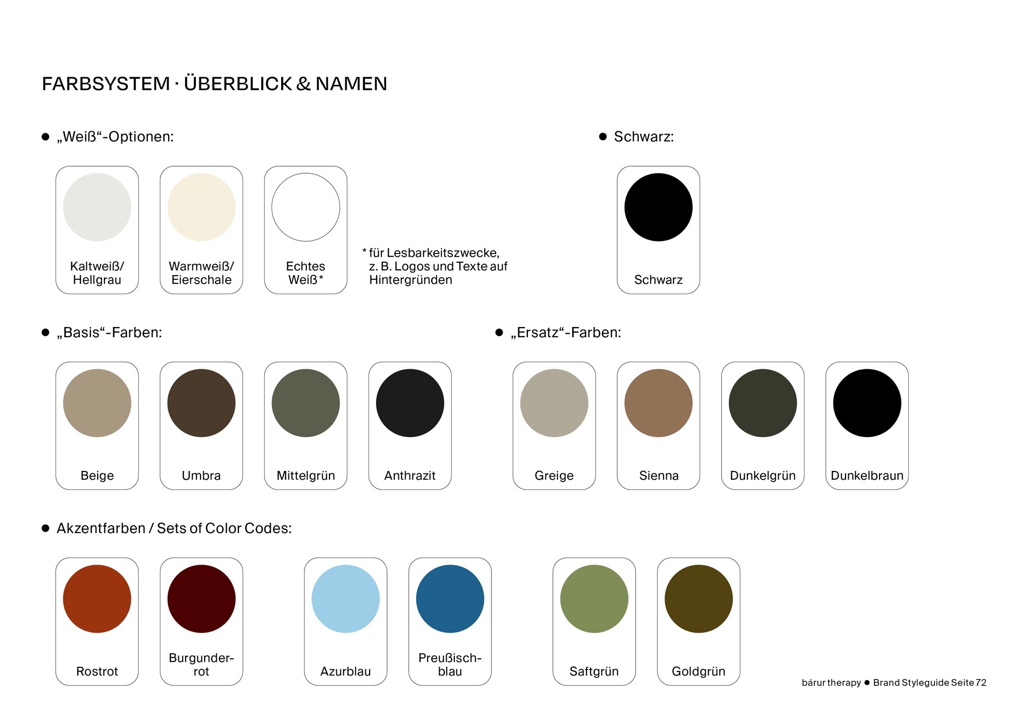
A wider palette demands more from whoever applies it: which colors to combine, when to let one dominate. We addressed this directly in the bárur style guide with combination principles and usage notes for each color group. The palette also opens an interesting future possibility: using specific color sets to distinguish between bárur’s three practice areas—osteopathy, yoga, and sound healing—giving each its own visual identity within the same coherent system.
Working with a palette like this is, in some ways, a mirror of the practice itself. Three disciplines coexisting under one philosophy. The colors do the same—and used well, they create a brand that feels rich, layered, and deeply considered.
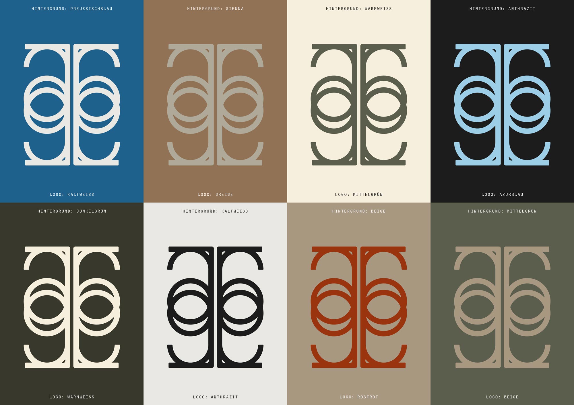
What’s in a Professional Brand Color System: HEX, CMYK & Pantone Explained
Every color in a professional brand palette exists in multiple formats because it needs to show up correctly in every context, from a website to a print run to a packaging proof. Here’s a quick guide to the systems we include in every Mindt® client deliverable:
- HEX & RGB When to use it? Website, social media graphics, digital design—anything on screen.
- CMYK When to use it? Standard print: business cards, flyers, posters, stationery.
- Pantone (no ad) When to use it? Specialty printing where color accuracy is critical—packaging, merchandise. Usually reserved for 1–2 key brand colors.
Every client who works with us on a full branding project receives a complete set of these codes in their style guide so the colors stay consistent long after we’ve handed off the work. That’s what makes the difference between a brand and a mood board.
Your Own Mindful Brand Color Palette
Ethical brands deserve mindful branding.
If you’re building something with substance, let’s talk about what your palette could say.


No Comments.