
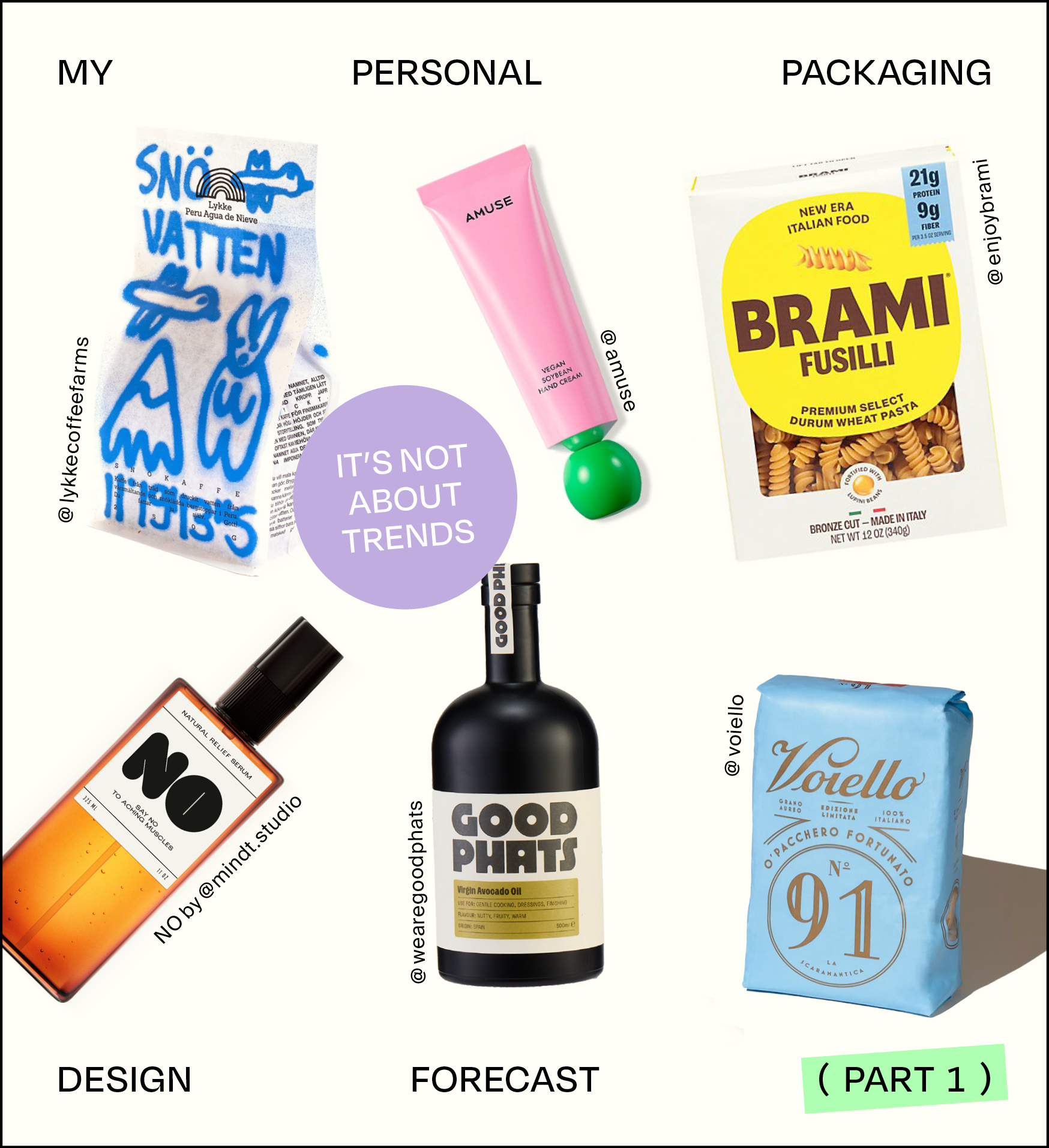
My Personal Packaging Design Forecast — Part 1
Why Packaging Design Trend Reports Are Overrated
Every brand is unique. Its visual identity should grow from within—rooted in brand values, positioning, vision, and more. Call it brand strategy, creative strategy, or whatever you like. But when you build a brand from the inside out, why should it have to follow a trend? In fact, would you even want that? Let’s find out what this means, especially considering packaging design.
Instead of chasing trends, shouldn’t brands be creating them? Carving new paths? Pushing boundaries rather than following the crowd?
That said, I get the value of being aware of what’s out there—understanding what works and why it works. But that’s research and insight, not a visual rulebook.
So, instead of predicting yet another set of so-called »trends« (who wants to be a trend follower anyway?), I’m sharing packaging designs that I love, why they stand out, and where I see potential for future products.
What Makes a Packaging Design Stand Out?
(Spoiler: It’s Not About Trends)
Before diving into specific examples, it helps to define why some designs catch our attention. It’s rarely about just looking trendy—it’s about storytelling, function, and a unique perspective. Some key factors:
- Authenticity → Does the design feel true to the brand’s DNA?
- Functionality → Does it enhance the user experience in a smart way?
- Memorability → Does it stand out in a sea of sameness?
- Innovation → Does it challenge conventions, whether visually or structurally?
- Aesthetics → Does it align with principles of beauty and visual harmony?
Let’s Explore Packaging Designs That Stand Out
Keeping those factors in mind, I did a little research and handpicked some examples that sparked my personal curiosity:
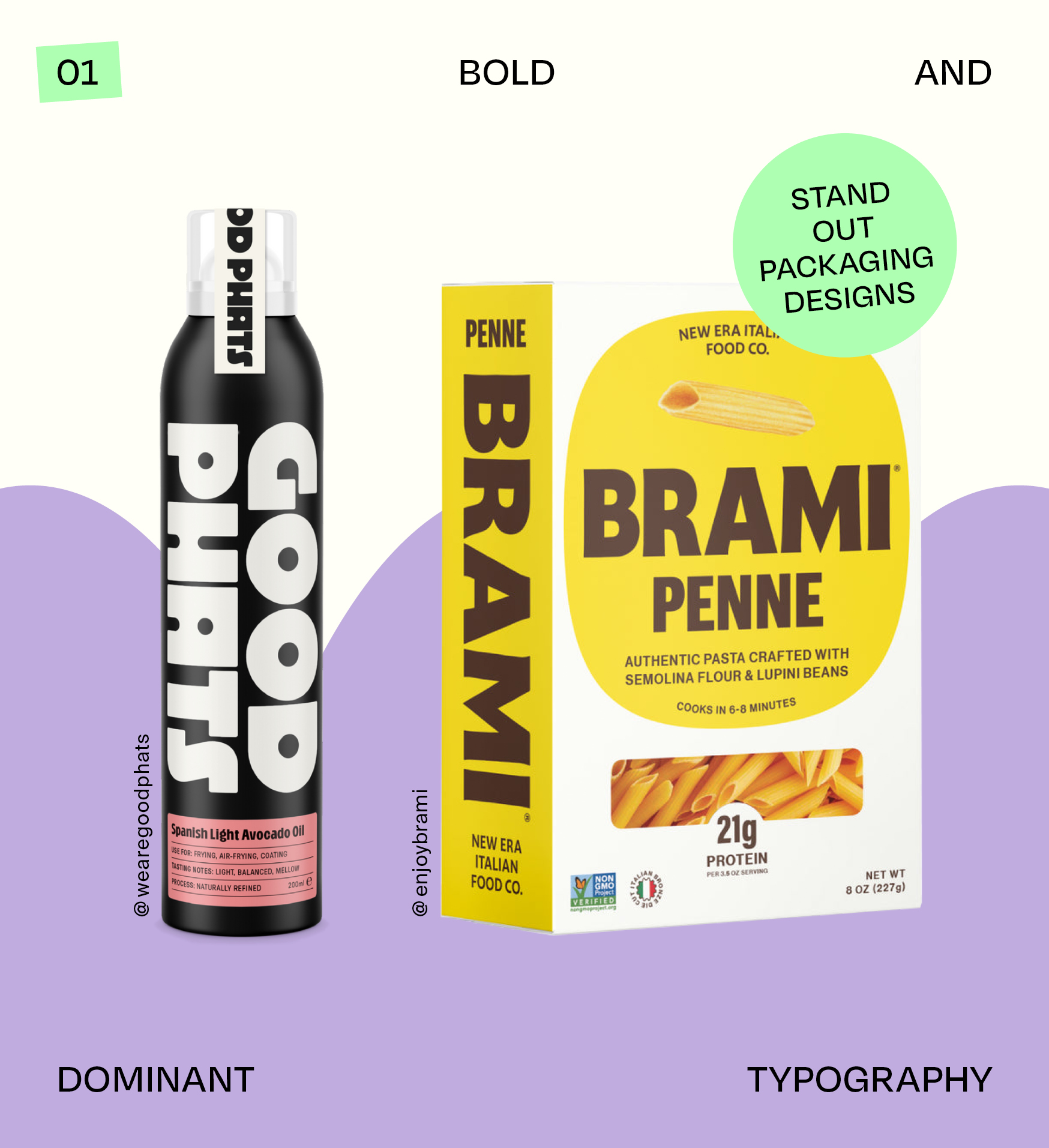
01 Bold and Dominant Typography
If you know me, my studio, and our style, you probably also know that we love type—especially type-based designs! Bold, dominant typography on product packaging can really make a product stand out, making it visible on shelves and positioning it as »design-forward,« visually pleasing, and cool. It attracts consumers who value these qualities.
Good Phats is a great example. Their wordmark is catchy both phonetically and visually, and they’ve gone for oversized placement across their product designs. The result? Memorability, brand awareness, and a name that’s hard to ignore.
Brami New Era Italian Food pursues a similar direction. I love the combination of bold type and bright yellow—a color not often seen in food packaging, which makes their products stand out even more. Their name isn’t as immediately descriptive as Good Phats (the word »bramare« means to passionately desire in Italian), so they complement it with additional illustrations and descriptions, which work really well.
When Should You Use Bold and Dominant Typography on Your Product Packaging?
- For a Memorable Brand Name—This works best if your brand name is either descriptive or phonetically striking, making it easy for people to remember.
- Align with Your Brand Strategy—Bold typography conveys confidence, and often a bit of audacity. Be sure this aligns with your brand strategy and vision.
Bold, type-based design has the potential to outlive trends. It’s a classic approach that, when paired with an aligned color palette, can remain timeless.
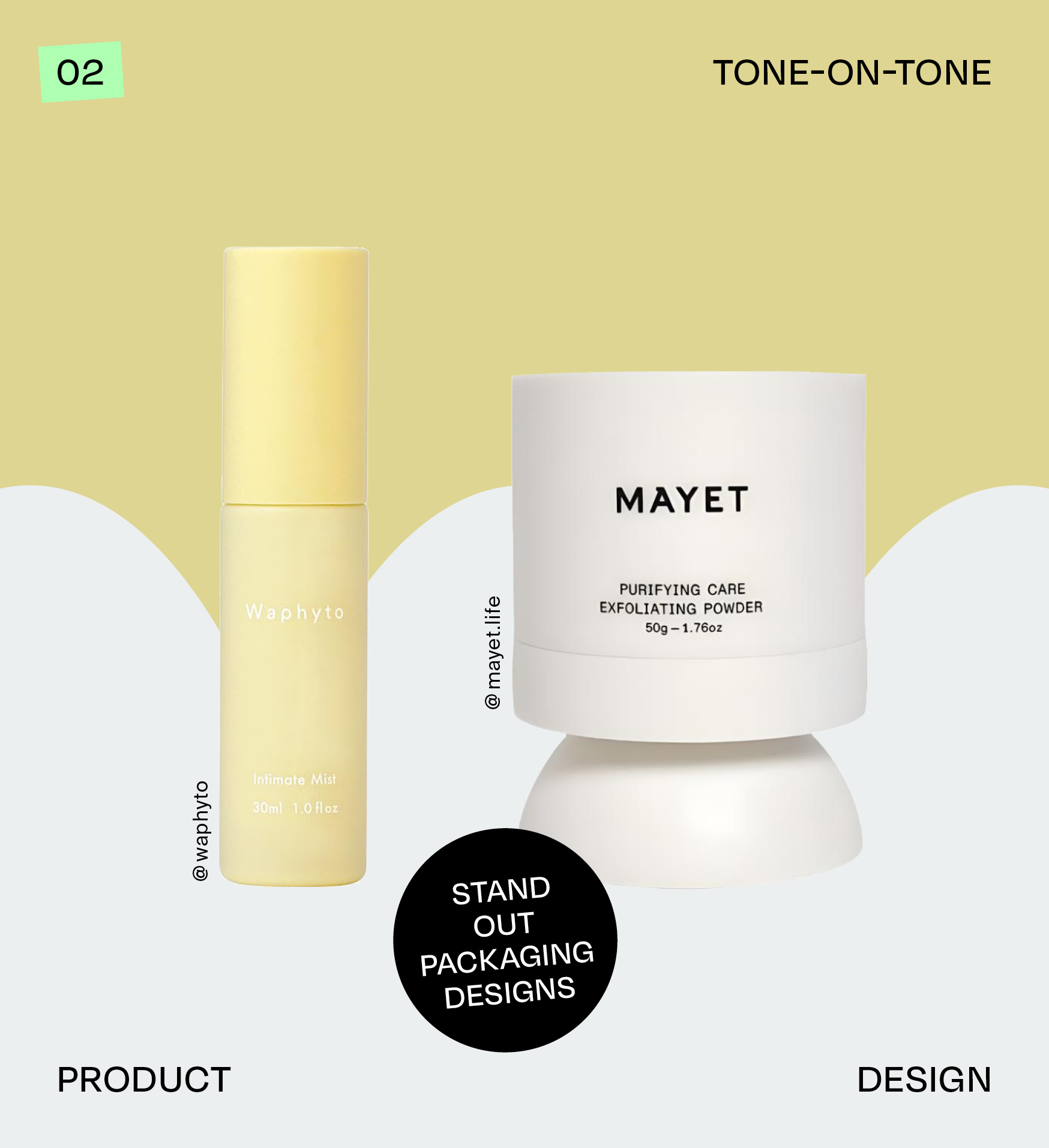
02 Tone-on-Tone Product Design
Tone-on-tone product design can create a calming atmosphere for a brand. With no distractions and minimalistic elements, this style promotes simplicity and tranquility. Personally, I get a Zen-like vibe from it, especially when the colors are soft and not too bright. I believe this strategy works particularly well for wellness products.
Waphyto does a beautiful job with this! They use a muted but still colorful palette, with each product or product line living within a specific tone. There are almost no contrasting elements on the bottles; even the text is often tone-on-tone, with a carving effect, and only some caps stand out in pure white. Waphyto’s clean visual language immediately evokes Japanese design principles—simplicity, ease, and balance. They even extend this color-coded minimalism into the box designs inside the cosmetic packaging.
Mayet takes this even further by incorporating a custom bottle design, transforming the product into something that feels more like a sculpture or artifact. This balanced, harmonious design amplifies the calming effect.
When Should You Use Tone on Tone Product Designs?
- If you want to establish a dominant color for your brand, tone-on-tone design is a great choice—it works with any color.
- If your goal is to convey calm and balance through simplicity, stick with earthy or soft colors to ensure the desired effect.
Again, we’re moving away from trends here, focusing on longevity and sustainable design. By using tone-on-tone elements, your brand can position itself as timeless and high-end. Color is a powerful design tool—especially when paired with color psychology. If this resonates with your brand vision, it’s definitely worth considering this approach.
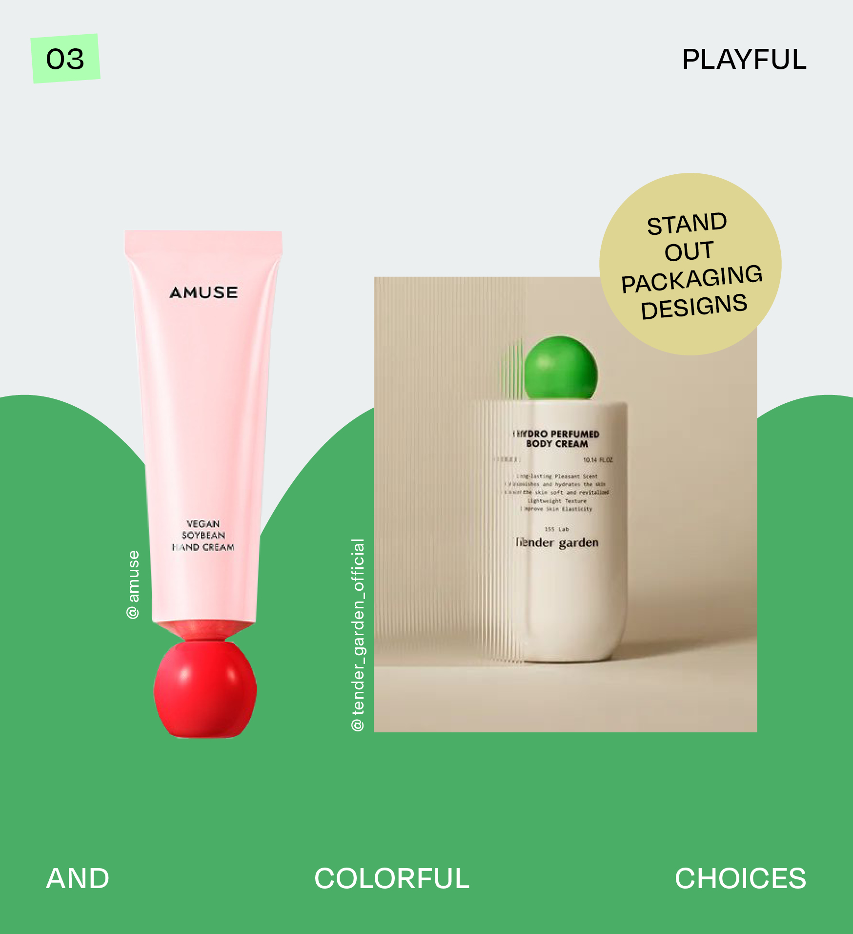
03 Playful and Colorful Choices
We’re still talking about colors here, but with an added twist: shapes! While the previous section focused on tone-on-tone color schemes, this one mixes multiple colors on a single product. By combining colors that align with your brand strategy, you can create a fun and playful vibe. Add in shapes that remind you of toy blocks, and your brand will take on a cheerful, energetic personality.
Amuse is a perfect example of this playful approach. While the overall design language isn’t far from the previous section (with its minimalist foundation), the combination of shapes and colors makes all the difference! The products have a childlike appeal, yet they are sophisticated and intriguing to the eye—something that could easily double as a stylish interior piece in your home. What’s particularly interesting is the way the packaging design evolves as you use the product. From a chubby "toy" (it almost looks like a lacquered wooden toy), the tube transforms as you press and reshape it.
Tender Garden follows a similar path, with colorful, round caps that are impossible to ignore! They pair that vibrant green with a white bottle, giving it a more sophisticated look. While it’s still playful, it leans toward elegance rather than a childlike aesthetic.
When Should You Use Playful and Colorful Choices?
- To create an eye-catching product! These designs aren’t meant for regular supermarkets or drugstores. They’re perfect for boutique settings or places where products are presented as unique pieces.
- You want your products to be more than just everyday items. They should double as interior or styling pieces.
- You want customers to experience fun and joy when using your products. It’s about the whole experience, not just the content inside.
While this approach could be considered a bit trendy, it offers a lot of creative flexibility. You can go all out with bright, bold colors or keep it subtle with one main accent color—what matters most is how it fits with your brand values.
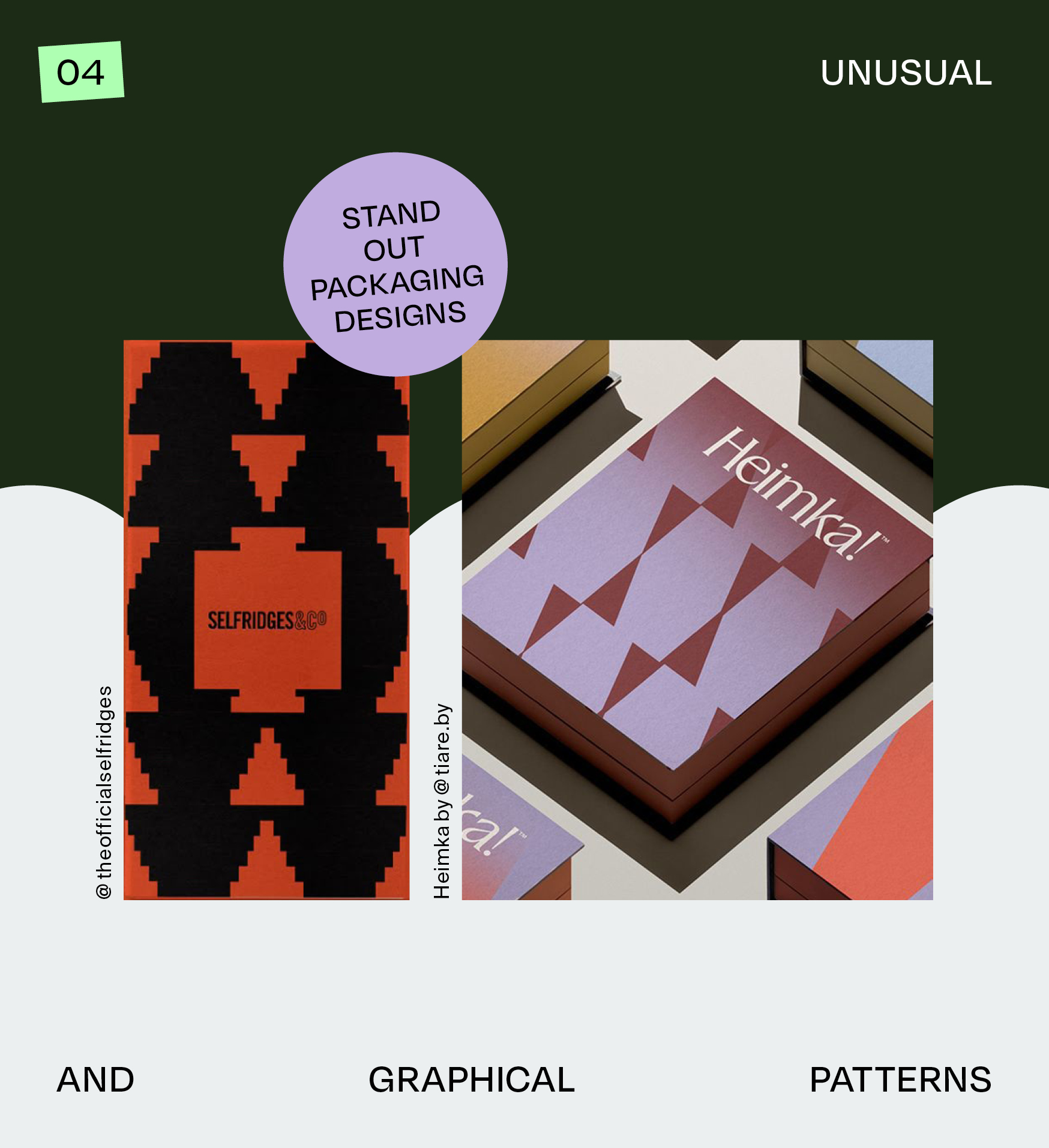
04 Unusual and Graphical Patterns
Patterns can be an amazing way to add personality and depth to a product and brand. As an additional design element alongside shape, colors, and typography, patterns open up endless possibilities for creating unique visual languages. Often rooted in symbolism or culture, they evoke emotions or associations that resonate with the audience.
One example that caught my eye is Selfridges. Although I couldn't pinpoint exactly what kind of product or packaging this is, their choice of pattern really stands out. The design exudes craftsmanship and carries a tribal vibe, which adds a unique layer of storytelling to the product. The repeating design draws you in and has almost a meditative quality to it—similar to the calming nature of yantras.
Another excellent example is the furniture brand Heimka, which shows how versatile patterns can be. By zooming in and out and using a broad but cohesive color palette, Heimka’s branding and packaging design truly stands out, making the patterns not only visually interesting but also an integral part of the brand identity.
When Should You Use Unusual and Graphical Patterns?
- If you want to attract attention with a dynamic, bustling aesthetic. Your brand could be lively, culturally connected, or bursting with personality.
- If you seek more creative freedom and flexibility. Unlike minimalist designs, unusual patterns allow for greater variability in design, giving you more opportunities for experimentation.
A good pattern, like a minimalist design, can be timeless. While it may not blend into as many visual contexts as a neutral design, a well-executed pattern will undoubtedly attract the right audience—one that appreciates personality and authenticity.
What’s Next in Packaging Design?
We’ve explored some standout packaging designs that break the mold and make a lasting impression. But there’s still more to uncover! Stay tuned for Part 2, where I’ll dive into more inspiring packaging ideas and the impact they can have. Keep an eye out—you won’t want to miss it.
Hey!
I’m Sarah, Founder & Creative Director of Mindt® Studio.
We love packaging design and are experts in branding.
No Comments.