
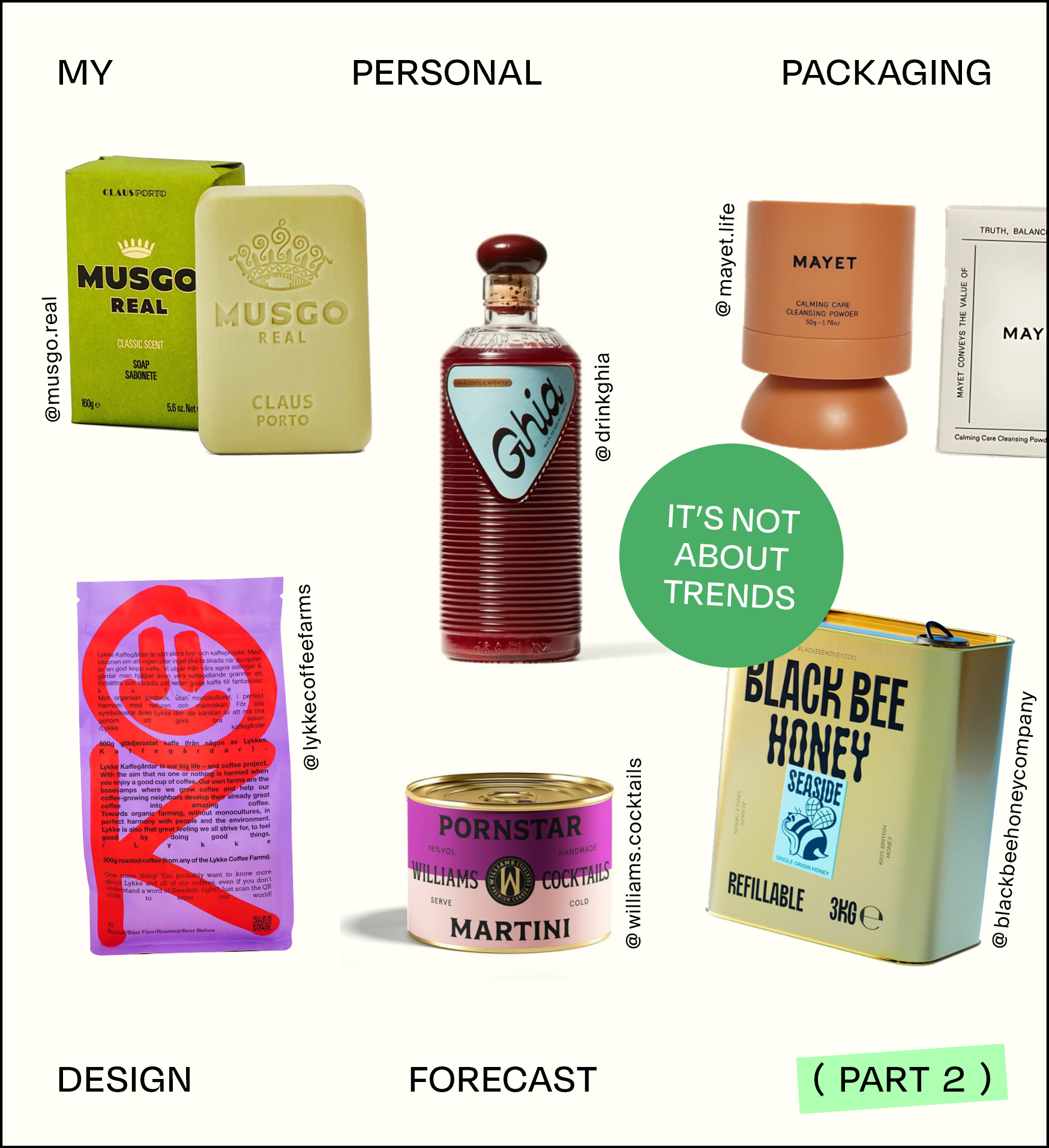
My Personal Product Packaging Forecast — Part 2
Welcome back to Part 2 of our exploration into product packaging design that goes beyond trends. In Part 1, we looked at designs that stand out through minimalism, color, playfulness, and patterns. But there are more ways brands are making an impact.
From unexpected materials to custom details, let’s continue uncovering how packaging can tell a story, spark curiosity, and build brand identity in meaningful ways.
Product Packaging Designs That Stand Out

05 Vintage Food and Product Packaging
This design »trend« has been around for decades and is still going strong. I wouldn’t even call it a trend—it’s more of a timeless classic. Vintage food or product packaging, when done well, has a broad appeal, evoking a sense of high quality and old-school craftsmanship. While it can sometimes lean into nostalgia a little too much, a well-executed vintage design can create an emotional connection and make a product feel more premium.
Voiello Pasta have chosen this well-established route in packaging: They embrace a vintage aesthetic through established colors, ornate but clean layouts, and elegant calligraphy. As a result, we strongly associate the brand with quality ingredients, rich flavors, and the warmth of home-cooked meals—just like at nonna’s. The brand’s goal was to reinforce its bond with Naples, and the design perfectly captures that passion and indulgence.
Musgo Real from Portugal do something similar in a different sector: men’s grooming. Their shaving and skincare products exude pure nostalgia, with traditional typography, royal iconography, and vintage-inspired color palettes—including gold foil accents that add an extra touch of sophistication.
When Should You Use Vintage Food or Product Packaging?
- If your brand has a long history or family heritage that you want to highlight.
- If your products are crafted using traditional methods, high-quality ingredients, or artisanal techniques that evoke a sense of the past.
- If nostalgia and timeless elegance are key parts of your brand’s storytelling.
I personally honor a well-designed vintage-style product—but only when it aligns with the brand’s actual values. Authenticity is key! If your brand has a story rooted in tradition, this aesthetic can be incredibly powerful. However, simply using vintage design for the sake of aesthetics, without a real connection to your brand’s essence, might come across as inauthentic. When paired with the right storytelling, though, this style can create a lasting impression.
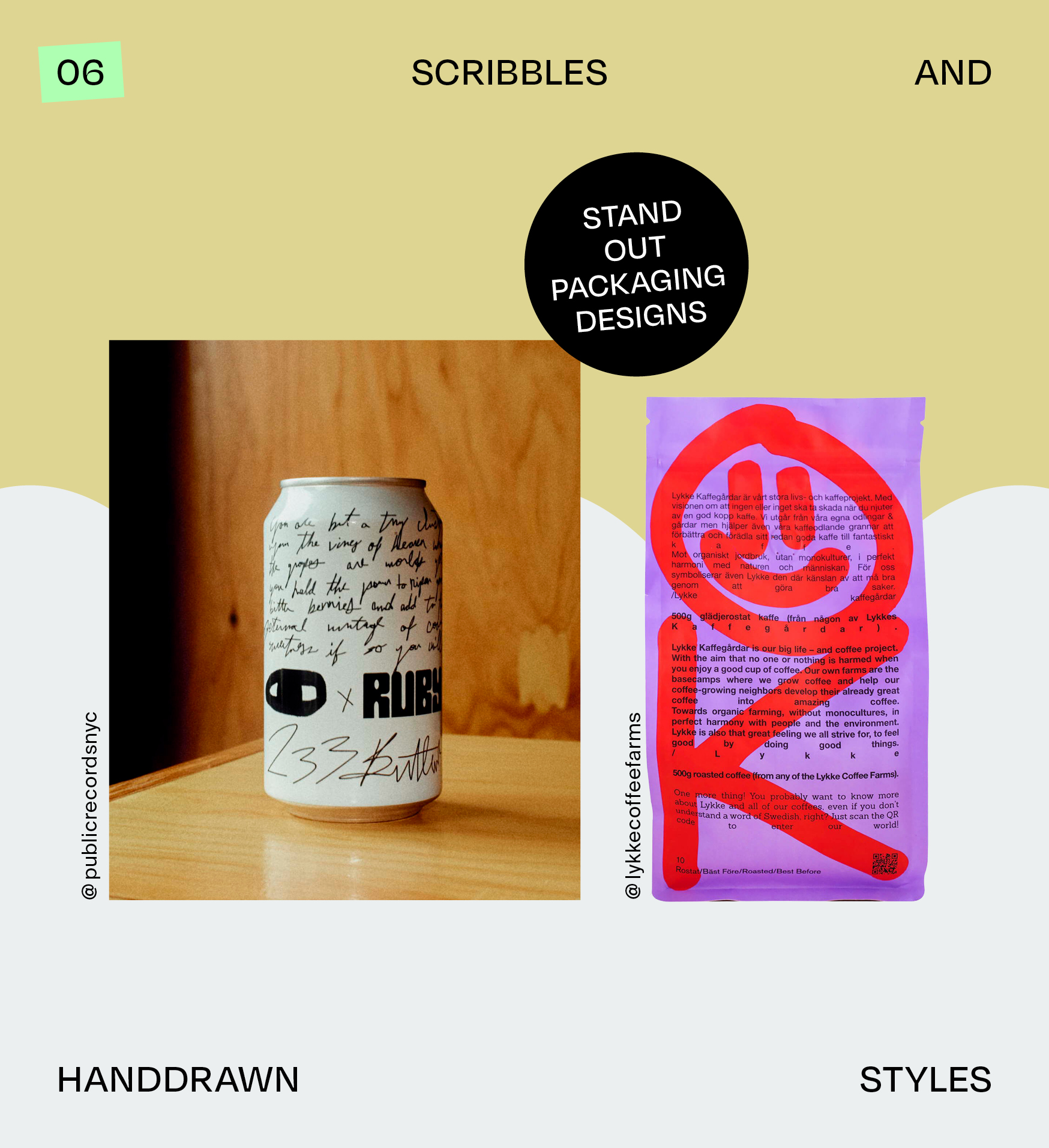
06 Scribbles and Handdrawn Styles
This approach might actually have the potential to become a new hype (pssst), because it’s not yet as prevalent: Scribbles and rough, hand-drawn styles on packaging. This style doesn’t rely on conventional beauty—it’s raw, expressive, and intentionally imperfect. It’s artsy, edgy, and full of personality, which is why it likely attracts a very specific audience and might be considered for special editions, collaborations, and the like.
Ruby Hibiscus And Brooklyn’s Public Records teamed up and created a can that fits into this niche. The black and white aesthetic looks like scribbles on plain paper, with bold branded elements next to an almost illegible paragraph—a poem maybe, or a philosophical quote. It immediately grabs attention and we want to know more about it. The roughly illustrated snake adds to this vibe evoking mystery, rebellion, and underground culture.
Lykke Coffee are known for a similar branding style. They layer spray-like illustrations and rough, tag-inspired typography over a clean typeset foundation, creating a bold, rebellious, and memorable look.
When Should You Use Scribbles and Handdrawn Styles?
- If your brand speaks to a young, creative, or underground audience (think street art, indie zines, hip-hop culture).
- If collaborating with artists fits your brand’s vision and helps create visibility and hype.
- If you want to embrace imperfection and authenticity—this style feels human, expressive, and full of personality.
This kind of packaging design particularly suits consumer products with a strong public presence—especially beverages that are sold or used in bars and cafes, food packaging in ready-to-consume food packaging, and more, but I’m excited to see this style emerge in completely different industries as well!
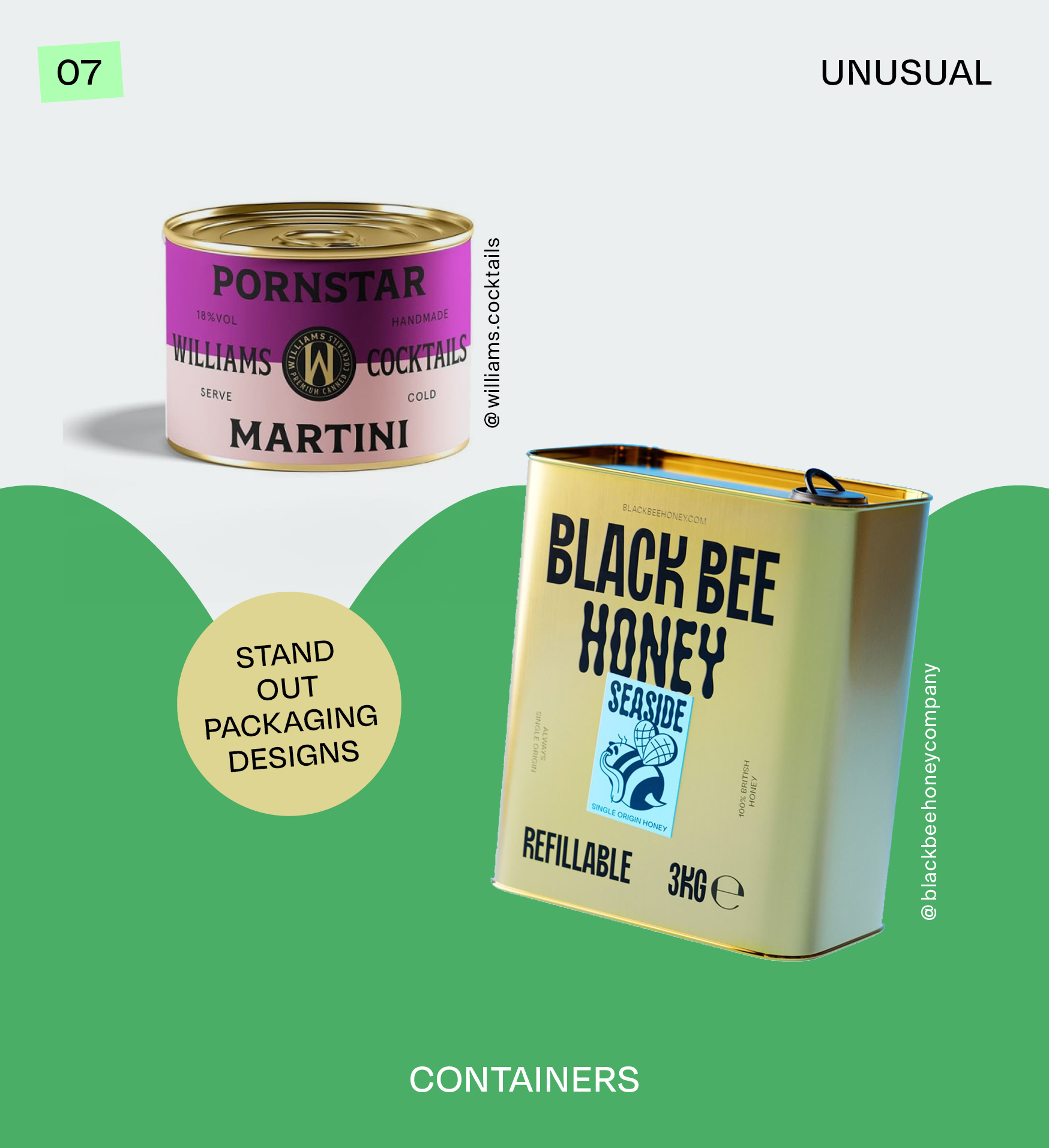
07 Unusual Containers
Blending two completely different worlds to create something unexpected has long been a smart marketing strategy. In packaging design, this means taking a container typically associated with one industry and repurposing it for a completely different product. Think industrial meets food, or luxury meets everyday items. It’s all about innovation, surprise, and curiosity.
Black Bee Honey uses a container more commonly seen for paint or motor oil, not honey. It’s a genius way to spark intrigue and challenge expectations. Whether a one-time marketing stunt or a regular product, it grabs attention and makes people look twice.
Williams Premium Canned Cocktails do things similarly. At first glance, their tin packaging might make you think of olives or canned goods, but inside? A premium cocktail. The unexpected container, paired with a refined branding and color palette, gives off a sophisticated and harmonious vibe—reminiscent of 1920s bars, indulgence, and the celebration of life.
When Should You Use Unusual Containers?
- If you want to stand out, spark curiosity, and make people talk about your product.
- If your brand thrives on storytelling, clever visuals, and disruptive marketing.
- If the container adds to the experience and perception of your product—whether through nostalgia, humor, or luxury.
While this is a brilliant way to create buzz, keep in mind practicality and sustainability—ensure the materials are safe for your product and minimize environmental impact.
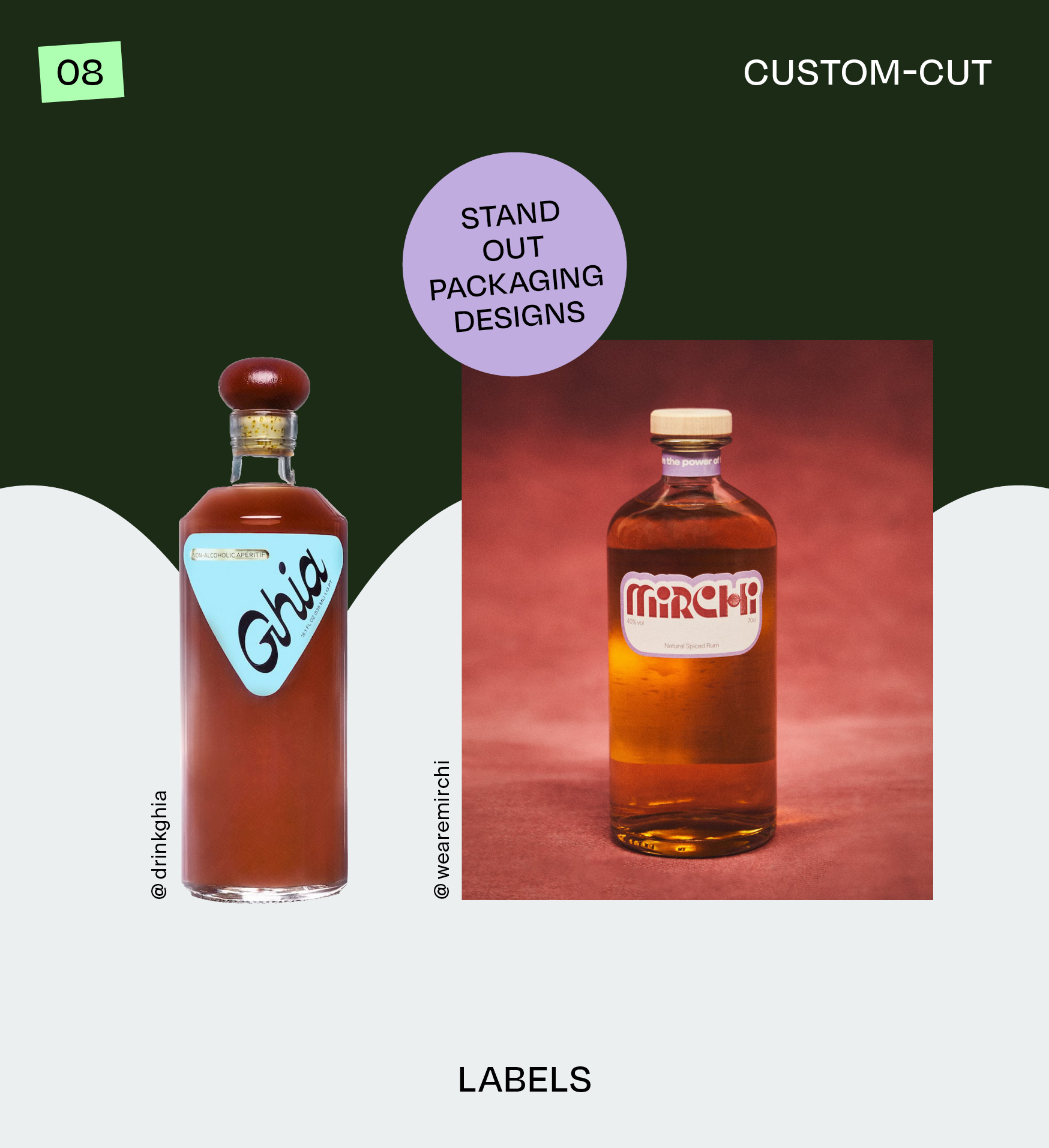
08 Custom-Cut Labels
This one is for print lovers and those who appreciate thoughtful customization. Most product labels are square or round, but custom-cut labels take things to the next level. They show that your brand values craftsmanship, intentional design, and a personal touch—not just in packaging, but in everything you do.
Ghia keeps it simple yet striking with a rounded triangle label. Paired with minimal content (just the logo and product description), it emphasizes quality and restraint. Some bottles even have a hollow space for the label, while the glass itself features intricate textures, proving that details matter.
Mirchi Natural Spiced Rum on the contrary, use a standard bottle, but still chose the custom shaped label that flows naturally around their word mark. This makes all the difference compared to a rectangular label, and lets the product stand out with minimal effort. A distinctive, high-end feel.
When Should You Use Custom-Cut Labels?
- If you want to showcase attention to detail and a love for custom design.
- If you're looking for a cost-effective way to elevate a standard product and make it feel more bespoke.
This is an underrated packaging approach! If you're a startup with a limited budget, a custom-cut label can add a sense of uniqueness and sophistication without breaking the bank.
Looking Forward:
The Potential of Product Packaging Design
What’s the future of packaging design if we ignore trends?
Packaging is more than just a container—it’s an experience, a statement, and sometimes even a piece of art. Whether it’s through materials, colors, structure, or storytelling, the most memorable designs are the ones that stay true to the brand while daring to do something different.
Looking ahead, I see huge potential in packaging that not only looks good but also feels intentional—whether that’s through sustainability, tactile elements, or unexpected creative twists.
There are also exciting opportunities on the horizon: hyper-personalized branding, AI-driven packaging, AR elements, or complete sustainable innovation with repurposable containers… I’m personally excited to see where it all goes.
What type of packaging design resonates most with you? I’d love to hear your thoughts! If you’ve spotted any packaging designs that break the mold or want to collaborate on a project, feel free to reach out.
Hey!
I’m Sarah, Founder & Creative Director of Mindt® Studio.
We love packaging design and are experts in branding.
No Comments.