Personal Branding Without a Logo
Rooms With Personality
☺︎ Services
Brand Strategy
Brand Design
Print Design
☺︎ Client
Context
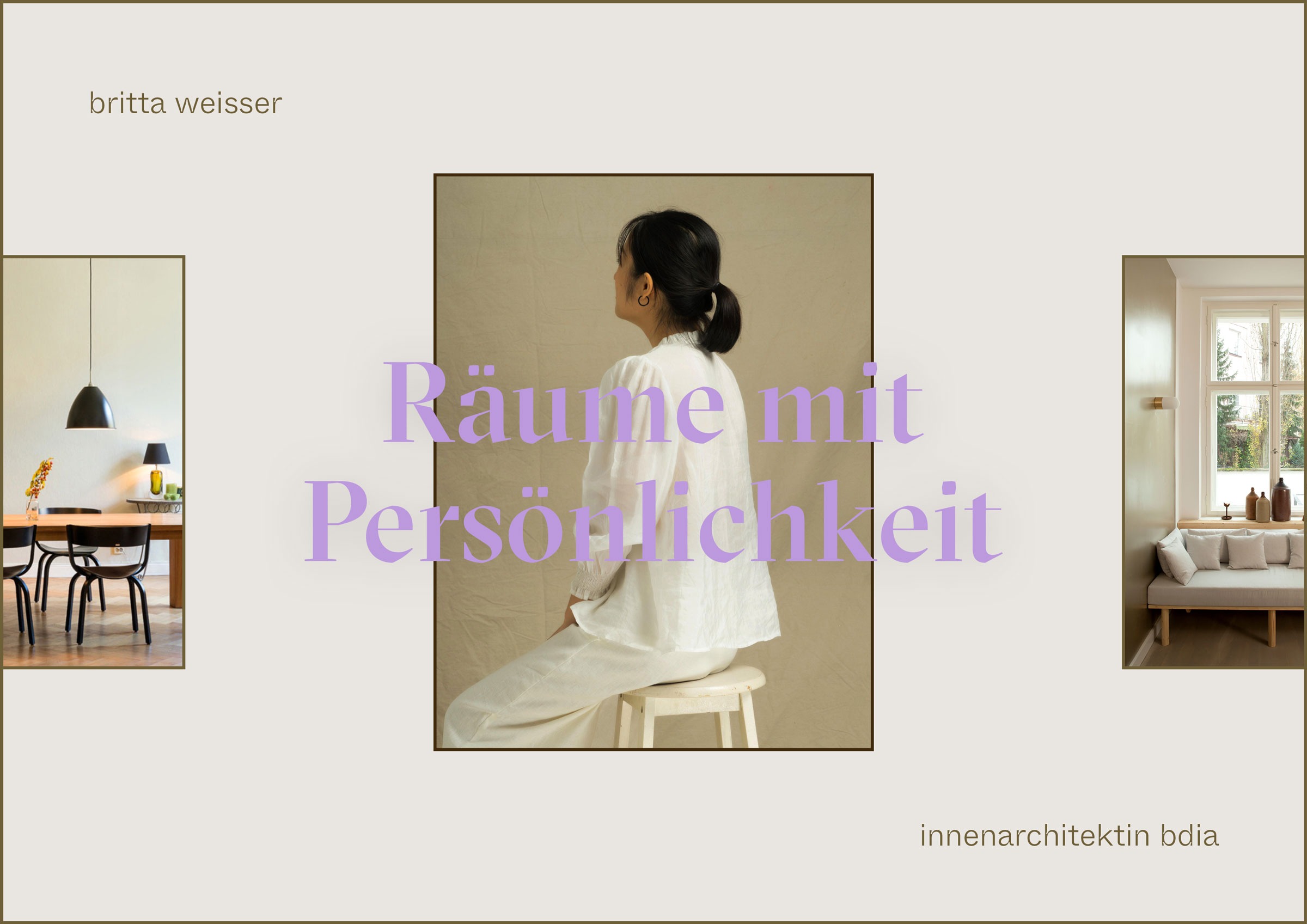
Britta Weißer is an interior architect based in Berlin, Germany. She designs habitats and spaces of well-being for private and business clients alike. Her work focuses on the interplay of color, material, lighting, and sound—elements through which she composes holistic environments. It is essential to her that people feel genuinely comfortable within these spaces and that beauty becomes part of everyday life. Britta’s approach is always personal, sensual, and clear. Her projects have been featured in interior publications and on platforms such as Houzz.
Our Approach
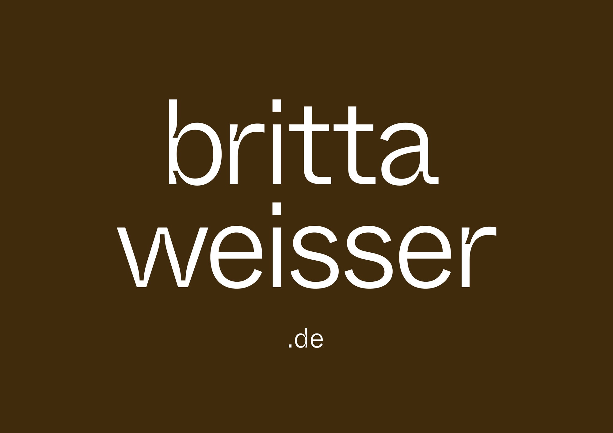
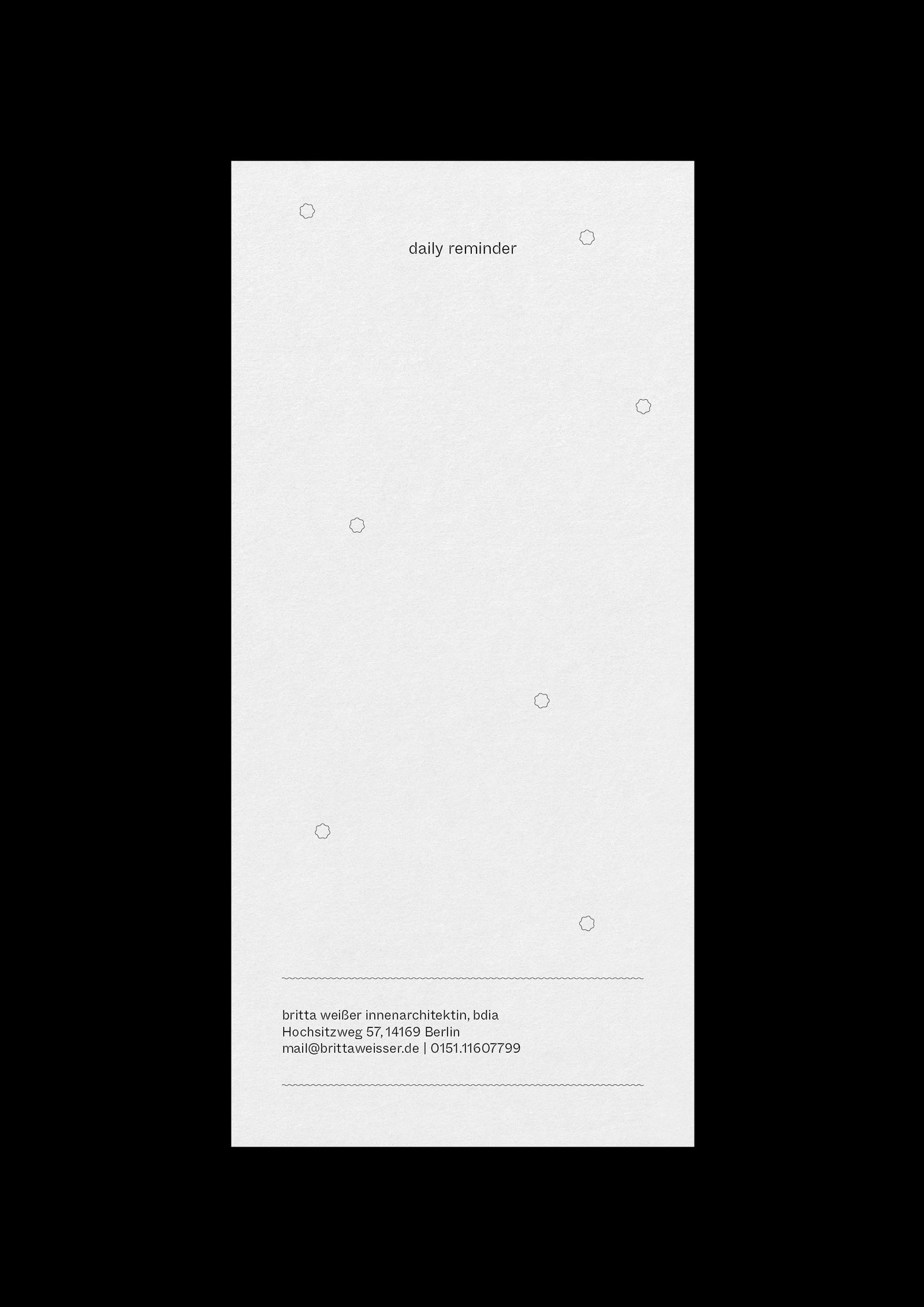
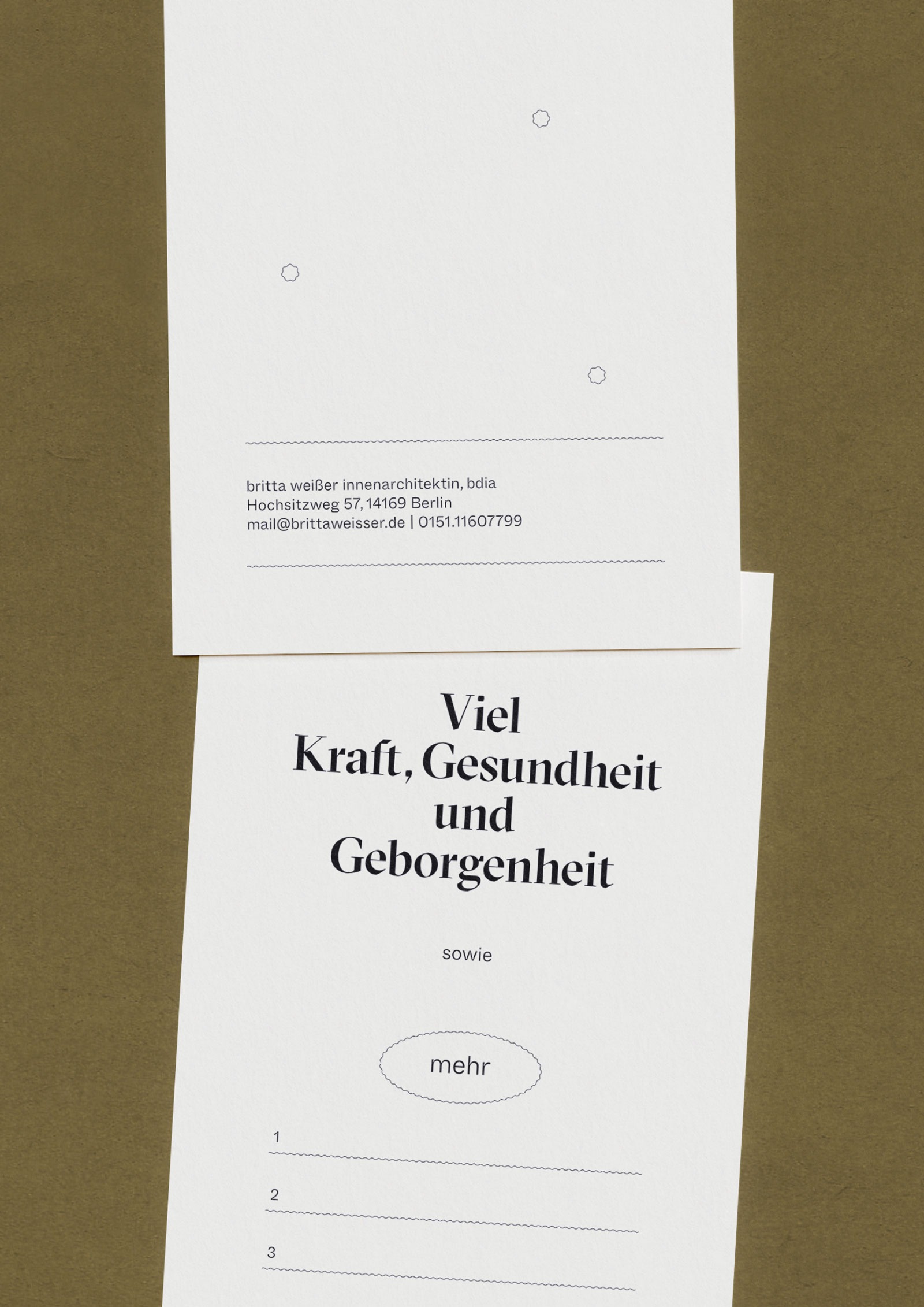
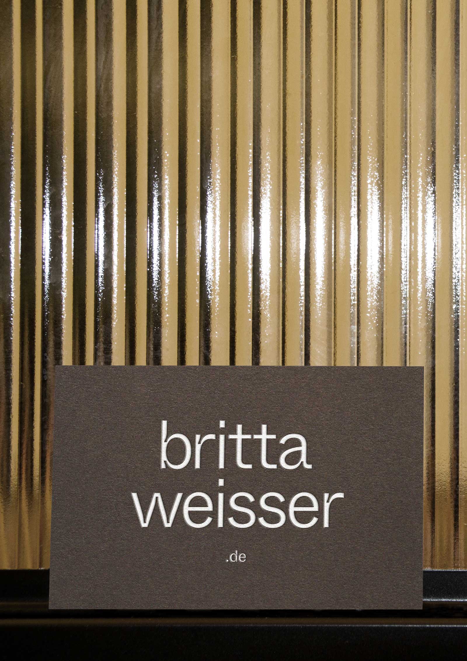
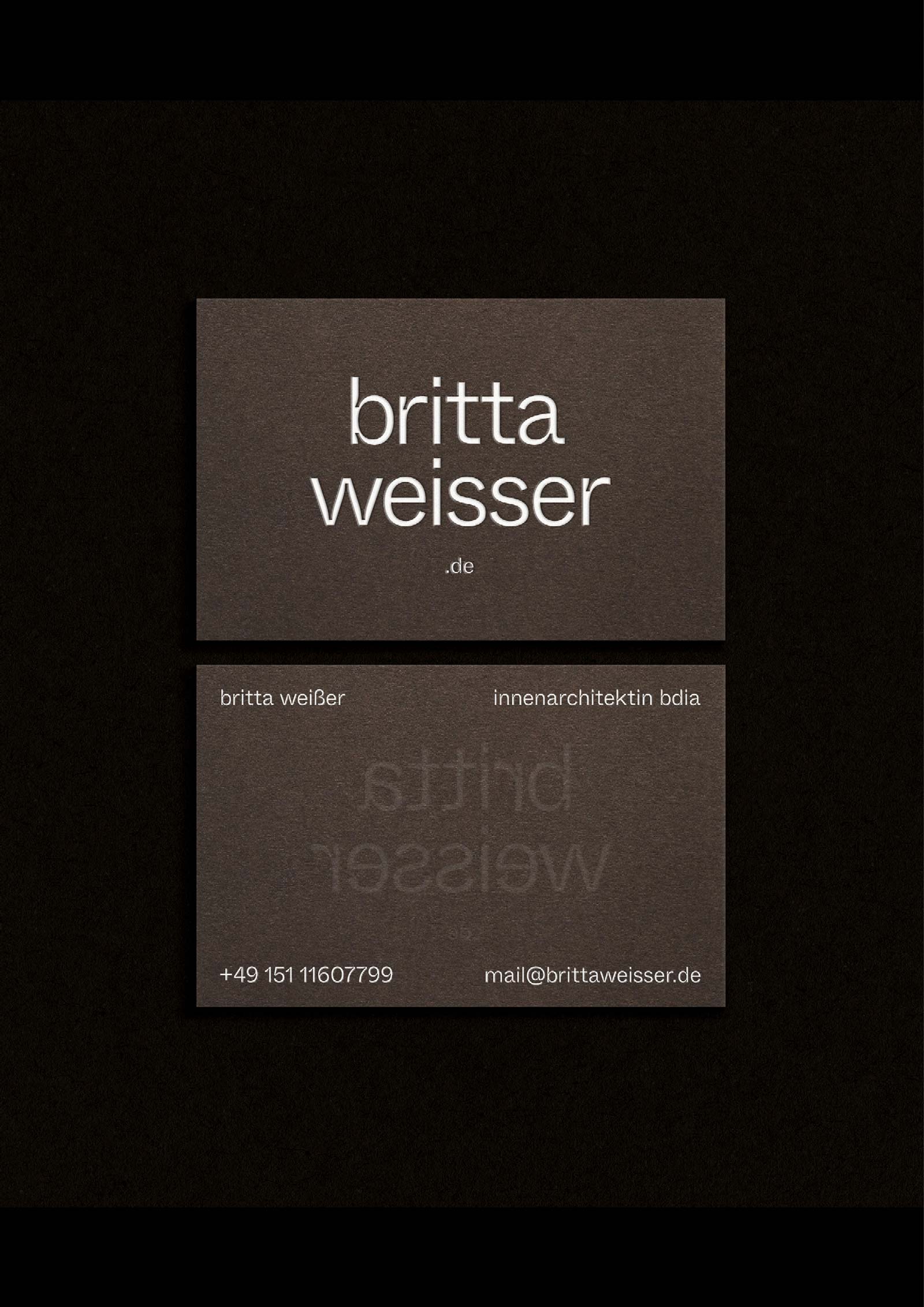
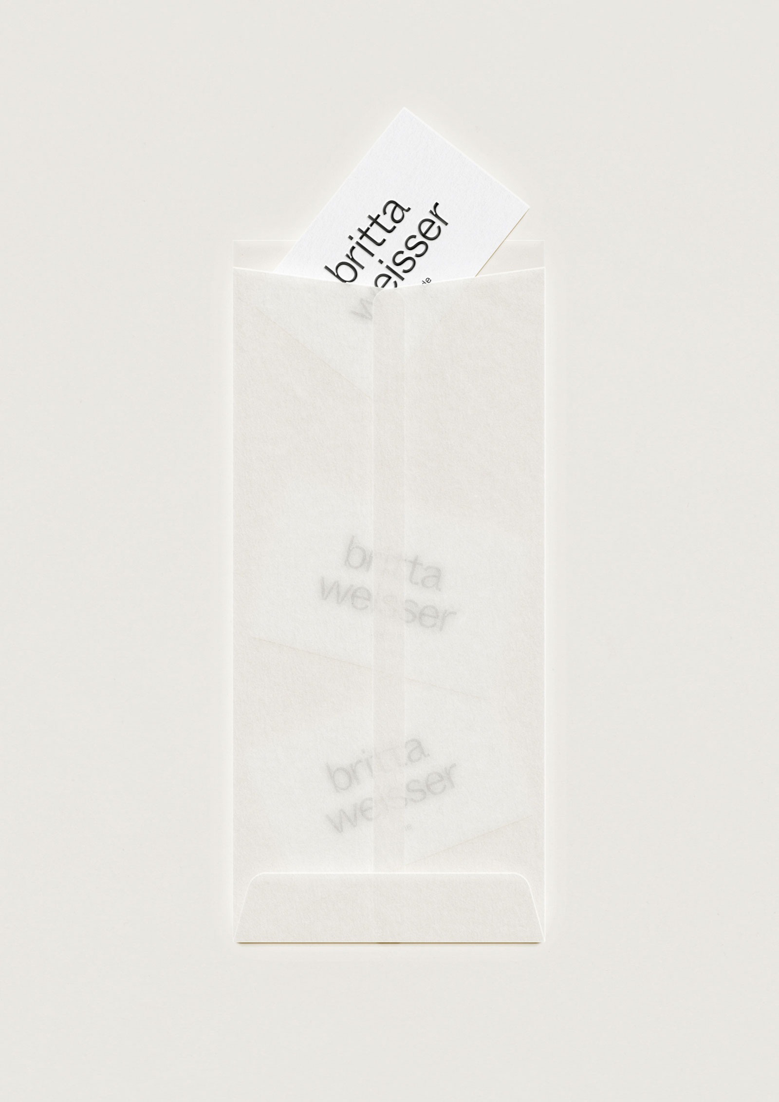
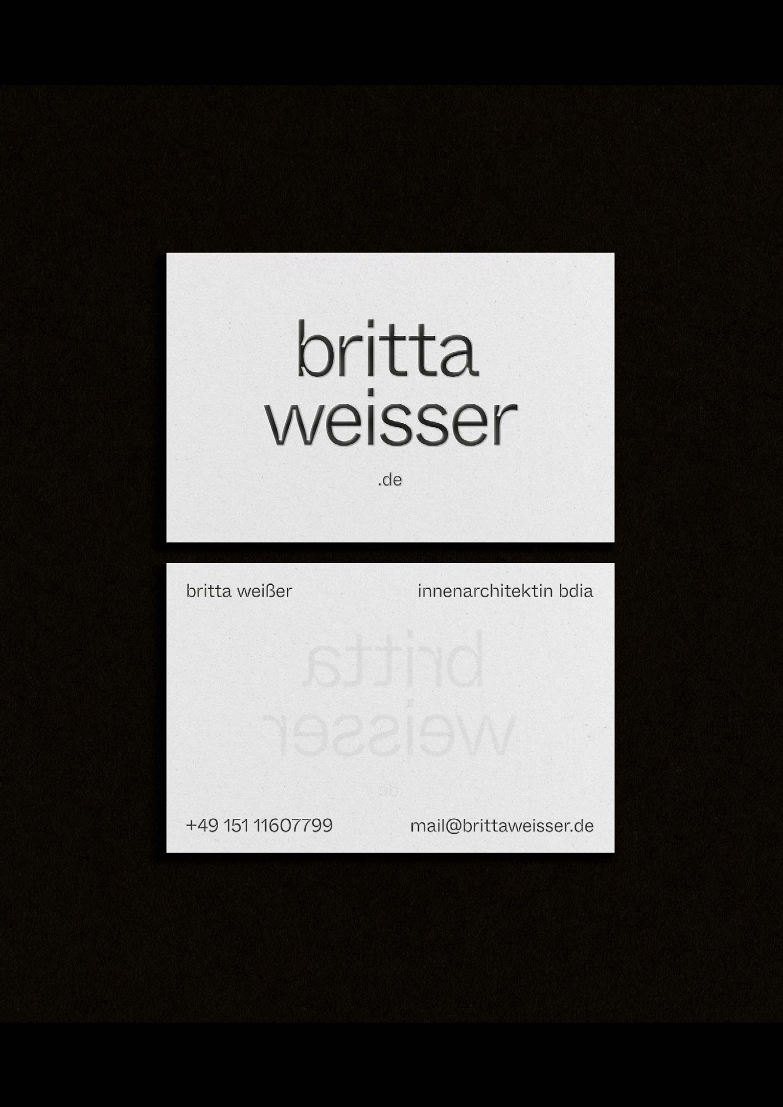
Our collaboration with Britta has evolved over several years. In the first phase, we developed a comprehensive brand strategy and, based on it, a refined mini personal brand identity. Through a carefully defined color palette, a typographic system, and a curated selection of tactile, vibrant papers for print applications, we built a strong and lasting brand foundation. A few years later, Britta approached us again to design new business cards. What began as a layout exercise unexpectedly resulted in a wordmark-like logo—without ever intentionally creating one.
◦ Type Concept
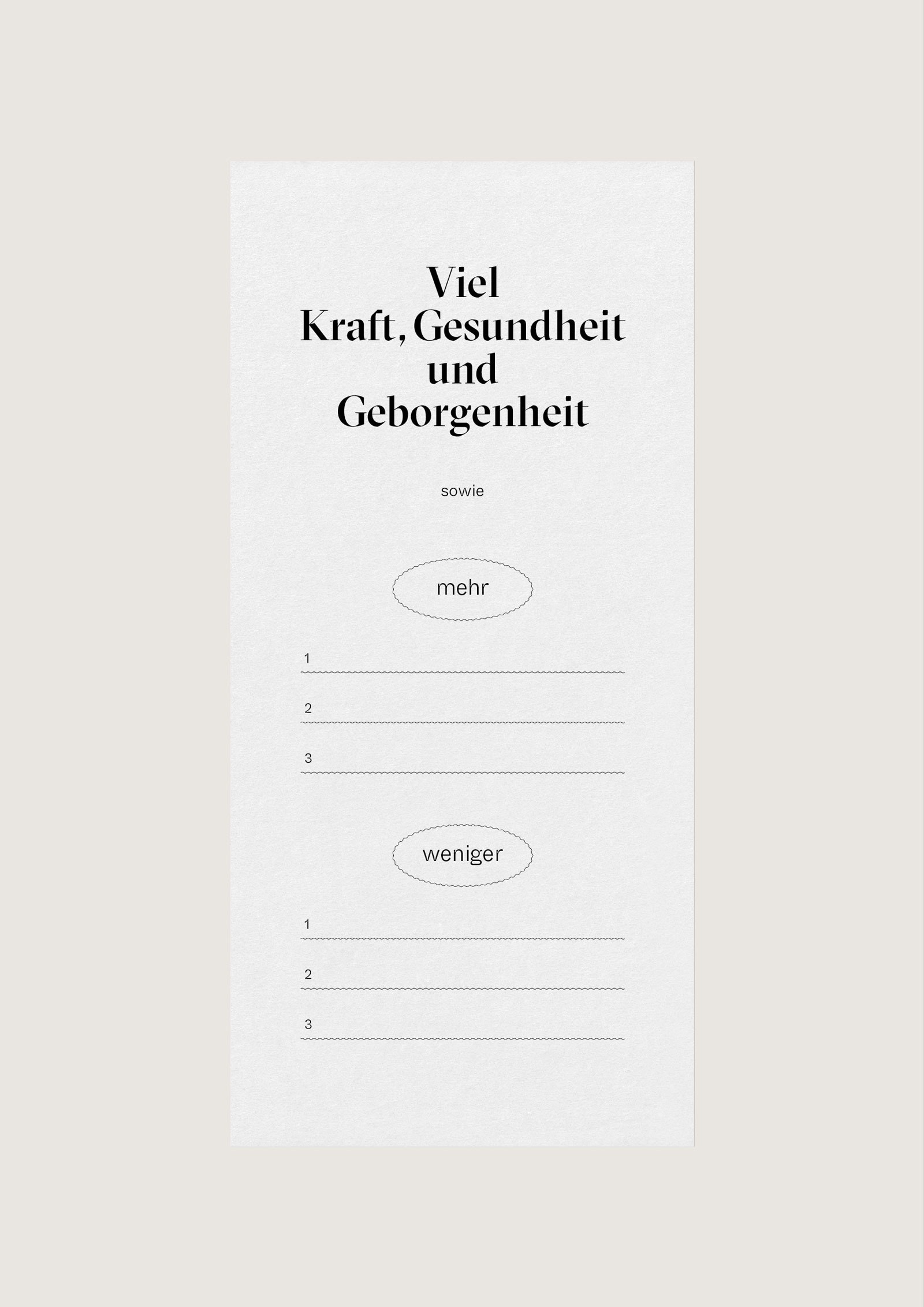
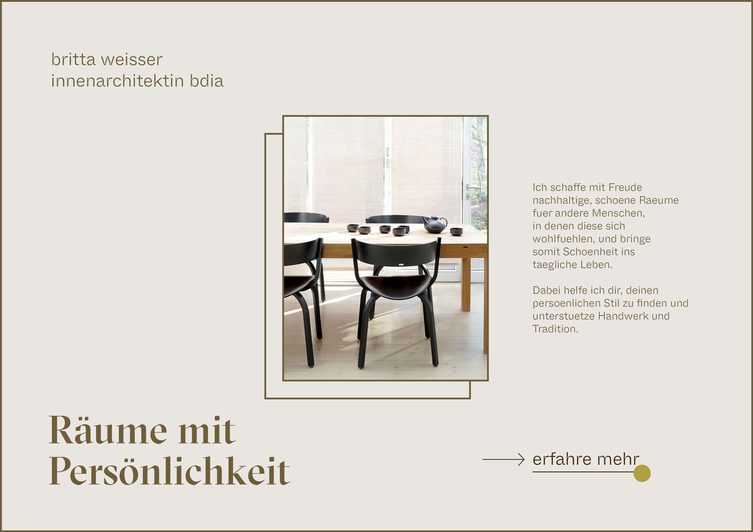
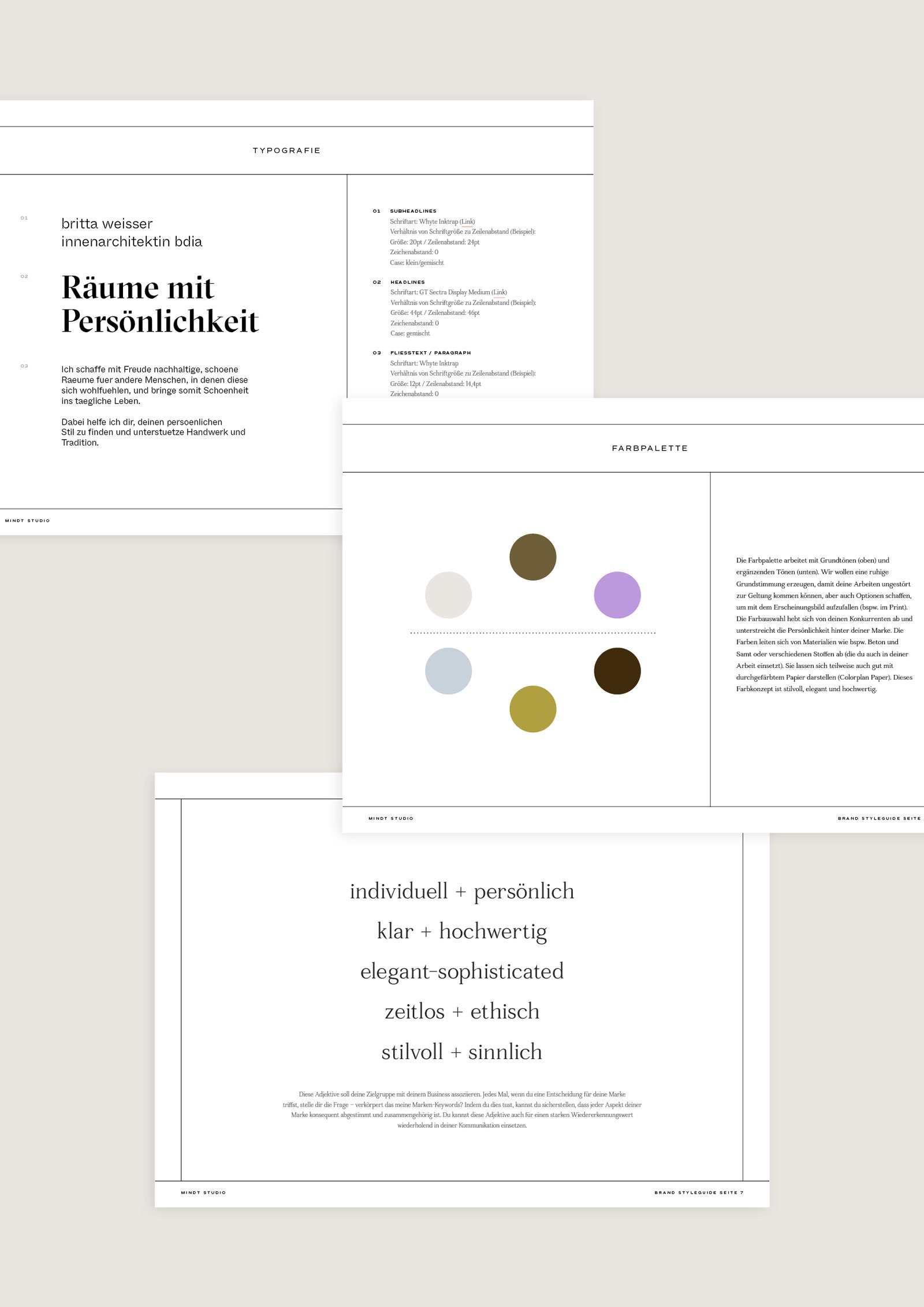
● In 2020, we defined a foundational typographic system for headlines, subheadlines, and body text. It consisted of GT Sectra by Grilli Type and Whyte Inktrap by Dinamo Typefaces. At that stage, the system was deliberately minimal and functional. Over time, Britta repeatedly questioned whether her practice actually required a traditional, fully developed logo.
● While designing the business cards, we explored a purely type-based layout rooted in the existing system. Through precise alignment, considered spacing, and the use of lowercase typography combined with the unconventional spelling (ss instead of ß), it became clear that a logo had already emerged. A distinctive wordmark was naturally formed.
◦ Overall Visual Direction
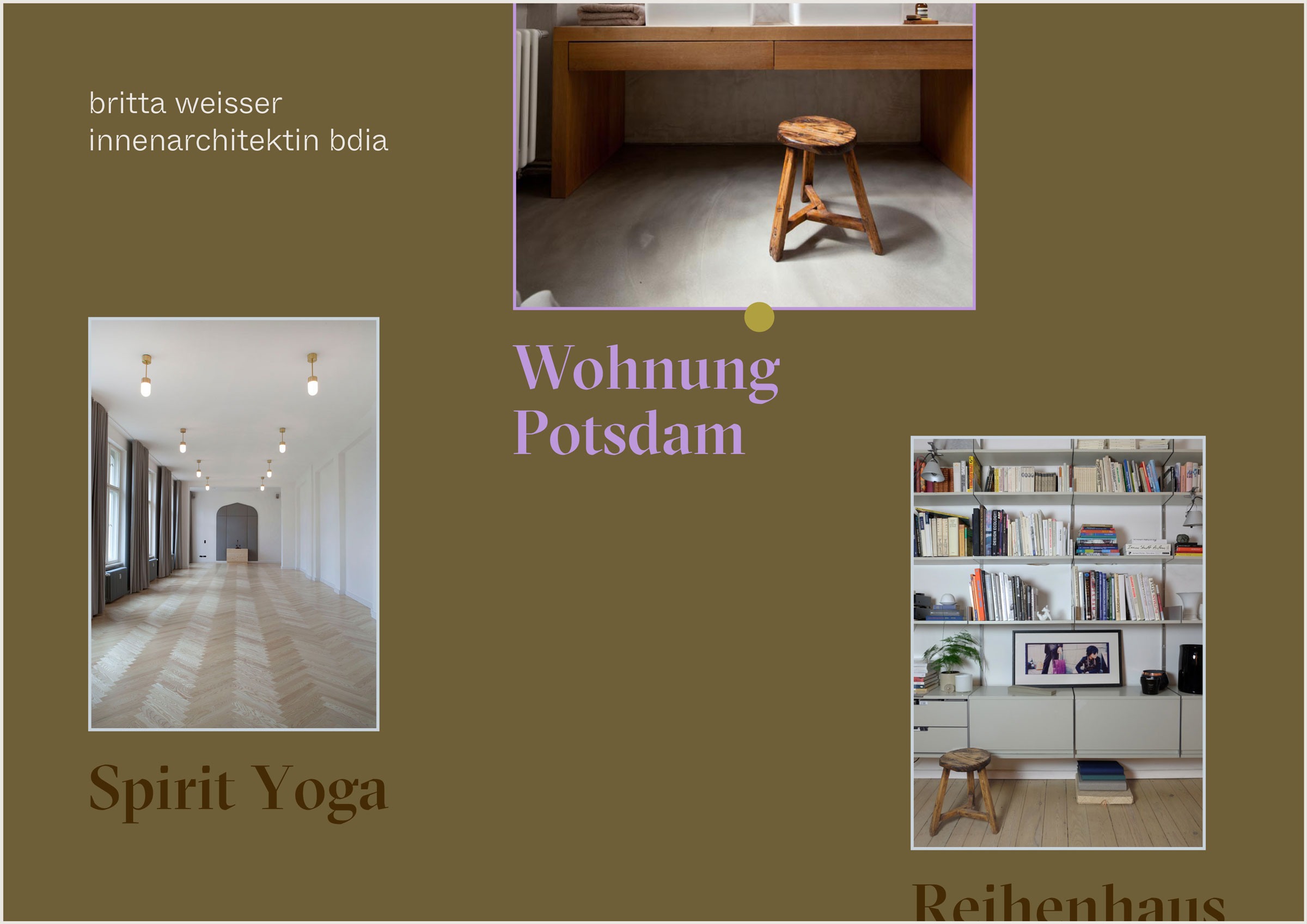
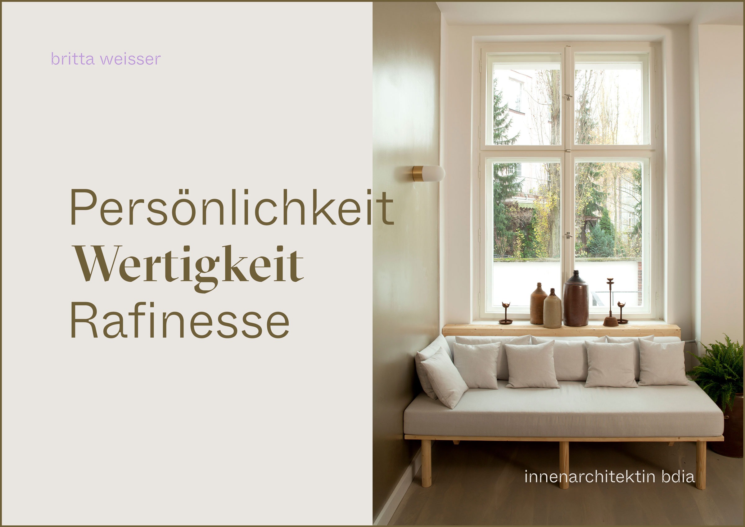
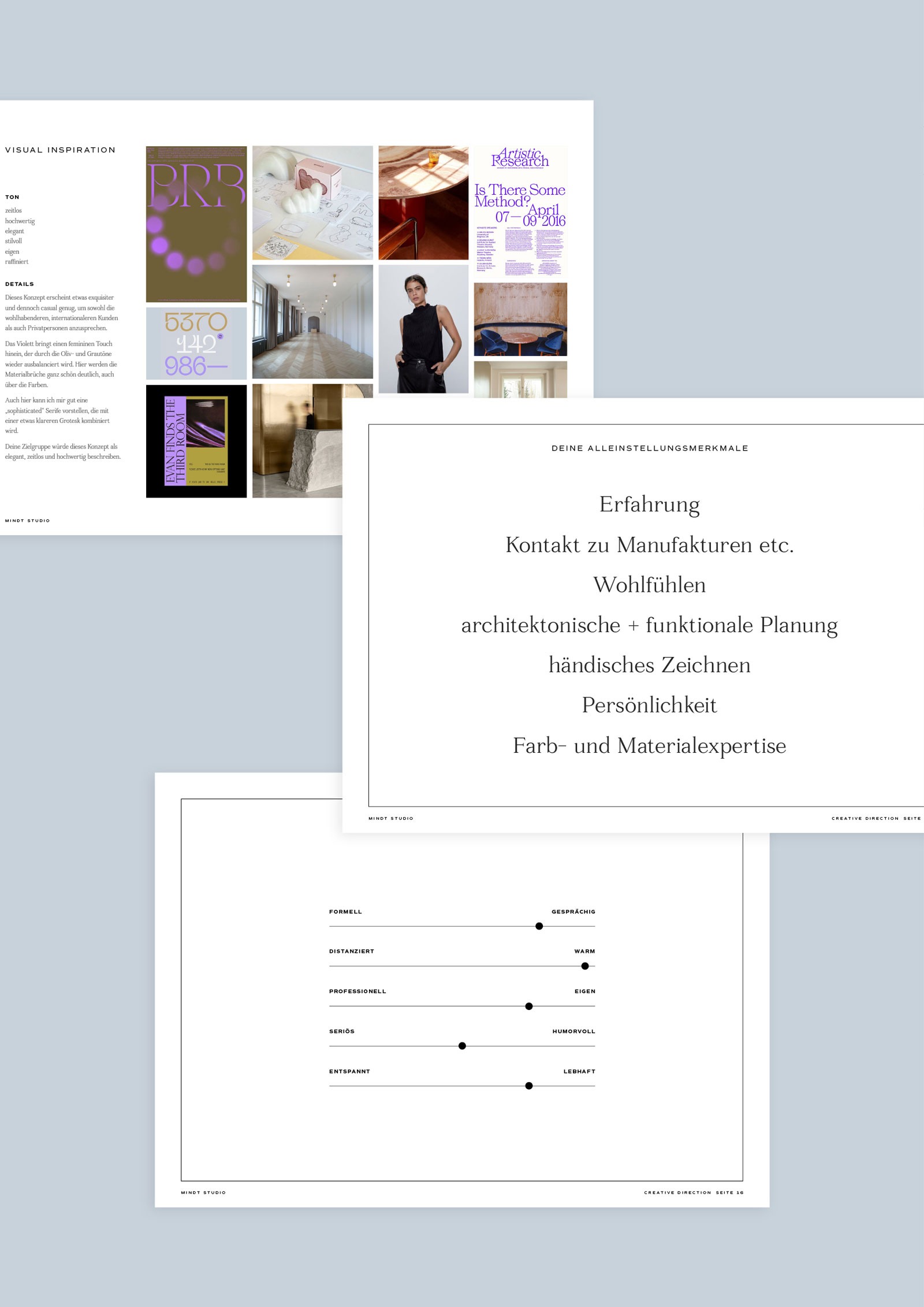
● Our goal was to create an identity that is clear, classy, and sensual—allowing Britta’s clients to feel both individually inspired and professionally supported when shaping their homes or workspaces. Core values include personality, quality, and sophistication.
● Through colors, fonts, and layout, we established a calm, understated atmosphere in which her projects could take center stage. At the same time, the system allows the brand to step forward confidently when needed, setting her practice apart from competitors.
◦ Color Concept
● The color palette consists of foundational tones complemented by accent shades. They are derived from materials such as concrete, velvet, and various textiles frequently used in Britta’s interior projects.
● For selected print applications like compliments slips and stationary, we chose tinted papers by Colorplan that reflect these hues. Combined, they create a chic, elegant, and premium tactile experience.
☺︎ Vibe
Individual + Personal・Clear + Premium
Elegant + Sophisticated
Timeless + Ethical・Stylistic + Sensuous
☺︎ Like What You See? Let’s Start Your Project!
Selected Projects

OH OH OM ® Ethical SportswearBrand Strategy & Design
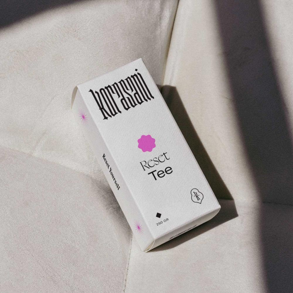
Korasani ®Brand Identity, Collateral & Web Design
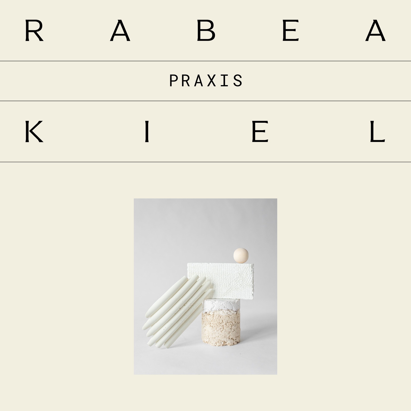
Praxis Rabea KielProject type
Drink OXY.Project type

Birth Studios ®Brand Strategy & Identity, Collateral, Web Design

bárur therapyBrand Strategy & Identity, Collateral

Join The Designer’s Well-Being Hub
Subscribe to the Mindt® Letter
Get Our Photo Bundles & Graphics
☺︎ We’re happy if we can inspire you—mutually be kind and professional and don’t copy or use any of our content without giving credit. This includes brand designs developed by us, the layout of this page, as well as any published texts.—Or, as Brian Collins has put it: »Be careful of doing too much work that copies the people you admire. Start out that way to see what feels right. But aim to seek what they were seeking instead of doing what they were doing.« ✌︎